Amy Pick
Graphic and Media Design BA Hons
Hereford College of Arts
Specialisms: Graphic Design / Advertising / UX Design
Location: Gloucester , United Kingdom


Amy Pick
First Name: Amy
Last Name: Pick
Specialisms: Graphic Design / Advertising / UX Design
Sectors:
My Location: Gloucester , United Kingdom
University / College: Hereford College of Arts
Course / Program Title: Graphic and Media Design BA Hons
About
I am a multidisciplinary graphic designer with a main passion for website UI/UX design, but I also enjoy creating illustrations and motion graphics, often incorporating these into my web designs to make them fun and unique.
My final project was based on my passion for watching Malvern RFC. As they are a small, local club I felt as though the team wasn’t appreciated enough and wanted to highlight the player’s commitment to the team and their support for each other. I started by redesigning their website using Adobe XD to enhance the functionality and give it a more cohesive visual language. Through this project I have learnt to prioritise the function and ease of navigation of website design, putting the user experience first in order to make the site accessible.
The success of the website inspired me to design a poster for their recent promotion and a collection of player cards to appreciate the individuality of the players and their abilities which resulted in an overwhelming amount of positive feedback.
My work has developed over time by incorporating more visual metaphors to enhance storytelling and meaning, particularly in my some of my other advertising campaign projects, combining two elements to directly link them together.
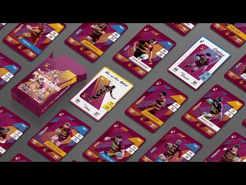


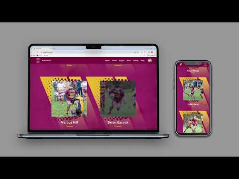


My end of year project derived from my excitement of watching and supporting my friends play for Malvern Rugby Club. These games gave me something to look forward to each week and it turned into a mechanism for managing my mental health, helping to begin my journey of overcoming my anxiety. This welcoming community was happy to involve me even when I had only just started going. Using their existing logo and branding colours kept the designs easily recognisable to fans. The new visual language consists of design assets that emphasise the speed and power of the team, as well as the close community that is a large part of how the club can continue to run. I started by redesigning their website to enhance the functionality and give it a more cohesive visual language. The success of the website inspired me to design a poster for their recent promotion and a collection of player cards to appreciate the individuality of the players and their abilities.
Competitions
