Hannah Lee
Textiles BA Hons
Arts University Bournemouth
Specialisms: Textiles - Print / Textiles - Weave / Textiles for Interiors
Location: London, United Kingdom


Hannah Lee
First Name: Hannah
Last Name: Lee
Specialisms: Textiles - Print / Textiles - Weave / Textiles for Interiors
Sectors:
My Location: London, United Kingdom
University / College: Arts University Bournemouth
Course / Program Title: Textiles BA Hons
About
Hannah Lee, is a Surface and Textile Designer who works across screenprint, weave and hard surfaces. She graduated with a First Class BA (Hons) in Textiles Design at Arts University Bournemouth. She is recognised for her bold use of colour, graphic pattern and tactile surfaces. Her creative practice is inspired by textures, colours and forms found in everyday life. Influenced by her South African heritage, Hannah’s aesthetic is vibrant and expressive, blending traditional craft with modern techniques. She continually experiments with print and materials to push creative boundaries, aiming to create joyful, sensory-rich designs for interior spaces.

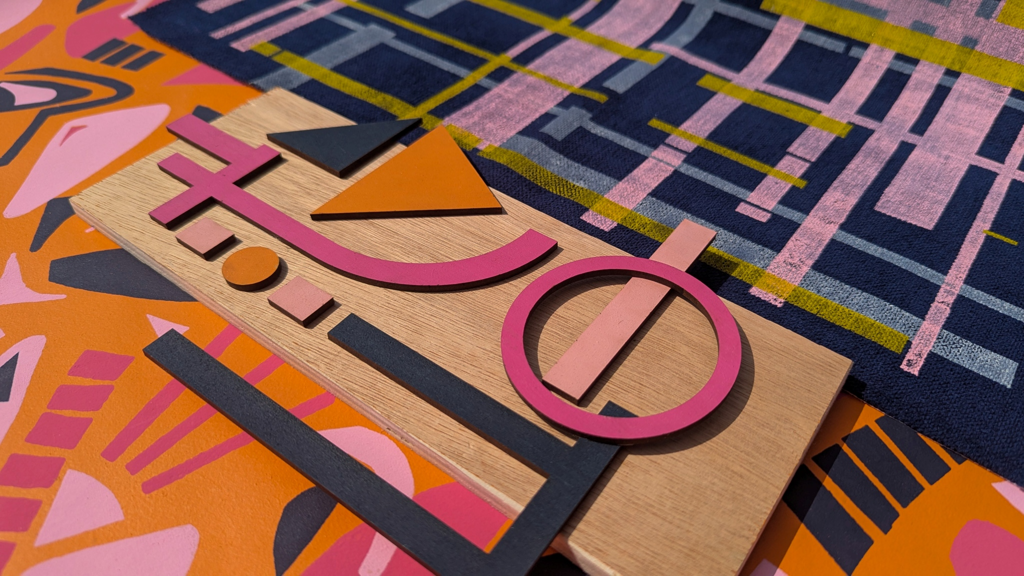
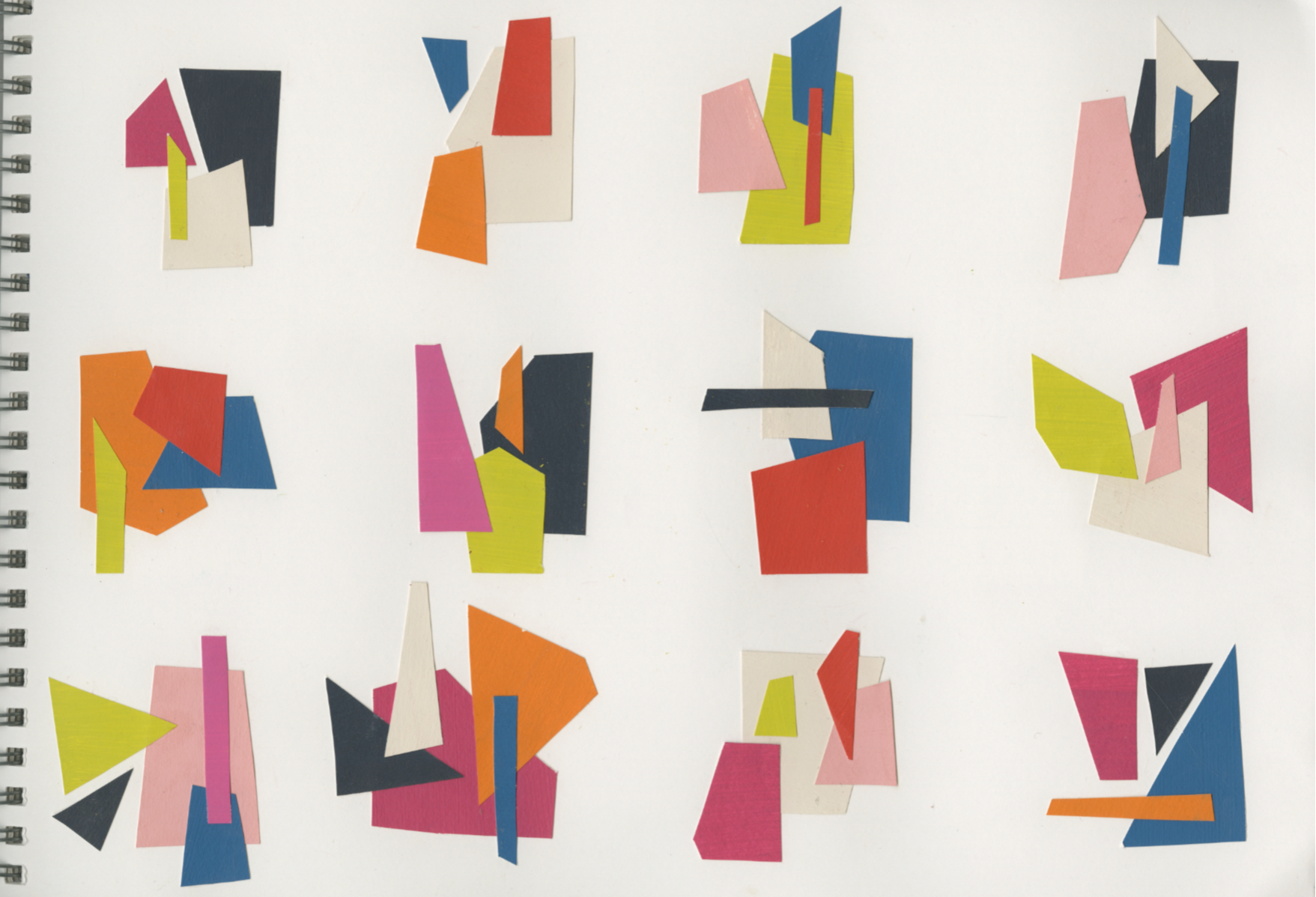
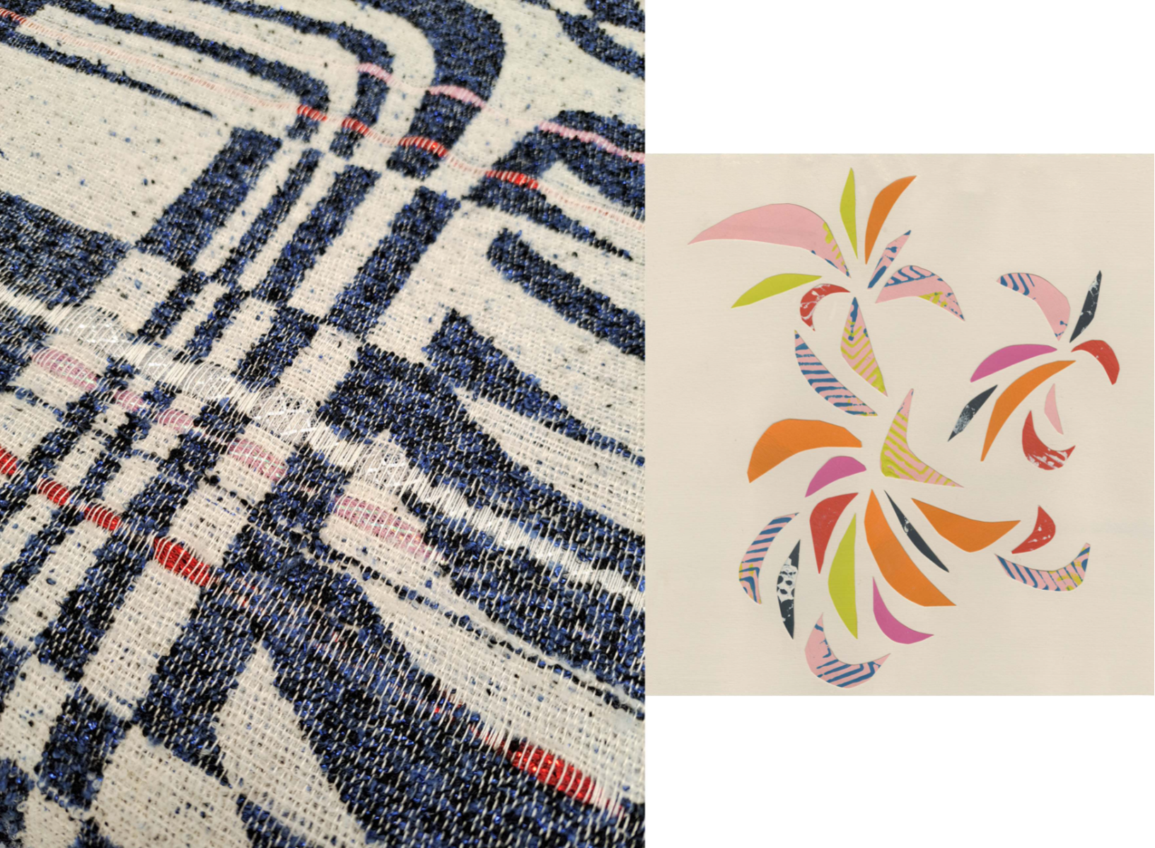

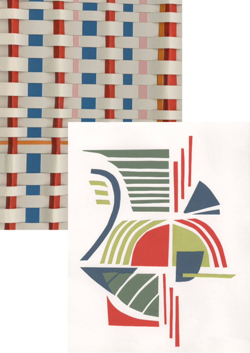
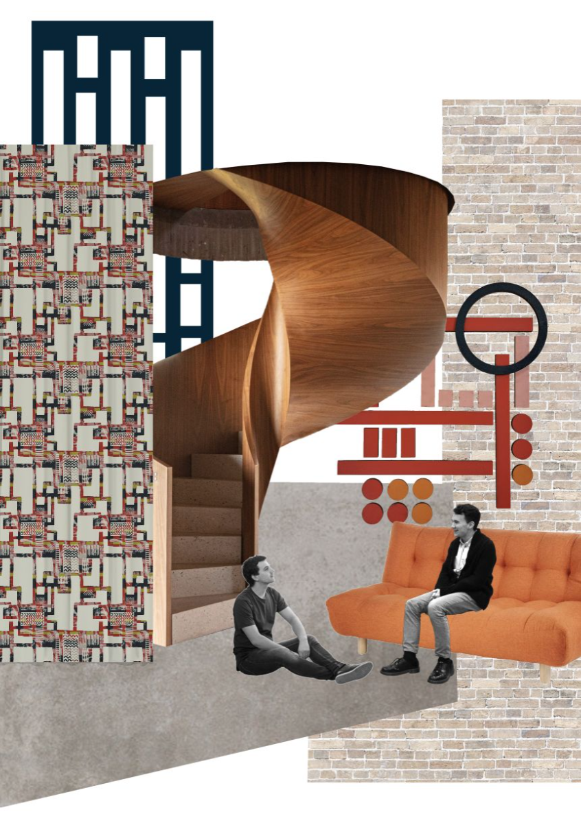


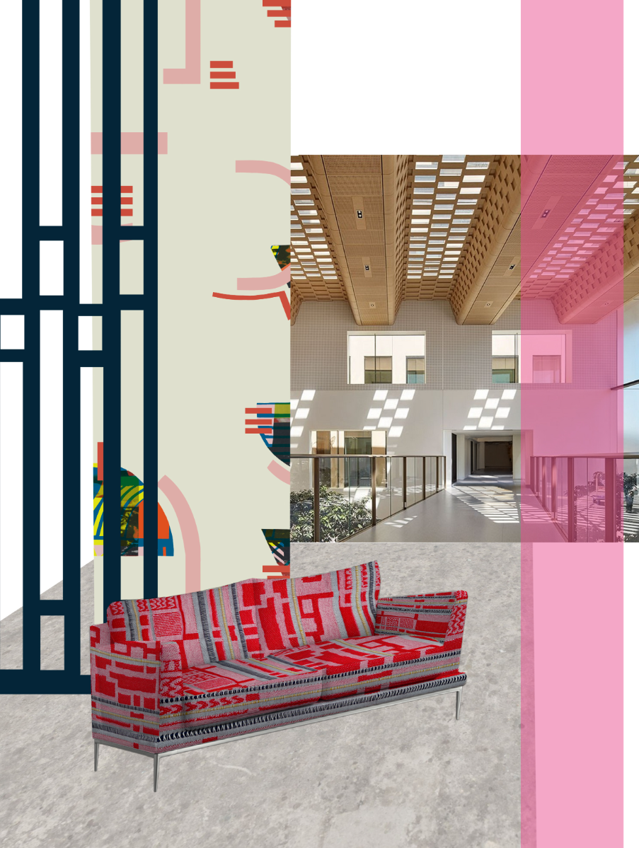
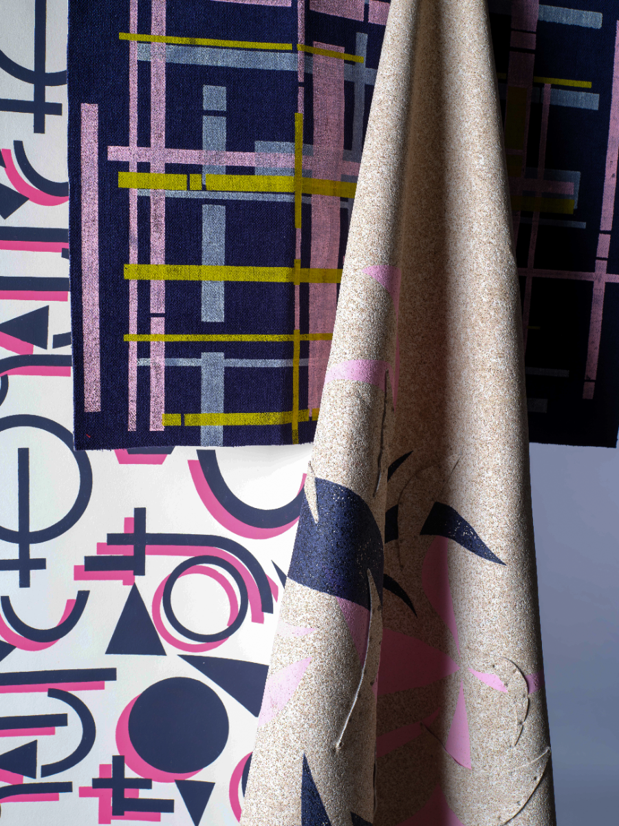
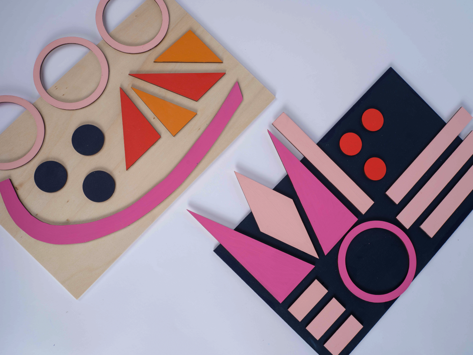
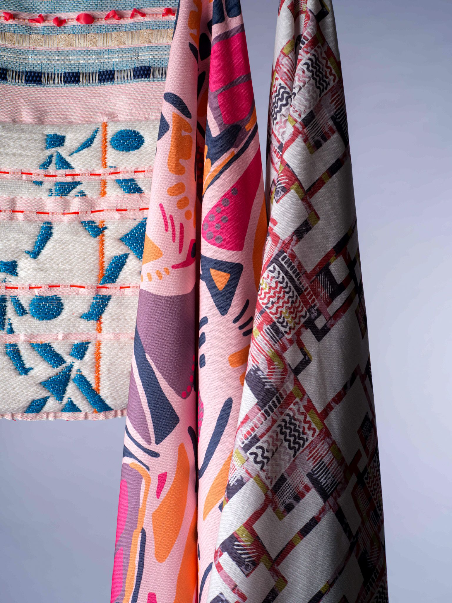
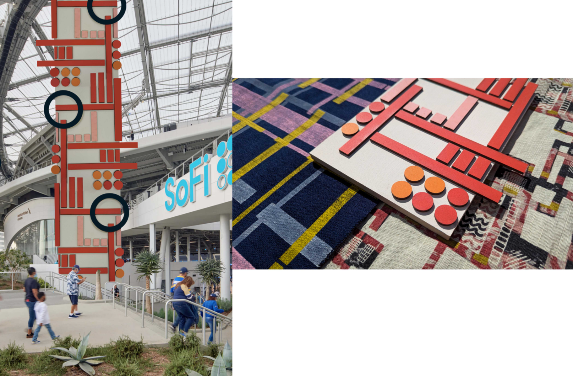
My graduate collection ‘In Motion’ is a vibrant celebration of energy and movement. ‘In Motion’ is an interiors collection featuring screen and digitally printed wallpapers, fabrics, tiles, and digital weaves. The collection is designed for leisure spaces, specifically gyms, changing rooms, and communal areas and is set within the hypothetical context of the 2028 Los Angeles Olympic Village. With the fitness industry continuing to grow post-pandemic, it is essential to design welcoming and inclusive environments. Research shows that 51% of UK gym-goers find fitness centres intimidating. This collection responds to that concern by creating spaces that are both energising and inviting. The concept of ‘In Motion’ was inspired by my visit to the 2024 Paris Paralympic Games, as well as my personal love of sport, particularly tennis and skateboarding. The bold graphic branding used throughout the Paralympics, on courts, signage, and merchandise, sparked the development of dynamic geometric motifs in my designs. I explored how colour, pattern, and form can reflect energy, movement, and excitement. The collection balances structured elements like wood and tiling with the softness of woven and printed textiles, creating an environment that feels luxurious yet playful. A vibrant, uplifting colour palette and abstract designs convey the joy I experienced at the Games. Accessibility is central to the project, as the target audience includes Paralympians and people with disabilities. With 24% of the UK population identifying as disabled (UK Government), it is vital to raise the profile of inclusive design. My good friend is a wheelchair user and another friend of mine competes at a high level in visually impaired tennis. My personal connection makes it even more important for me to research accessibility as I have seen first-hand how frustrating it can be when this isn’t well considered in design. I have made thoughtful design choices to enhance sensory engagement, for example, incorporating bright colours and graphic patterns that are more easily seen by people with sight loss or those with colour blindness. Using the laser cutter and puff binder allowed me to create raised and embossed textures to help visually impaired people feel the patterns instead, without compromising on the aesthetics of the overall collection. By considering these aspects in my designs, ‘In Motion’ is an interiors collection that can be enjoyed by all. vimeo link: https://vimeo.com/1081658131/9ae8f19f5a
Competitions

Global Creative Graduate Showcase 2025
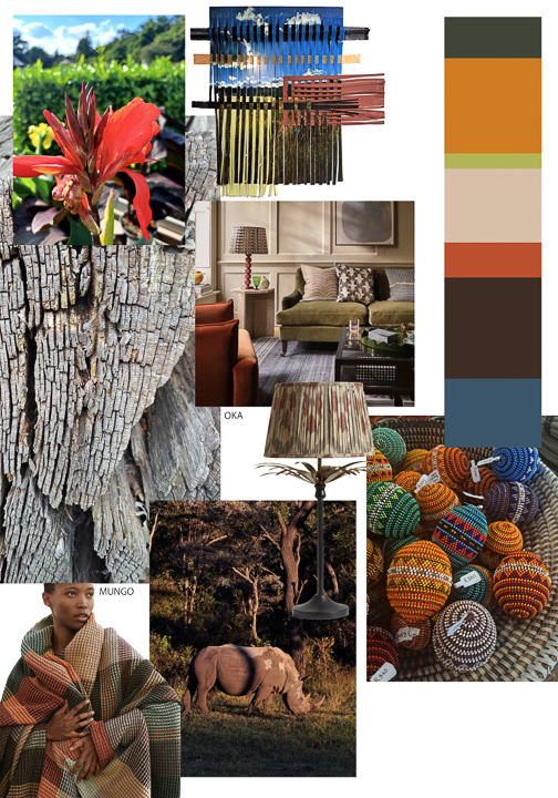
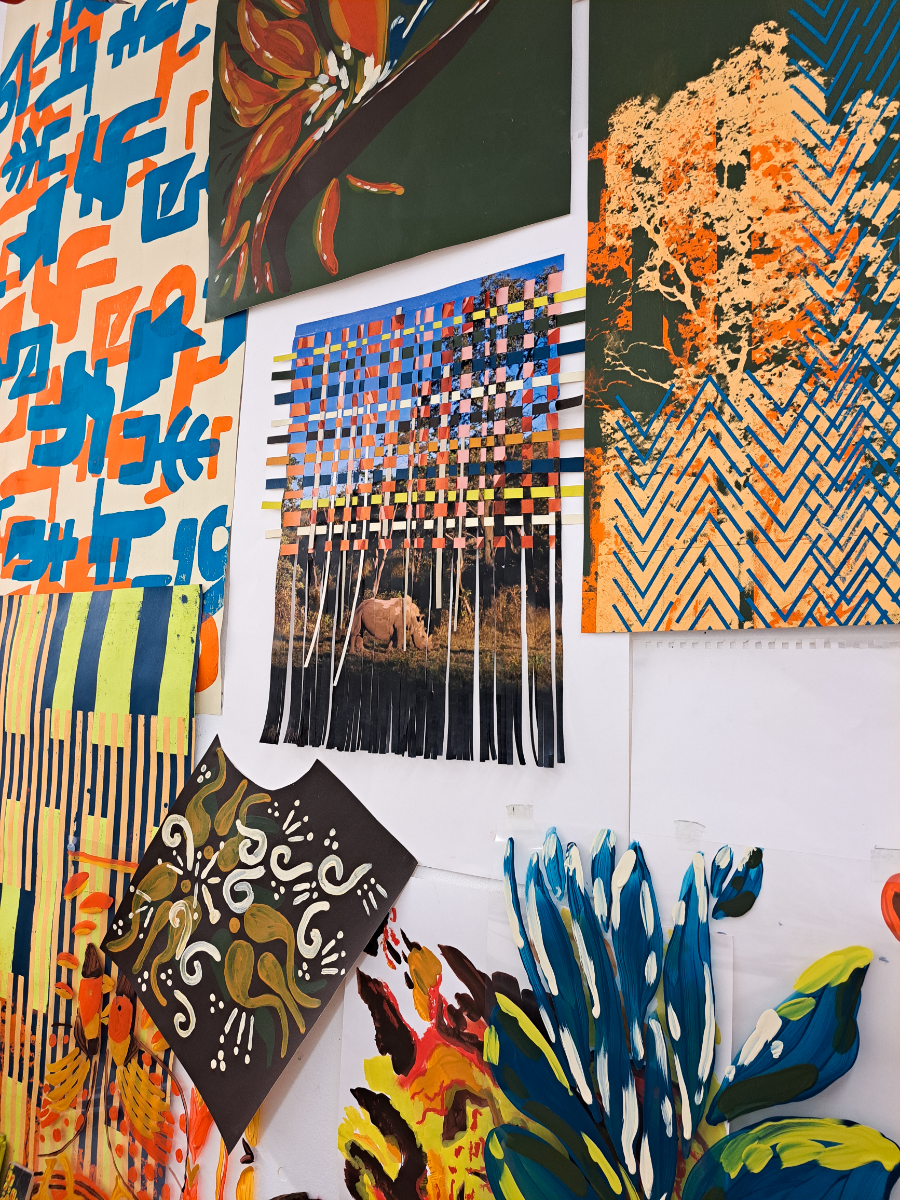
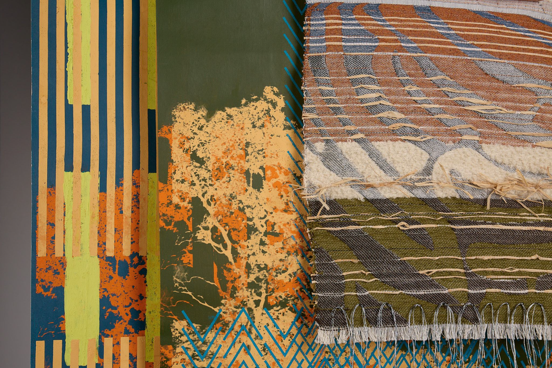
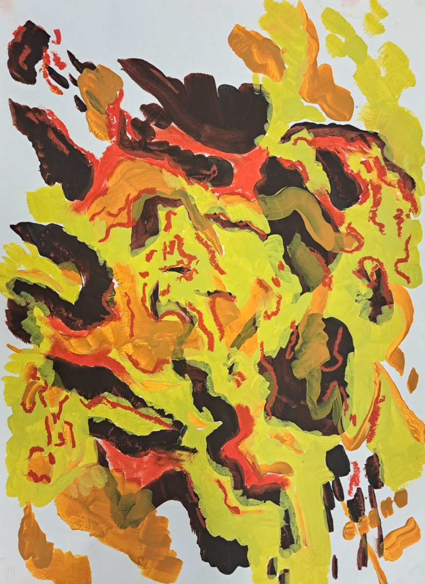
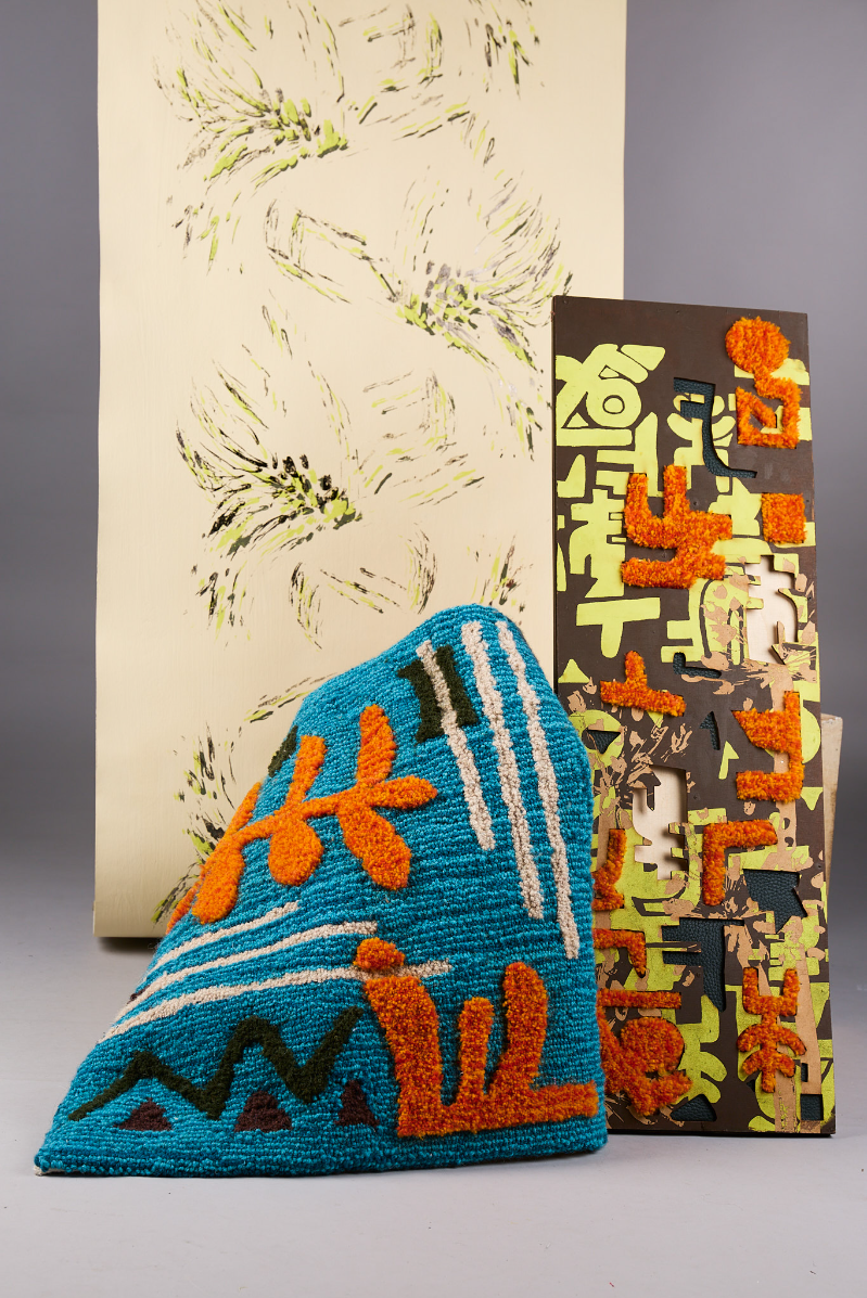
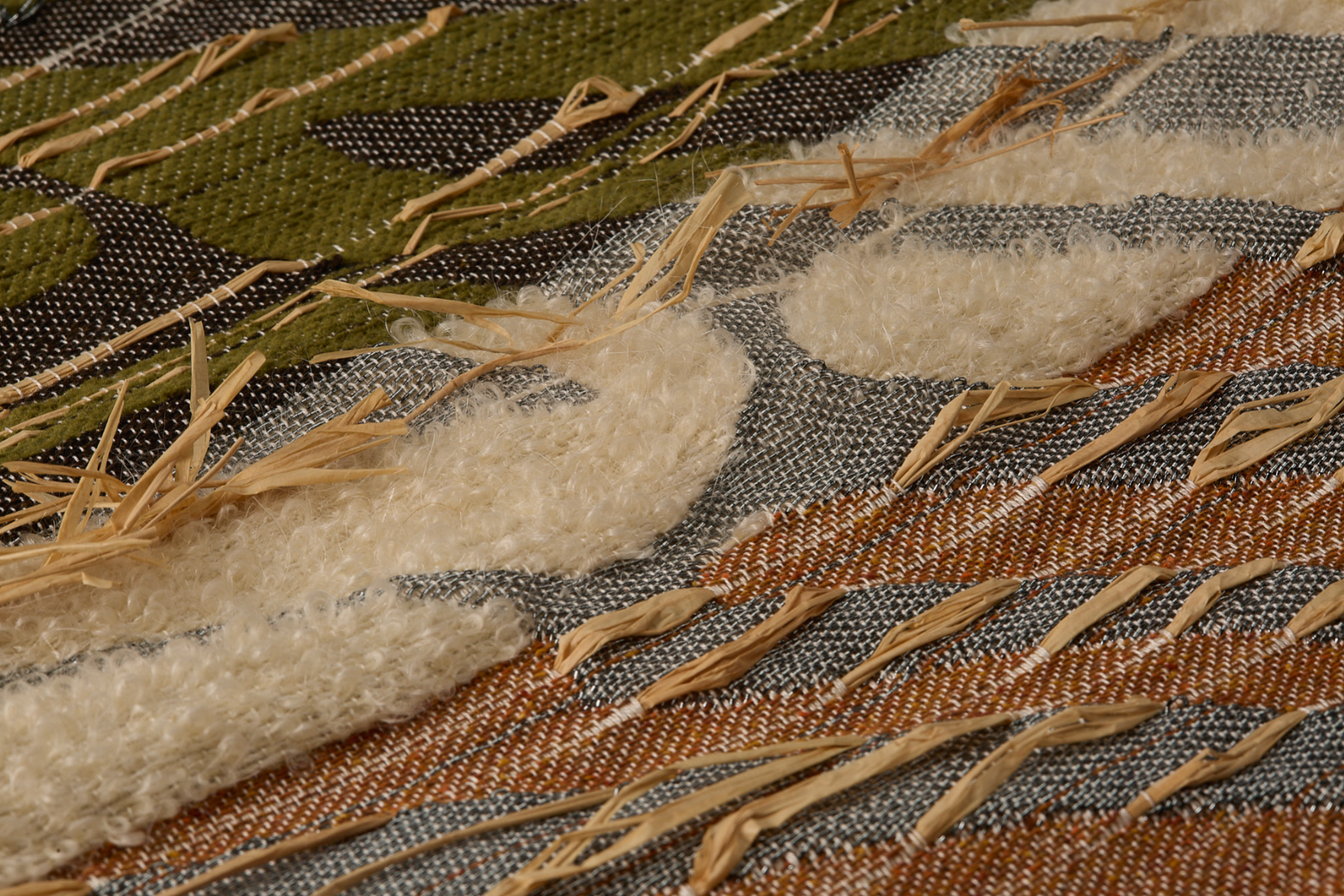
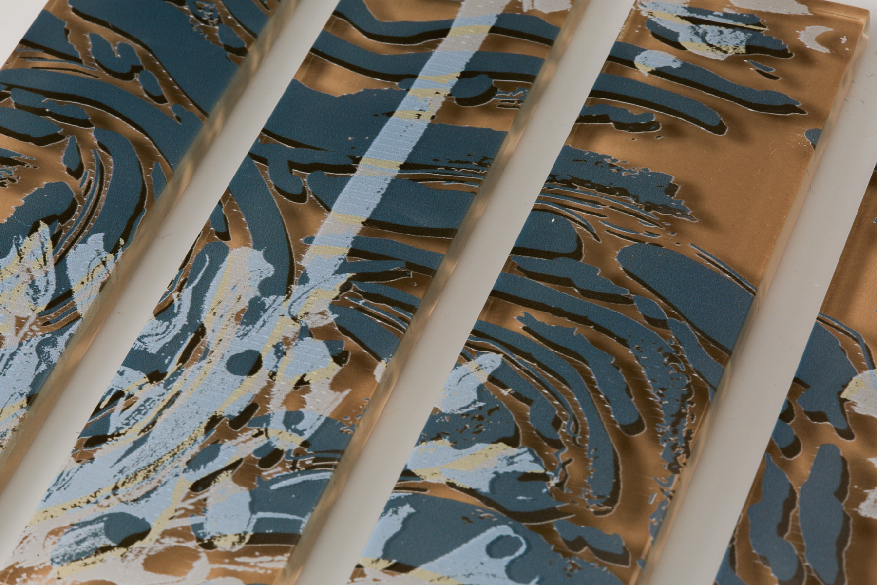
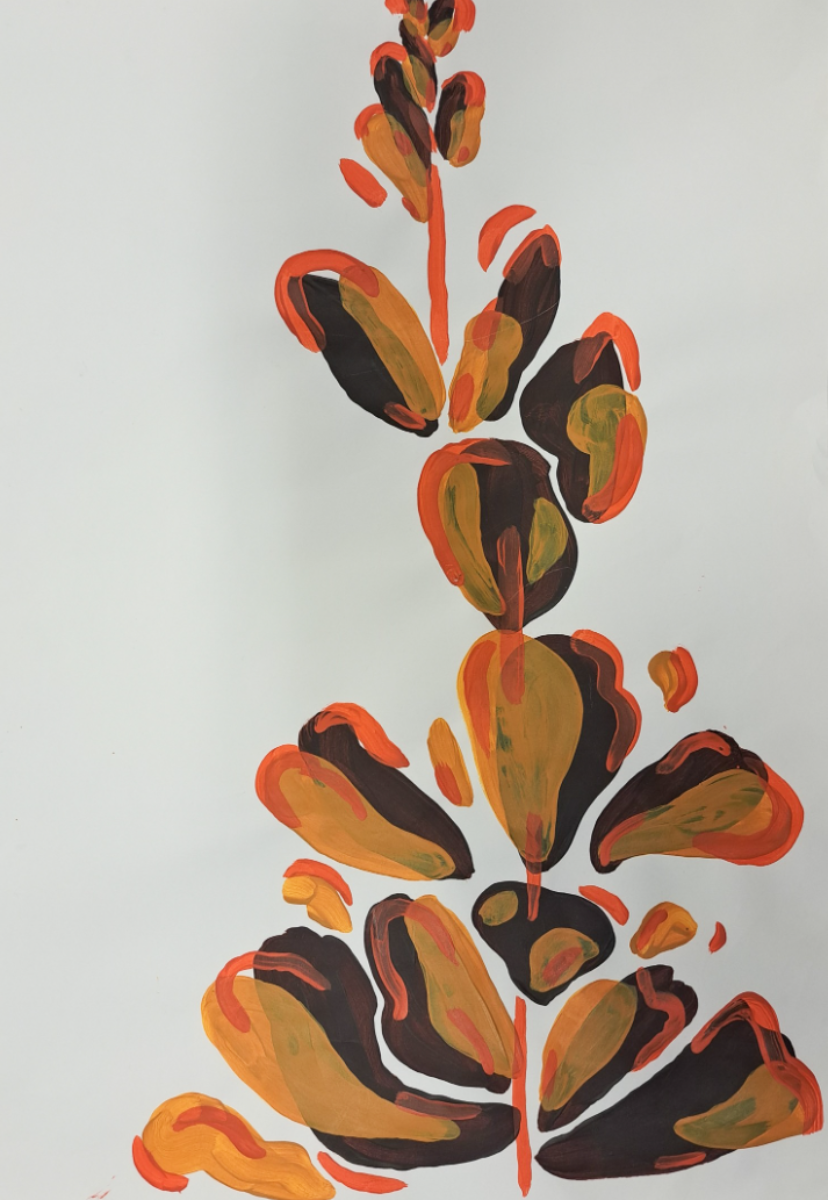
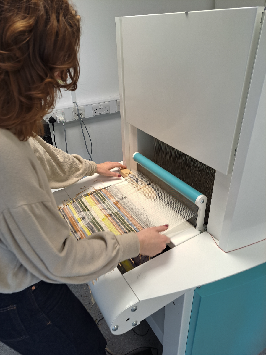
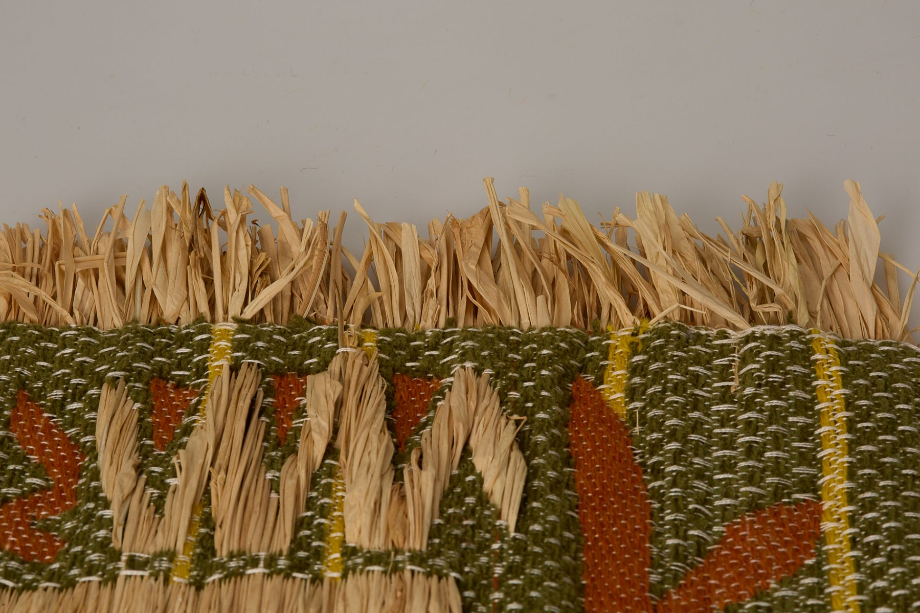
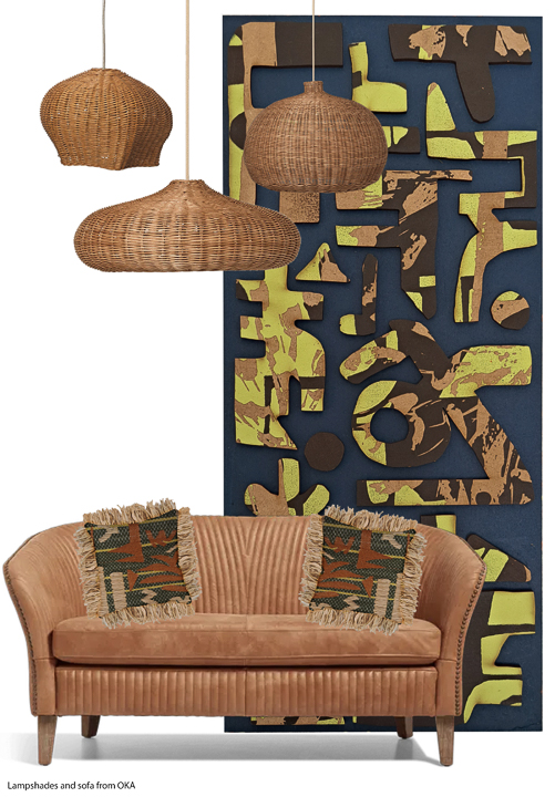
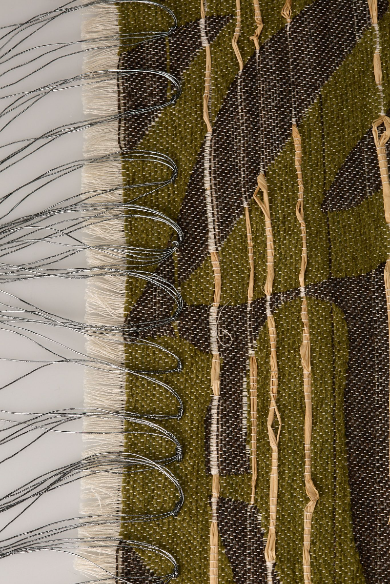

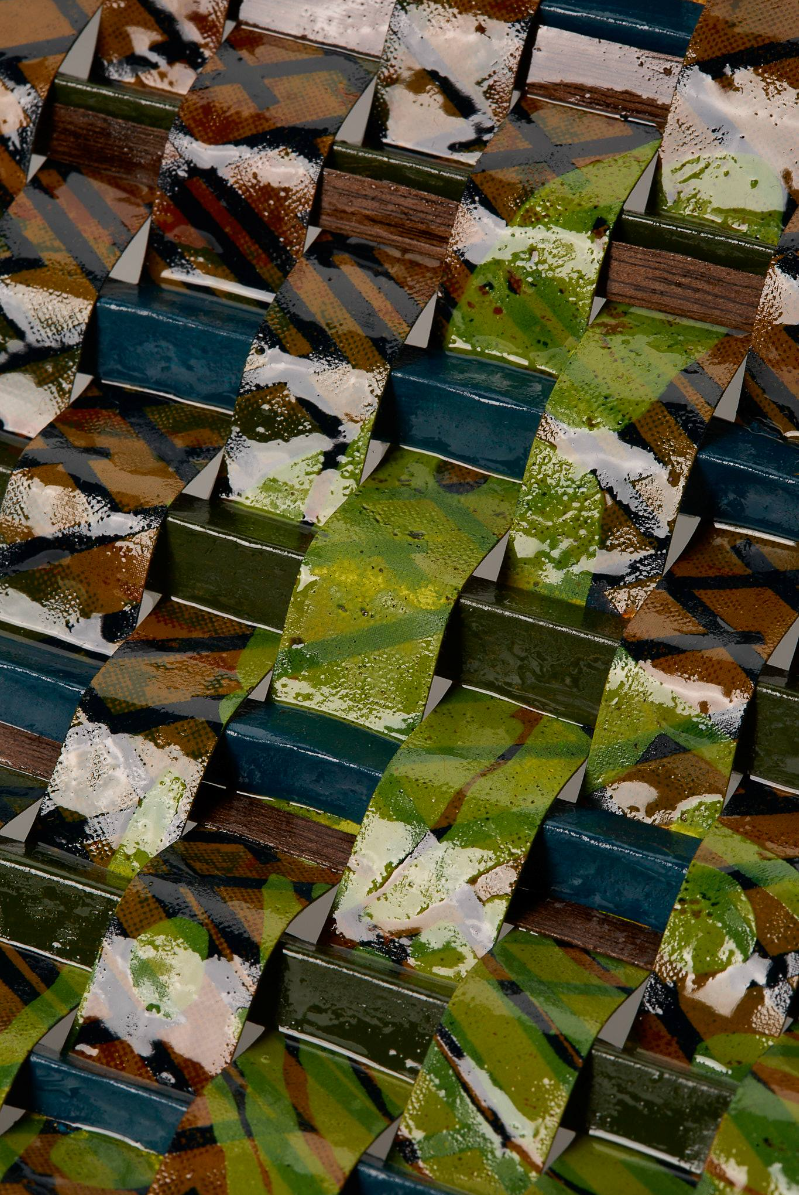
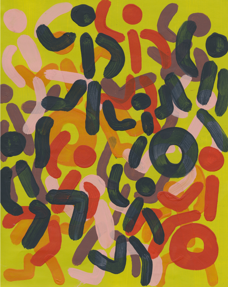
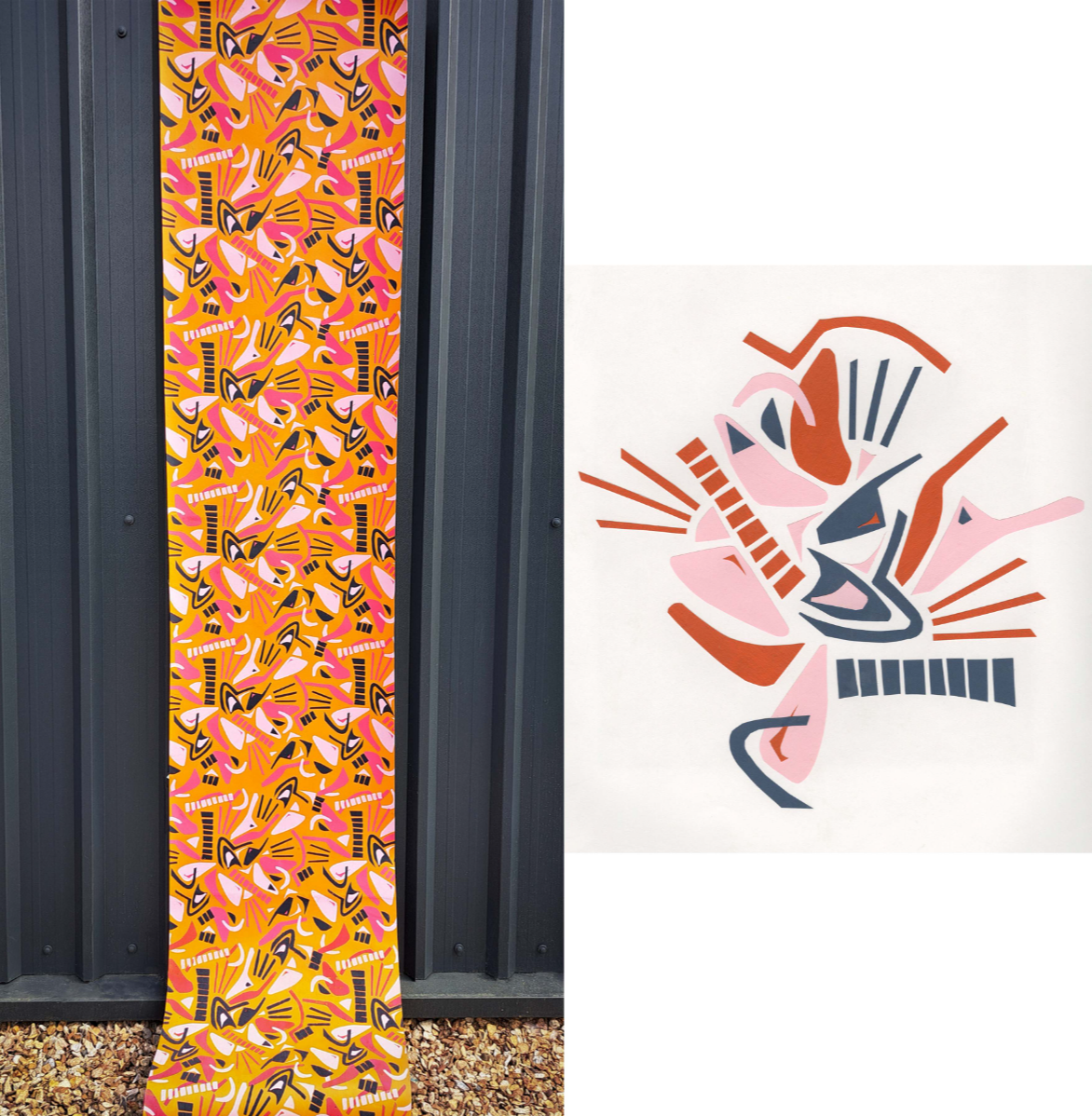
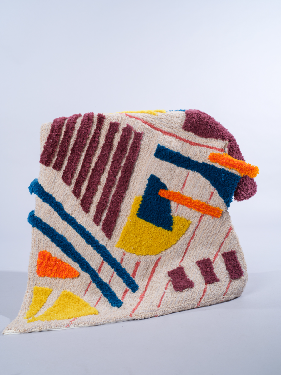
‘Untamed Africa’ is an interiors collection that draws on my South African heritage and the beauty of the African bush. The collection brings together screen-printed wallpapers, digital weaves, digitally printed fabrics, and innovative hard surface samples to create a cohesive yet striking collection. Inspired by the anticipation of searching for wildlife in their natural environment, I explored themes of concealment and revelation through layering and distortion in both prints and weaves. This reflects how animals exist subtly within the landscape—hidden yet ever-present. My design approach is rooted in abstraction, where organic forms are reimagined through a contemporary lens. I drew not only from the natural world, but also from South African cultural practices such as beading and basket weaving to inform my geometric motifs. Research of South Africa’s complex history ran parallel to an exploration of its emerging design scene. I was particularly drawn to the bold style of contemporary South African design— which has often been overshadowed by the countries dark past. Through the use of graphic imagery, tactile surfaces, and a considered yet vibrant colour palette, this collection seeks to reframe South Africa’s past with optimism and respect. Material exploration played a central role in the development of the collection. I combined traditional techniques with contemporary processes to create surfaces that are texturally rich. The use of raffia in the weaves introduces a sense of place and authenticity, while the juxtaposition of materials—such as resin-coated paper weaves and the pairing of tufting with wood—brings a sculptural, unexpected dimension to the work.