Tsz Yan Bella Wong
Graphic Design MA
Nottingham Trent University
Specialisms: Graphic Design / Illustration / Printmaking
Location: Glasgow, United Kingdom


Tsz Yan Bella Wong
First Name: Tsz Yan Bella
Last Name: Wong
Specialisms: Graphic Design / Illustration / Printmaking
Sectors:
My Location: Glasgow, United Kingdom
University / College: Nottingham Trent University
Course / Program Title: Graphic Design MA
About
Hi, I’m Bella. I’m a Graphic Design graduate from Nottingham Trent University. My practice often blends playful illustration, surreal concepts, and food-inspired ideas. I enjoy using irony and sarcasm as a design language — twisting familiar visuals into thought-provoking messages that challenge how we see everyday culture.
My recent project, The Flavour of Time, reflects this approach. It’s a collection of twelve illustrated tea towels, each representing a Hong Kong festival linked to a specific month. The designs capture cultural traditions, rituals, and foods in a vibrant, risograph-inspired style. The collection reimagines tea towels as timeless objects — an everlasting calender that reminds us of the continuous cycle of celebration.
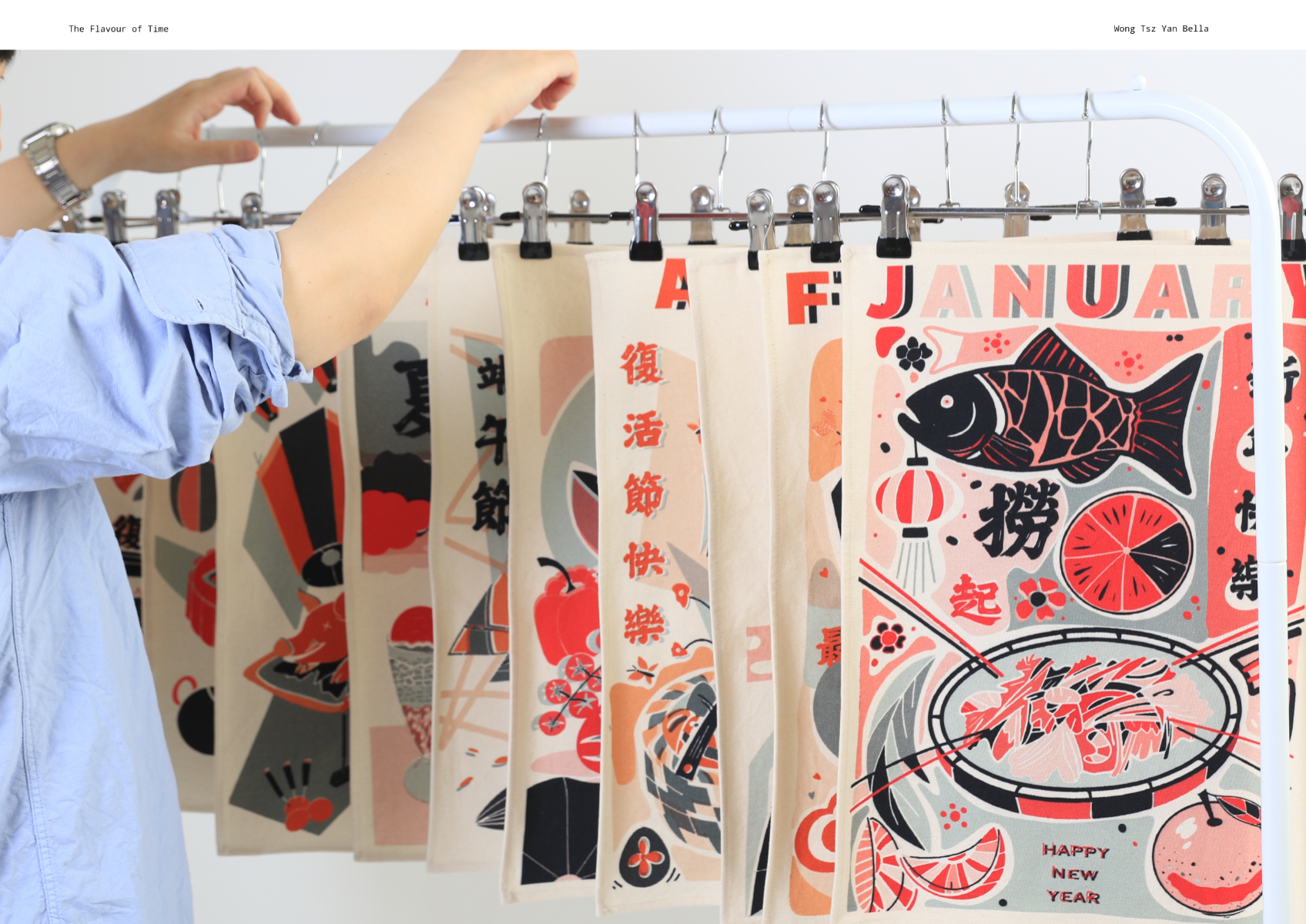

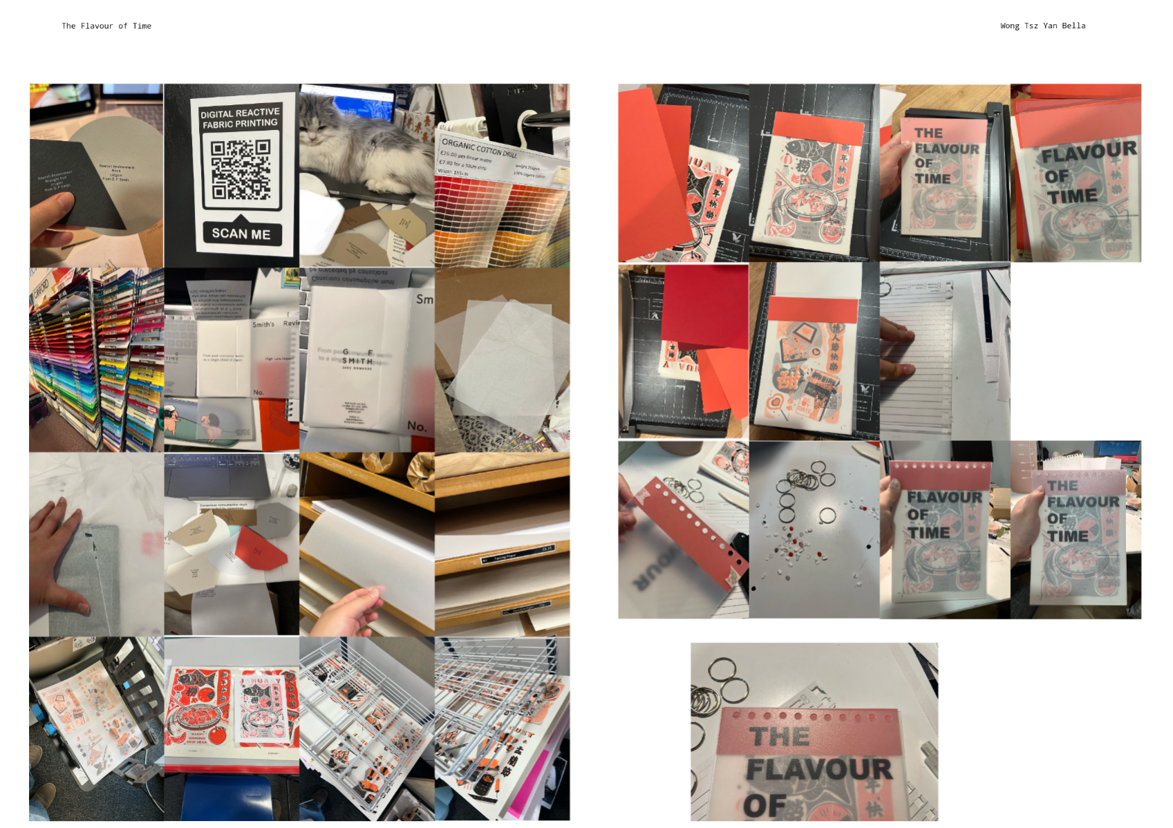
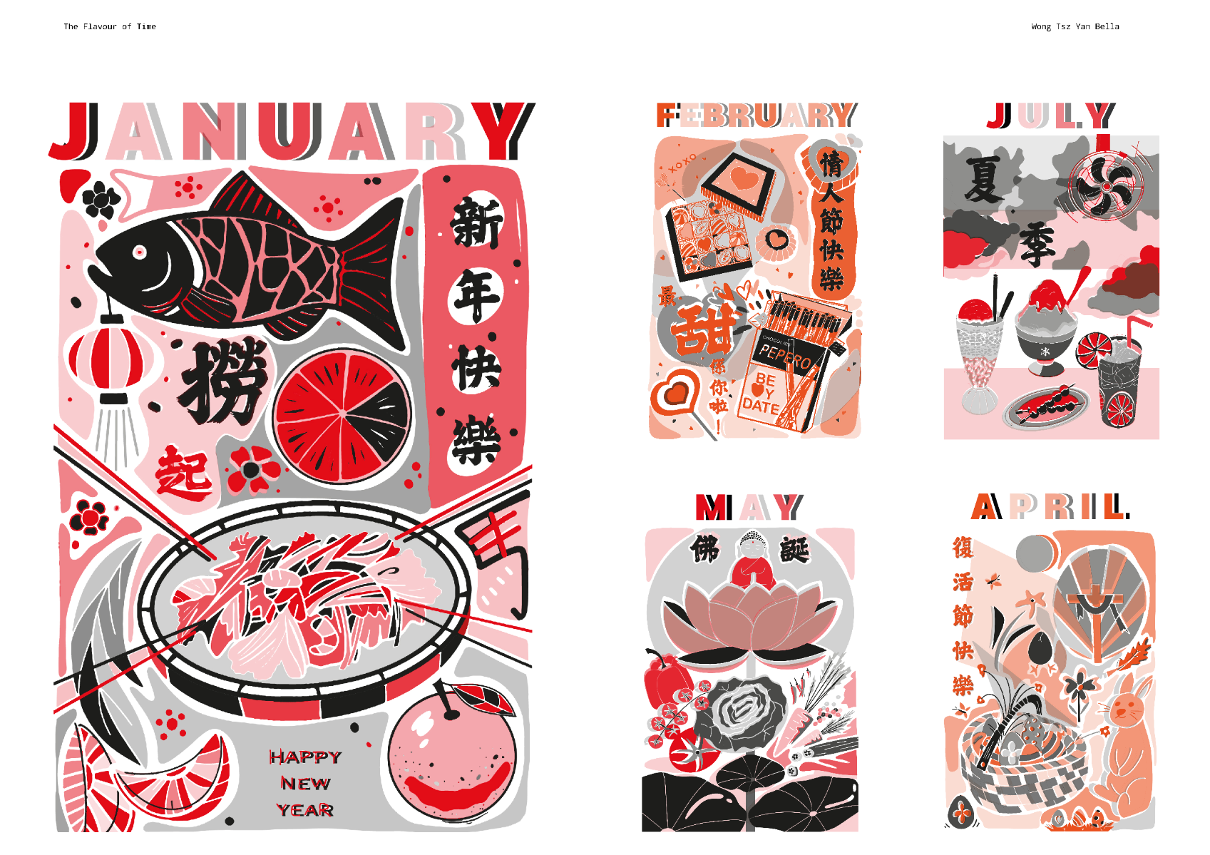
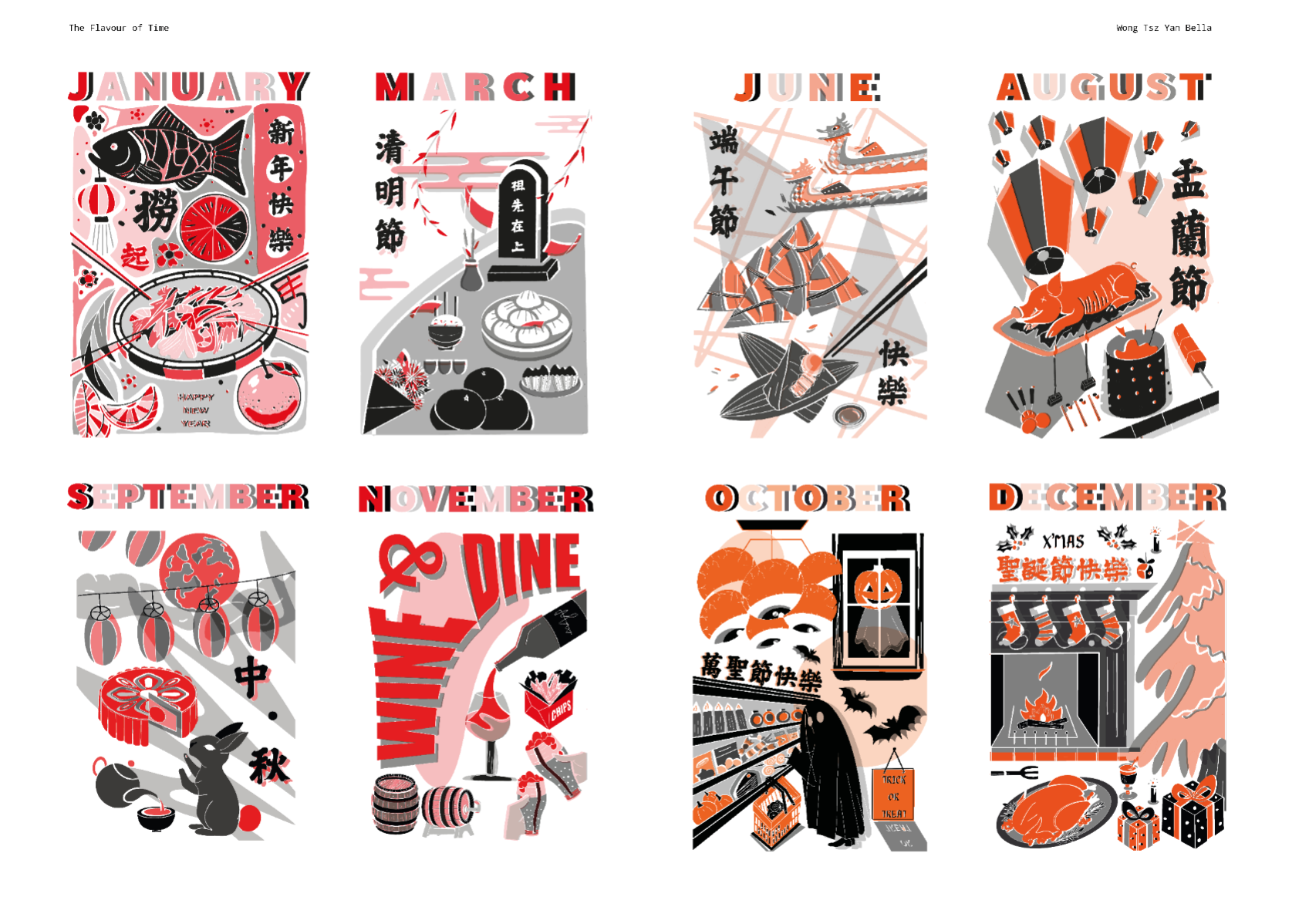
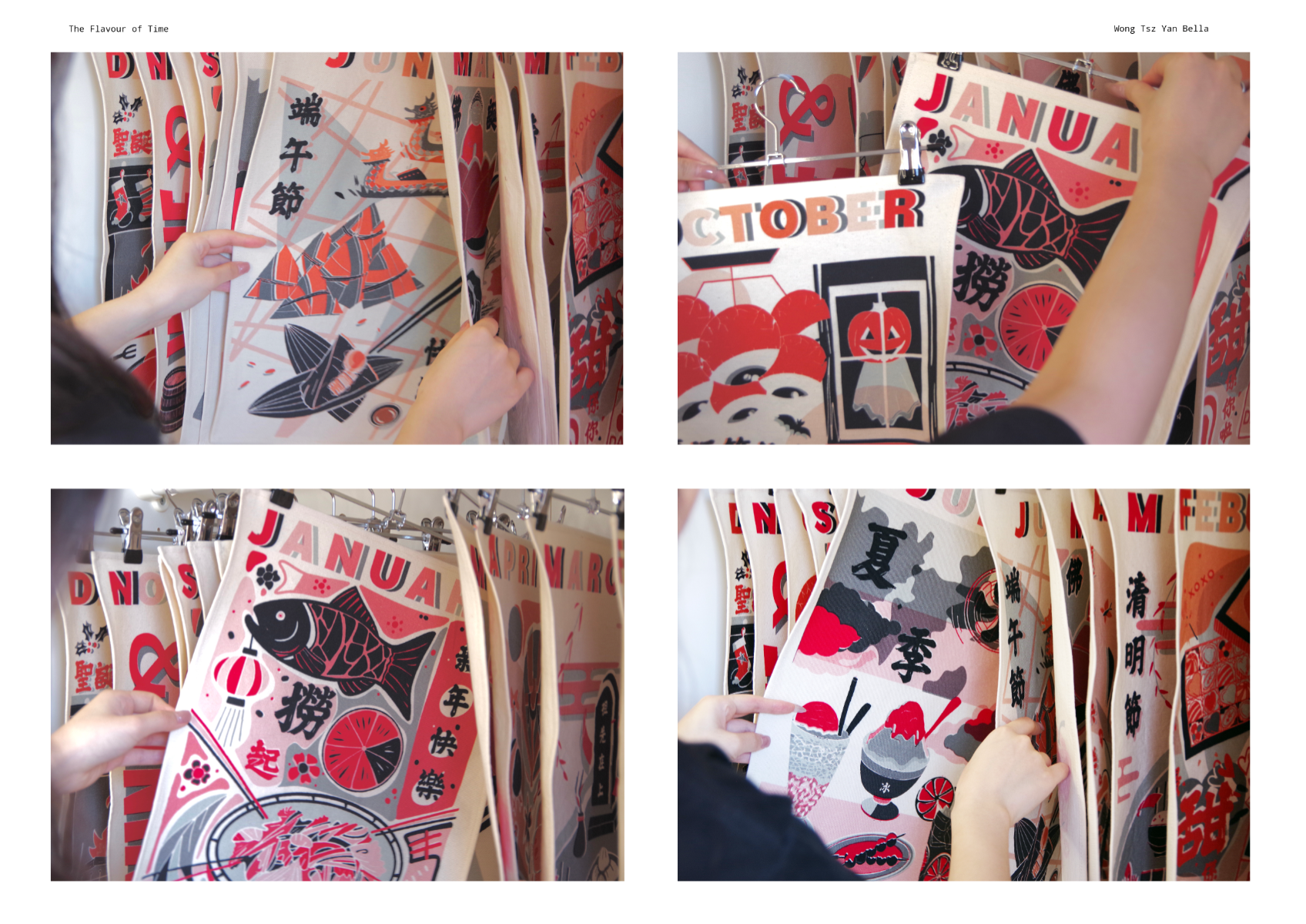
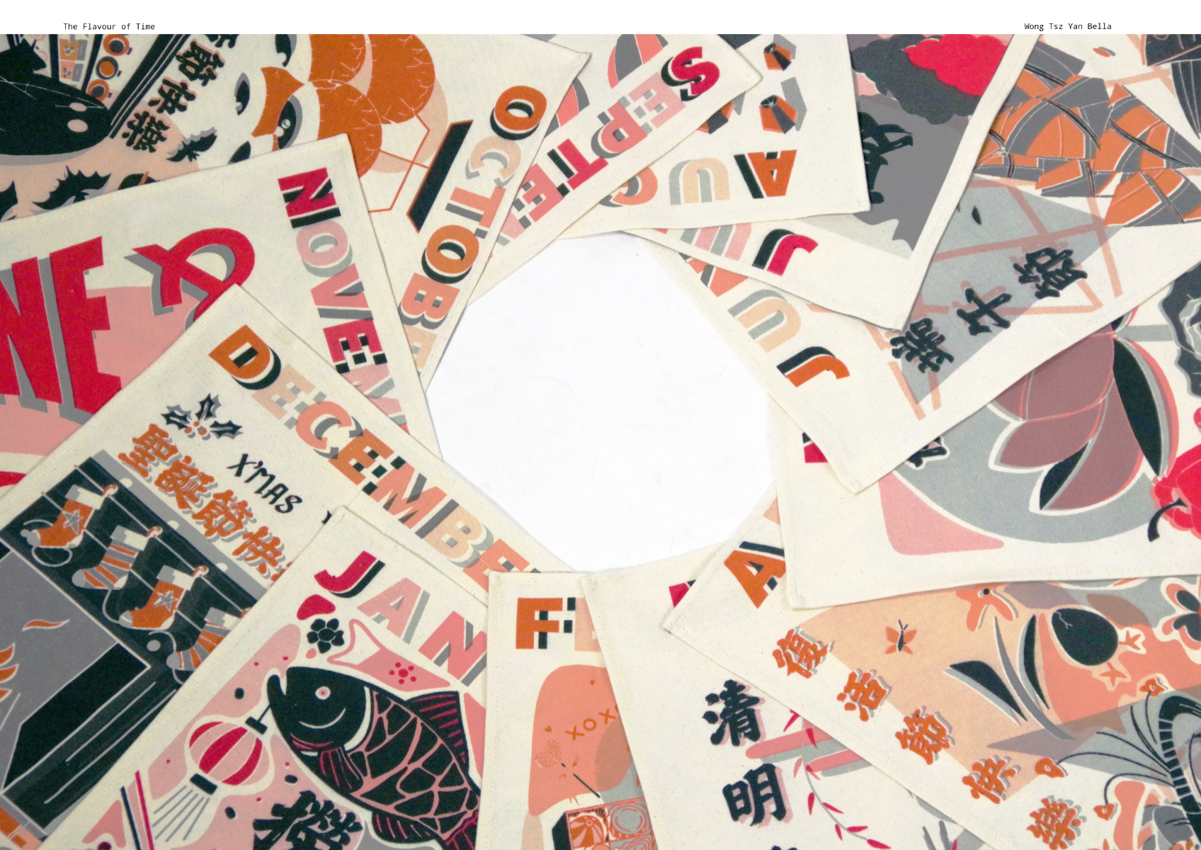
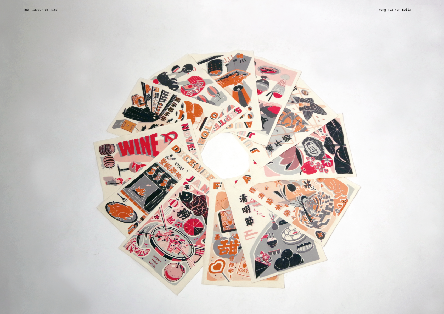
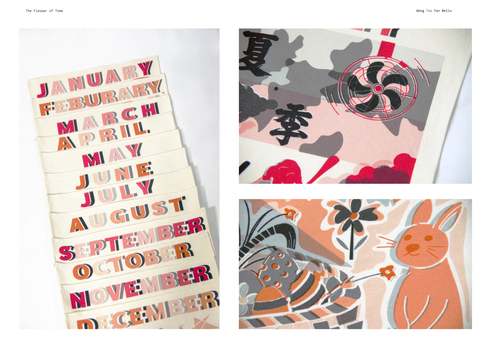
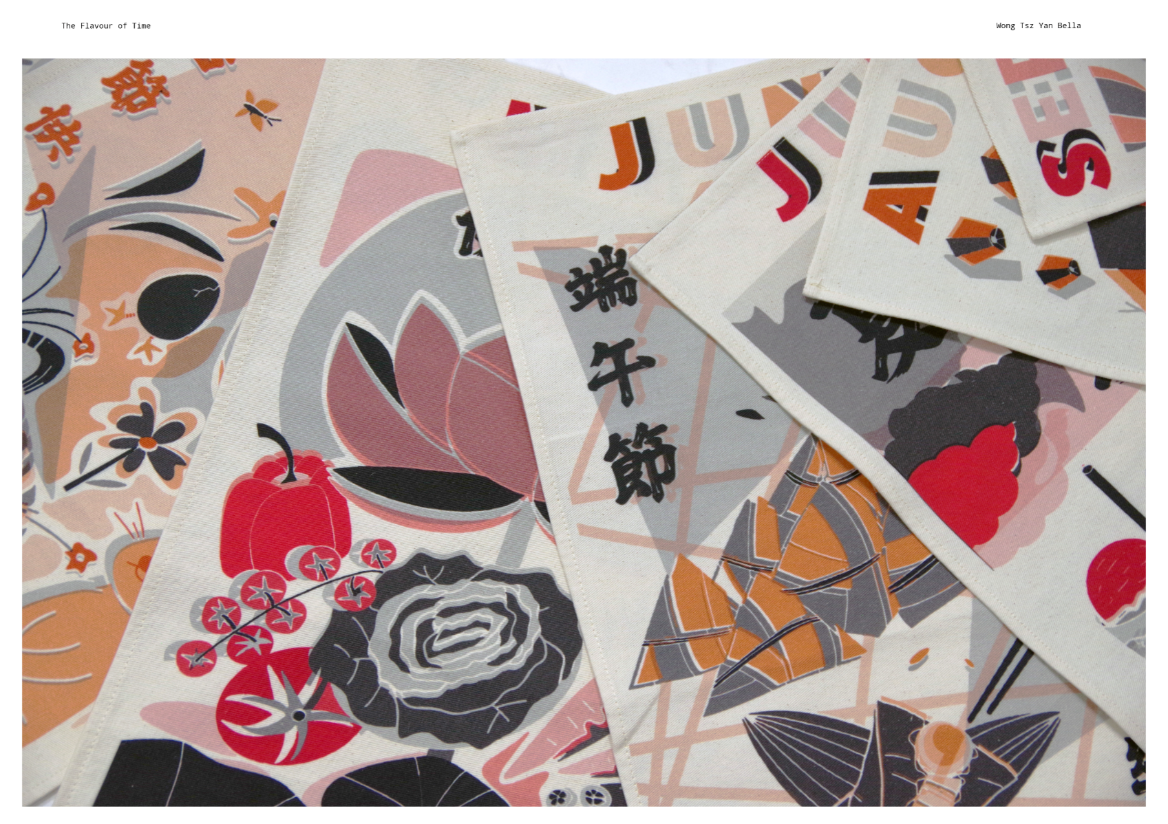
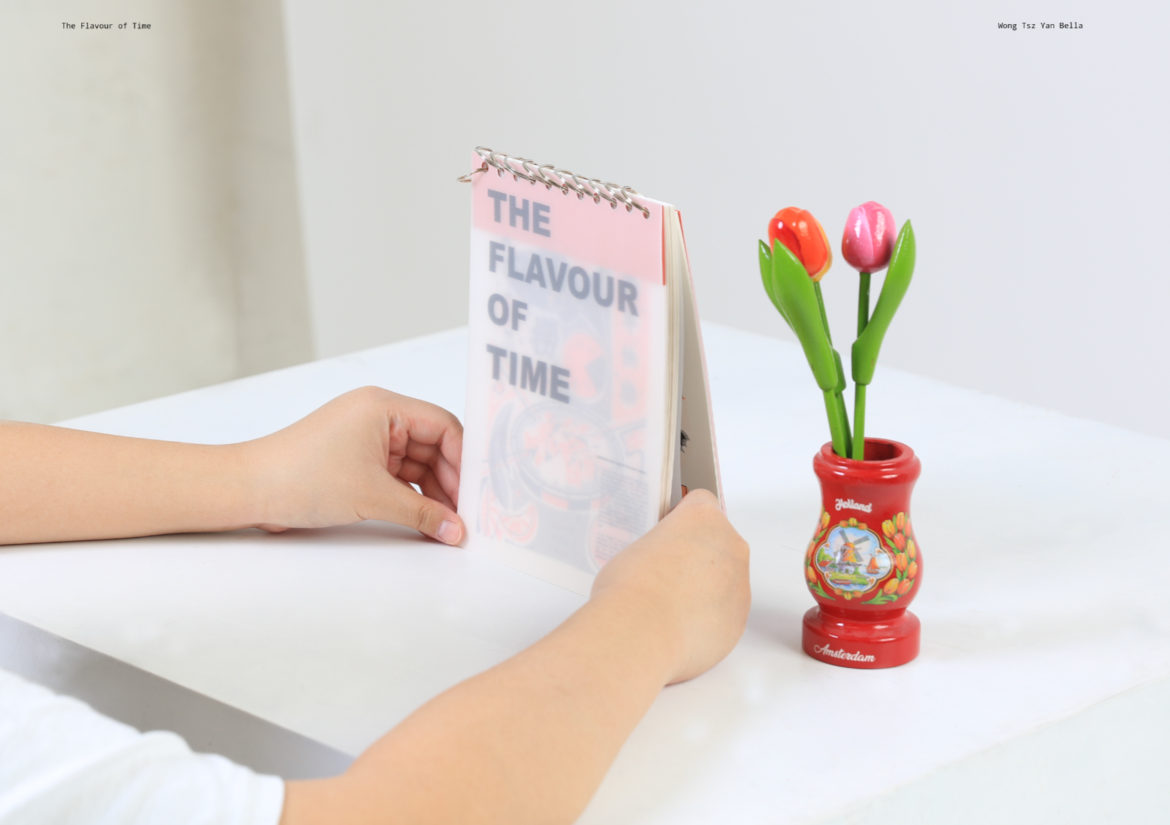
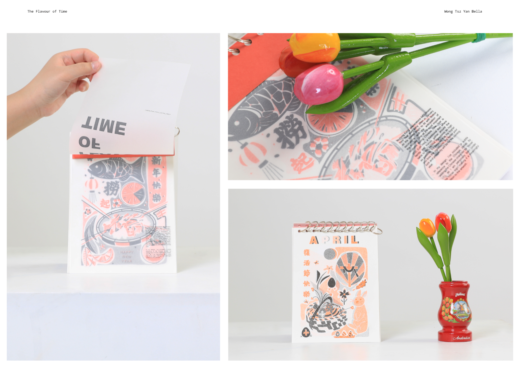
The Flavour of Time is all about bringing festivals into everyday life. I created twelve illustrated tea towels, each one representing a Hong Kong festival tied to its month. I love food, colour, and playful illustration, so the project combines all of that with a bold, risograph-inspired style. The idea is that tea towels are like clothes you can “wear” in each month — functional, timeless, and fun — while also keeping cultural traditions alive. Alongside the teatowel, I also made a standing calendar with tracing paper overlays to tell the story of each festival month by month.
Competitions

Global Creative Graduate Showcase 2025
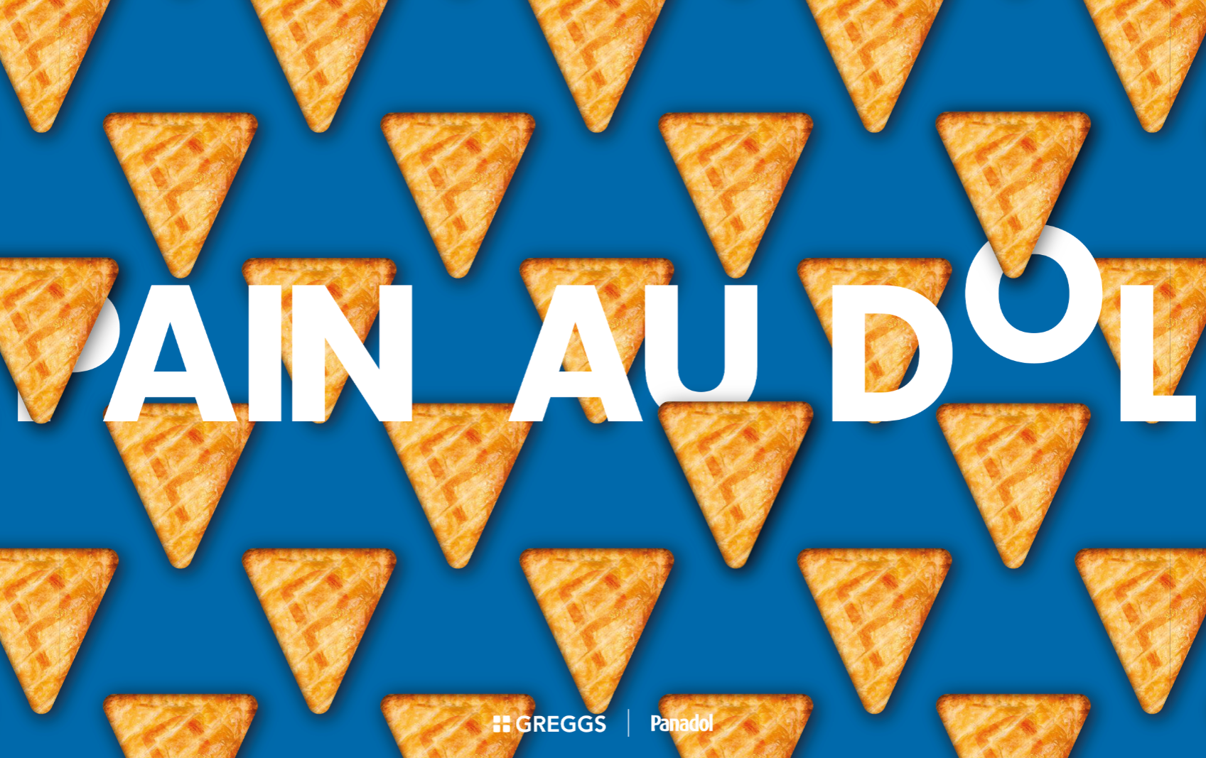
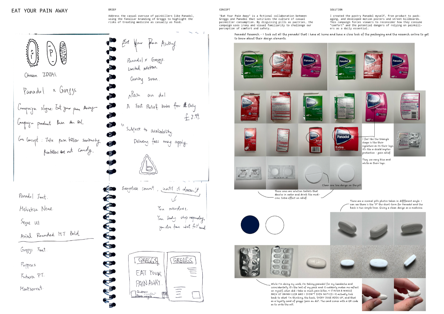
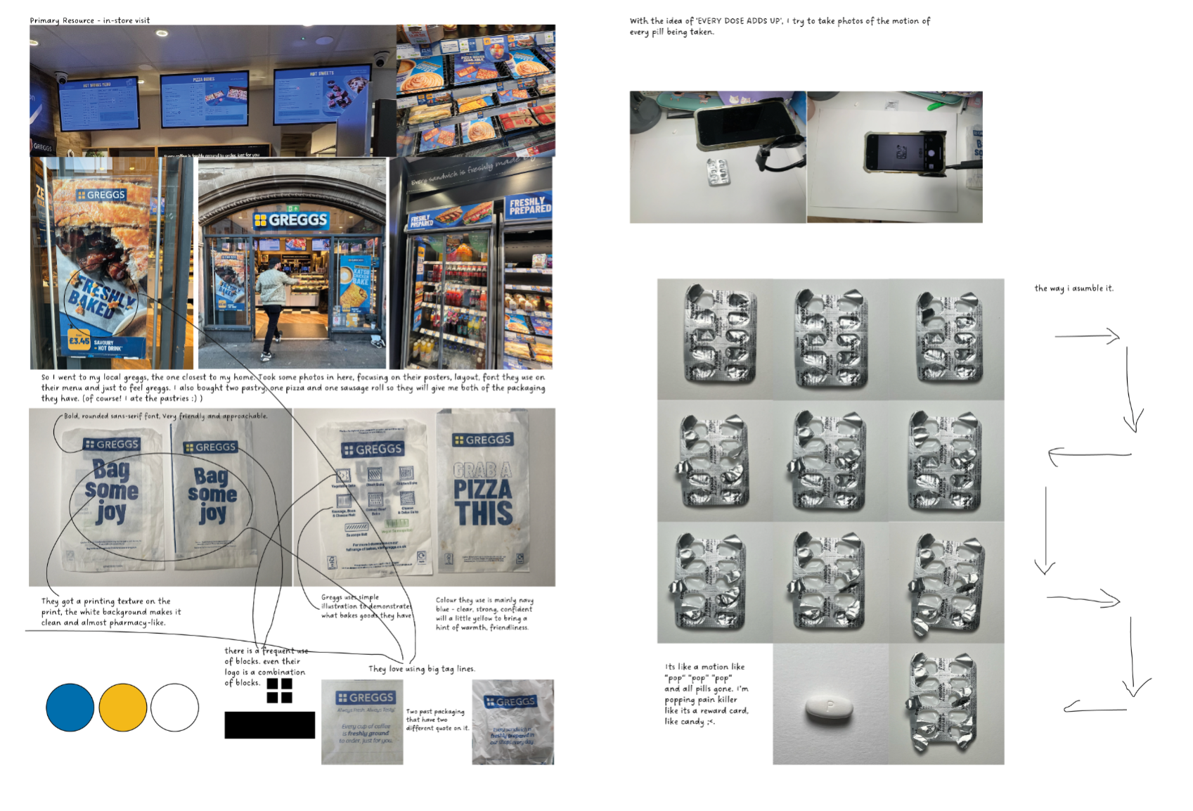
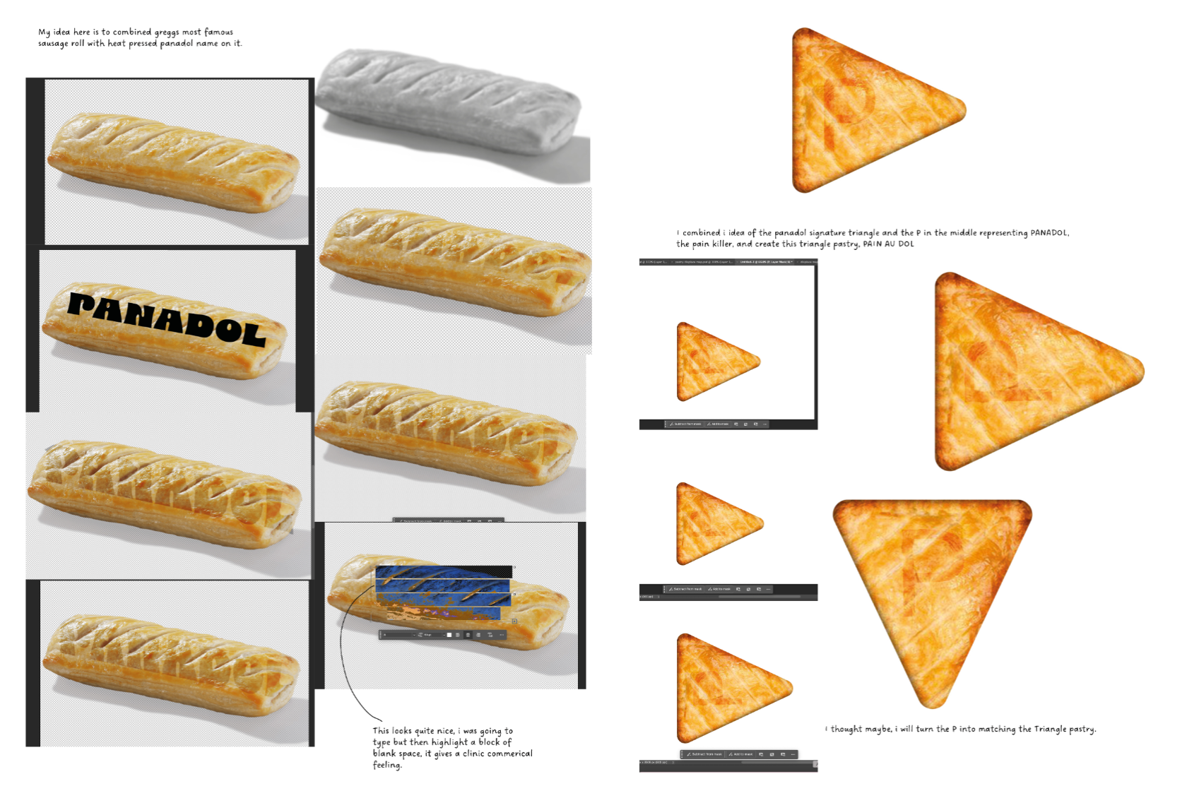
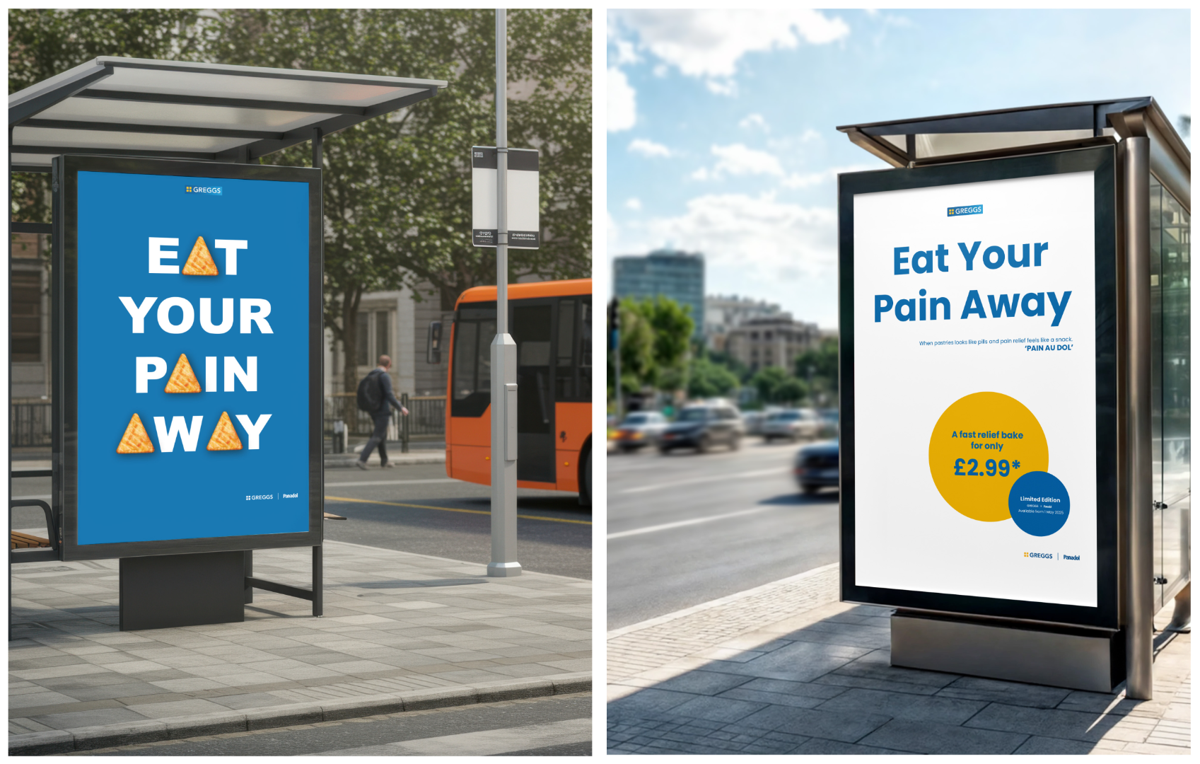
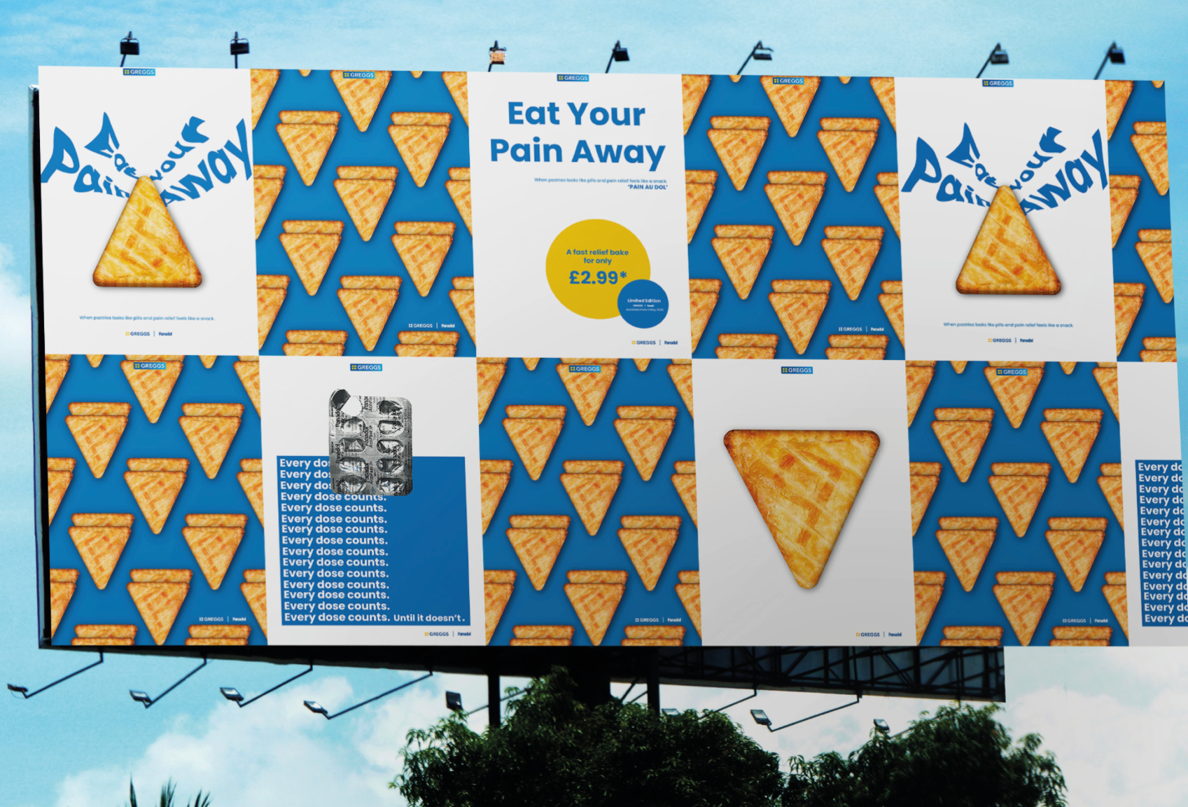
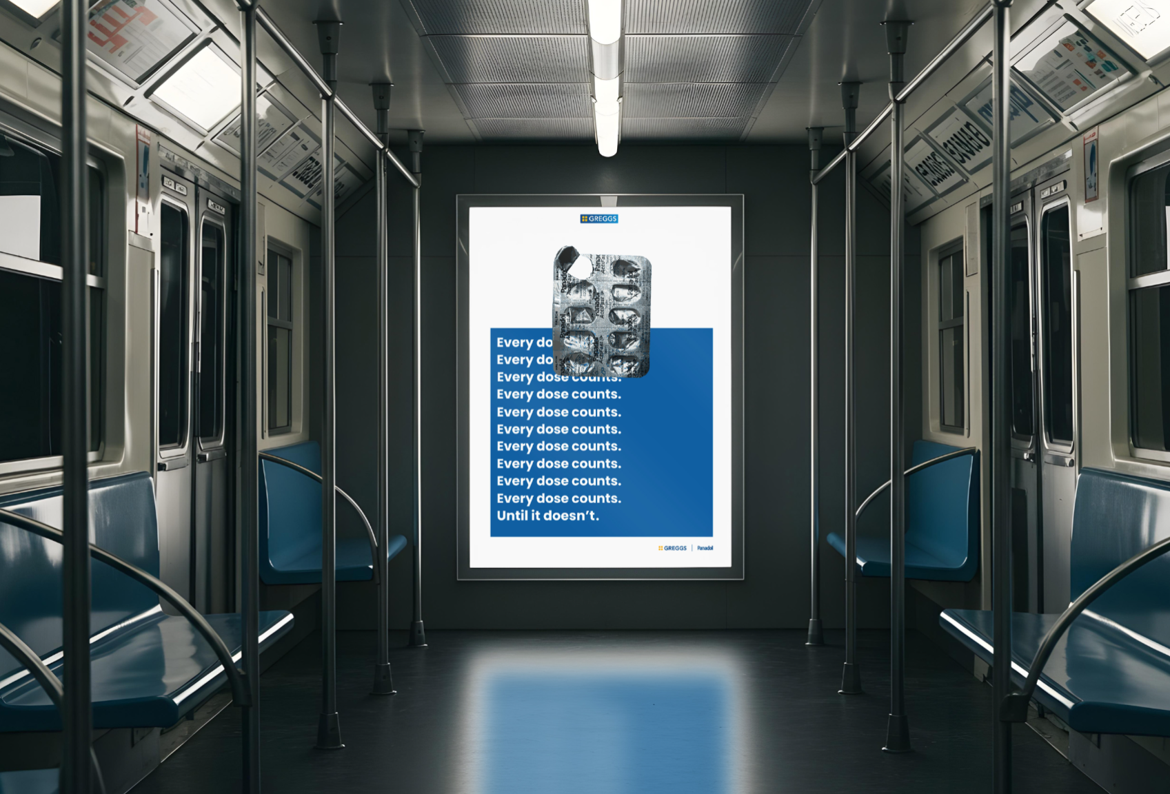
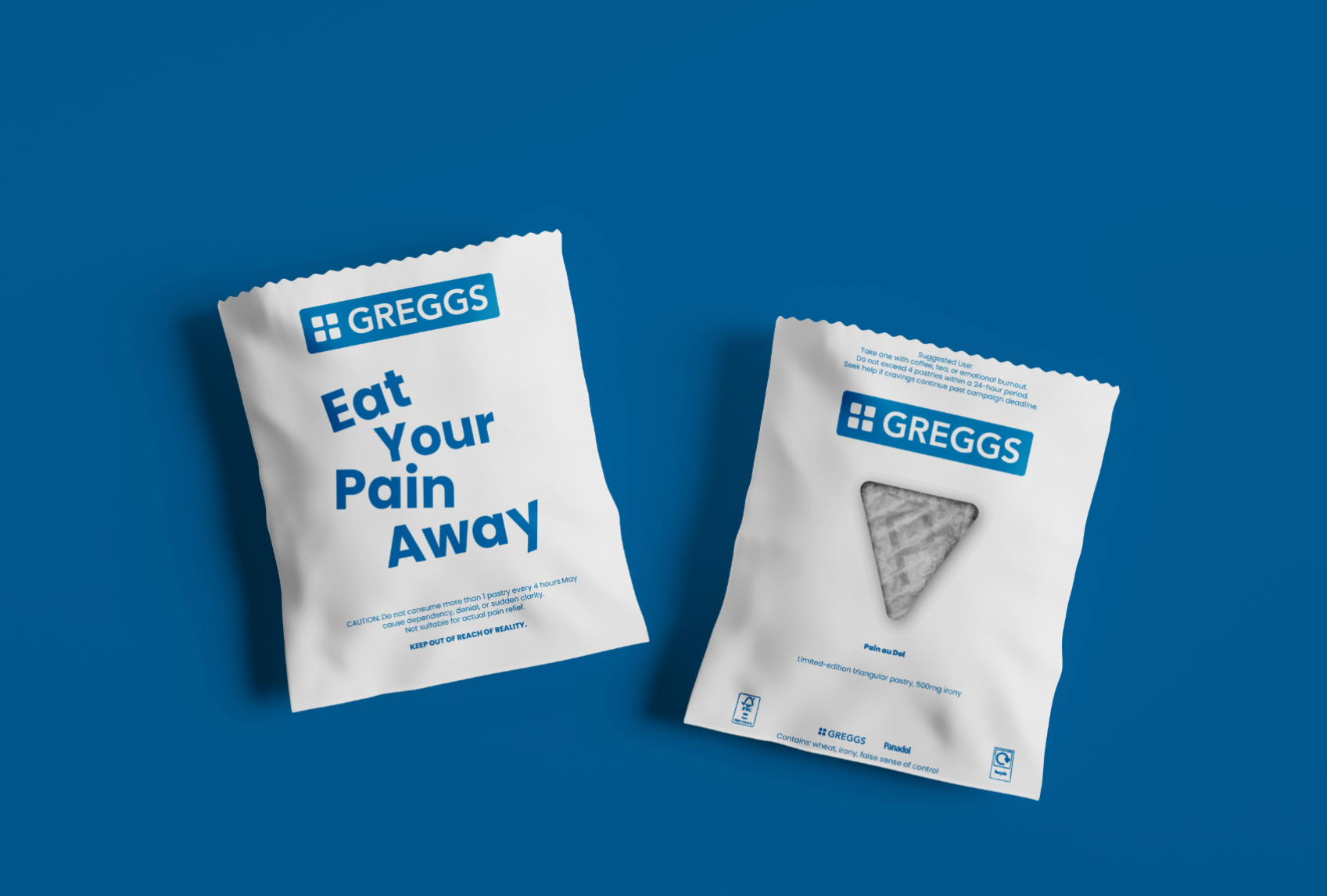
Eat Your Pain Away – Panadol x Greggs This campaign tackles the casual overuse of Panadol by reimagining it through the lens of Greggs, a beloved British bakery. The concept asks: if painkillers were disguised as pastries, would we think more carefully before consuming them? By blending comfort food with medicine, the project highlights how dangerous it is to treat pills like everyday snacks. From product design and packaging to motion posters and billboards, the satirical branding blurs the line between familiarity and discomfort. The irony delivers a sharp message: medicine isn’t candy, and careless consumption has consequences.
Competitions