Lily Moore
Fashion Design Diploma
Fashion Retail Academy
Specialisms: Fashion Illustration / Genderless / Textiles - Print
Location: London, United Kingdom


Lily Moore
First Name: Lily
Last Name: Moore
Specialisms: Fashion Illustration / Genderless / Textiles - Print
Sectors: Fashion/Textiles/Accessories / Fashion/Textiles/Accessories
My Location: London, United Kingdom
University / College: Fashion Retail Academy
Course / Program Title: Fashion Design Diploma
About
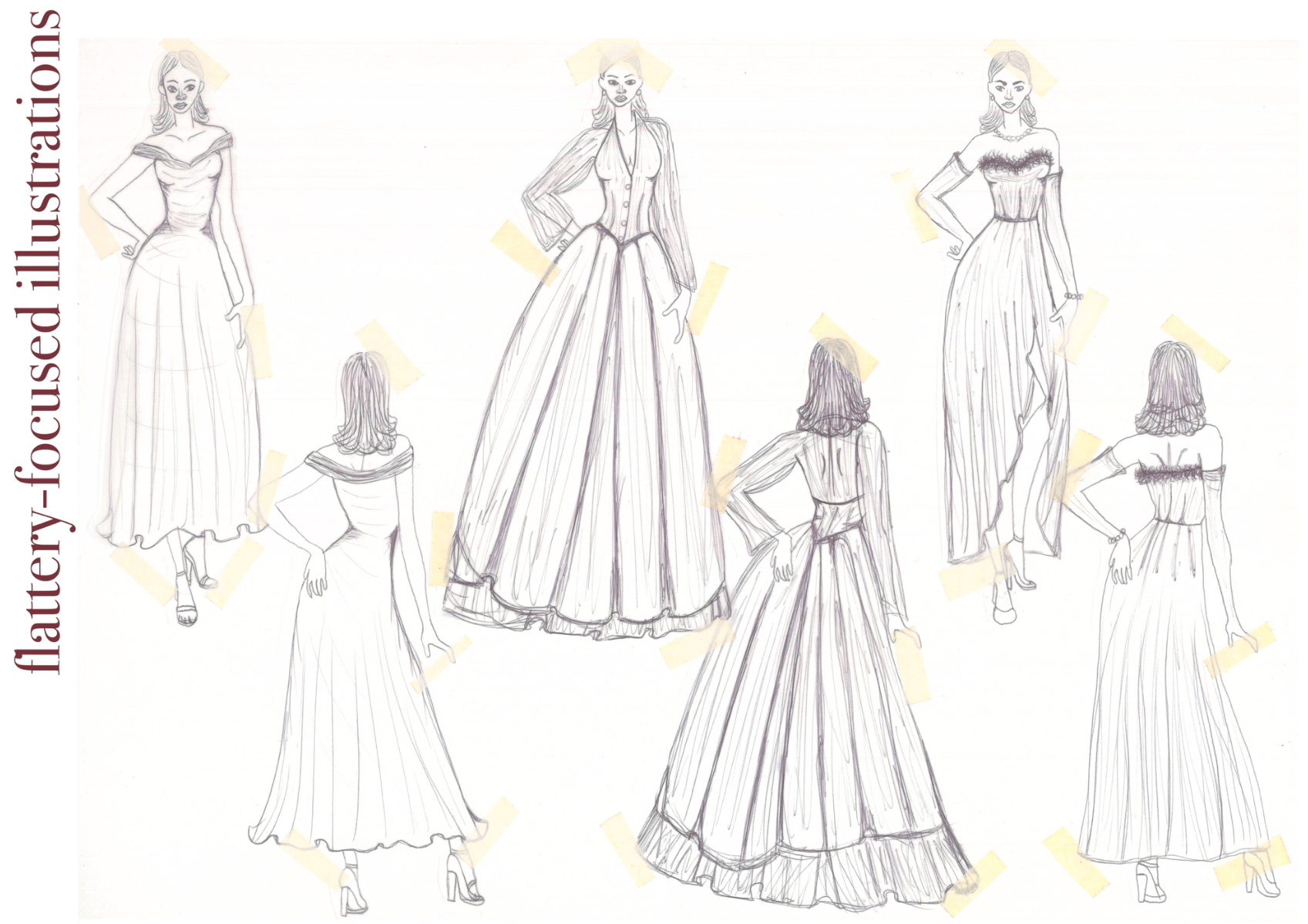
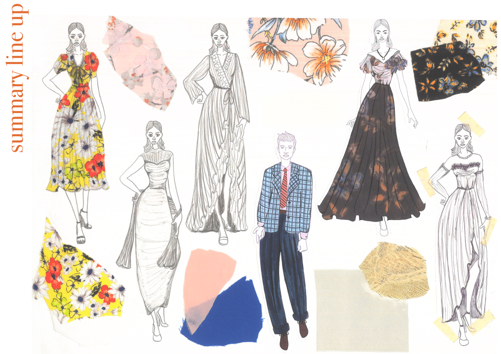
Enjoying artistic subjects from a young age, I am a creative and imaginative individual enjoying creativity outside of my fashion studies I recently completed in London. I have always been very ambitious where I work hard to produce unique and engaging outcomes whatever the creative task at hand. My bubbly and enthusiastic nature helps with new interactions and relationships where my flair is evident in how I present myself and communicate with others. A recently-graduated fashion design student hoping to one day share my interests in design with the wider world outside of my current smaller bubble, my biggest design passion lies with tailoring. I prefer to opt for creating silhouettes that will flatter the customer however they desire whether it is to be fitted and sleek or androgynous and make a bold statement.
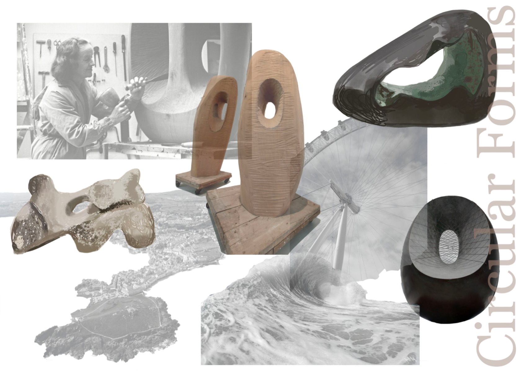
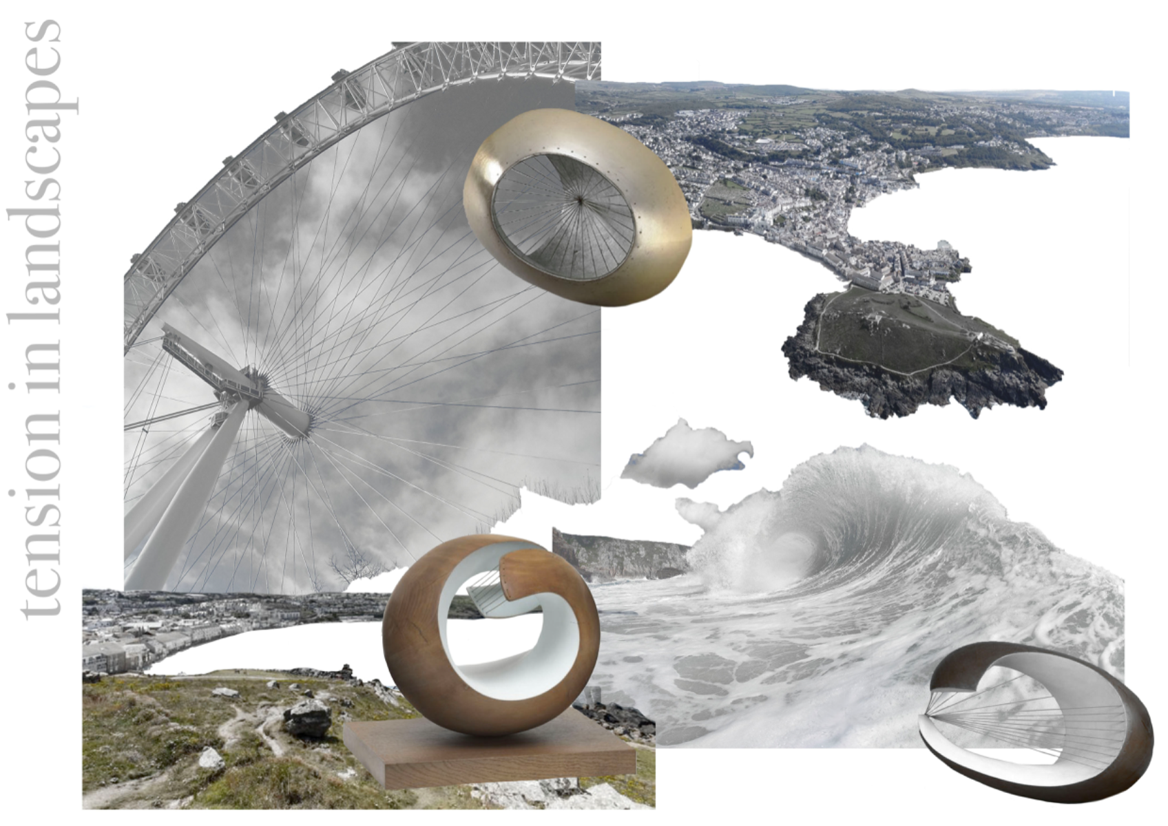
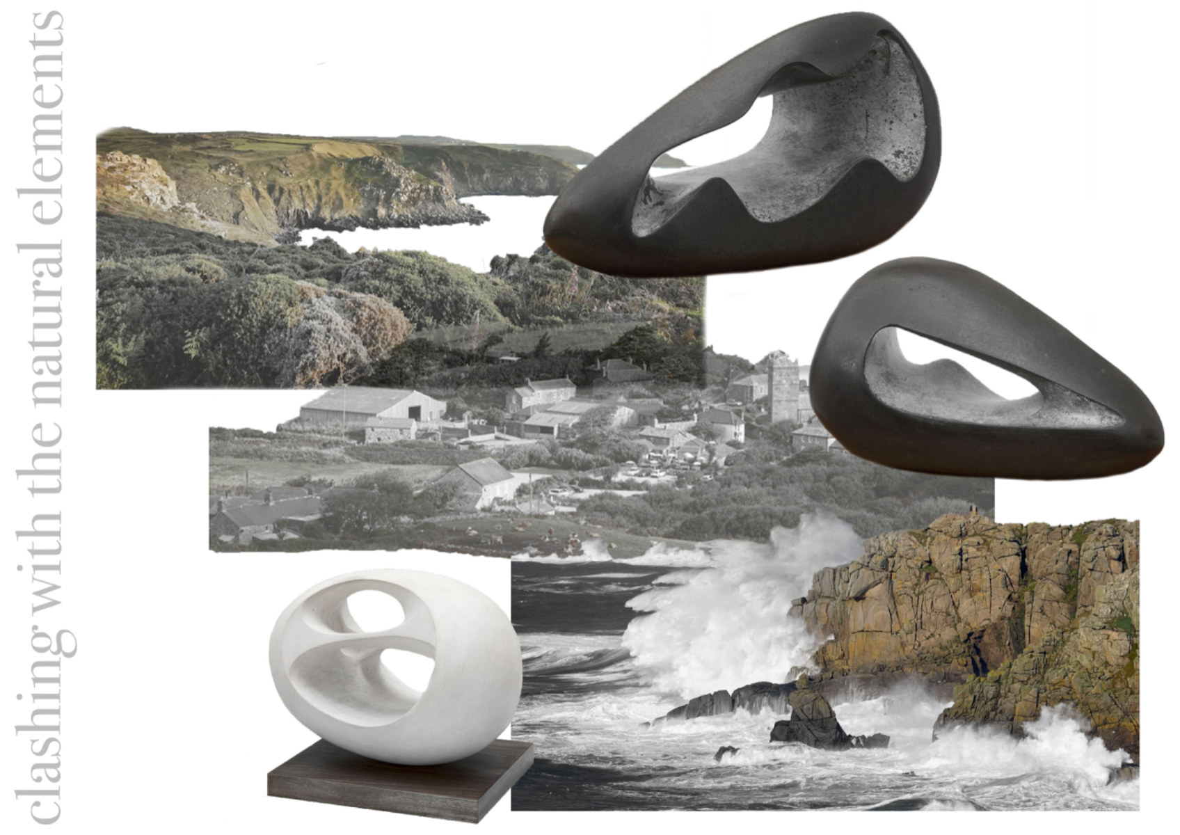
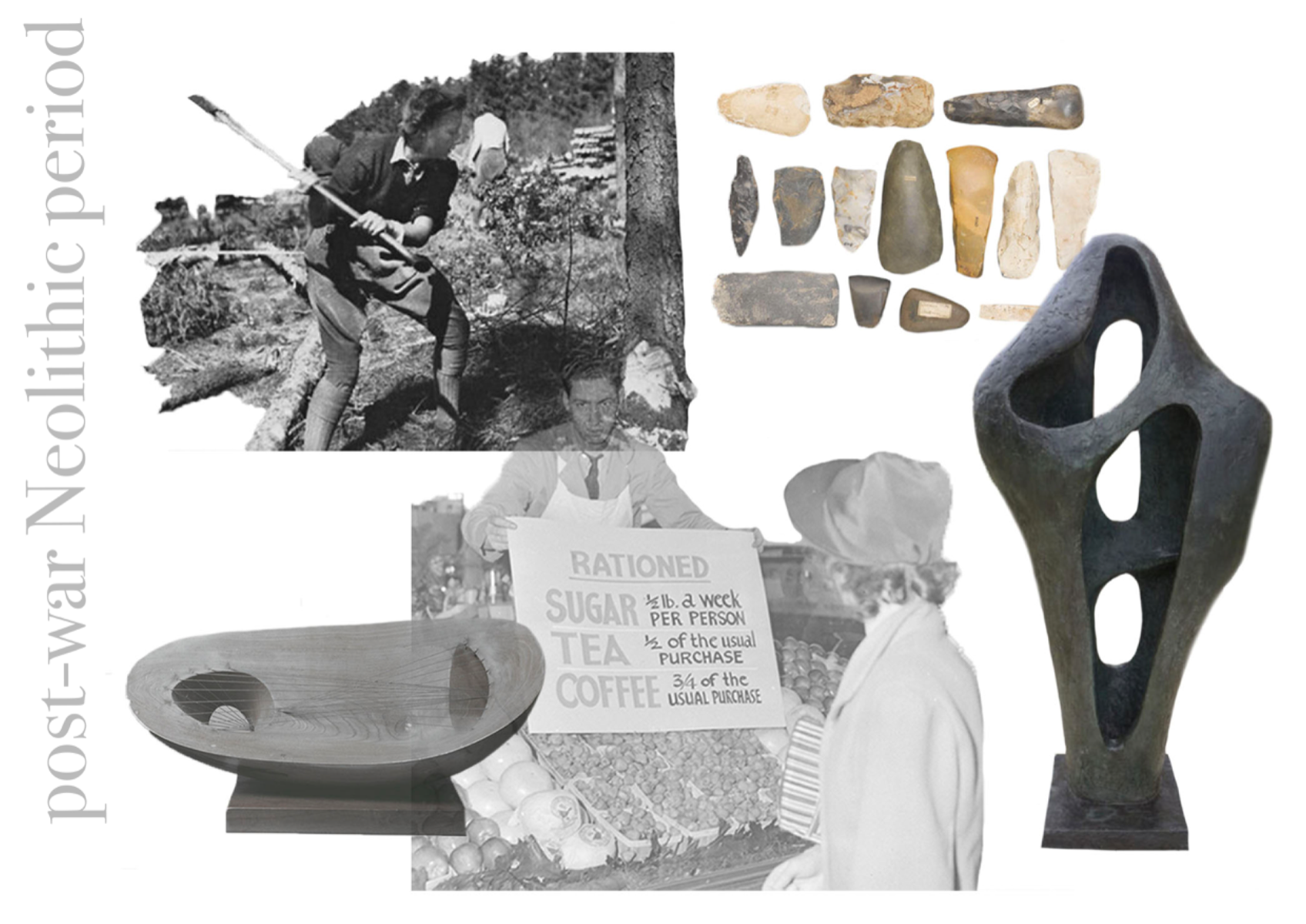
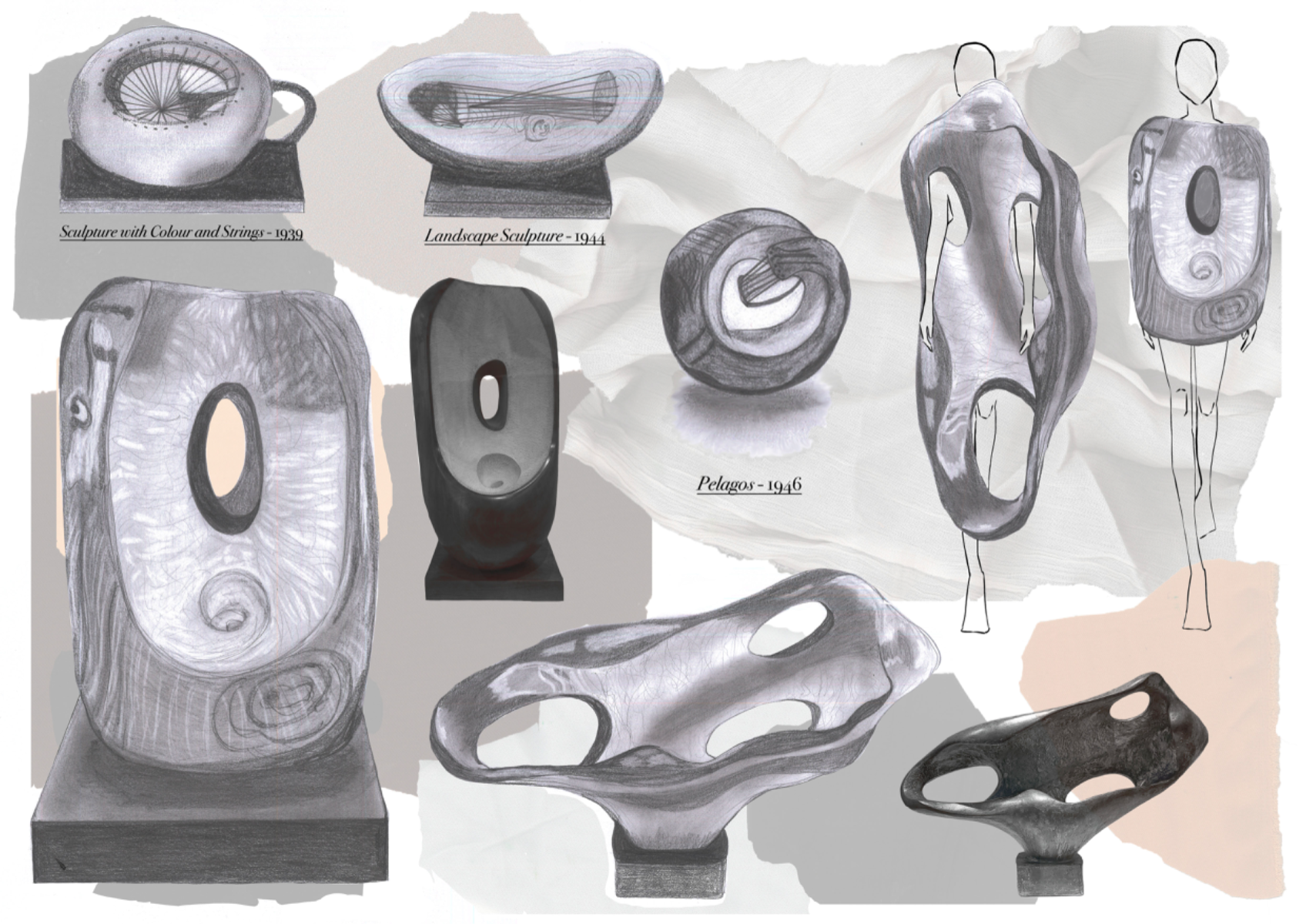
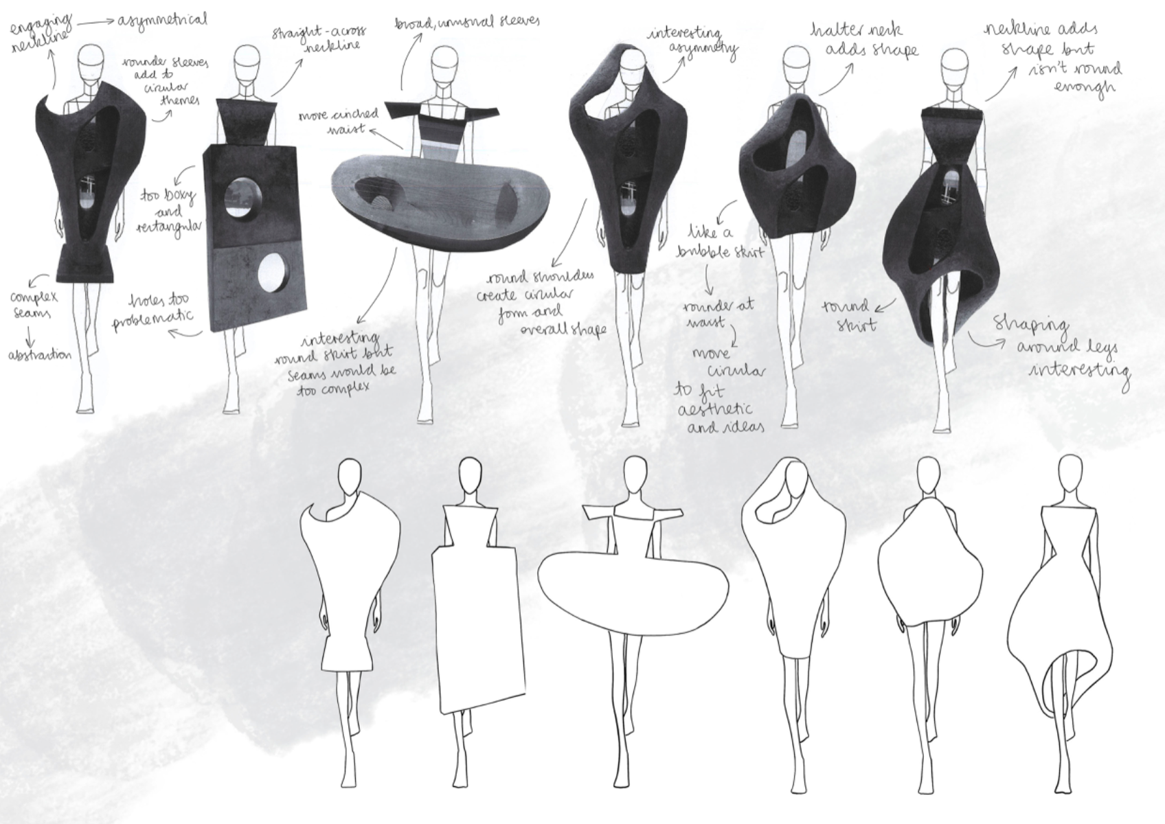
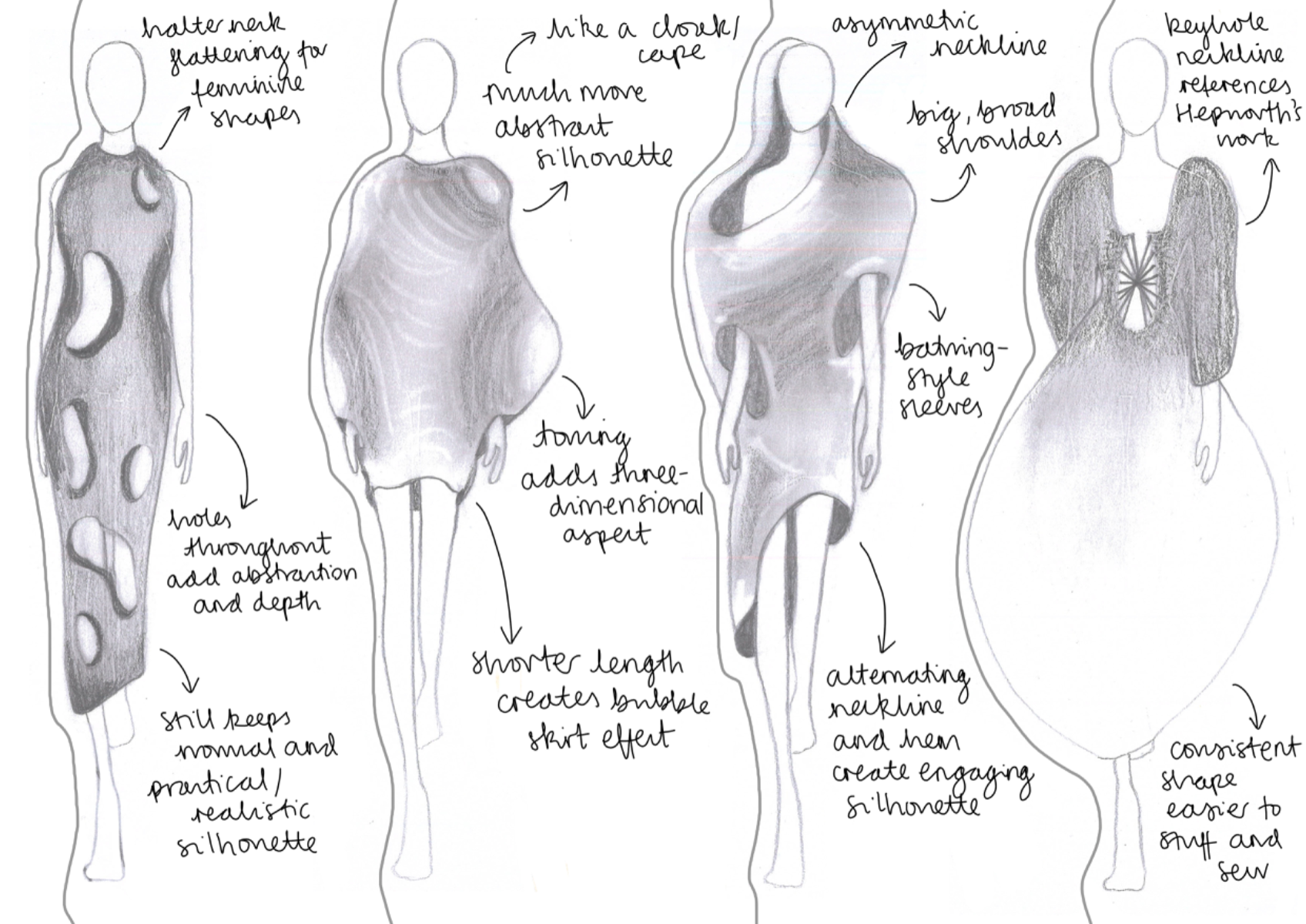
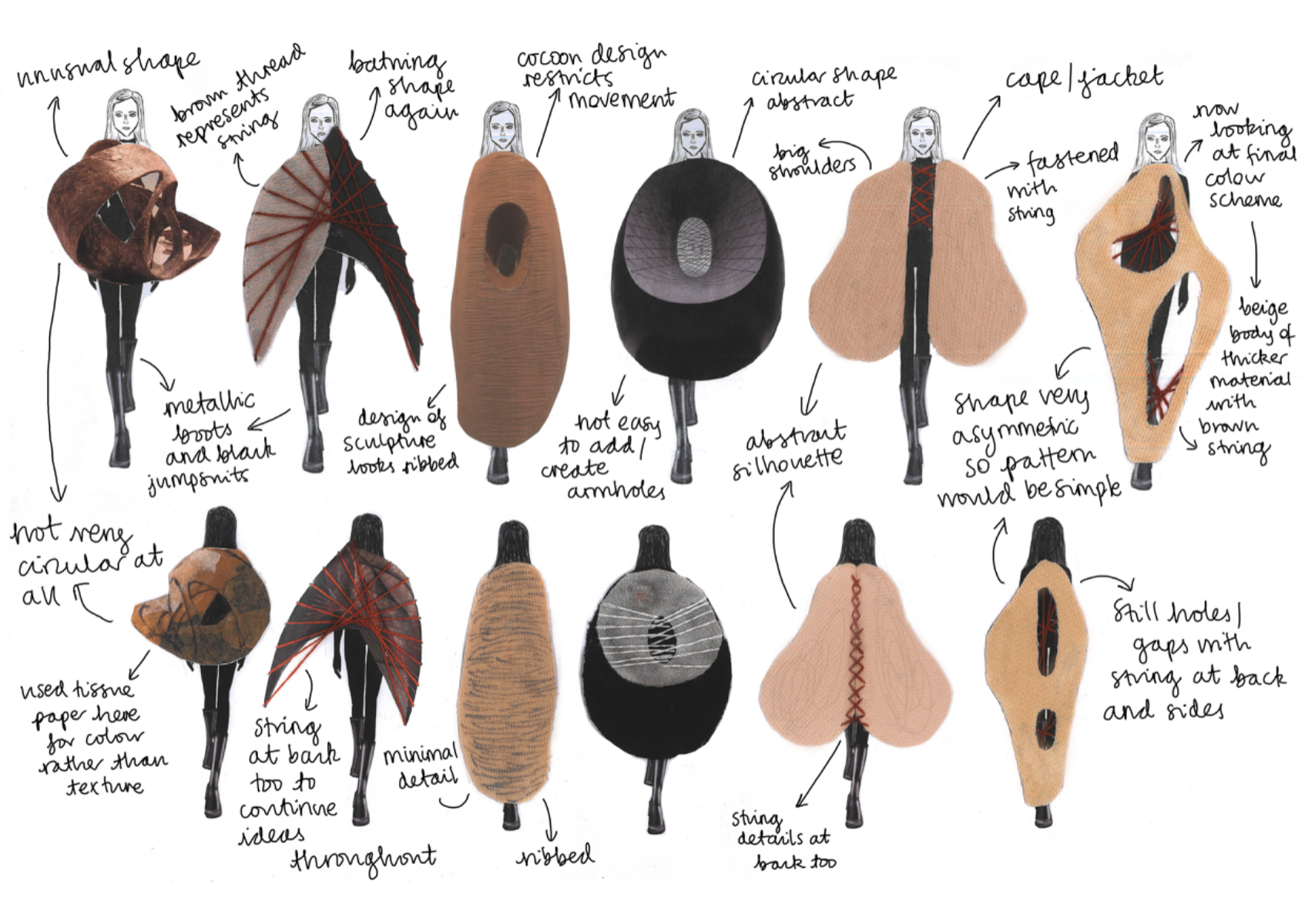
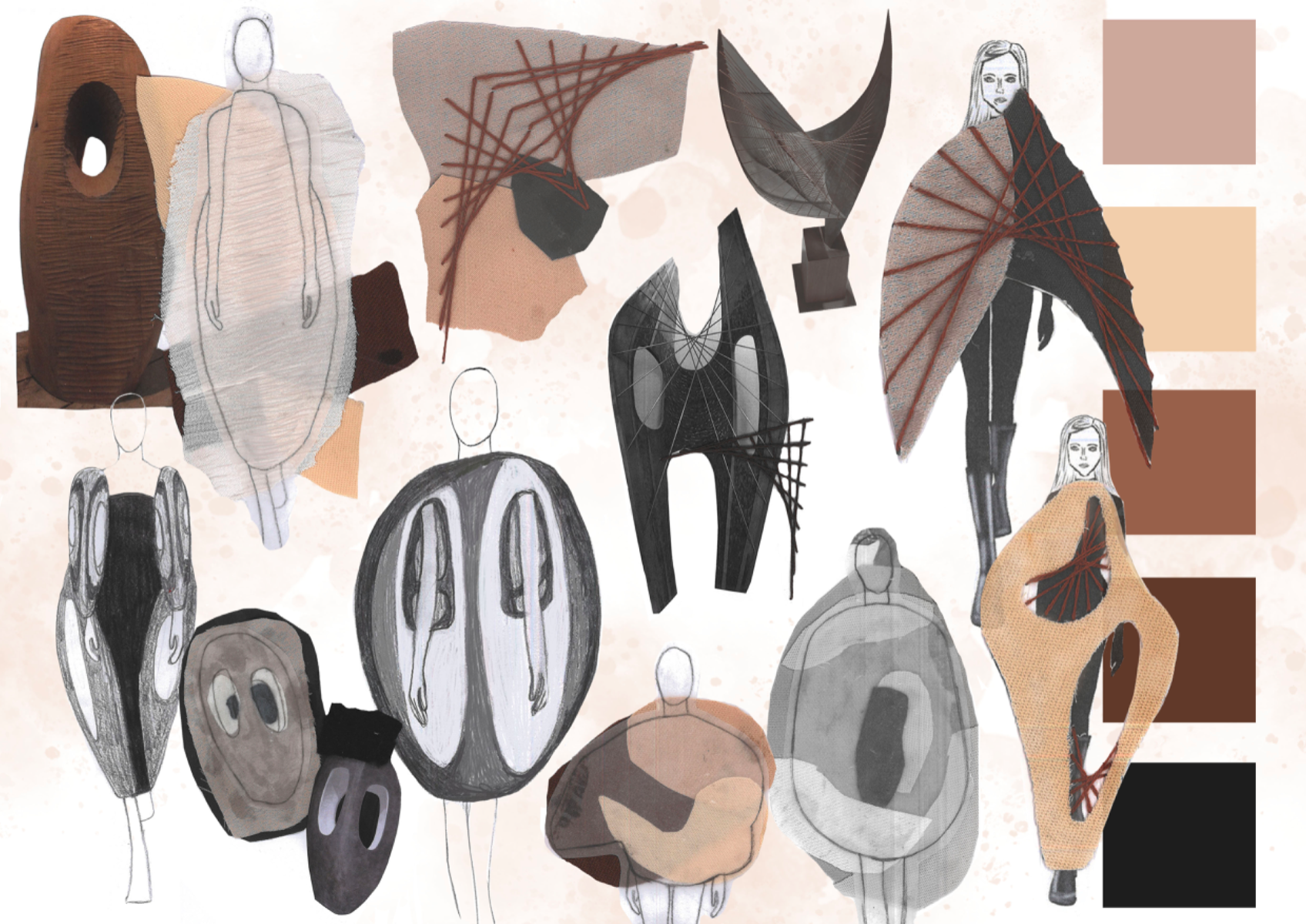
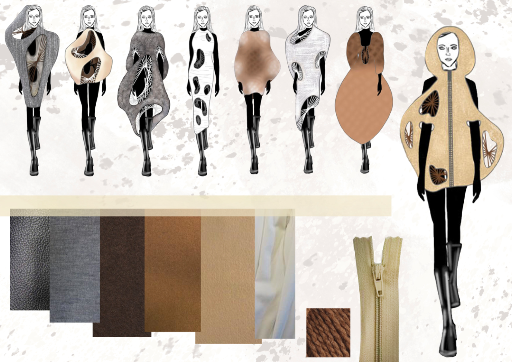
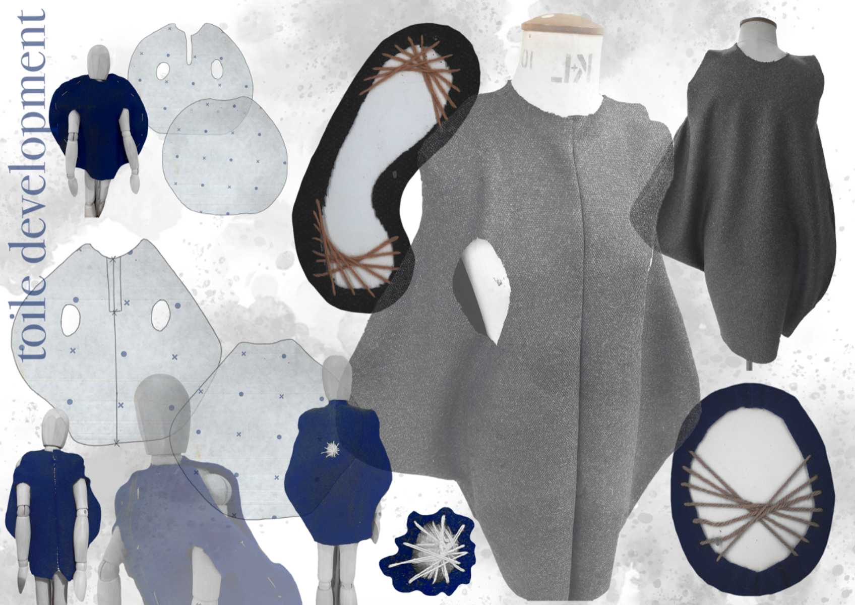
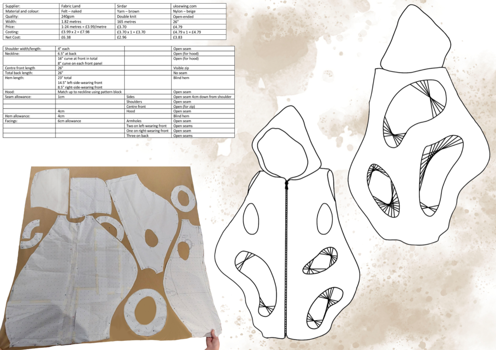
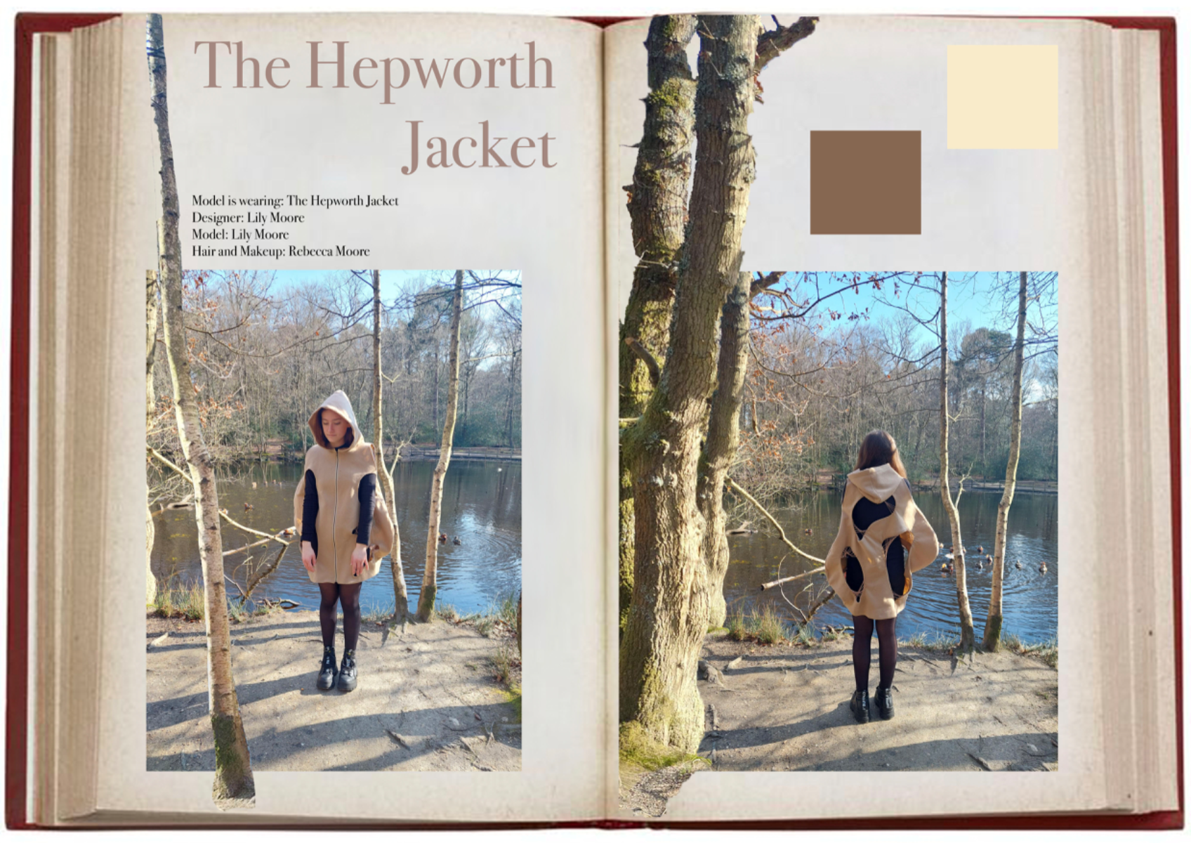
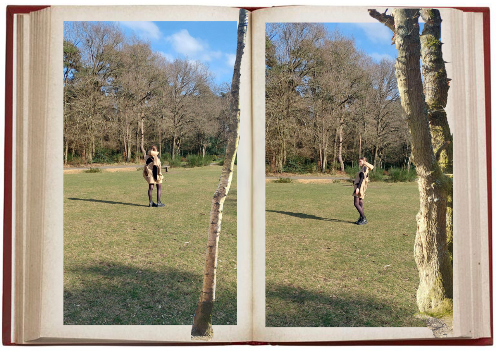
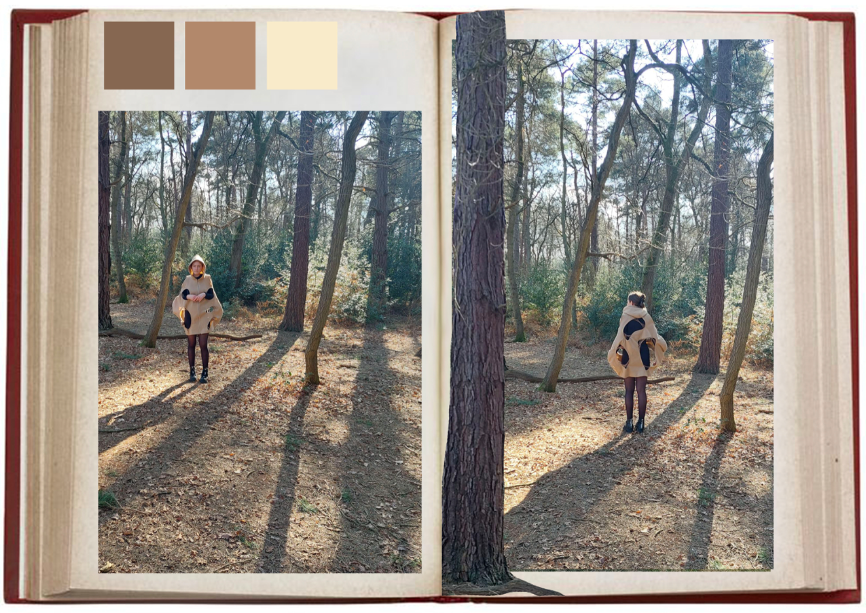
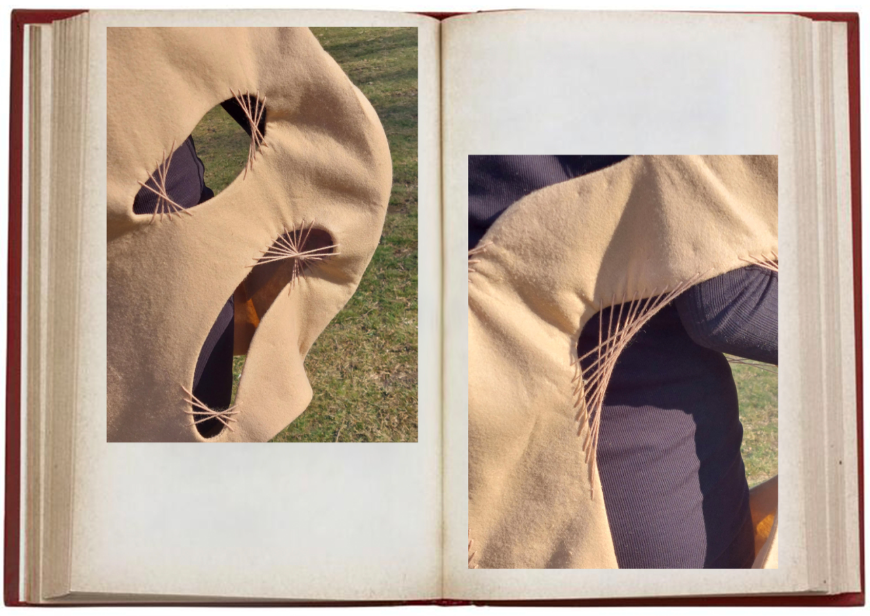
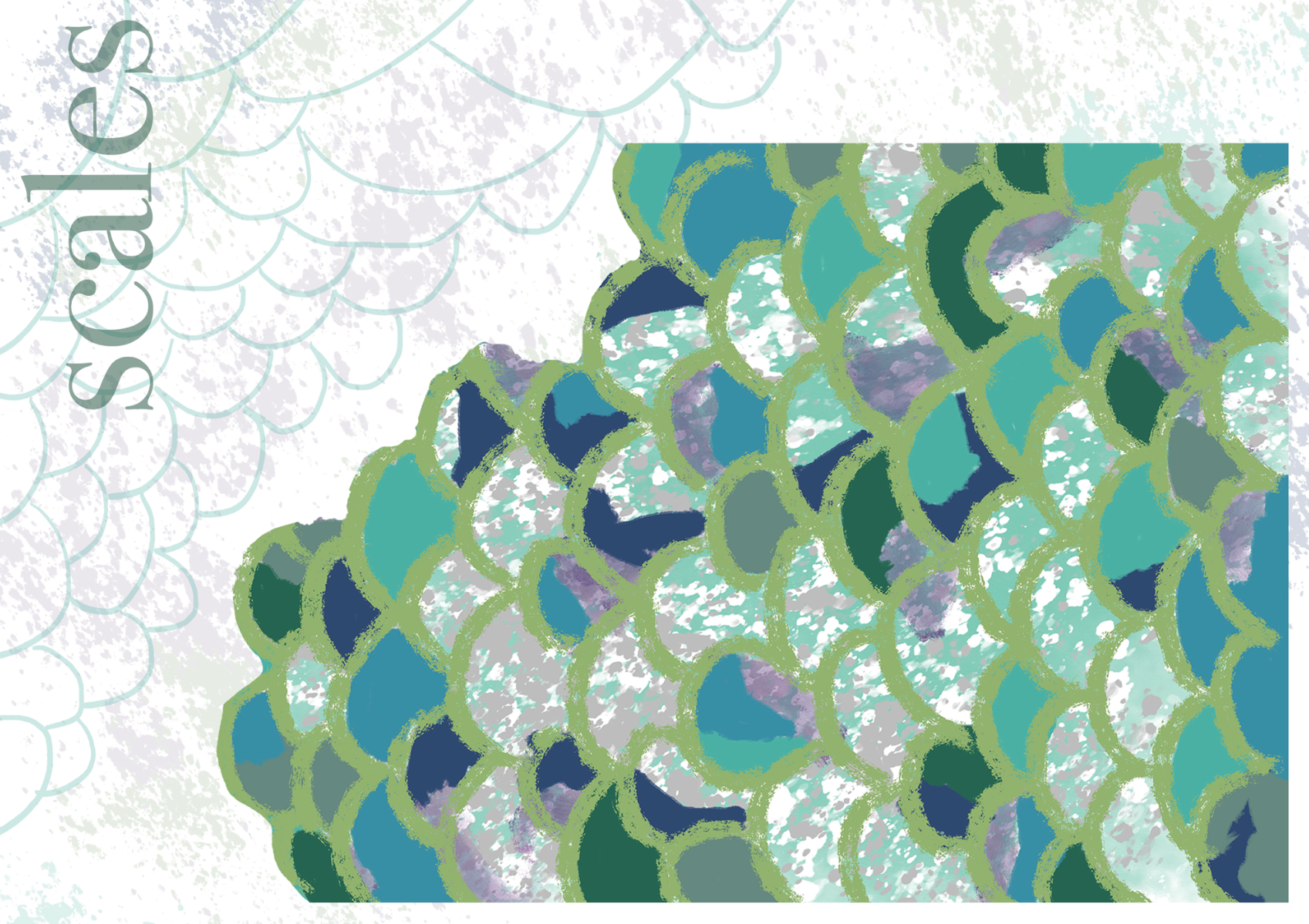
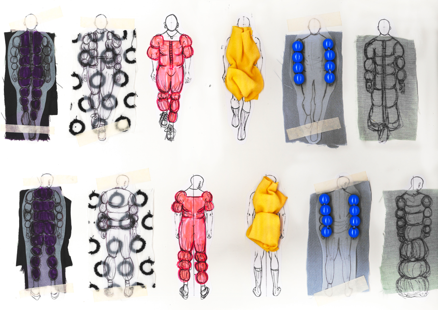
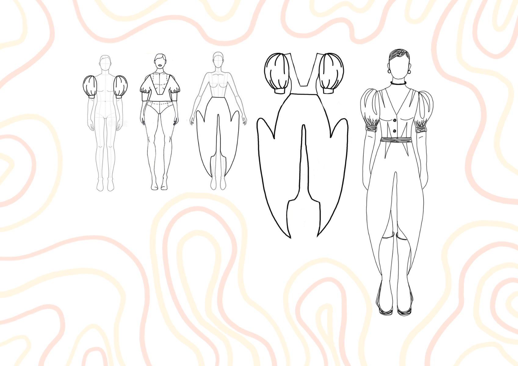
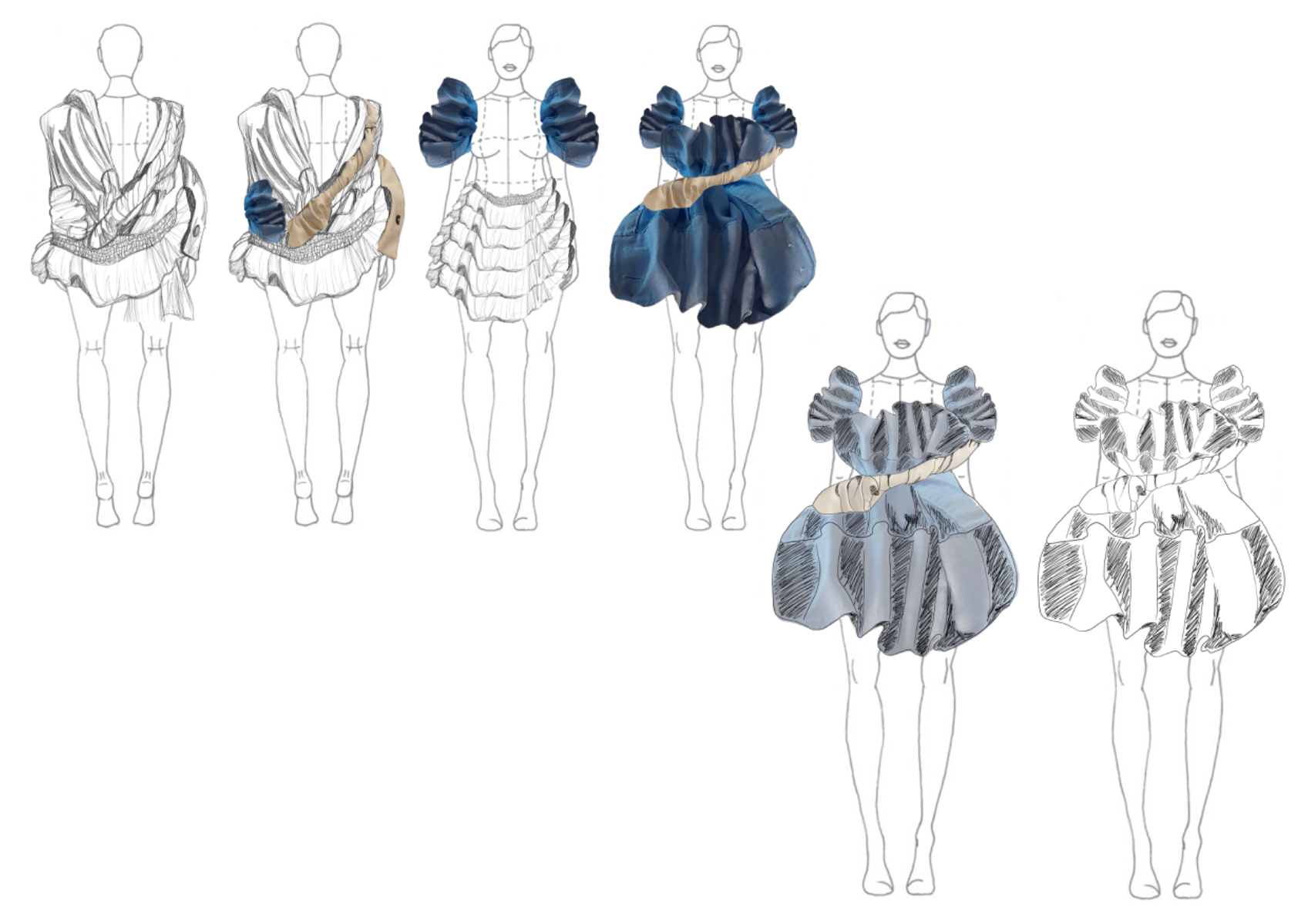
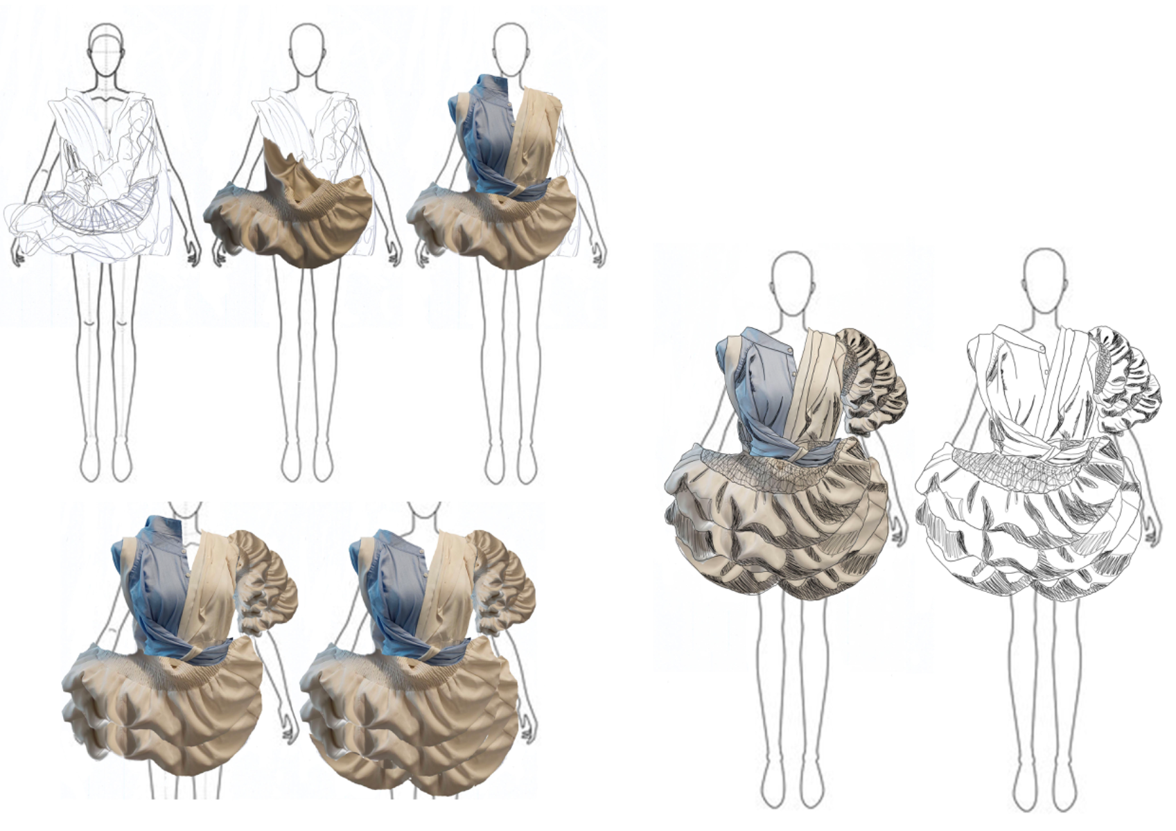
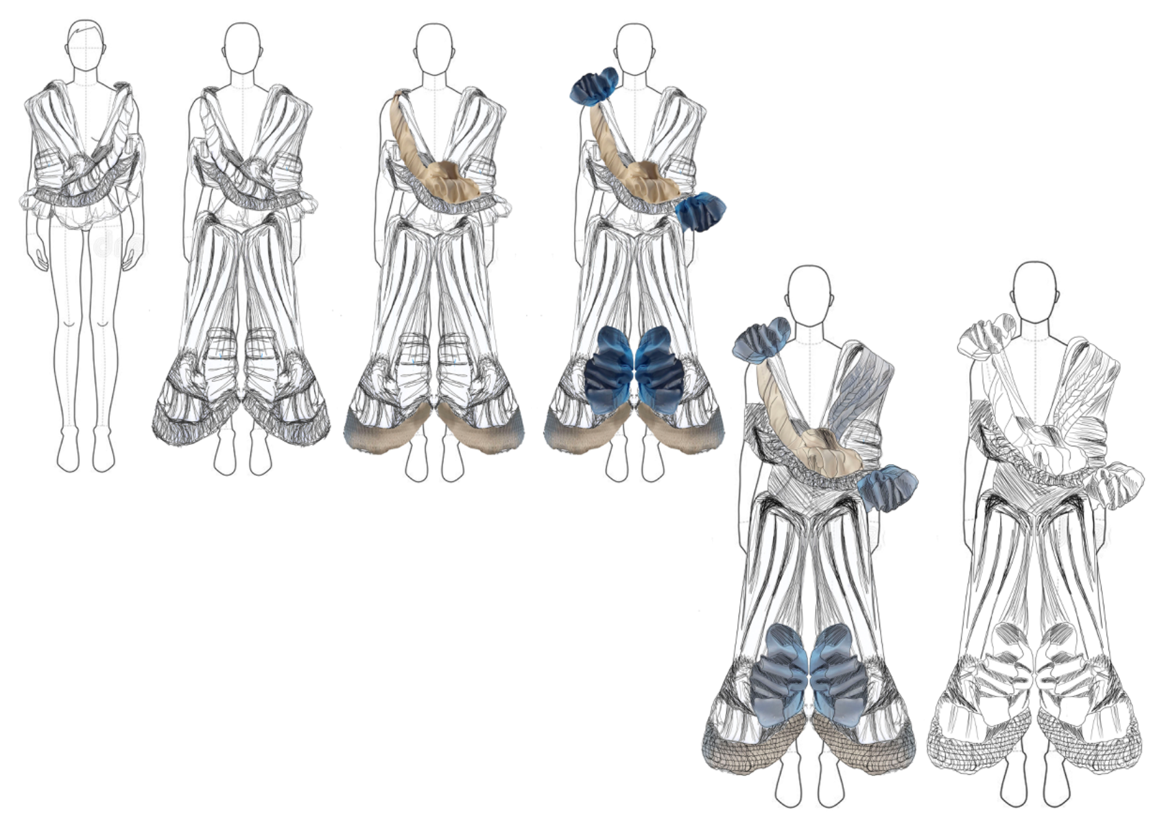
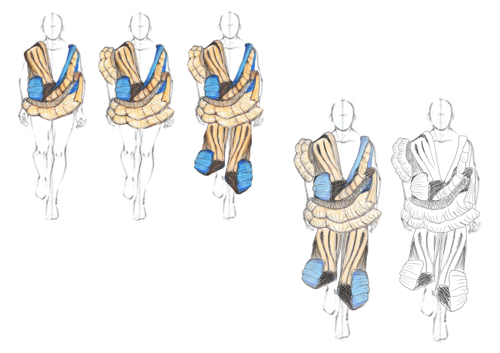
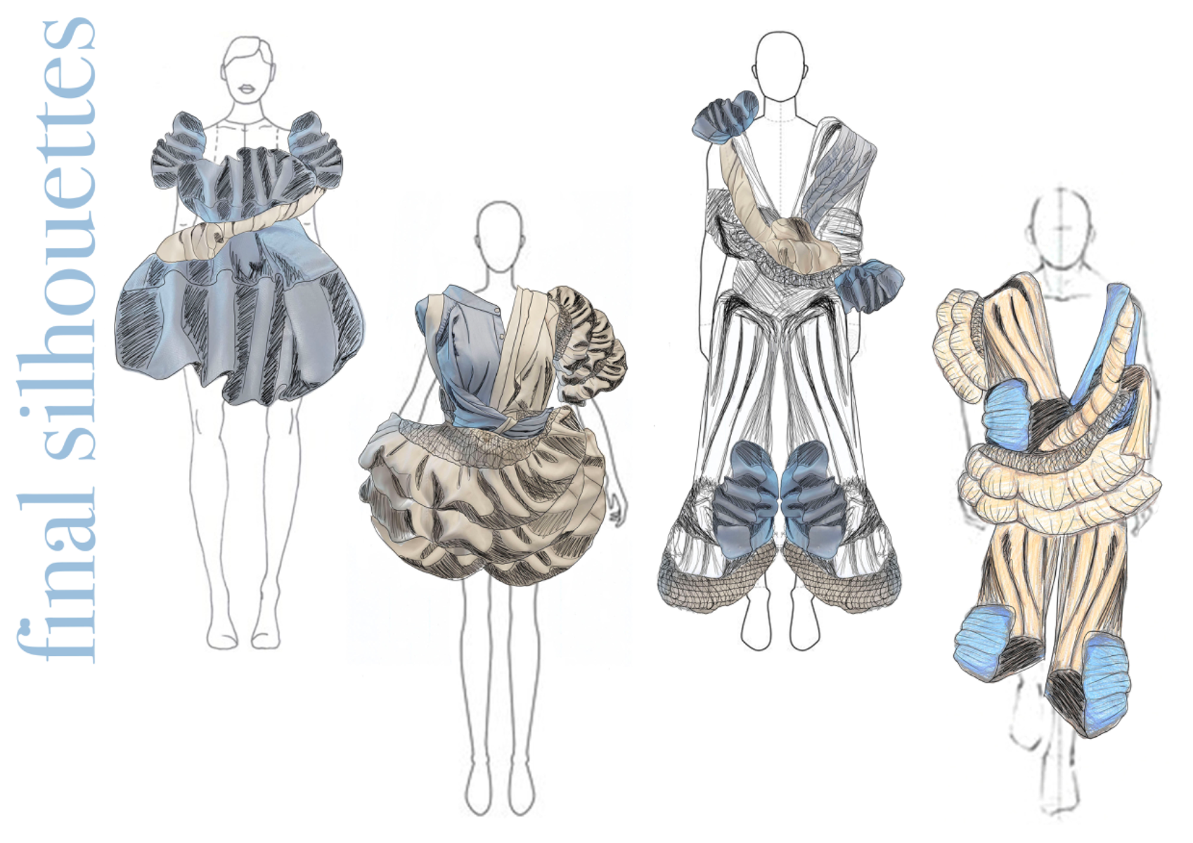
Dame Barbara Hepworth, a sculptor born in West Yorkshire, England, who lived in St. Ives, Cornwall, England, worked in an oversized, cocoon silhouette. Most, if not all, of her work, was influenced by St. Ives in Cornwall, England, after moving there with partner Ben Nicholson. She found an interest in the tension in the landscapes there where she noticed a tension between nature, air, water and herself etc. Hepworth used circular forms as details that reflected the outside, in - and vice versa. After visiting The Hepworth Wakefield in West Yorkshire, I observed and was inspired by Hepworth’s way of using her sculptures to curate the space they are in. I therefore developed my inspiration into ideas of how to pay homage to her style in silhouette and forms where I worked with a muted colour palette - greys, whites and beiges. By completing this project, I gathered knowledge, techniques and processes used in two and three-dimensional creative practices. I also explored and experimented with practical skills and experienced how a designer works from concept to final outcome.
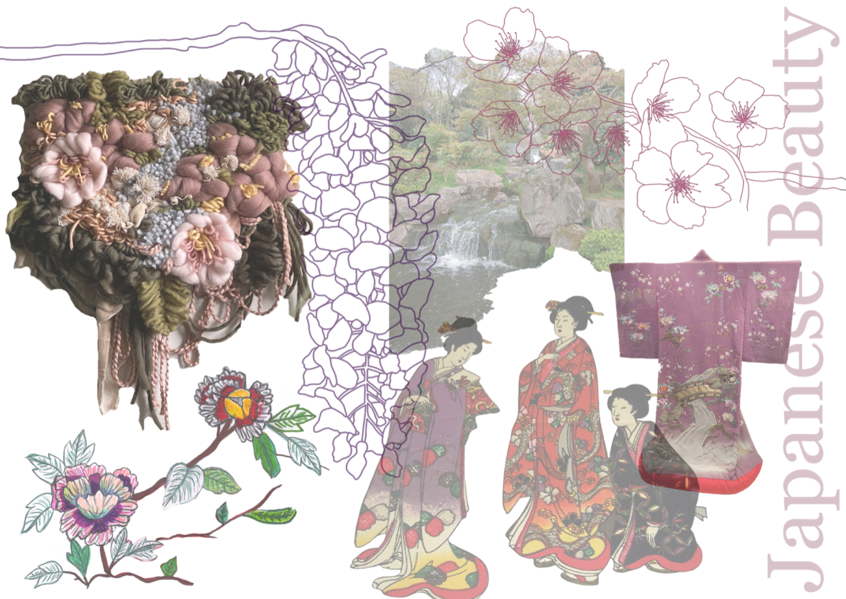
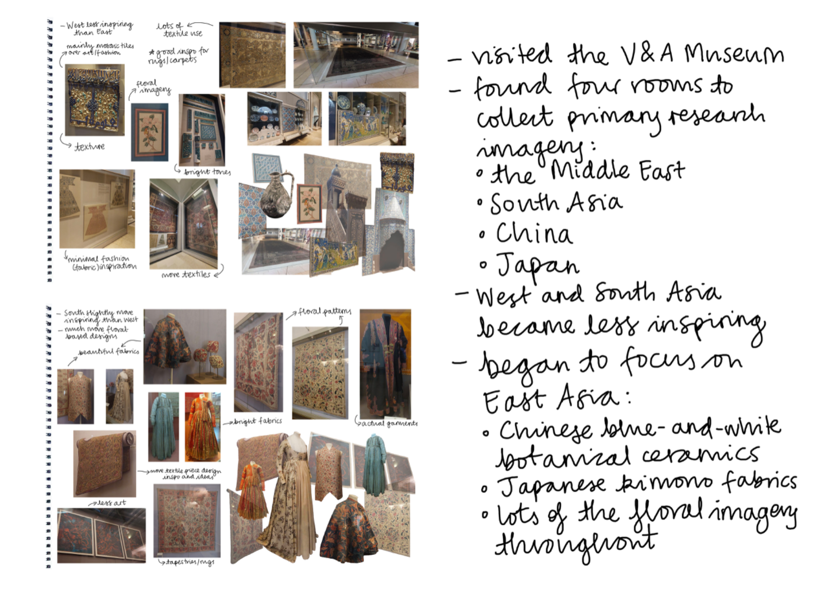
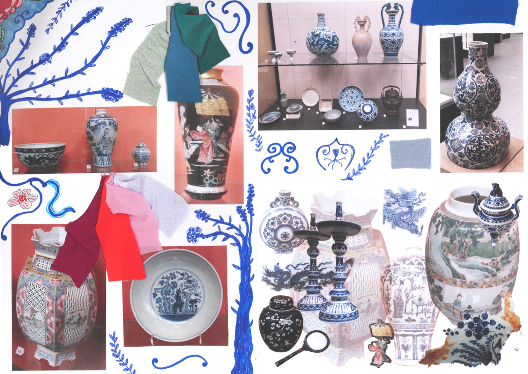
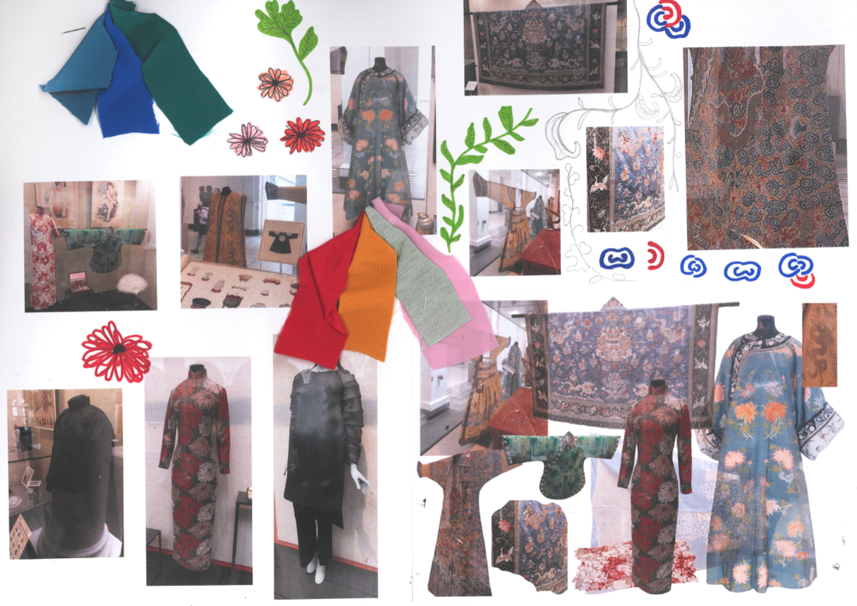
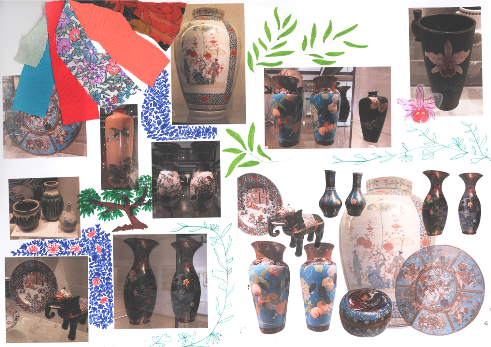
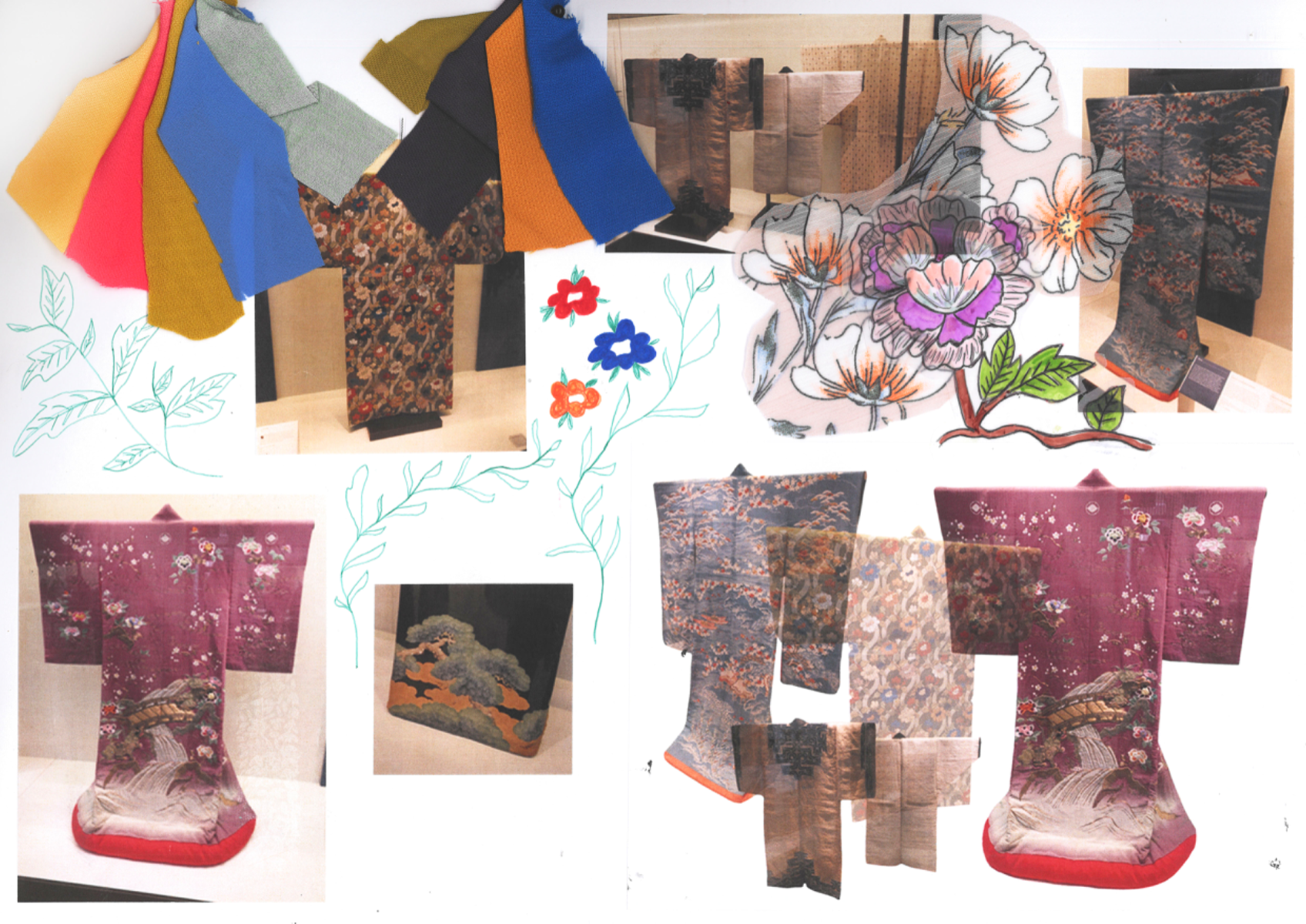
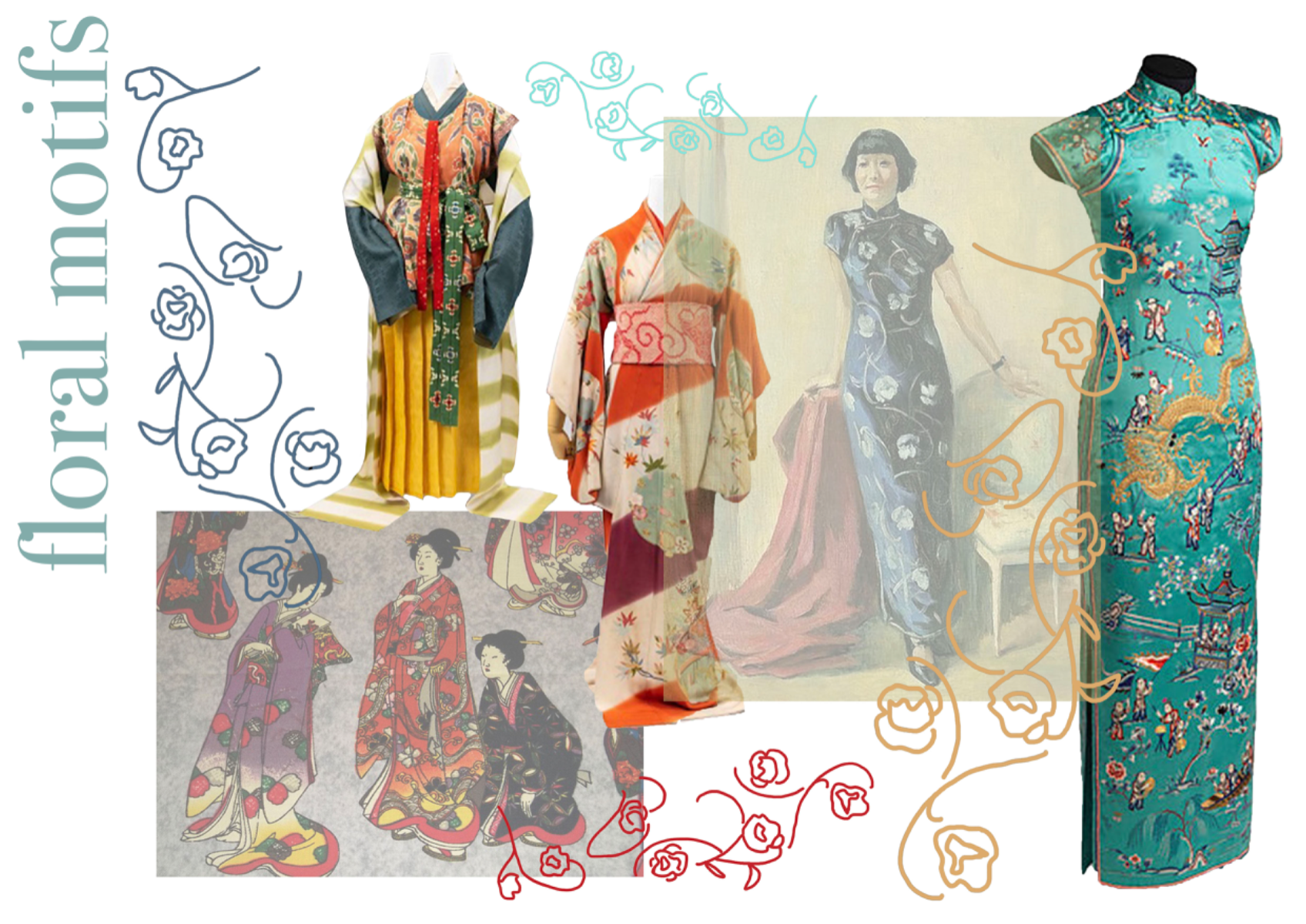
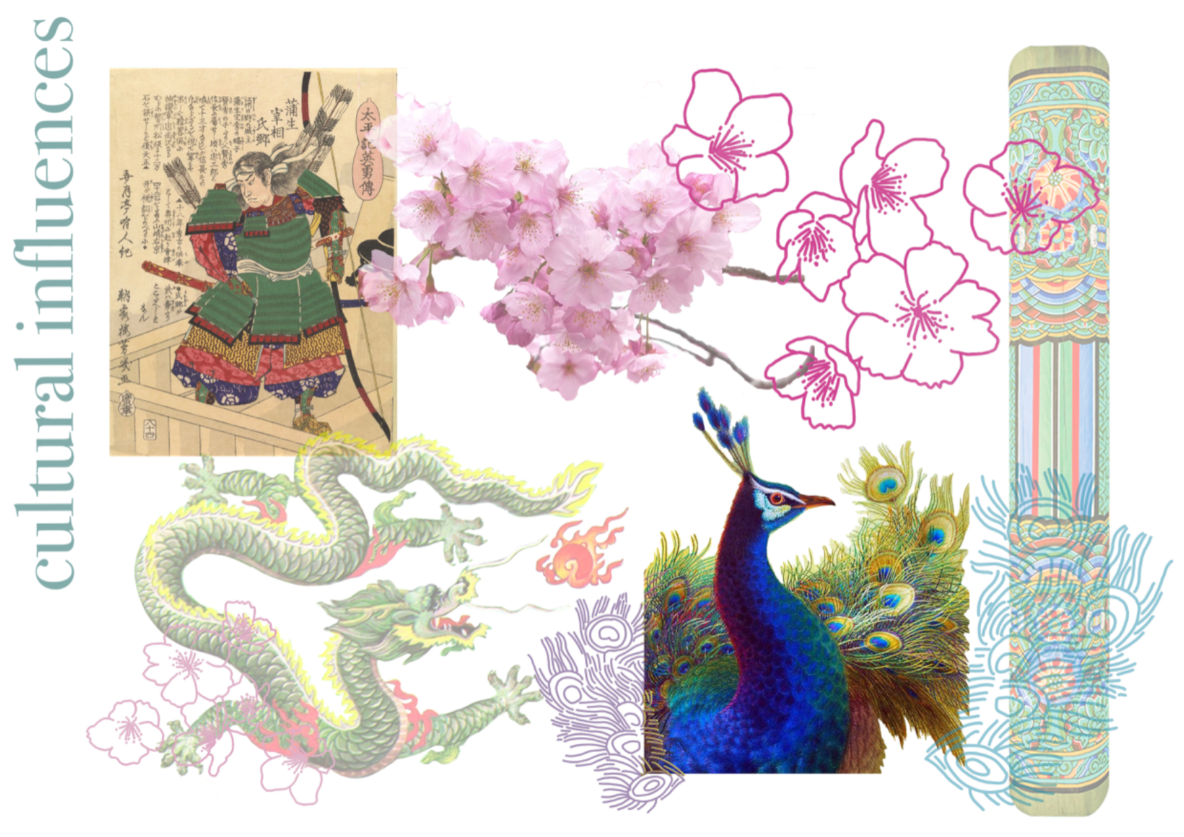
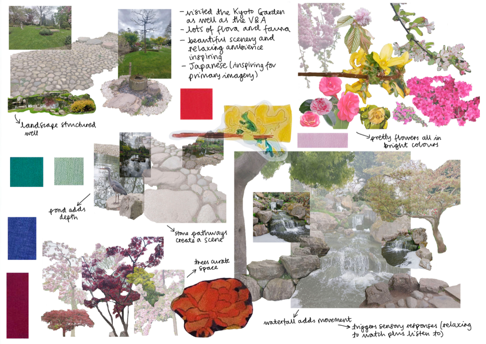
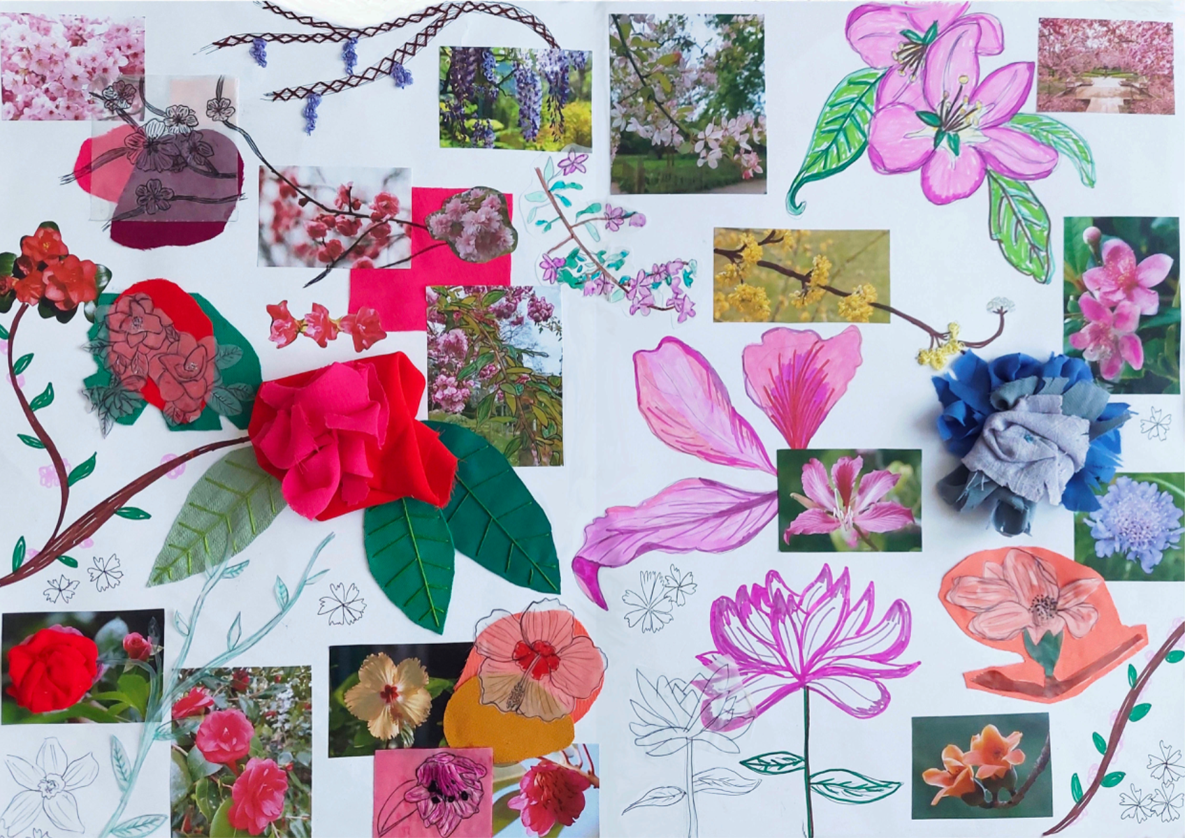
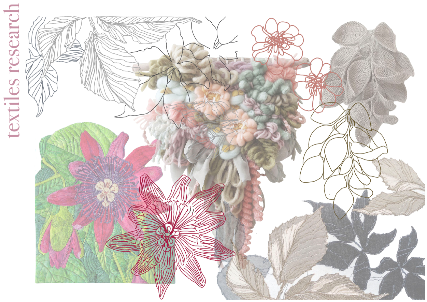
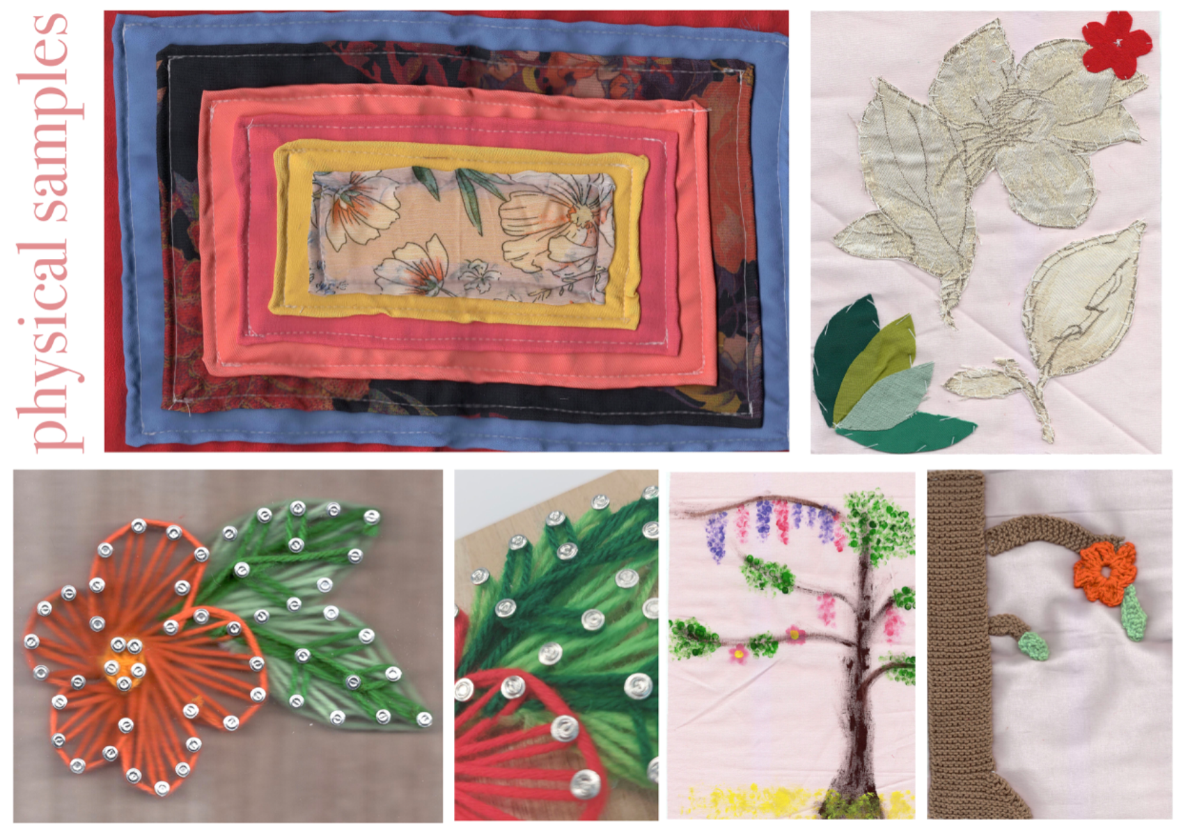
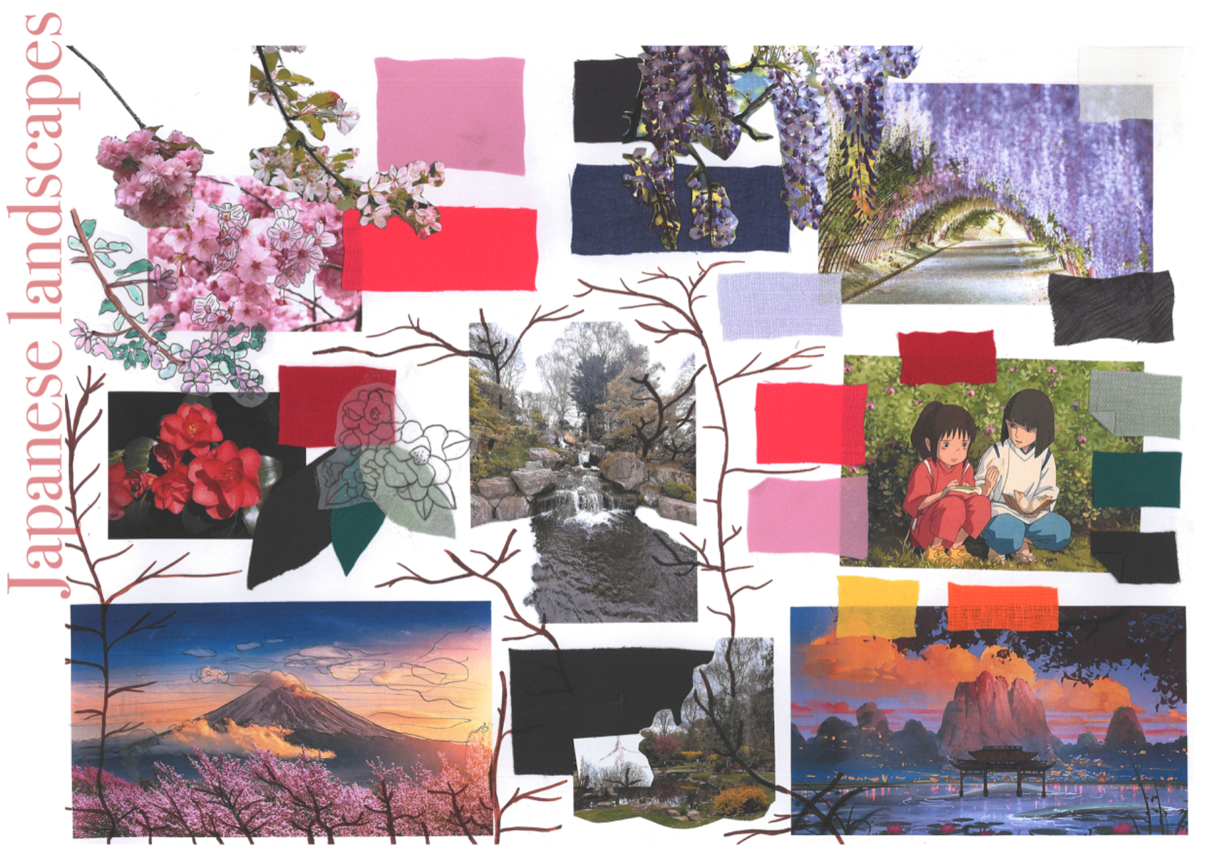
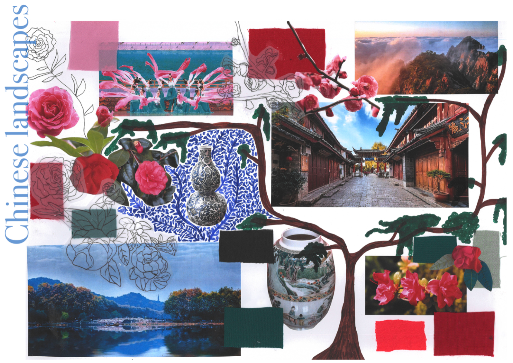
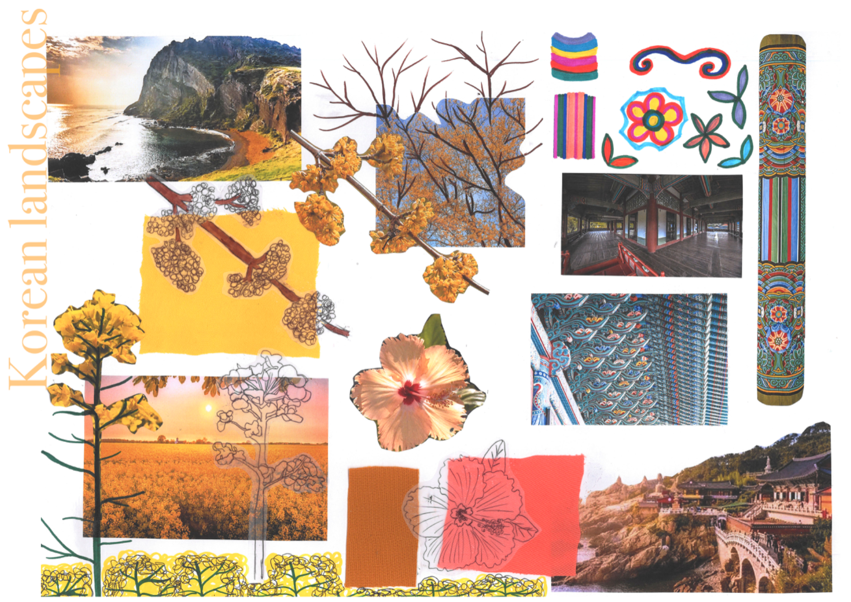
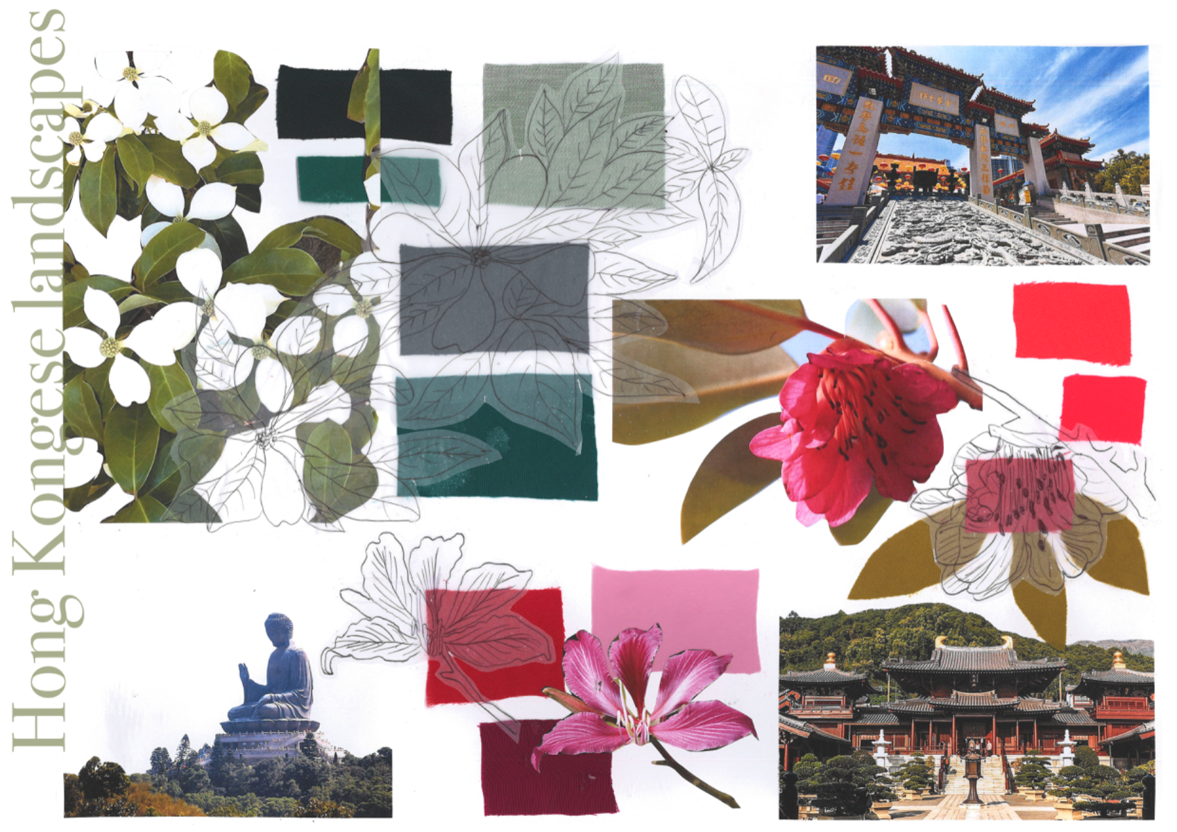
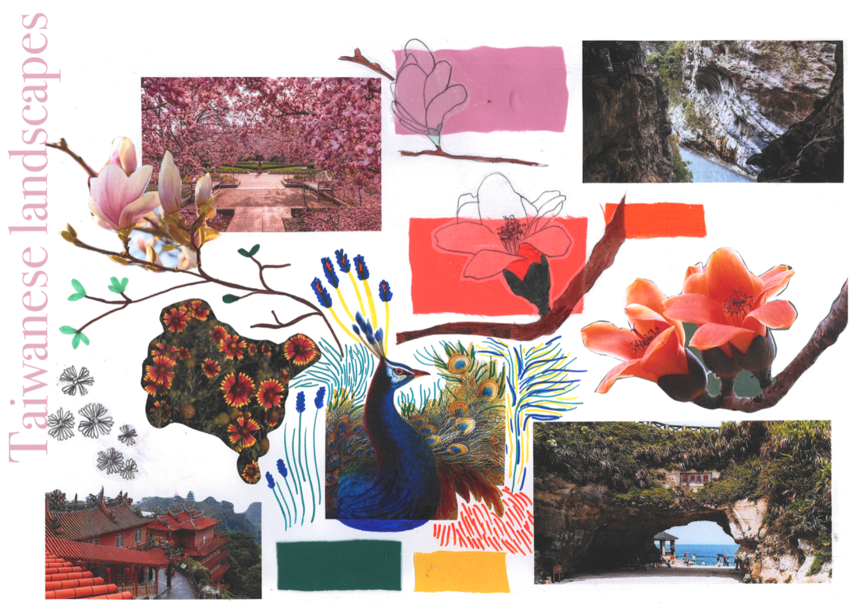
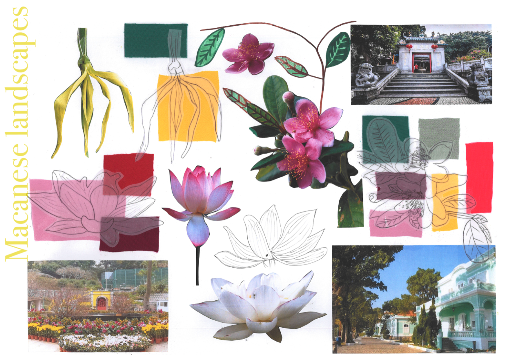
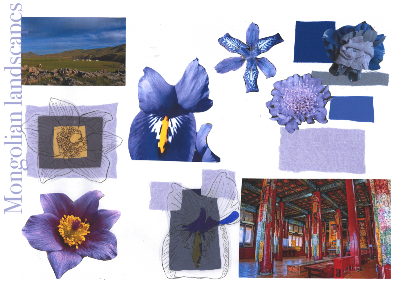
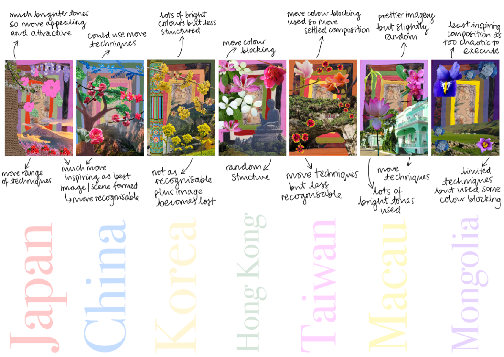
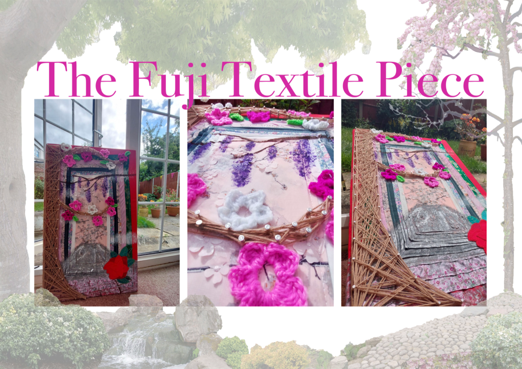
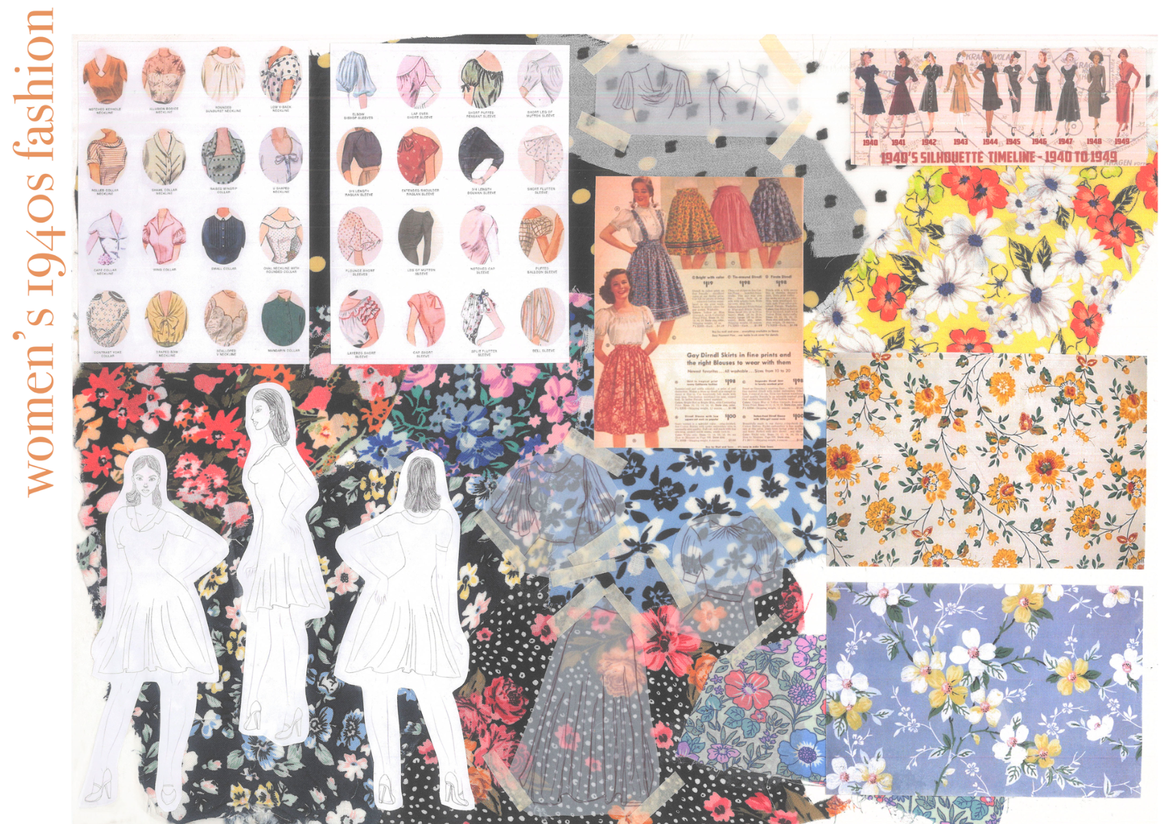
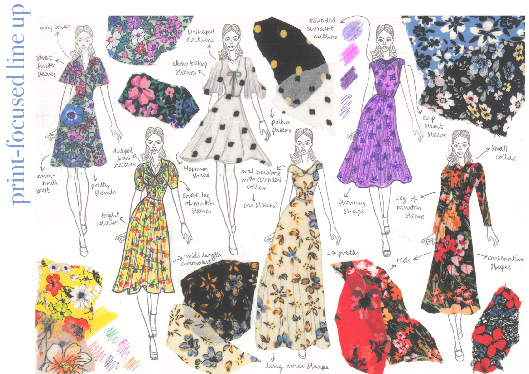
This project was completed in honour of my first year at the Fashion Retail Academy studying L3 Fashion Design coming to a sad but insightful close. For my FMP (Final Major Project), I selected the textiles pathway and thought about my interest in exploring cultures foreign to my own in order to understand and appreciate them. I began with the broad subject of Asia but my passion for East Asia and its beauty was too clear to ignore. My project looks at a way of celebrating and paying homage to the beauty of Eastern Asian culture through my textile design while addressing some of its history and origins. For instance, I researched East Asia in its politically divided state (not the one we often hear about in the media etc.). To gather primary research, I visited the Victoria & Albert Museum in South Kensington, London, England, as well as the Kyoto Garden in Holland Park, London, England. Both were equally as inspiring for my ideas even though I eventually created a final piece ‘line-up’ to separate my ideas and create a less overwhelming piece. I am incredibly happy with my final textiles piece because it incorporates many textile techniques to showcase my practical skills. However, more importantly, it reflects my ideas perfectly in terms of beautiful floral imagery within East Asia - focusing on Japan for now and maybe another country later on. I am looking forward to discovering what my second year of studies hold for me and my future.
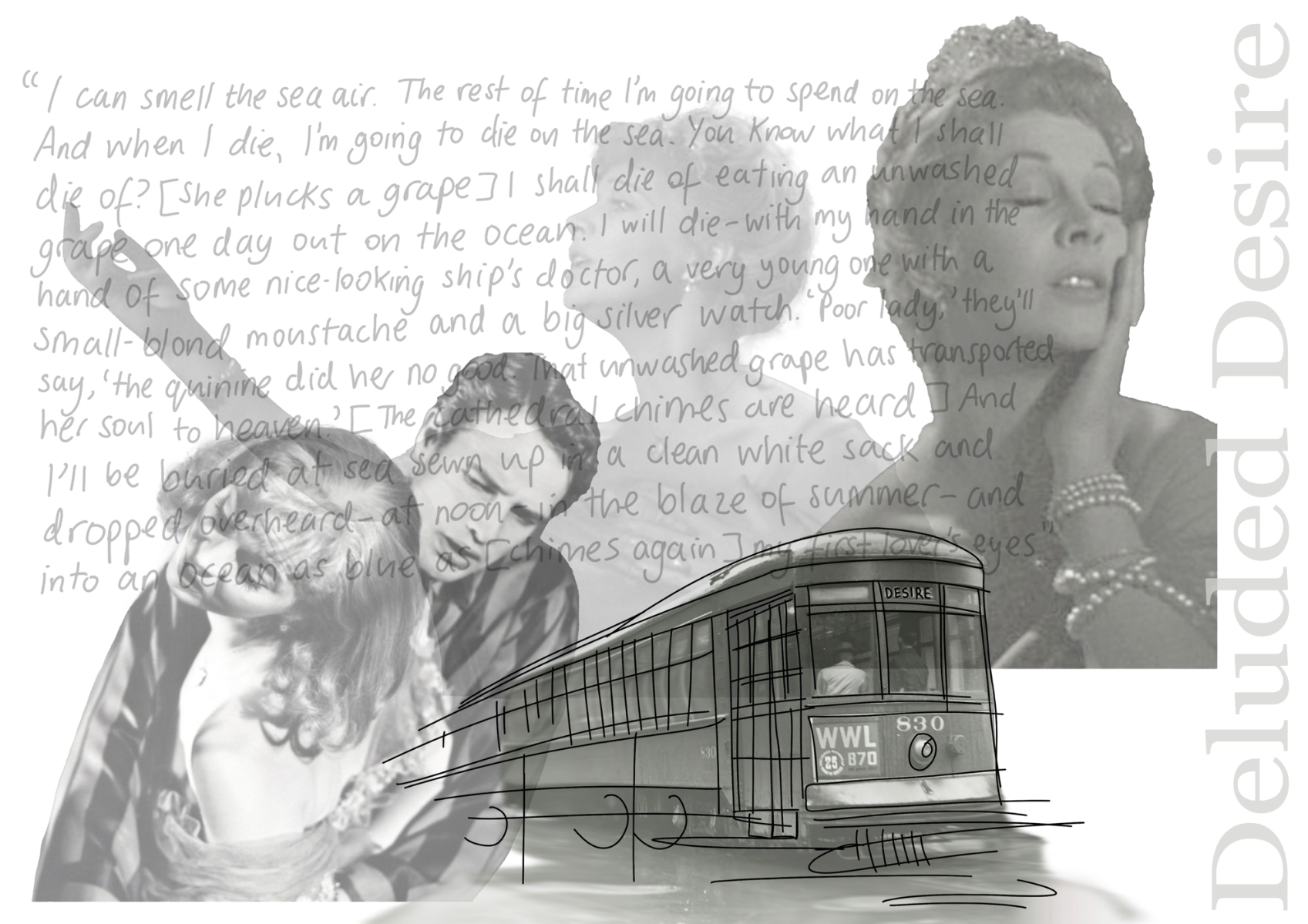
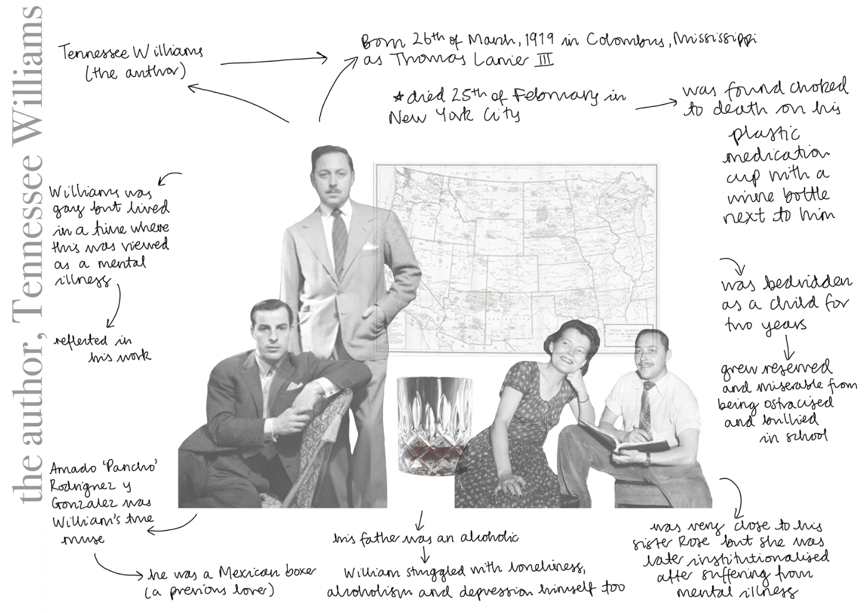
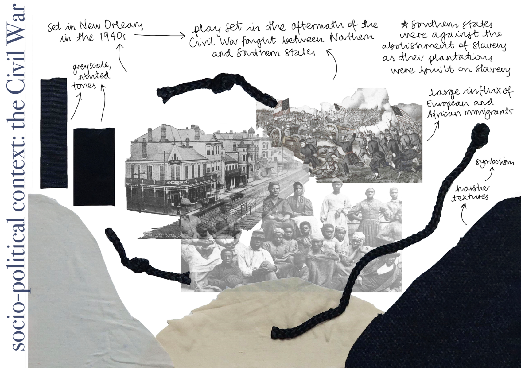
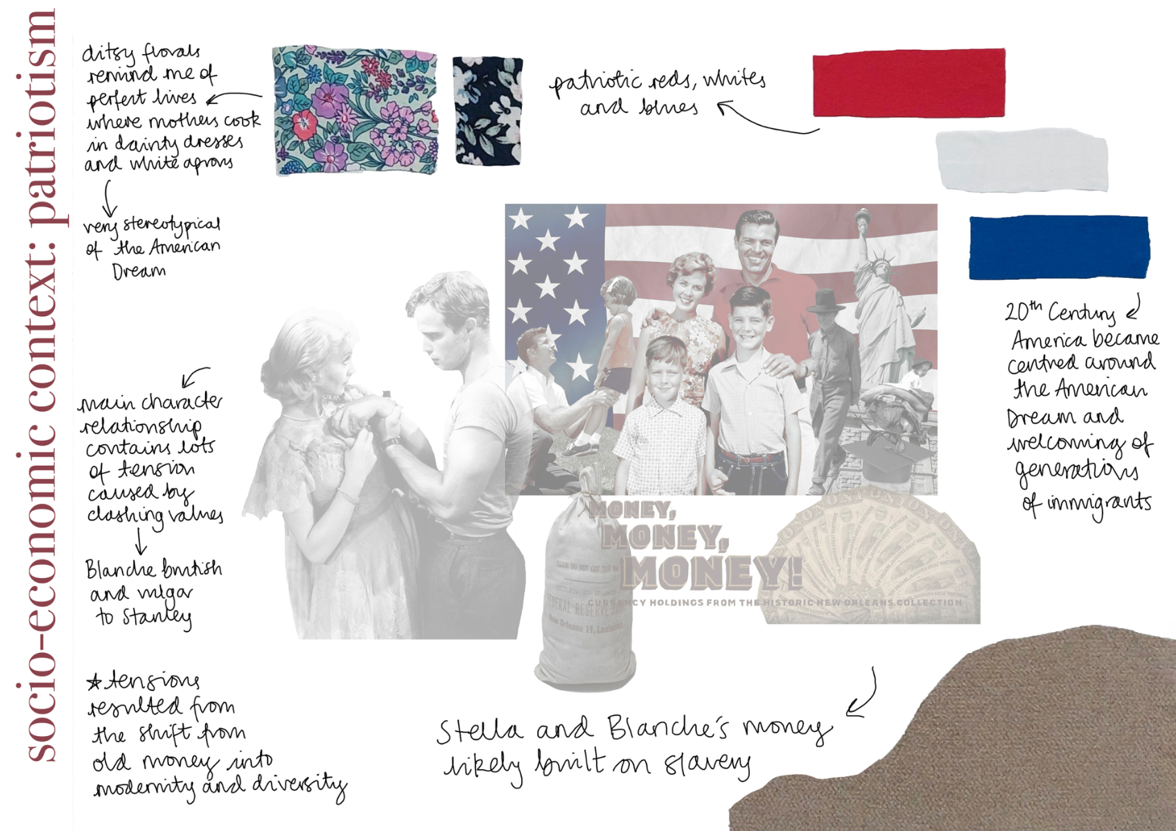
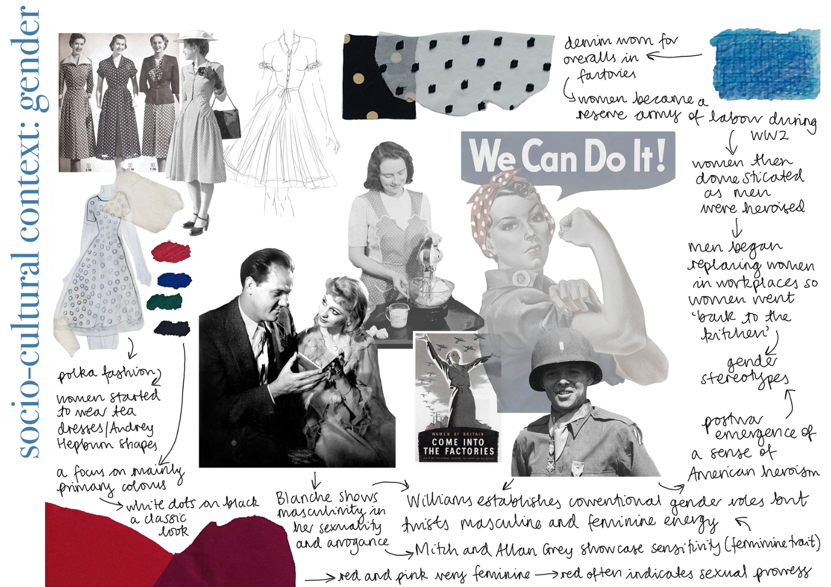
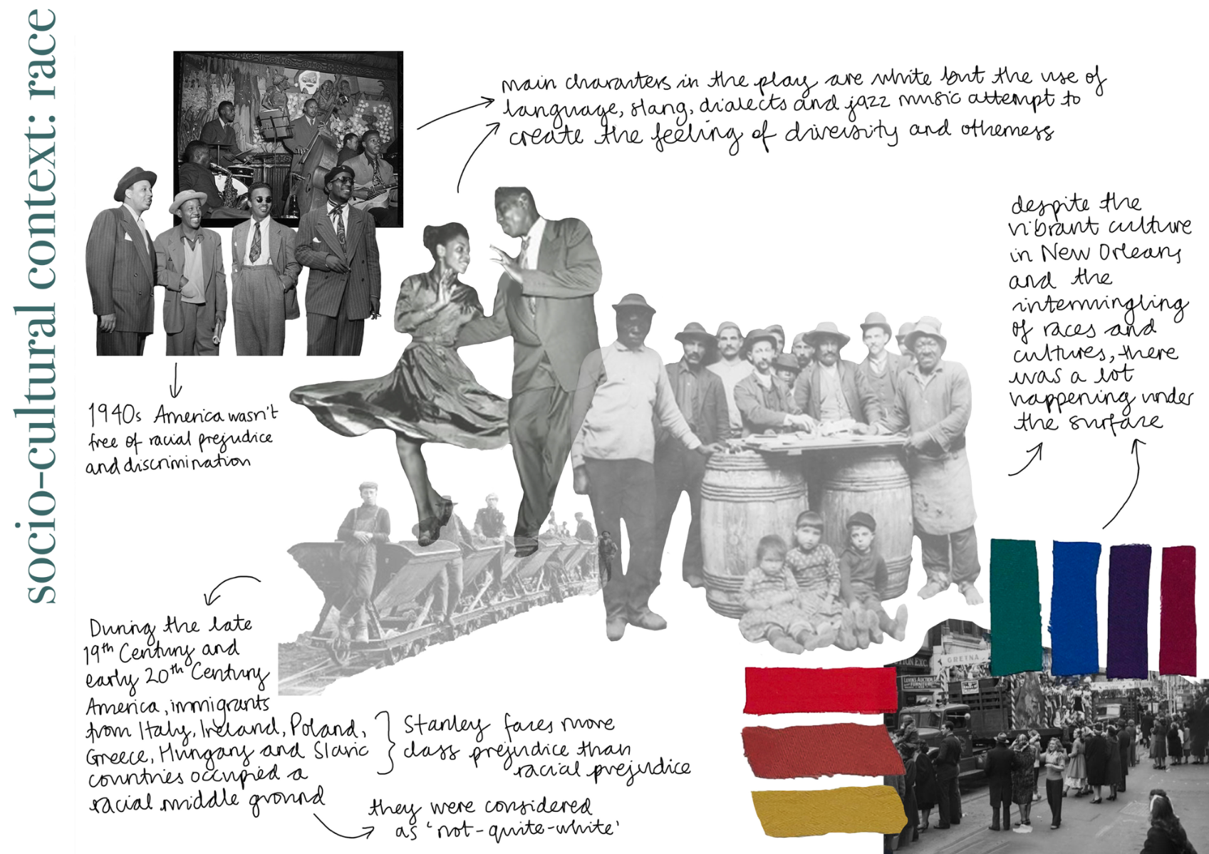
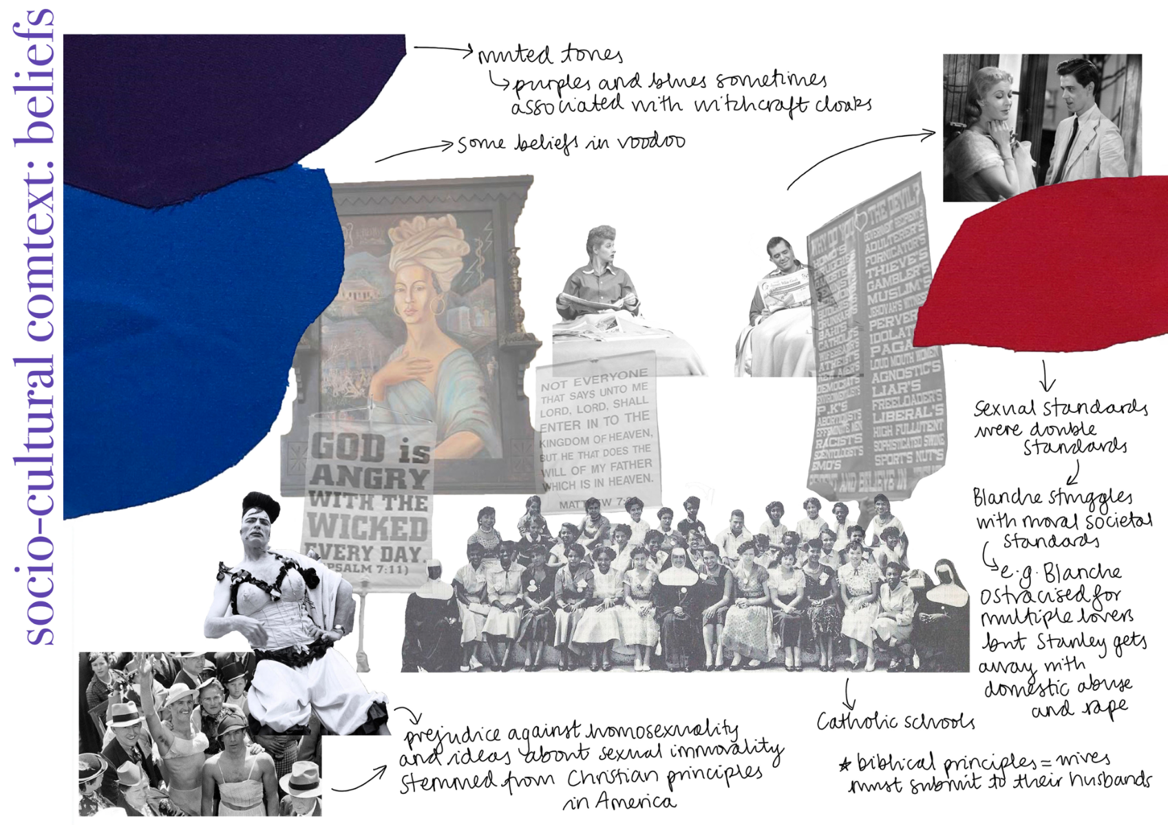
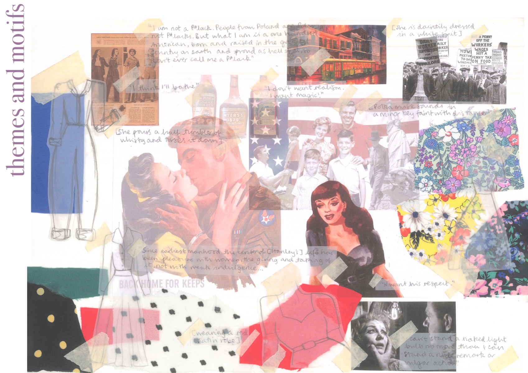
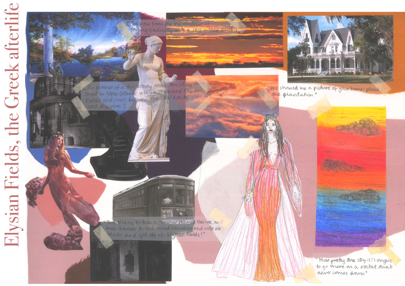
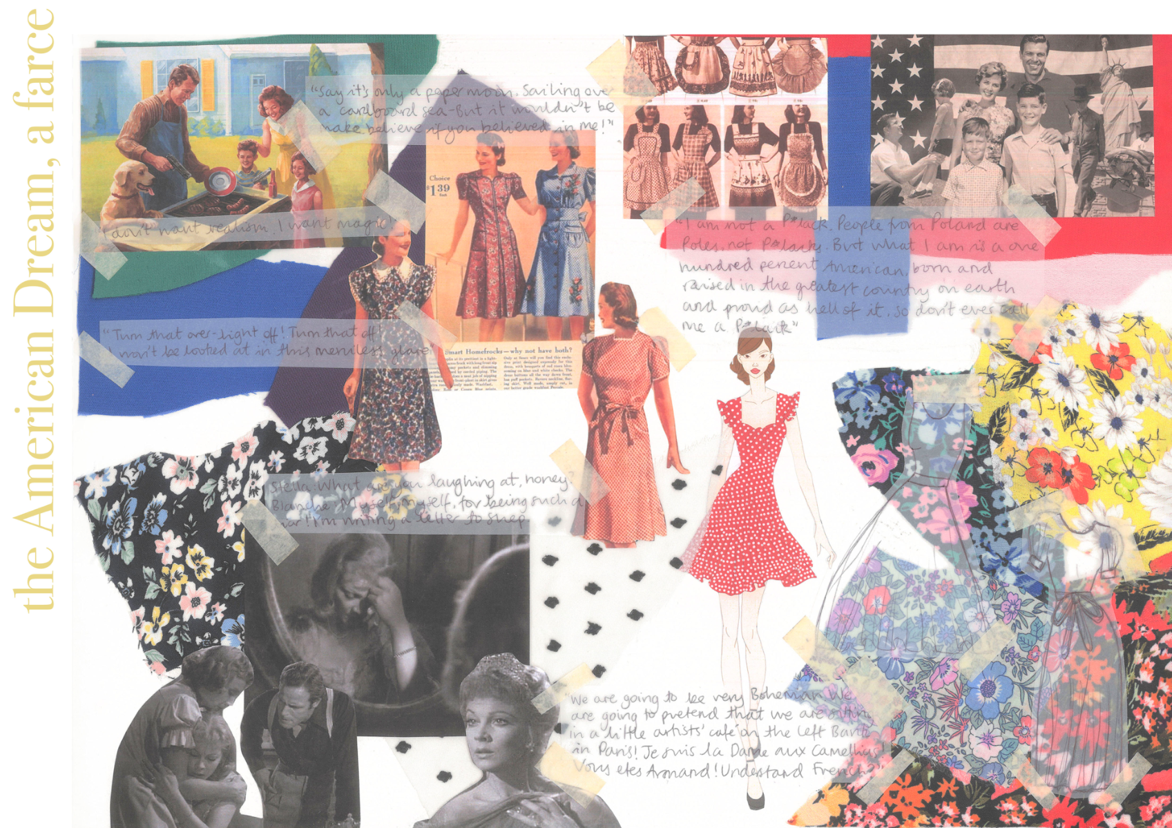
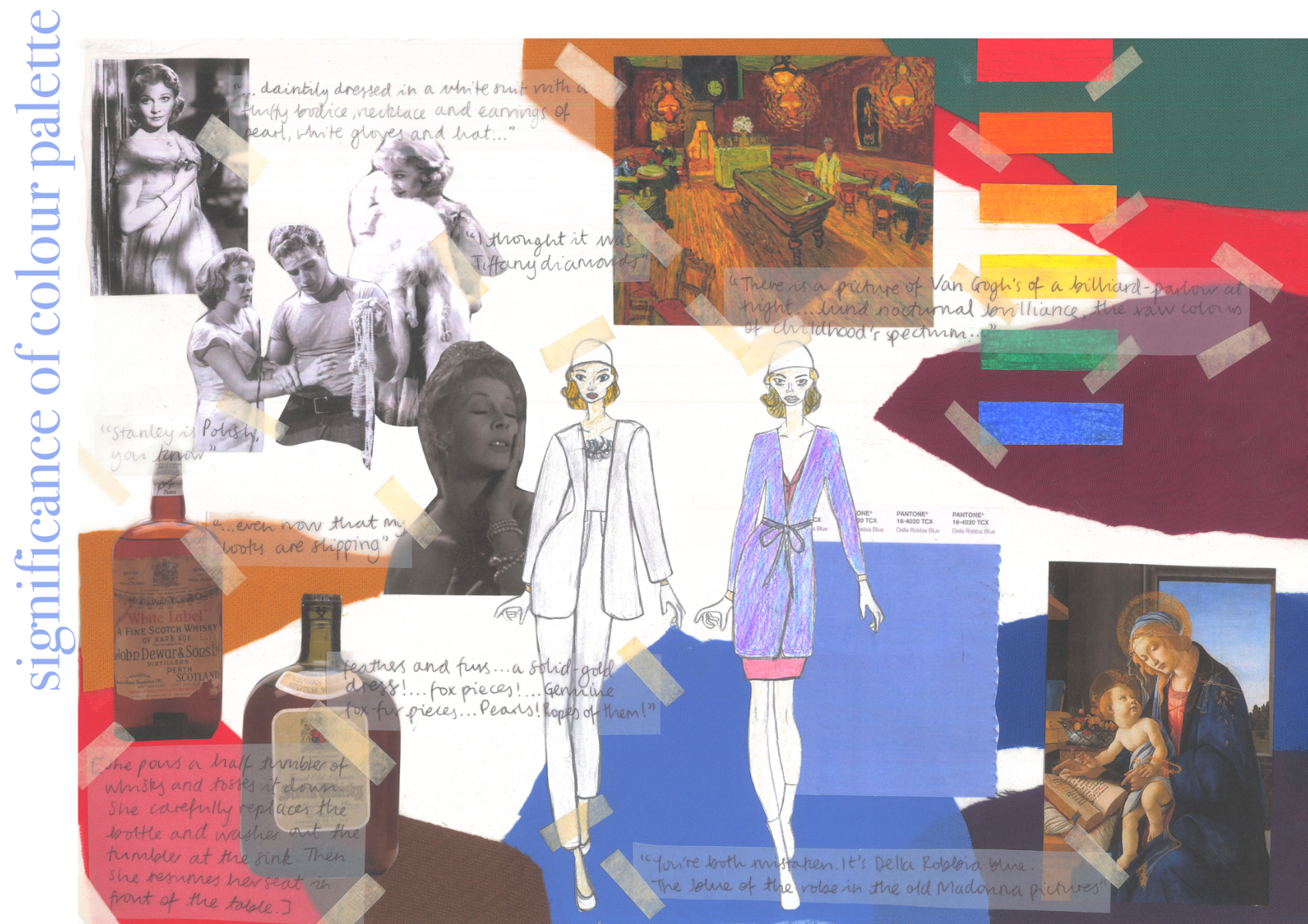
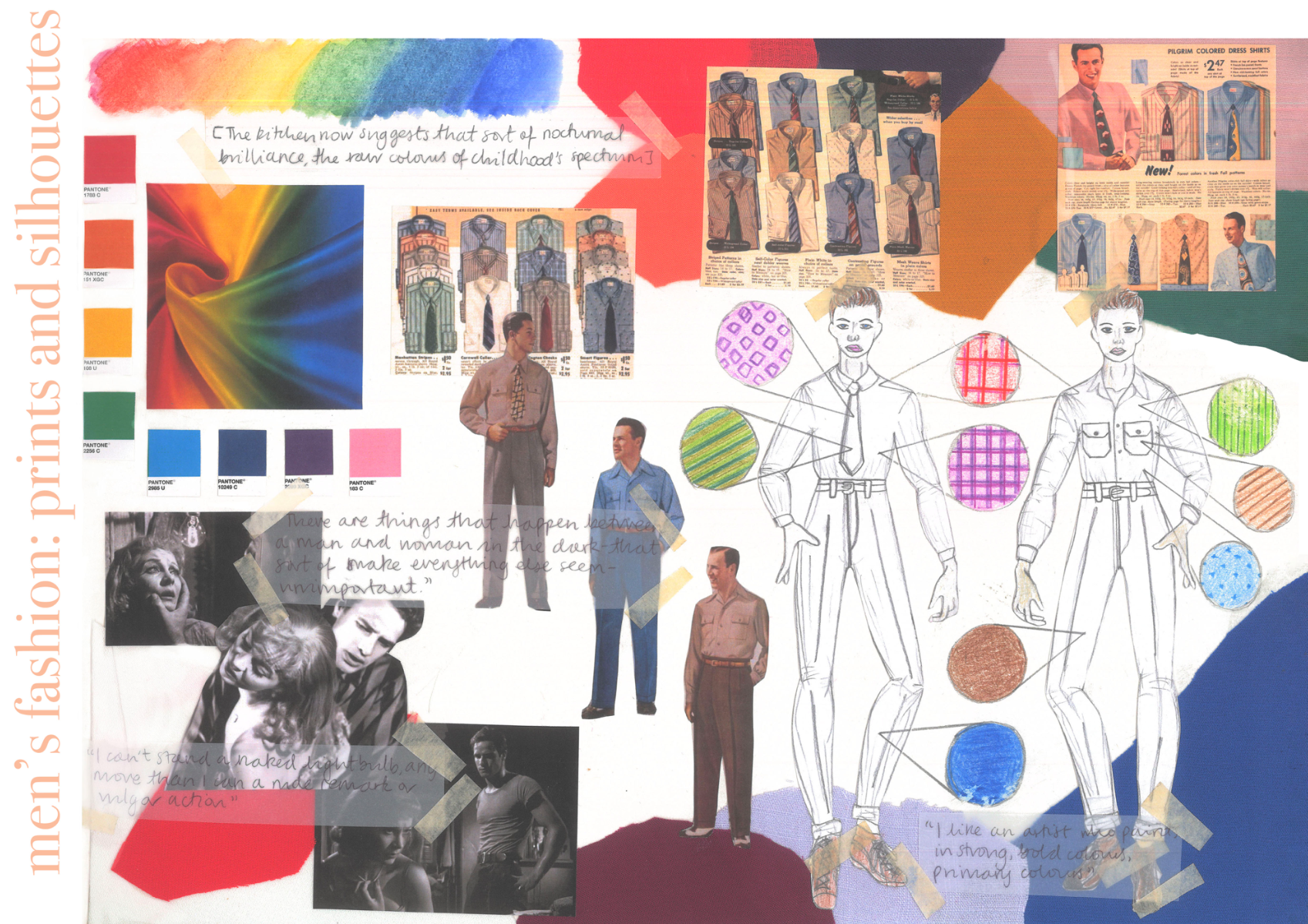
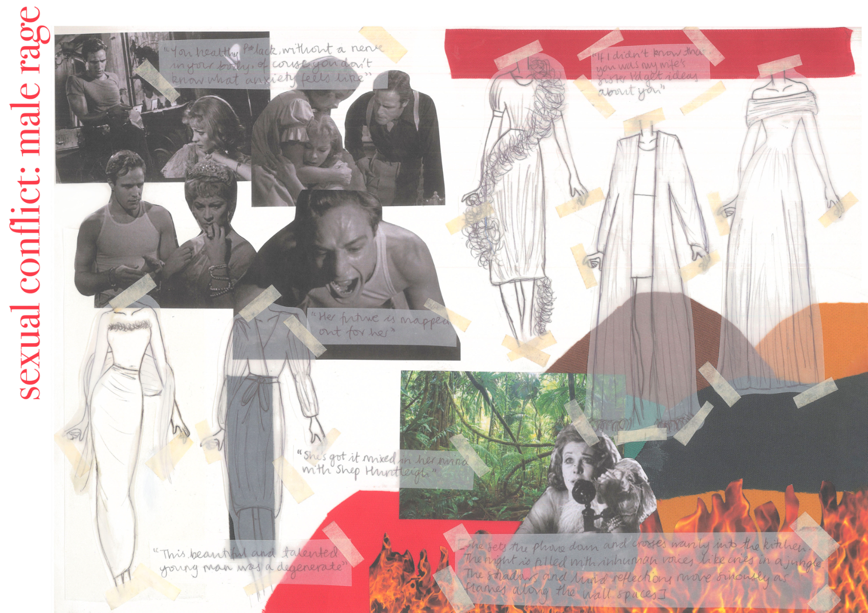
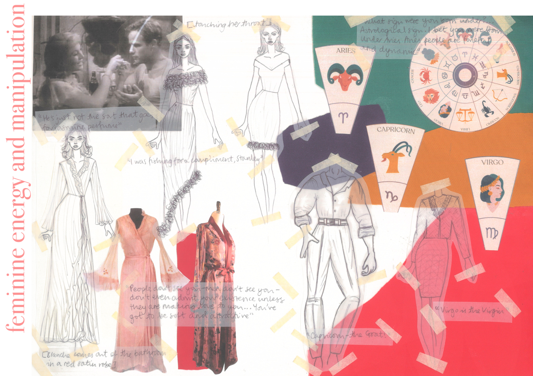
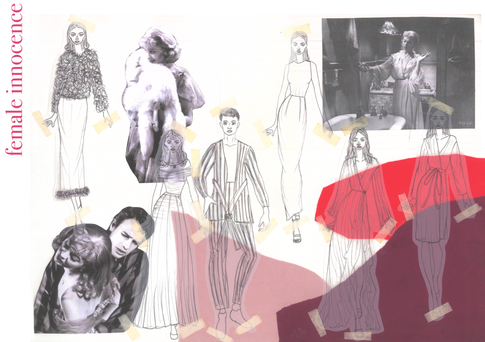
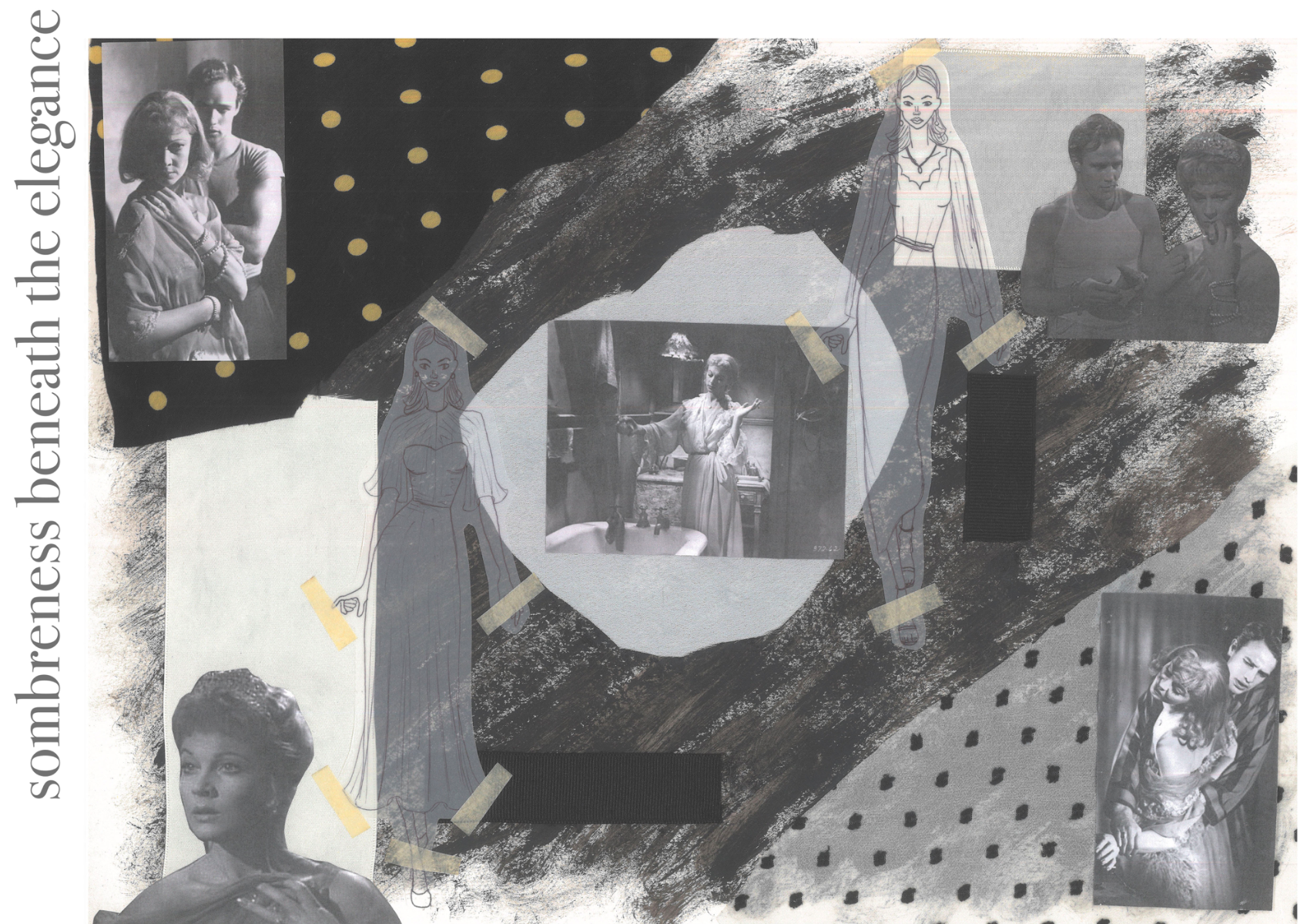
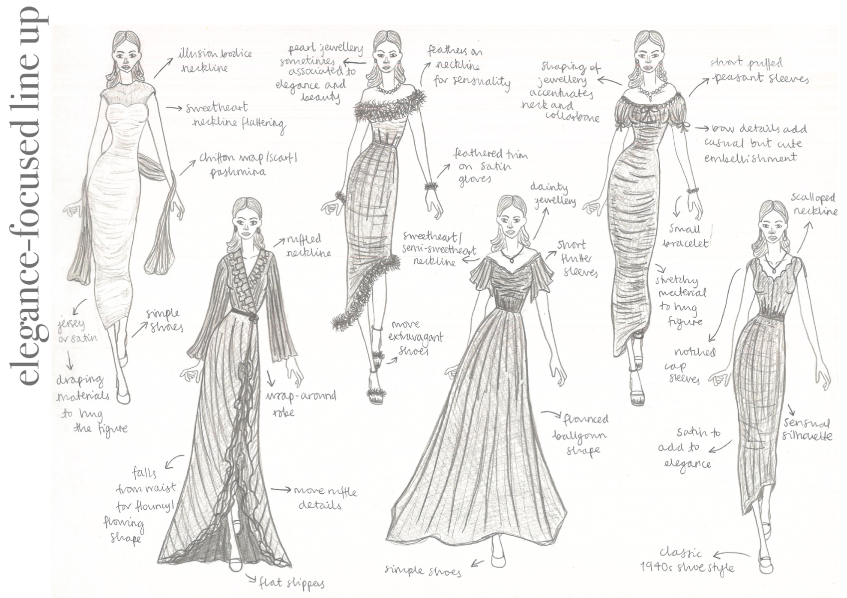
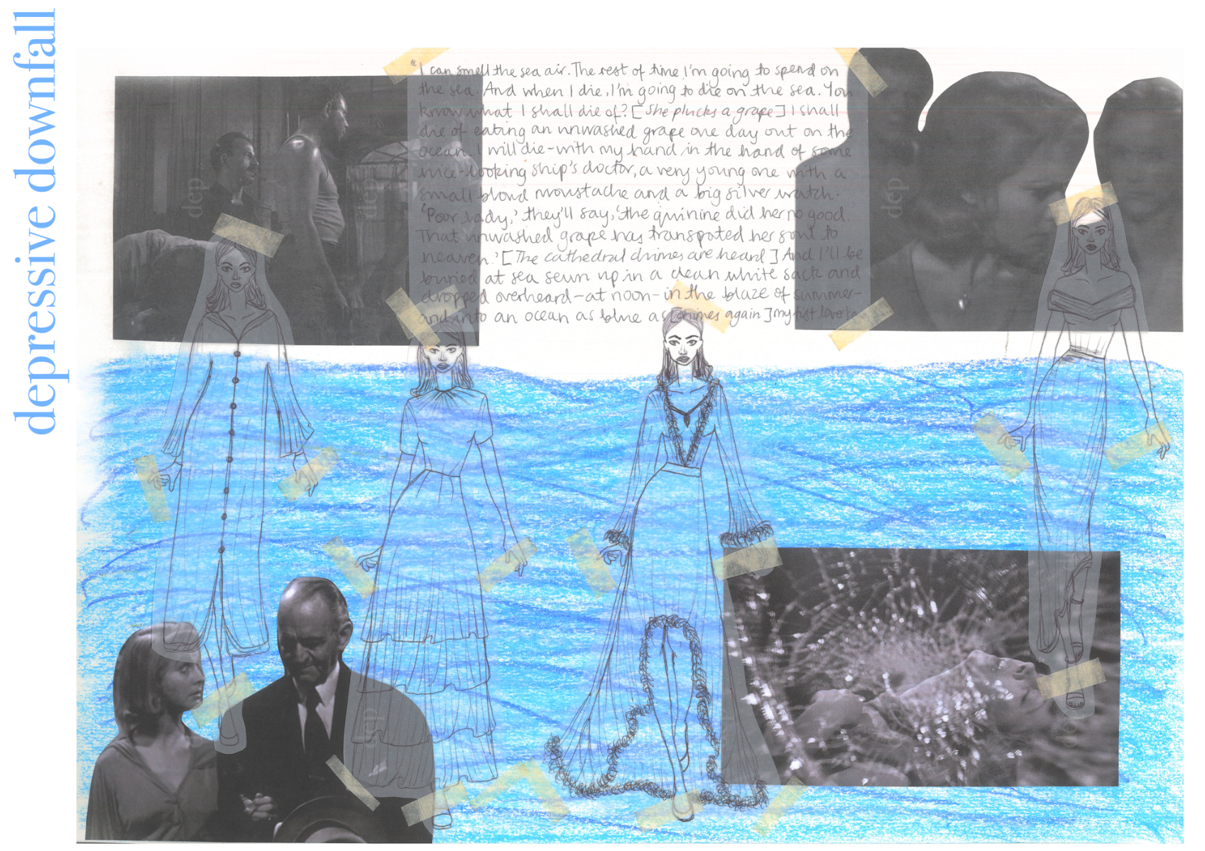
For this mini project I completed over the summer of 2022 ahead of my second year of studying at the Fashion Retail Academy, I selected a book to read and create several physical sketchbook pages about. I selected A Streetcar Named Desire by Tennessee Williams which contains many themes to explore that gave me scope to physically illustrate the mood being communicated by Williams. I began with contextual research surrounding the author, societal context of the time period the play is set in, and broader themes. I then moved onto quotes in the play separated into different sections regarding settings, descriptions, conflict/tension, and sexuality. This built up my ideas as I progressed through my pages, which is clear in the storytelling of my work, with little to no extra notes added on. Towards the end, I began to consider some line up ideas for the themes and quotes in the play I had researched and presented in the sketchbook. I am very happy with my final line ups as they use mixed media methods and are relevant to the play and its context.
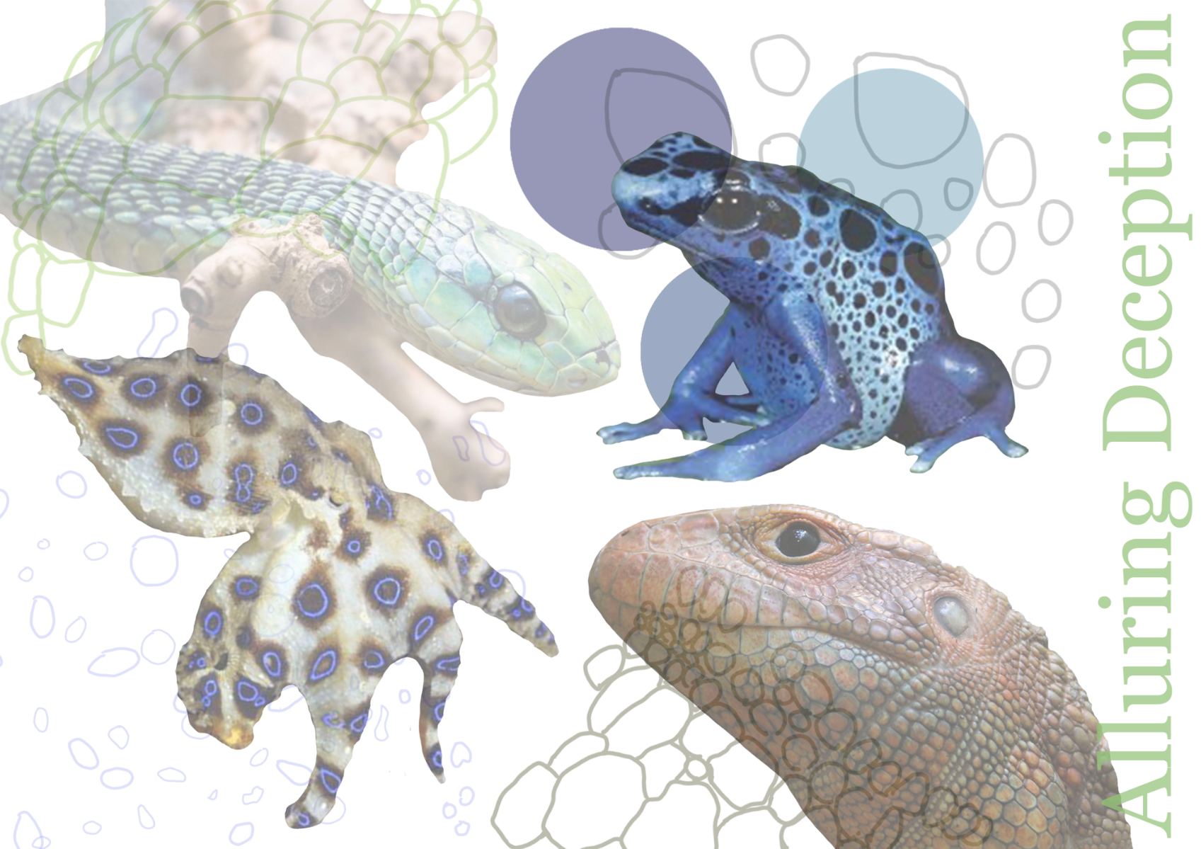
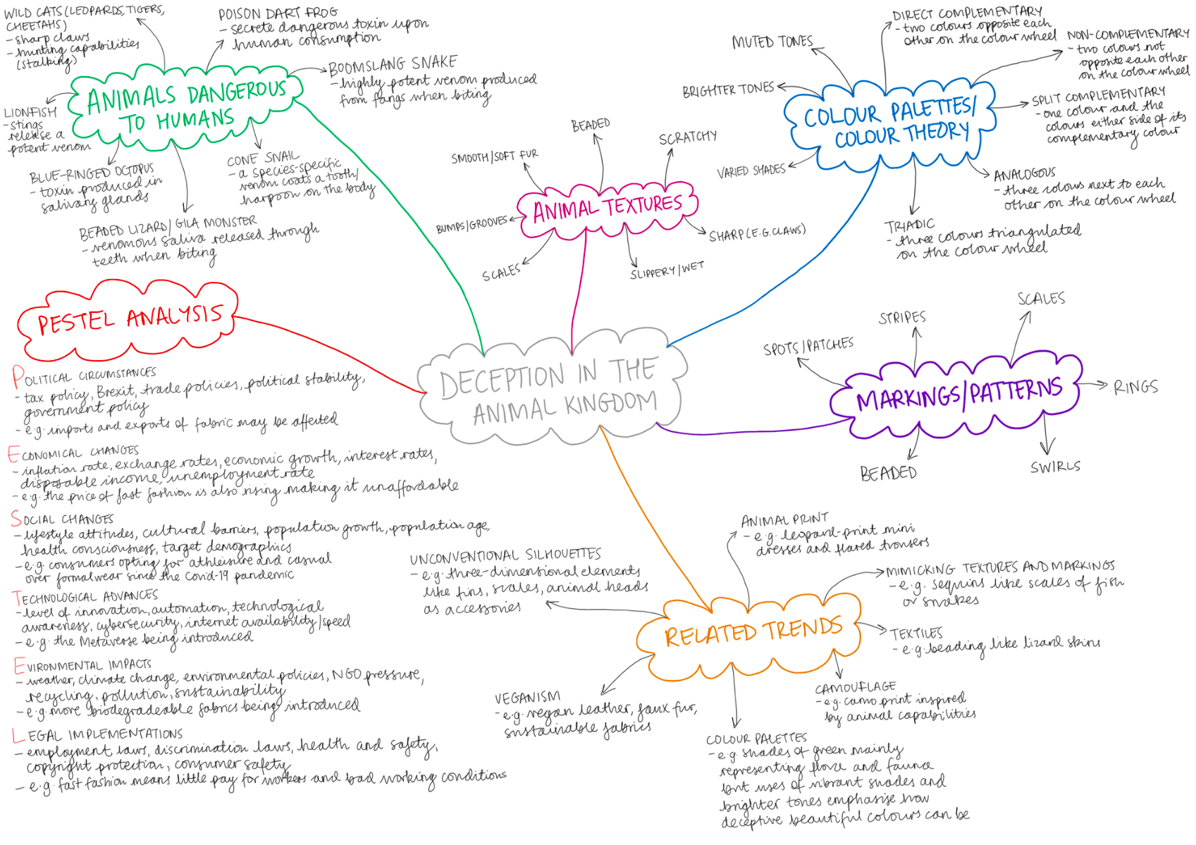
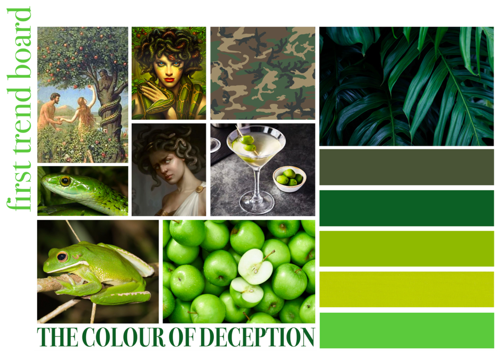
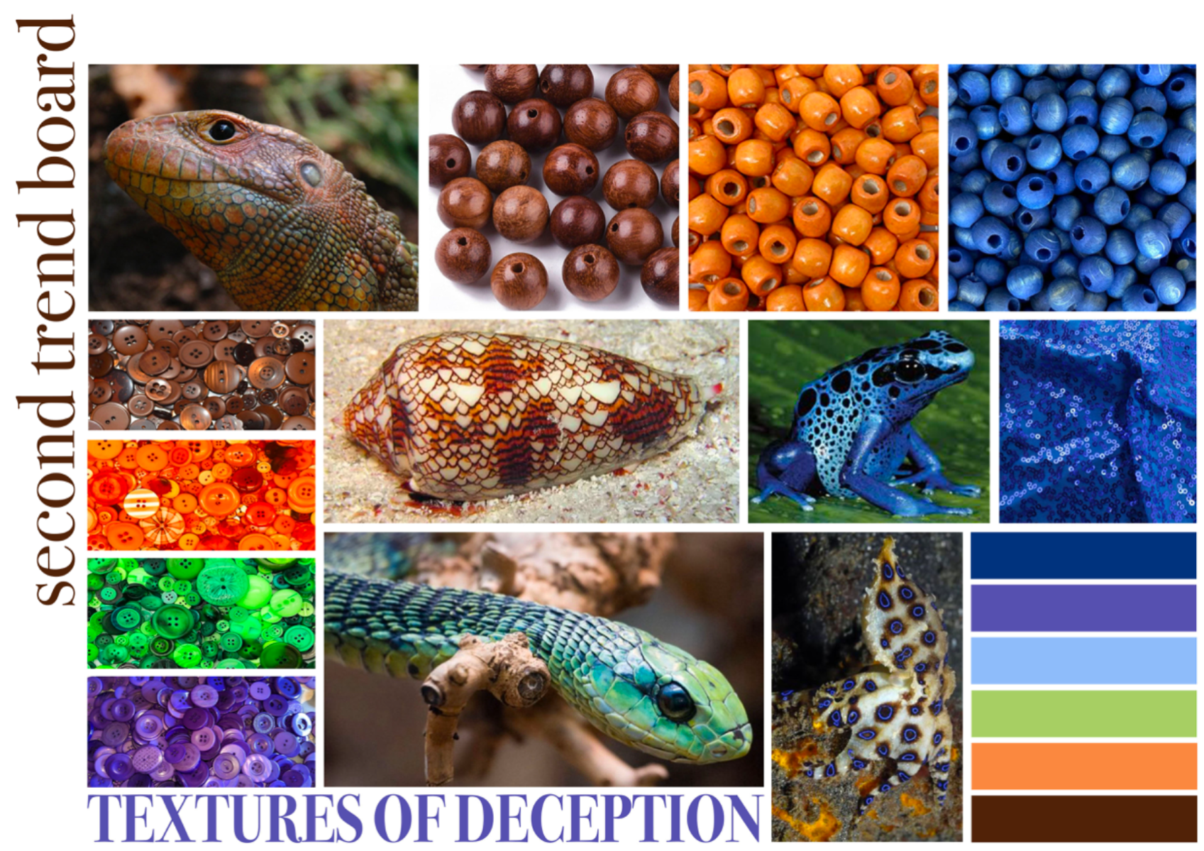
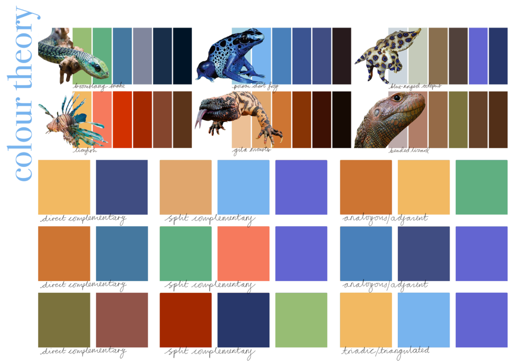
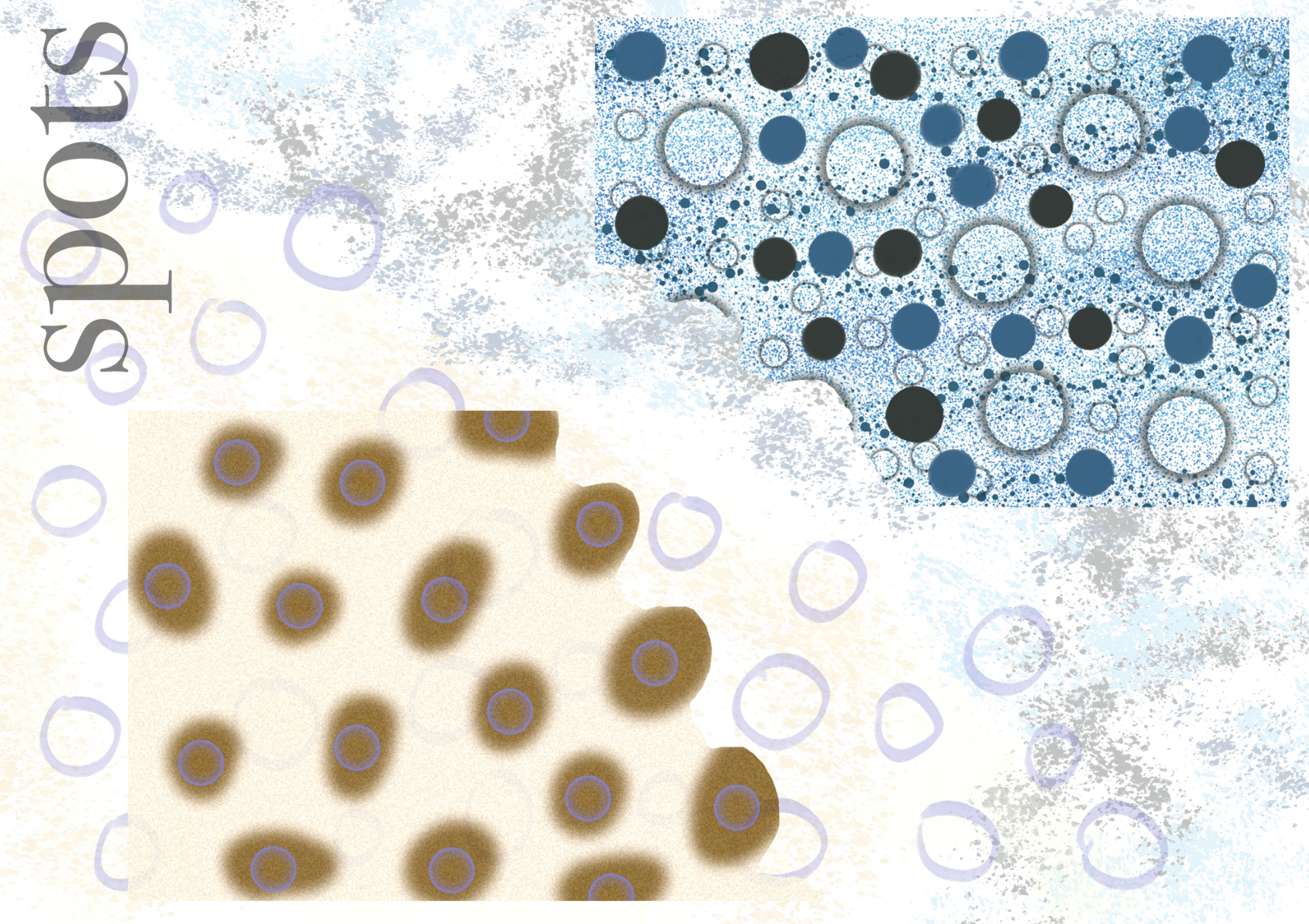
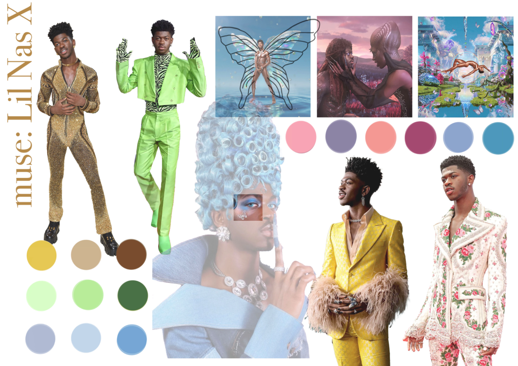
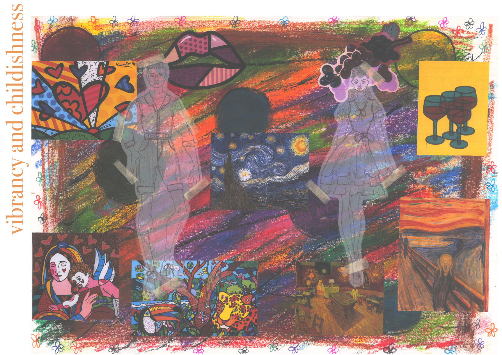
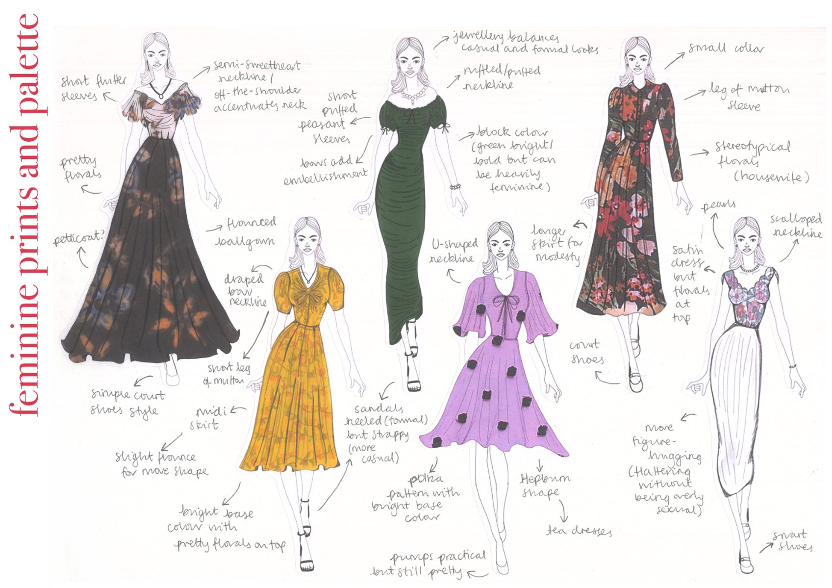
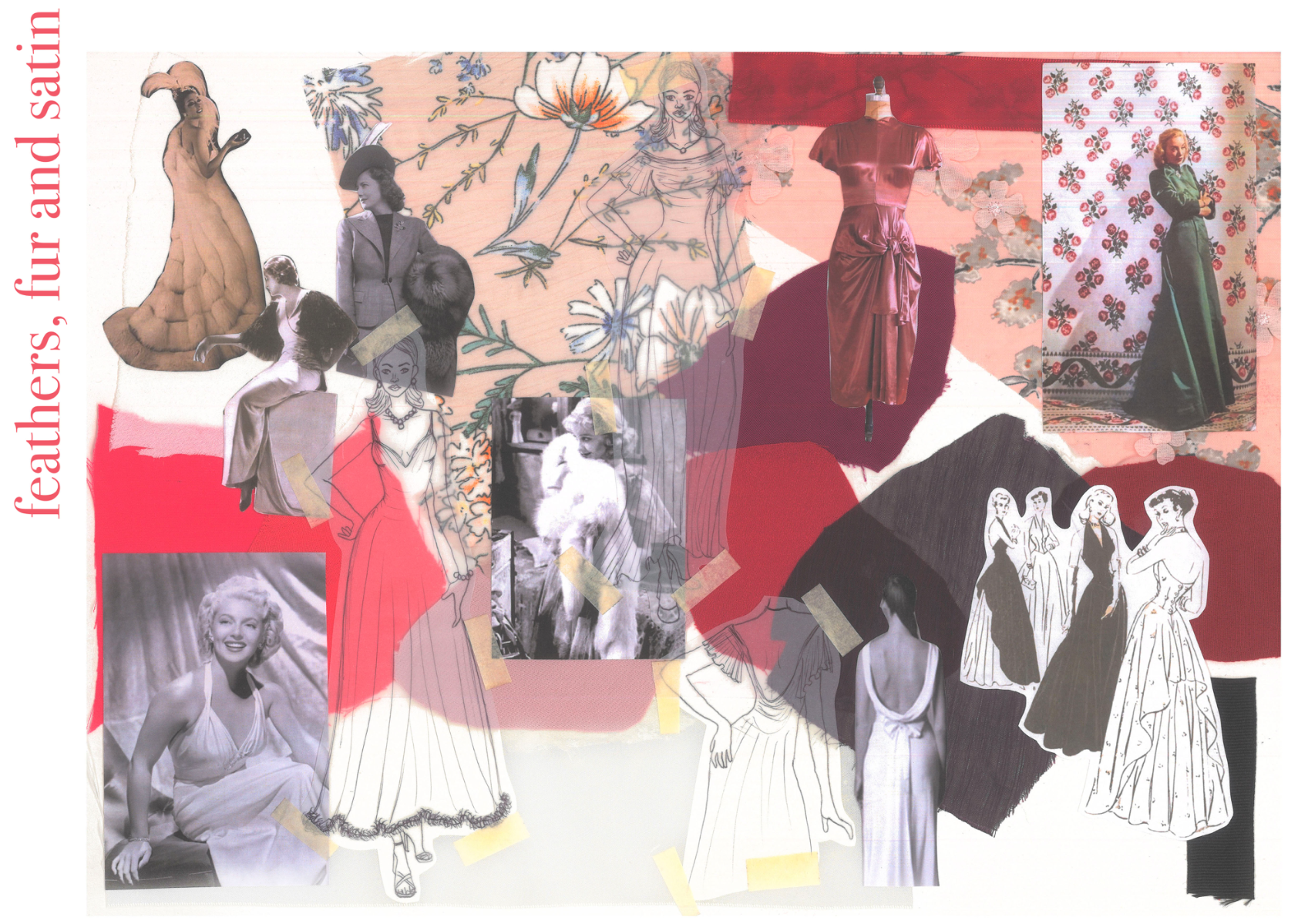
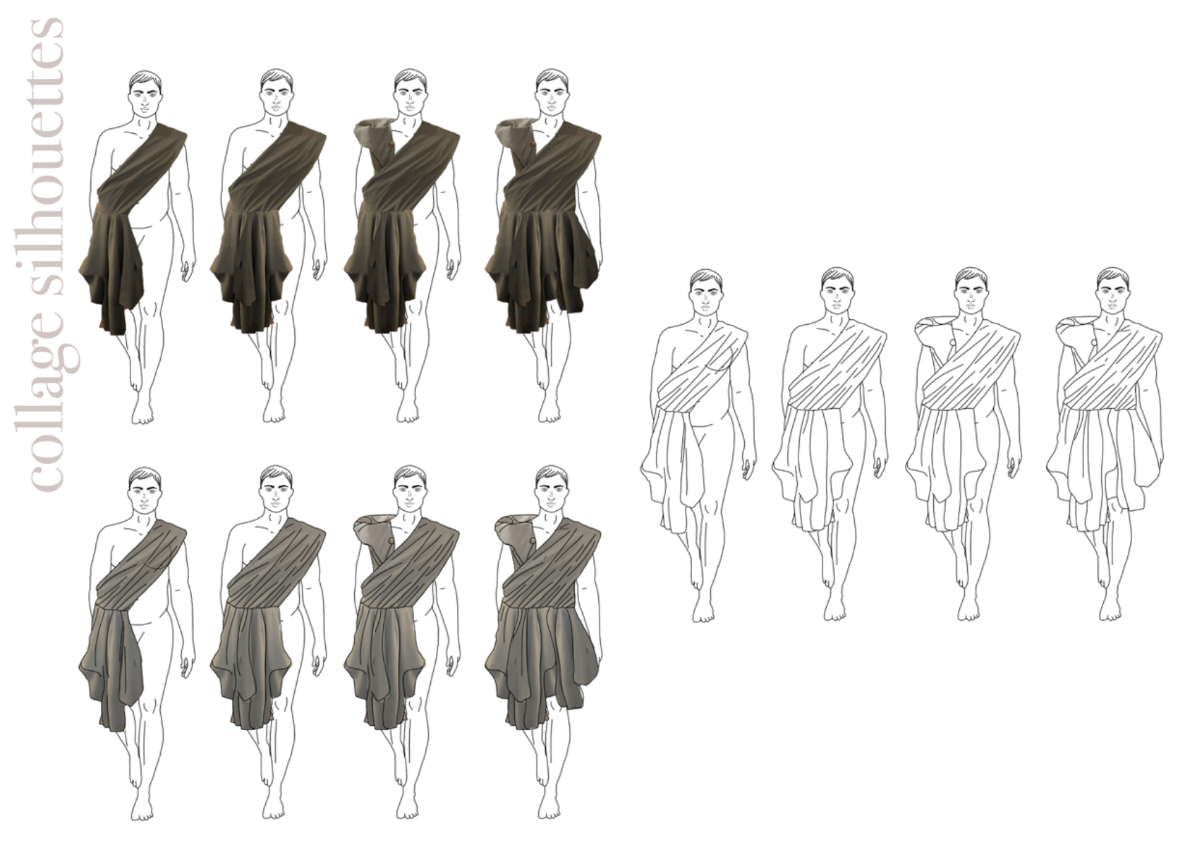
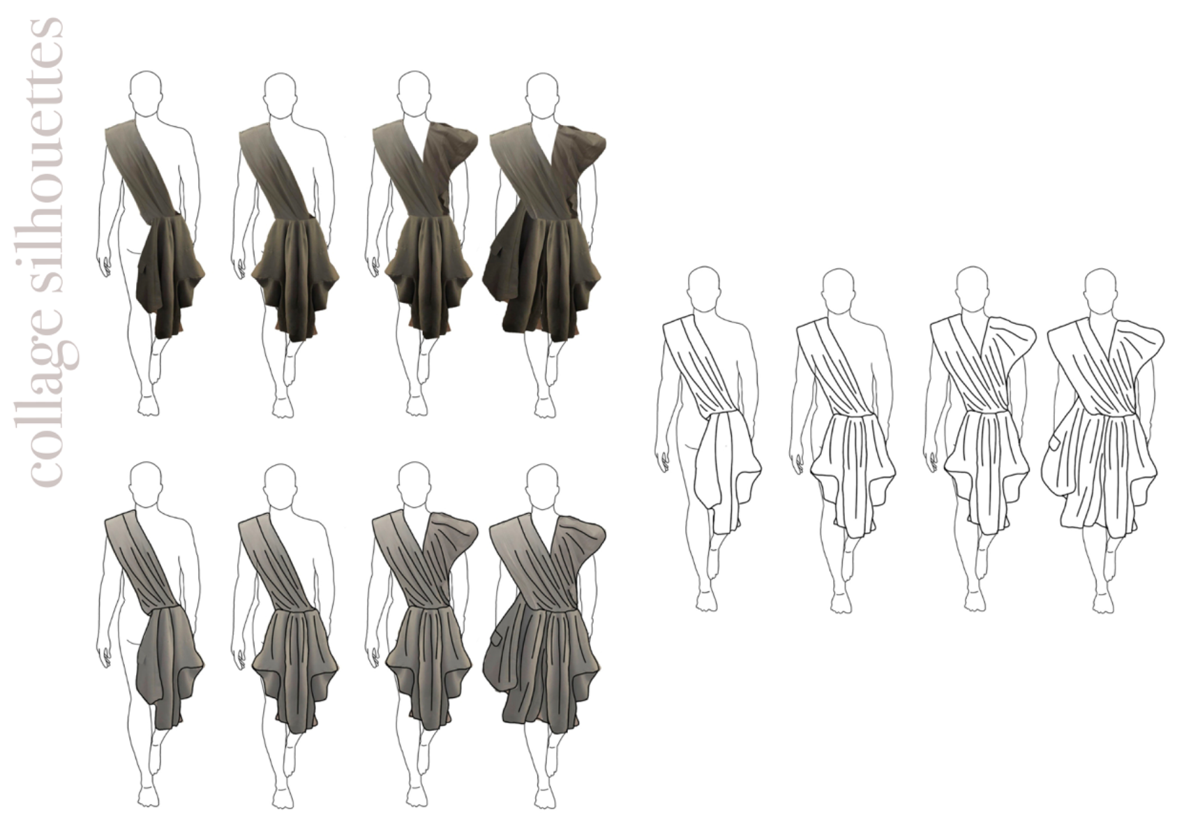
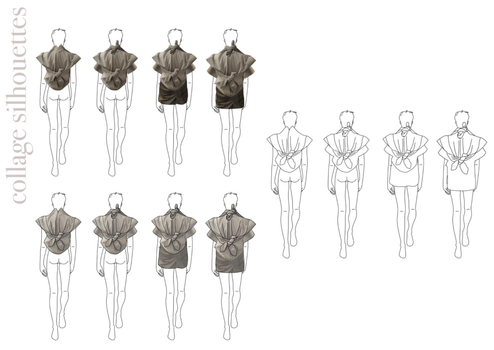
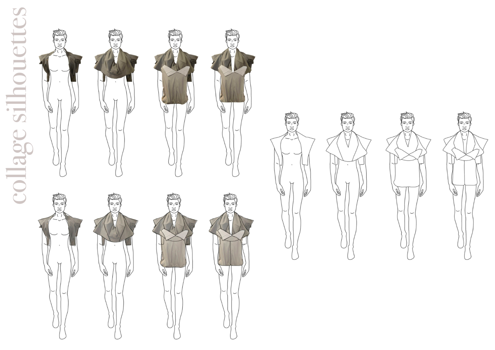
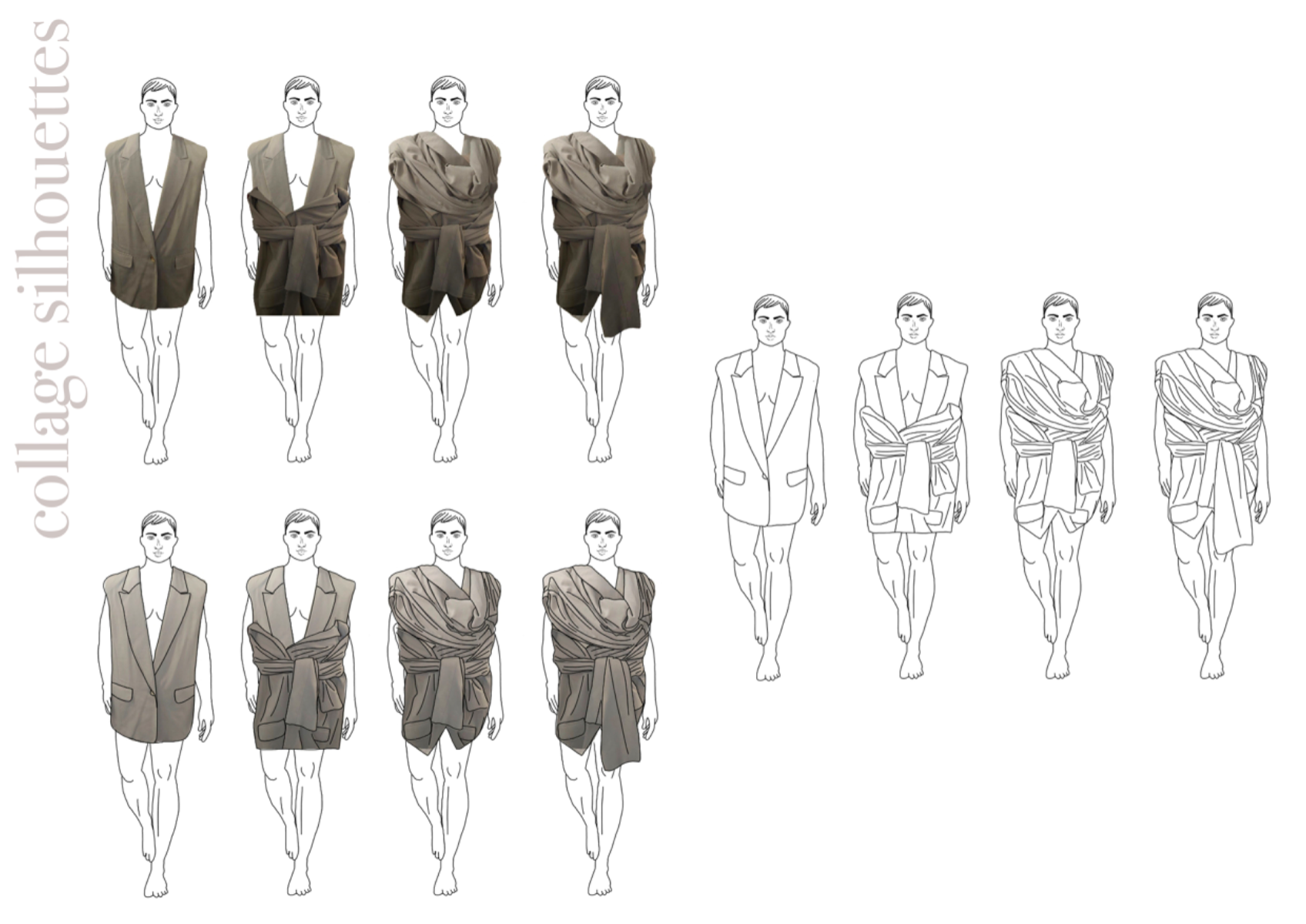
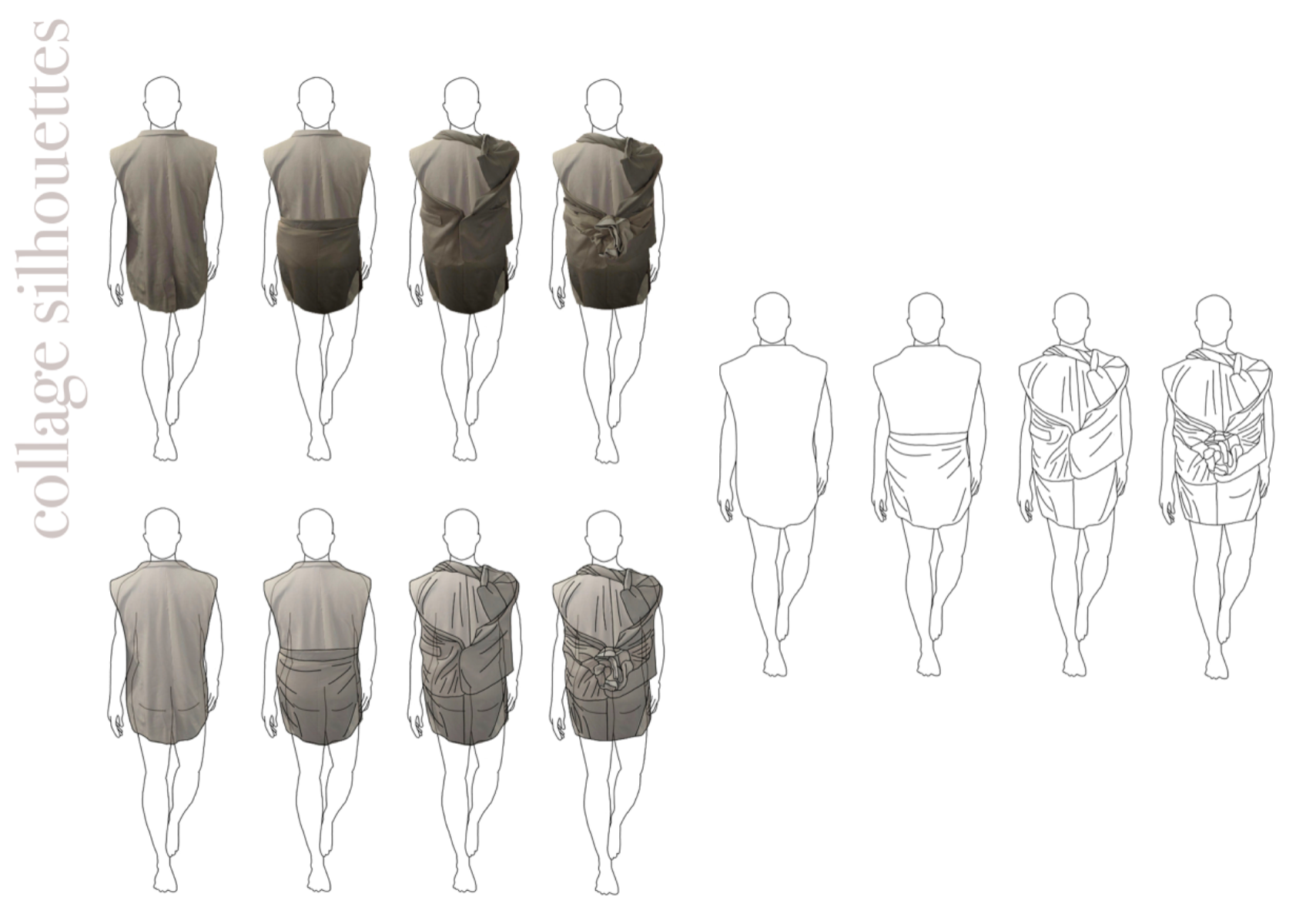
For this mini project to commence the second and final year of my Level 3 Extended Diploma at the Fashion Retail Academy, we used the previous project of reading a book and finding key themes to explore and design contextually for. I explored Blanche Dubois’ spiral into delusion and chaos from the play A Streetcar Named Desire. I delved into how there is deception and manipulation throughout the play, toying with Blanche and essentially making her mad. To follow with the common theme in my portfolio of a natural aesthetic (e.g. flora and fauna, symbolism in nature, natural settings), I thought it would be interesting to study how deception is very common in the animal kingdom. As this project would be purely digital due to its shorter length, I felt that this would give me scope to explore markings some animals possess; in particular, deceptive animals that appear beautiful on the outside but are lethal on the inside, like Blanche Dubois throughout the original play. She may have a movie star appearance, but she is mentally unstable and volatile beneath the mask she tries to keep up. I really enjoyed creating digital mark making pages by layering patterns and colour palettes from various softwares including kleki.com, Photoshop and ibisPaintX. The mark making was quick as it was digital using different textured brushes, as well as fun as a result of mixing colours and shapes based on secondary imagery I had researched. Due to developing our knowledge of industry processes with this shorter project, we began to learn about trend boards, PESTLE analysis, muse boards, colour boards, draping on the stand, collaged silhouettes, fashion mood boards and fabric boards. These were very fun to make, as well as educationally developmental, as it helped me see a clearer vision earlier into the research and development – we studied these specific boards, as well as other industry boards, further in projects that followed. I believe the project is very clear in what I was researching as I went along, especially as I clearly laid out my collage silhouettes (from sketchbook work), fashion mood boards, then final line ups.
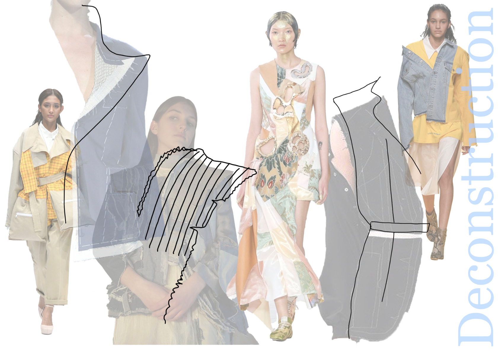
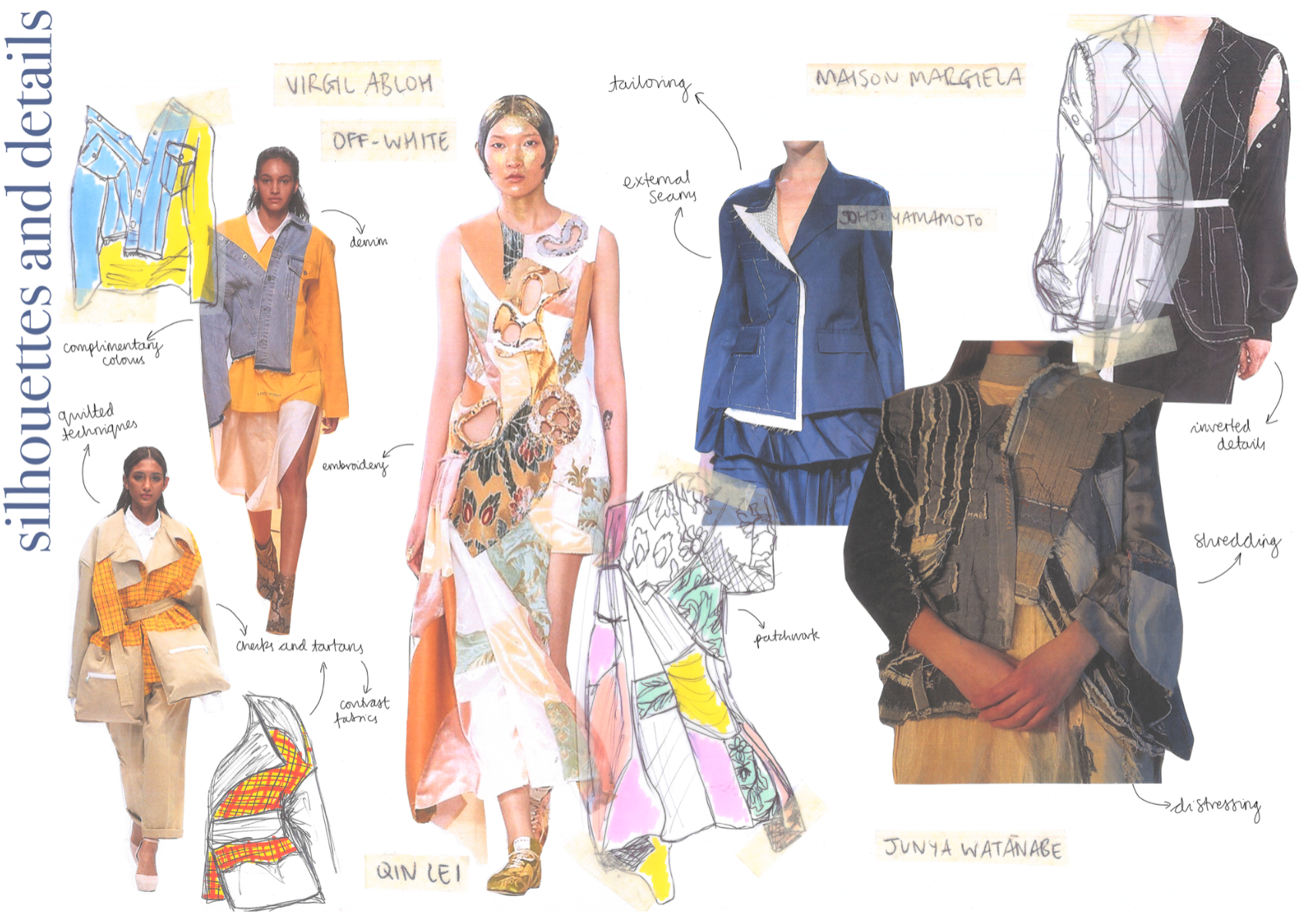
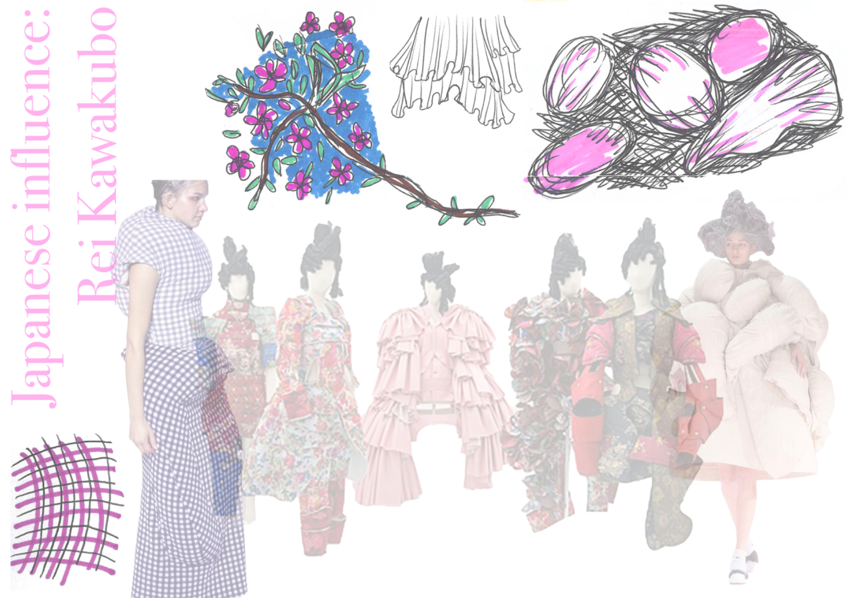
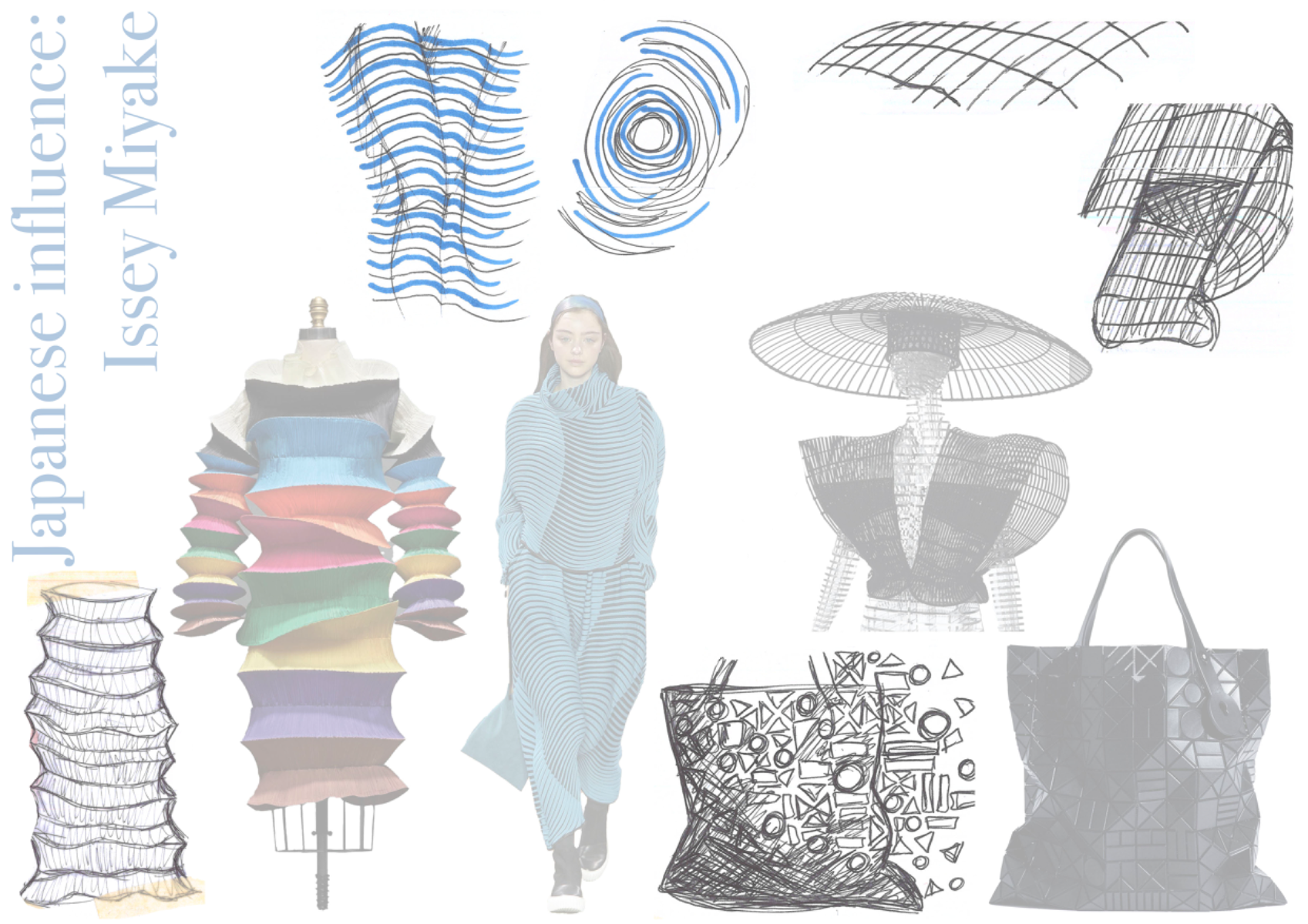
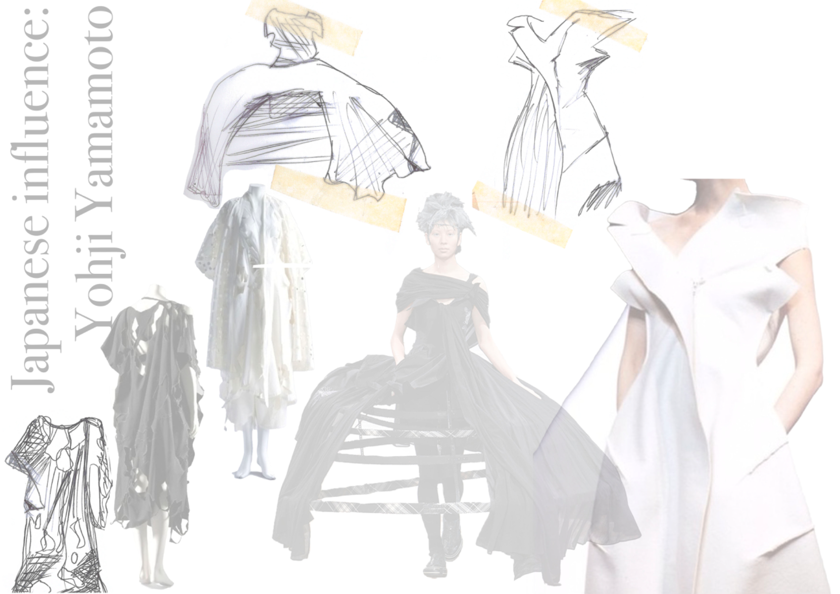
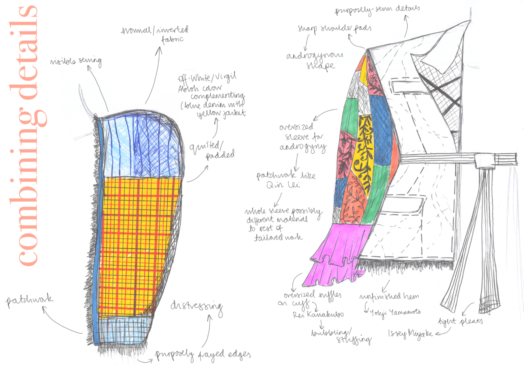
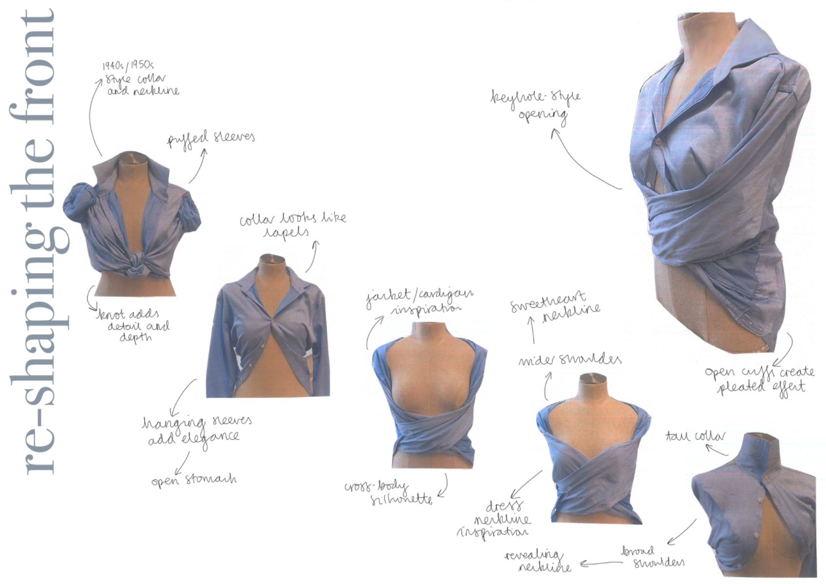
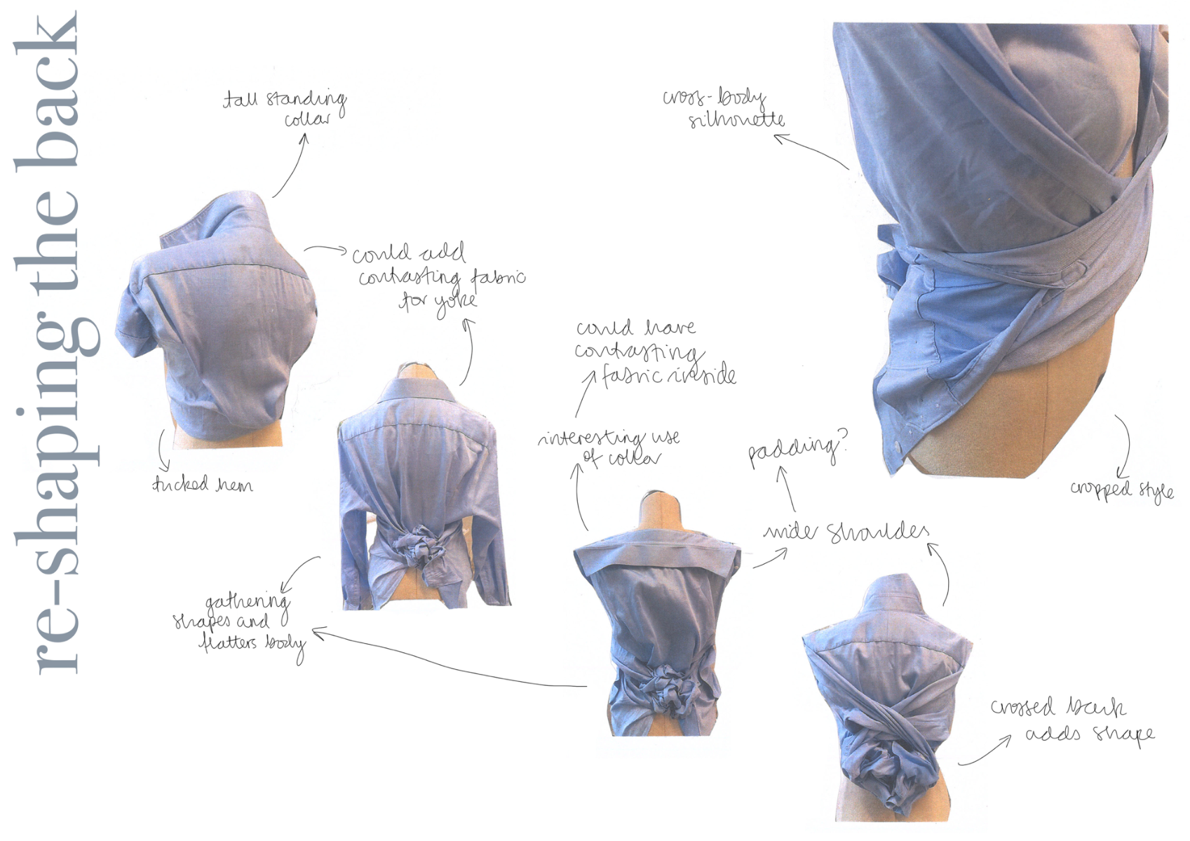
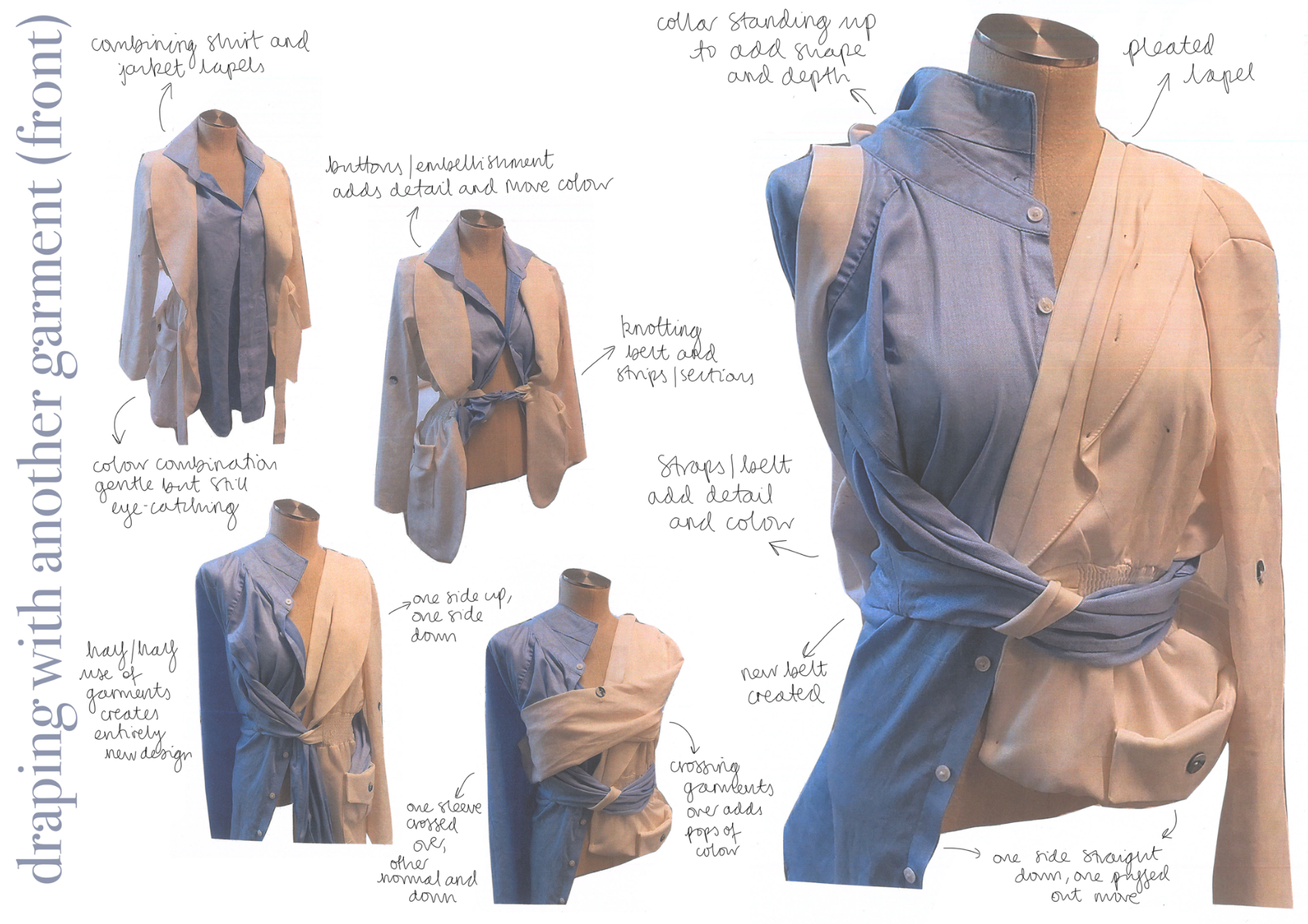
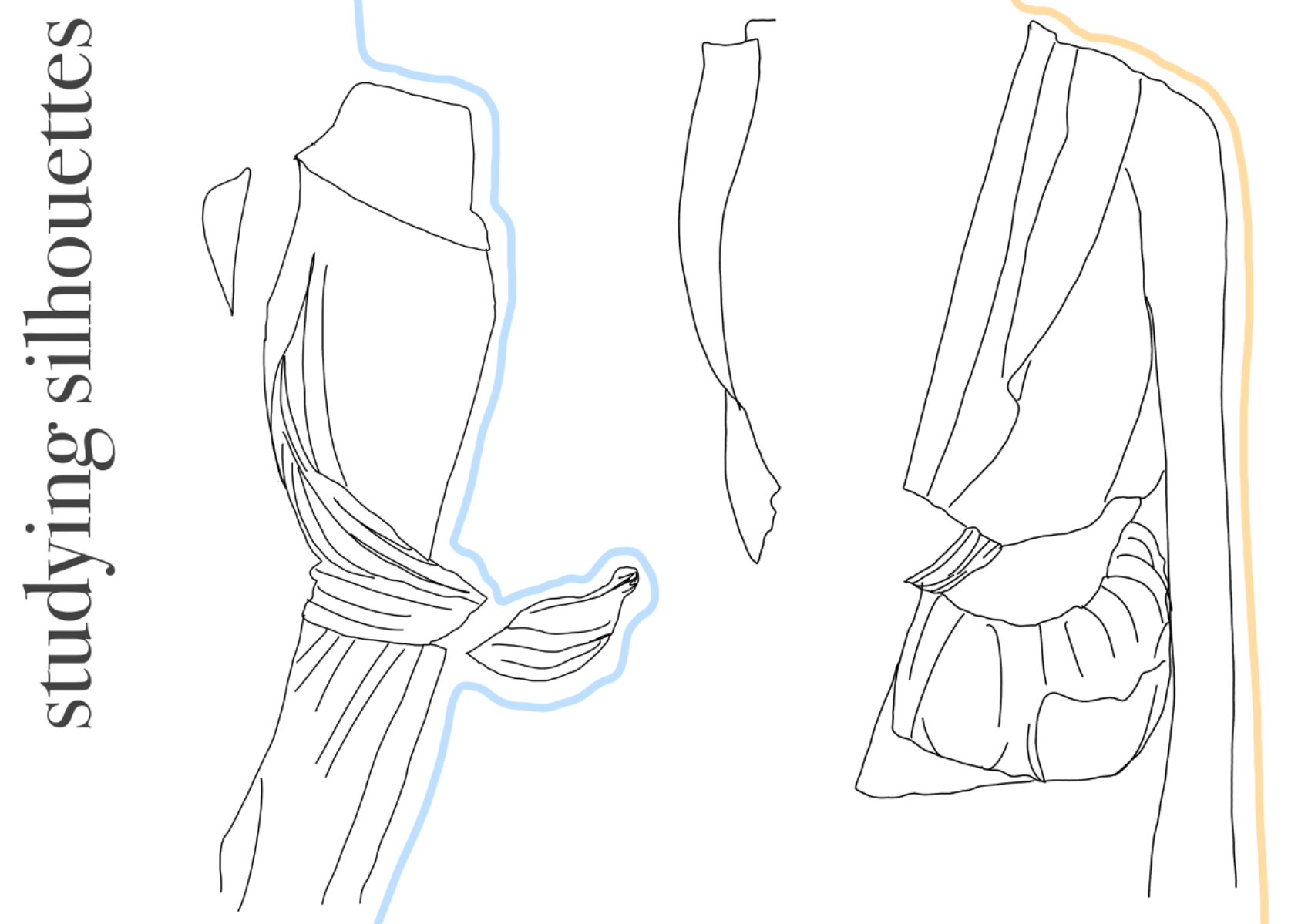
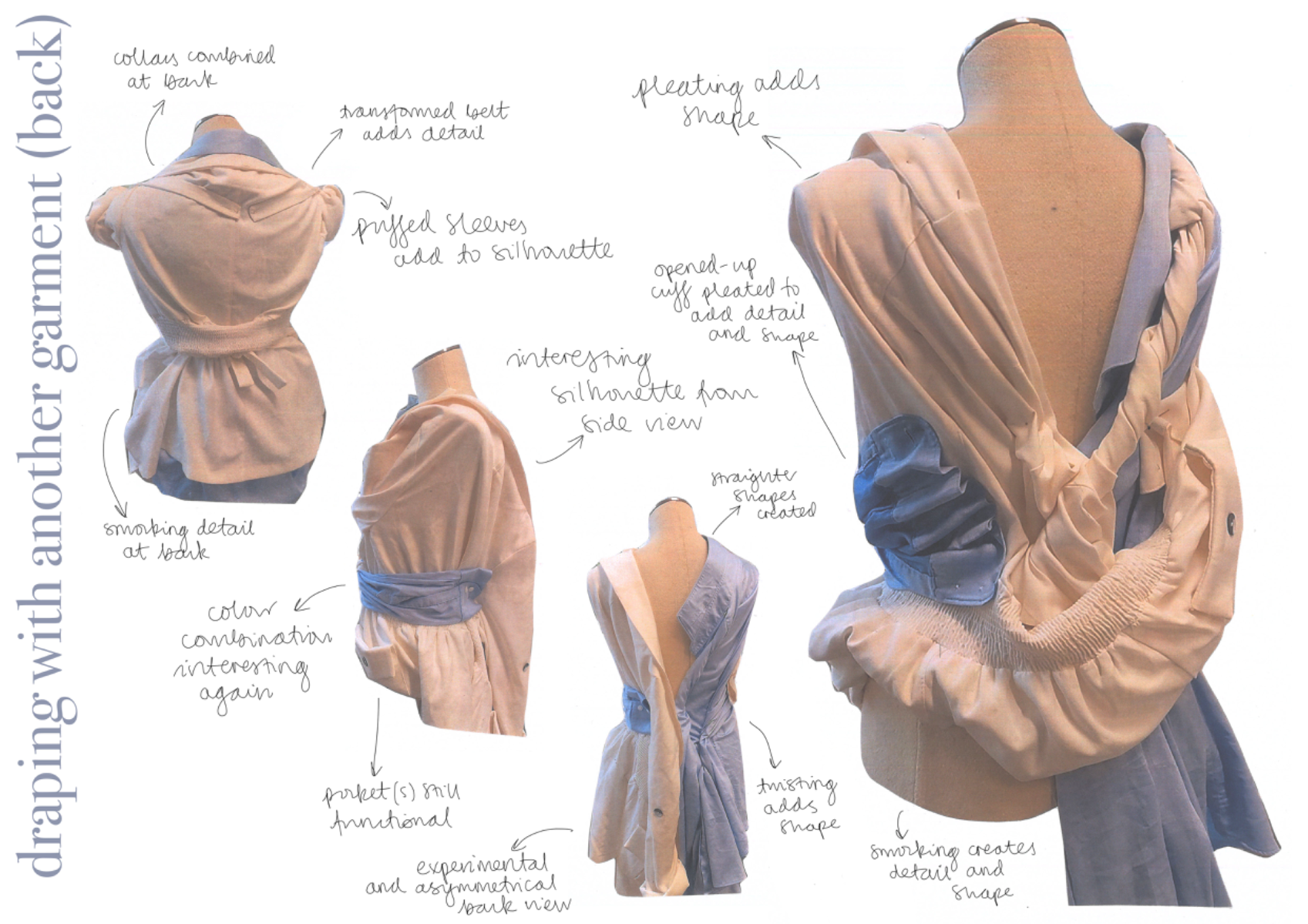
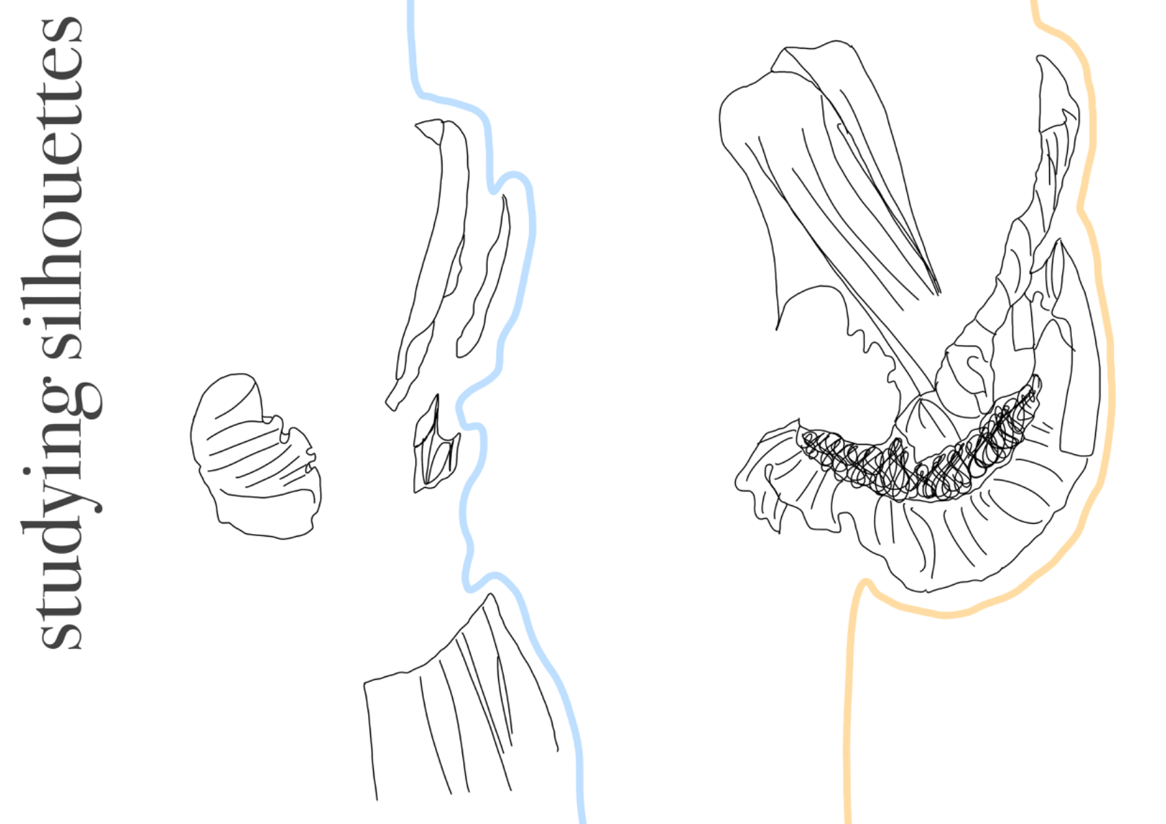
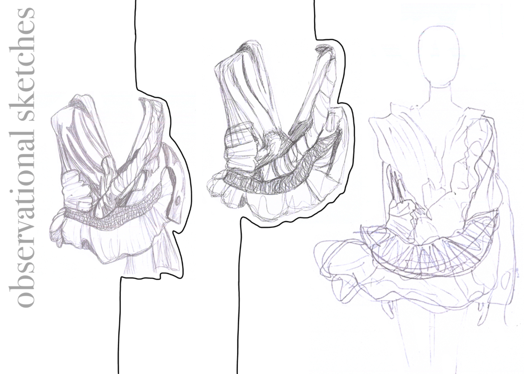
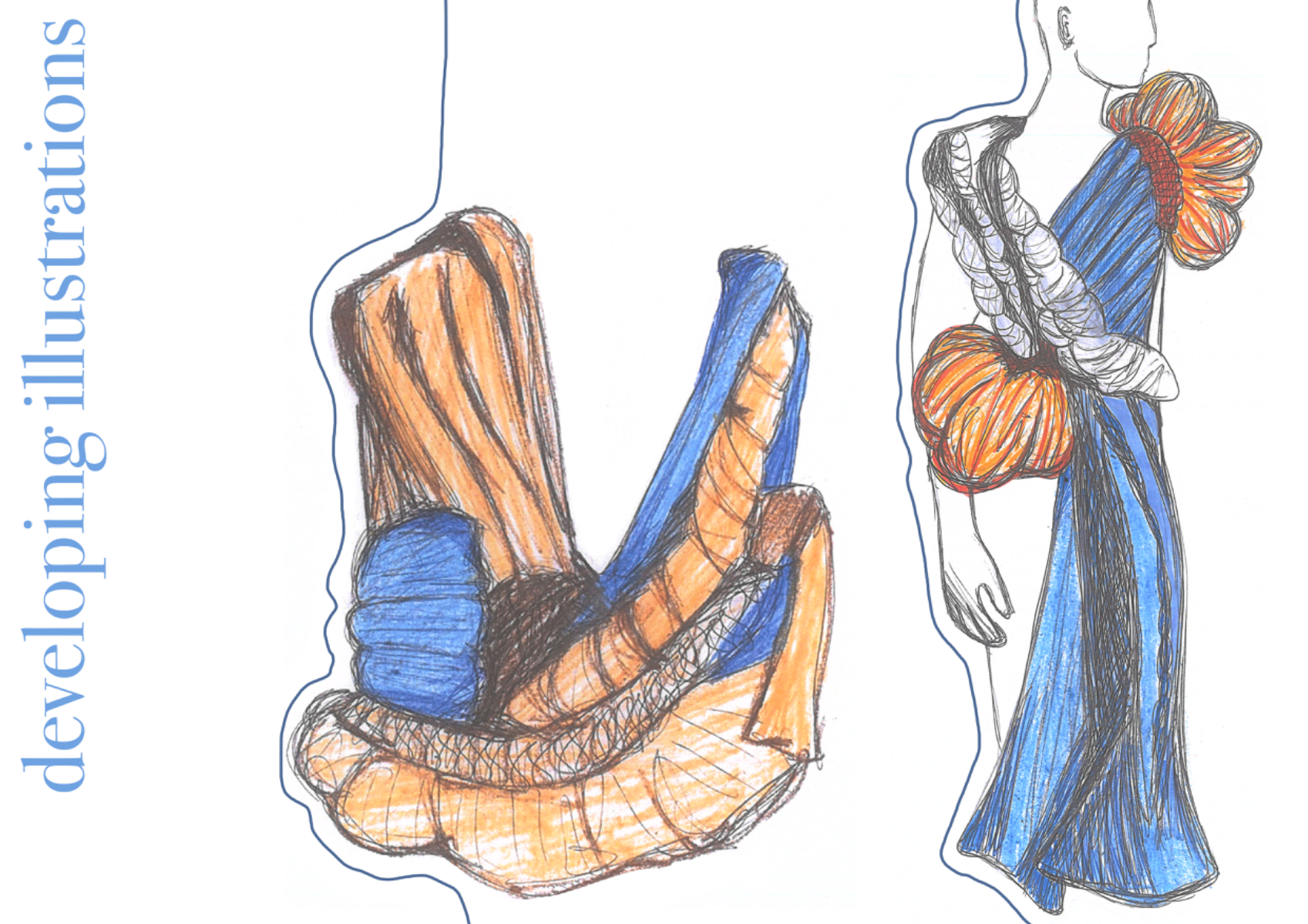
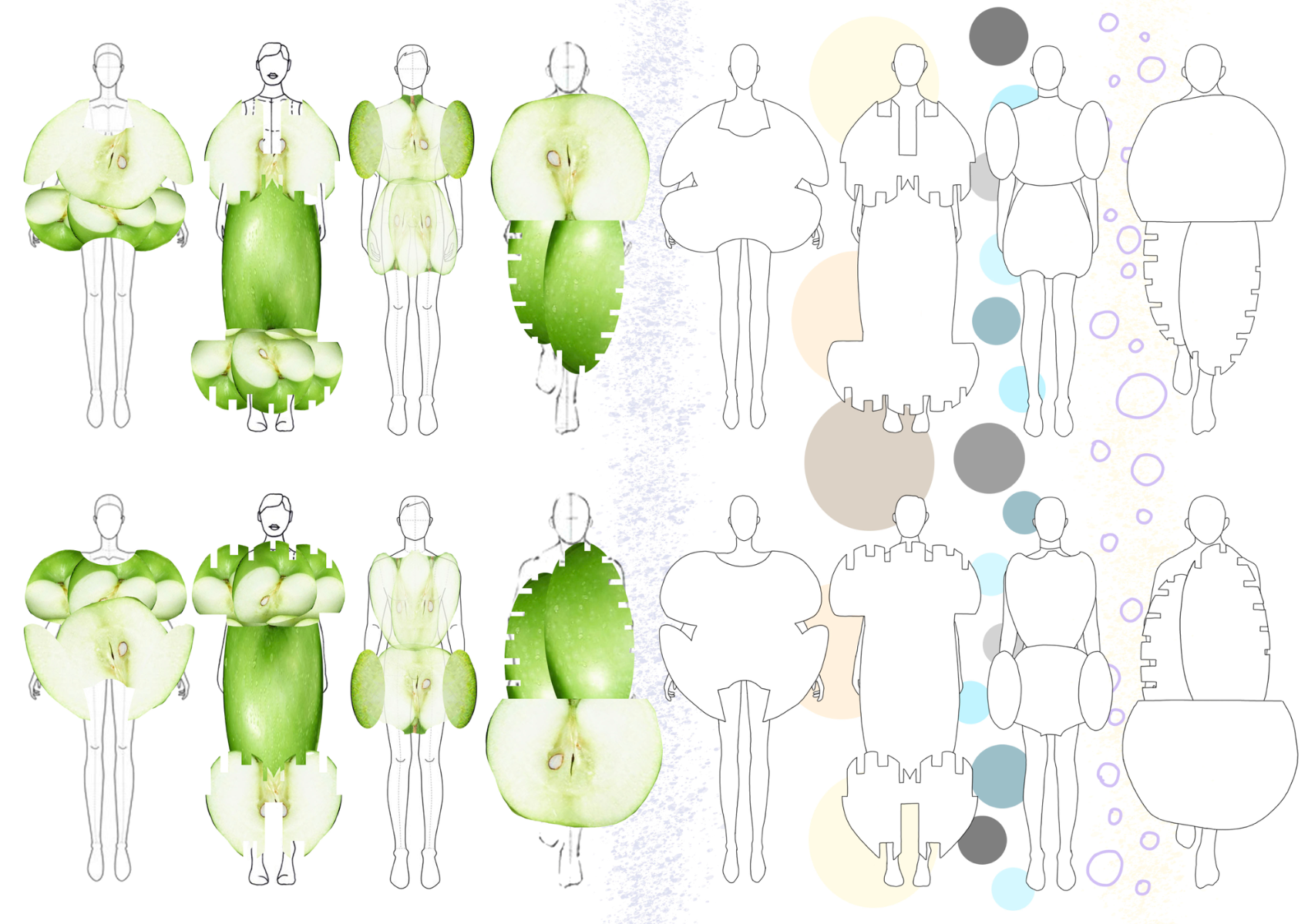
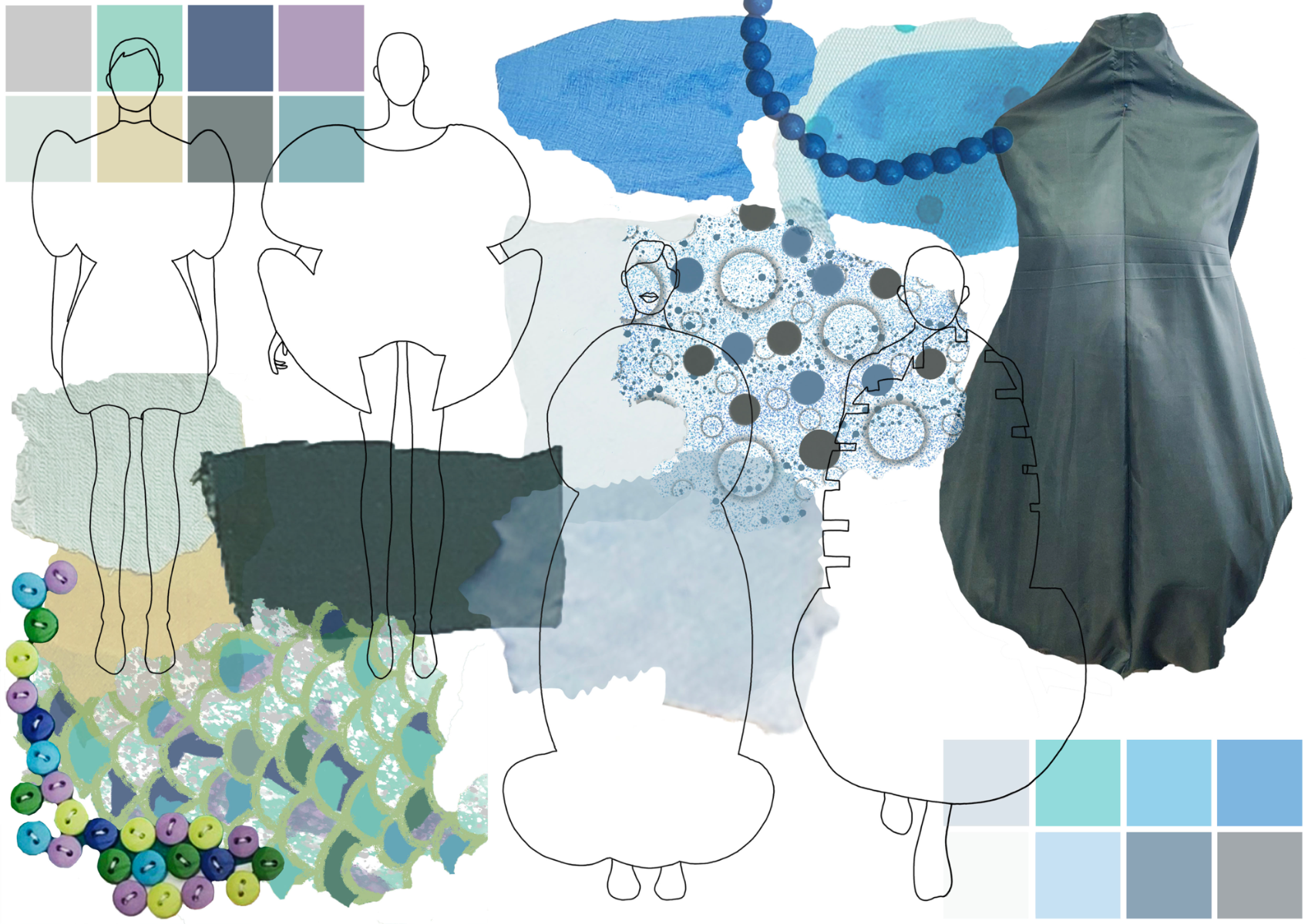
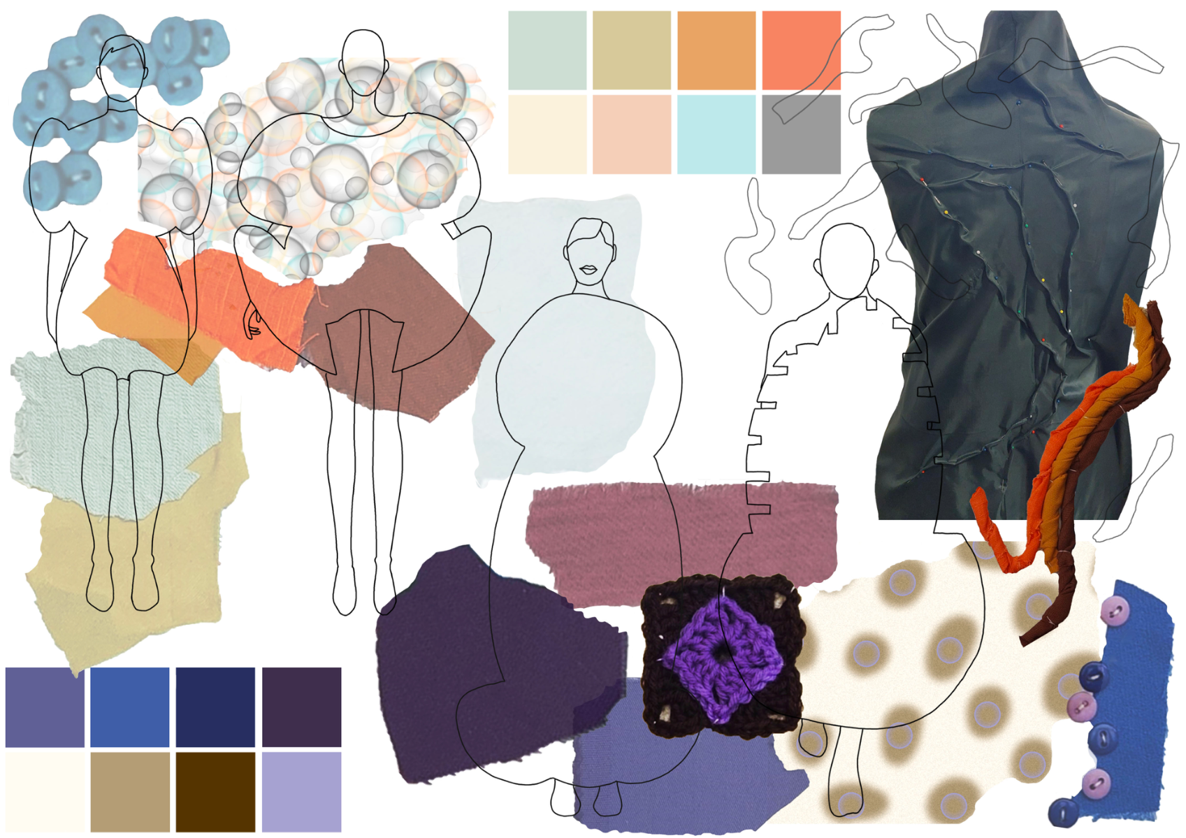
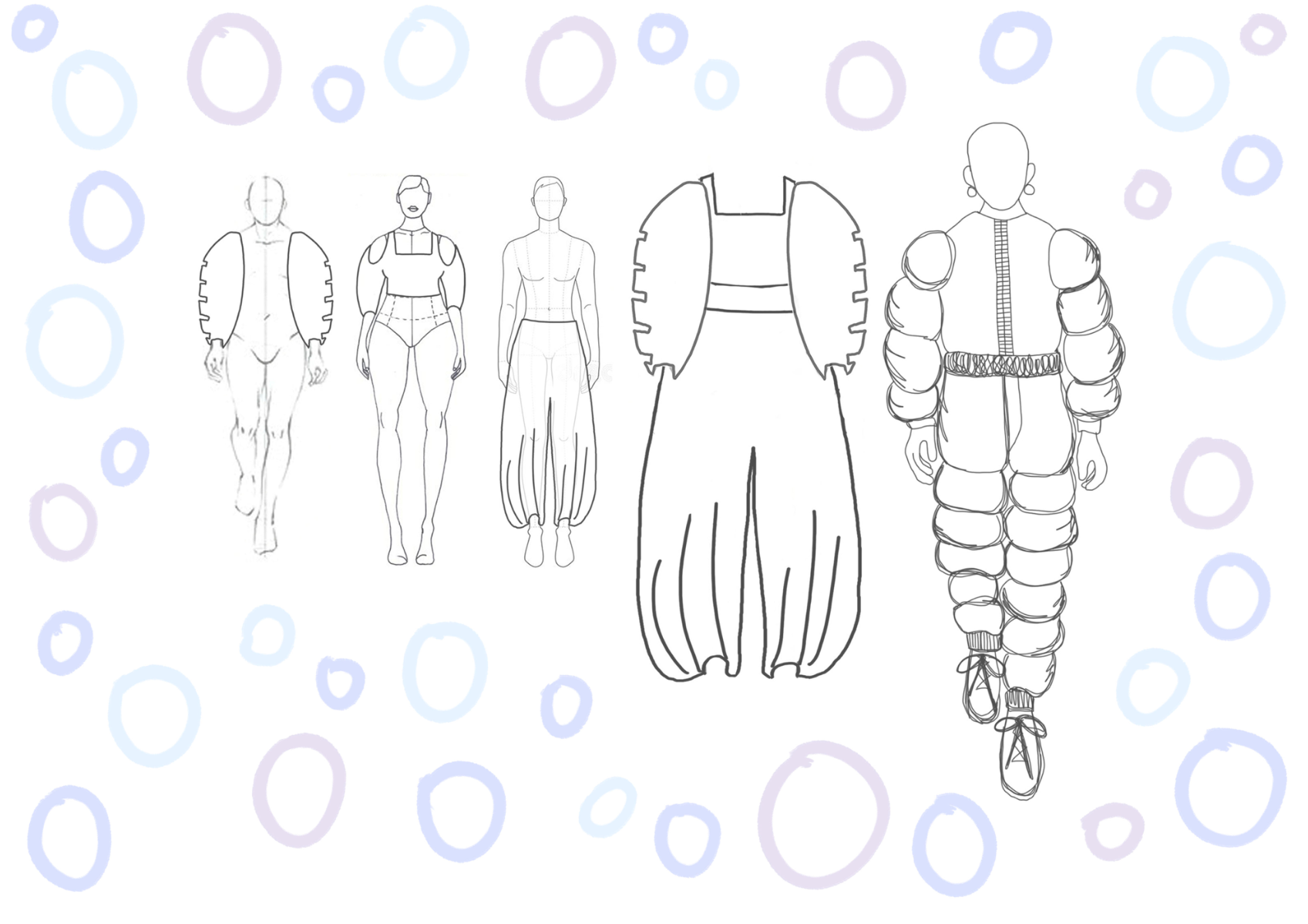
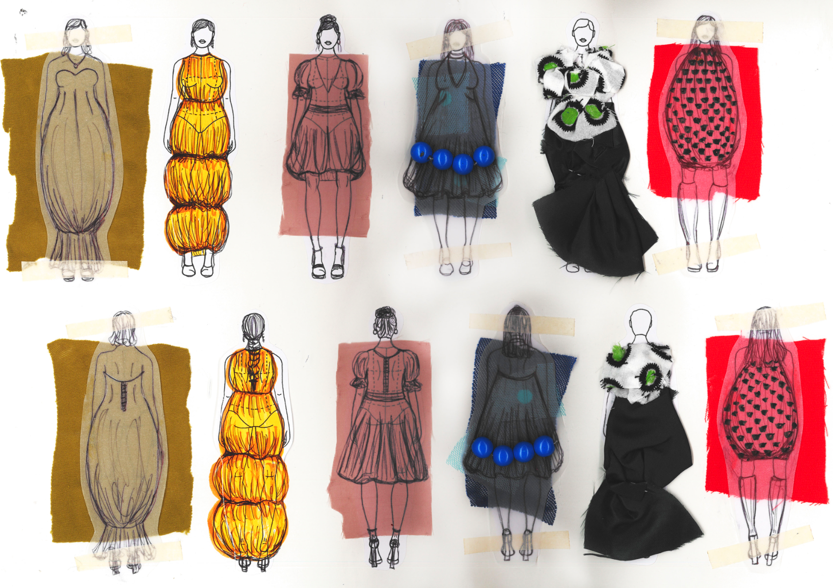
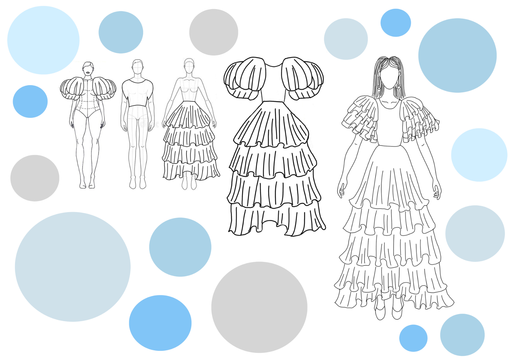
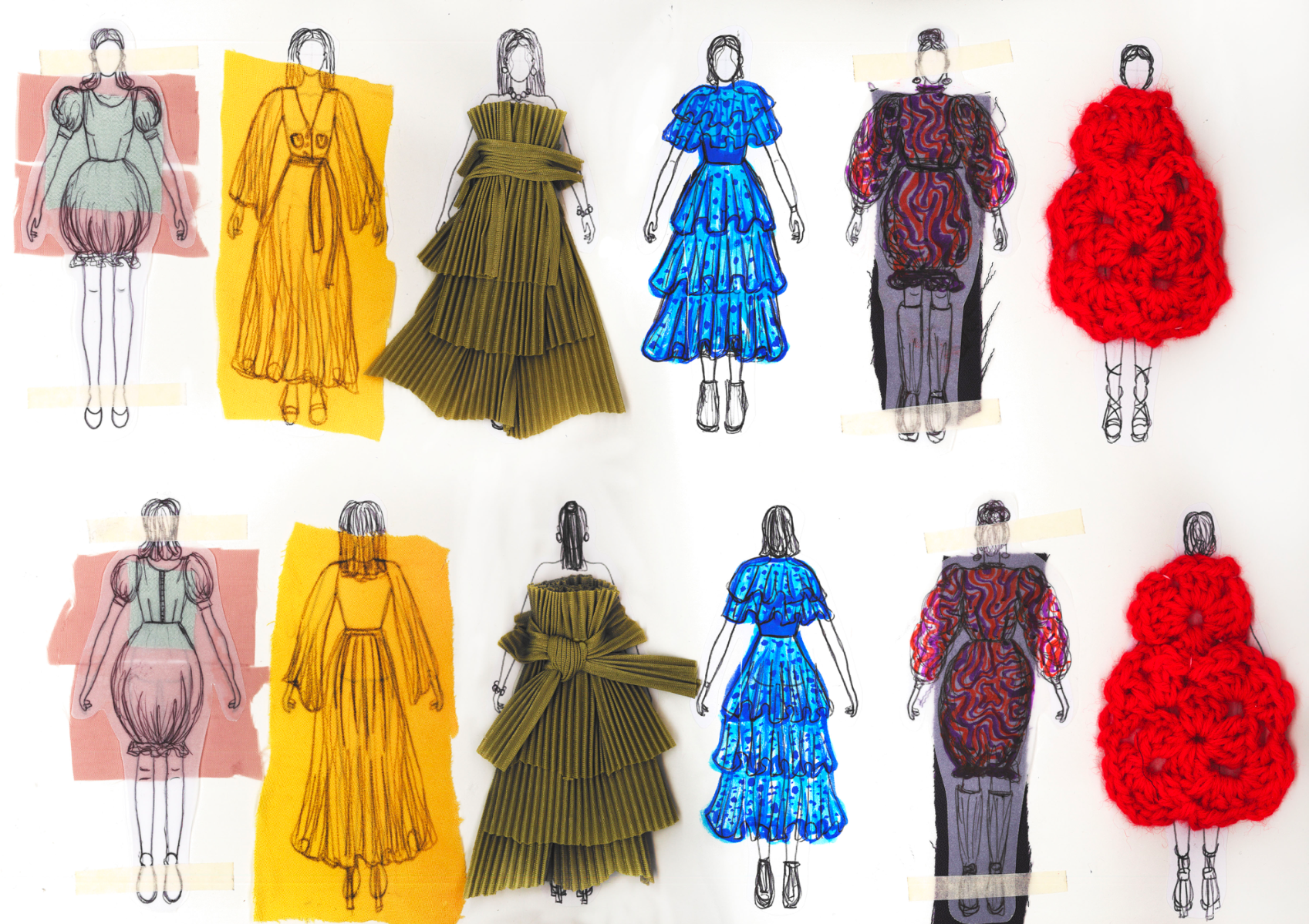
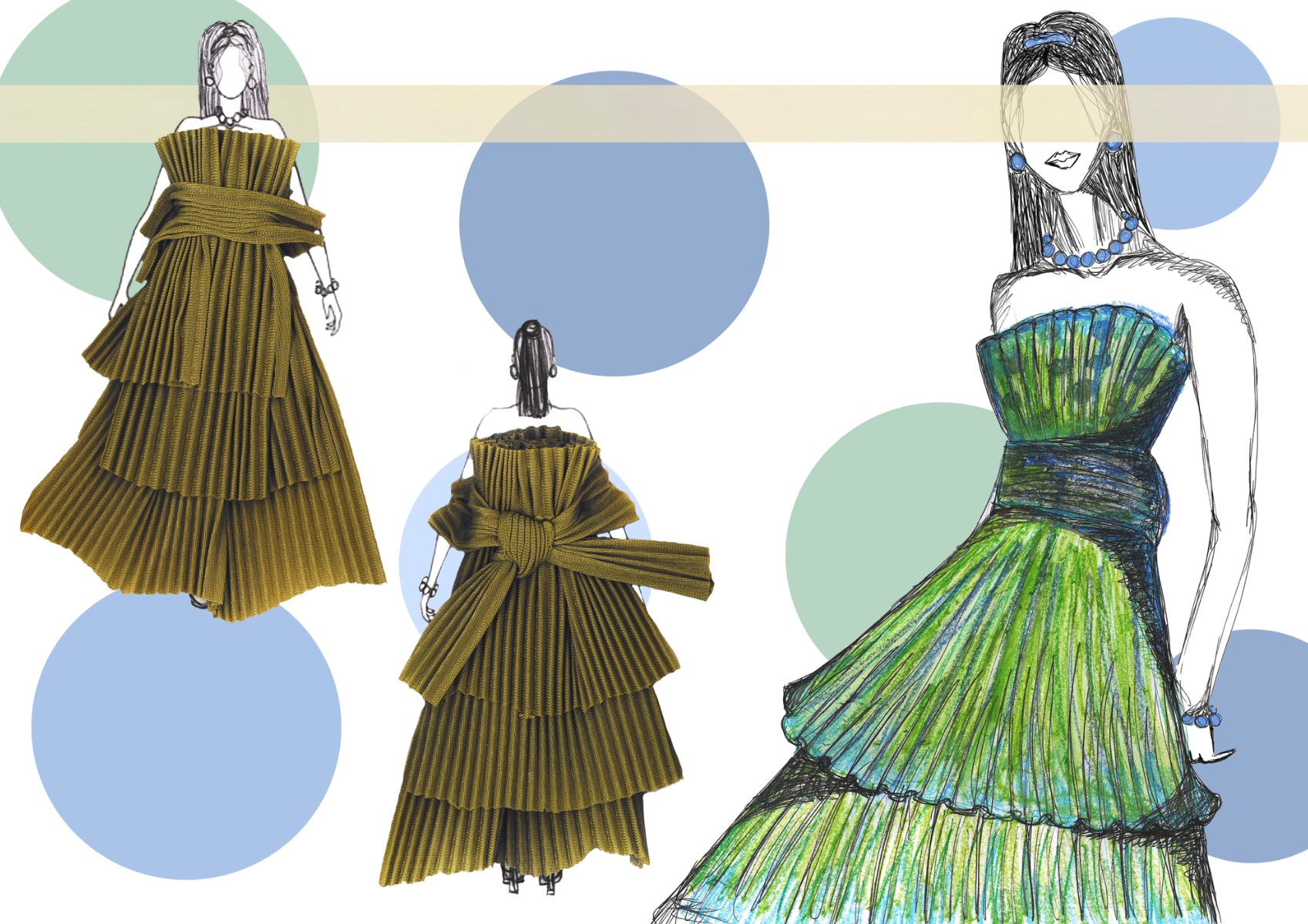
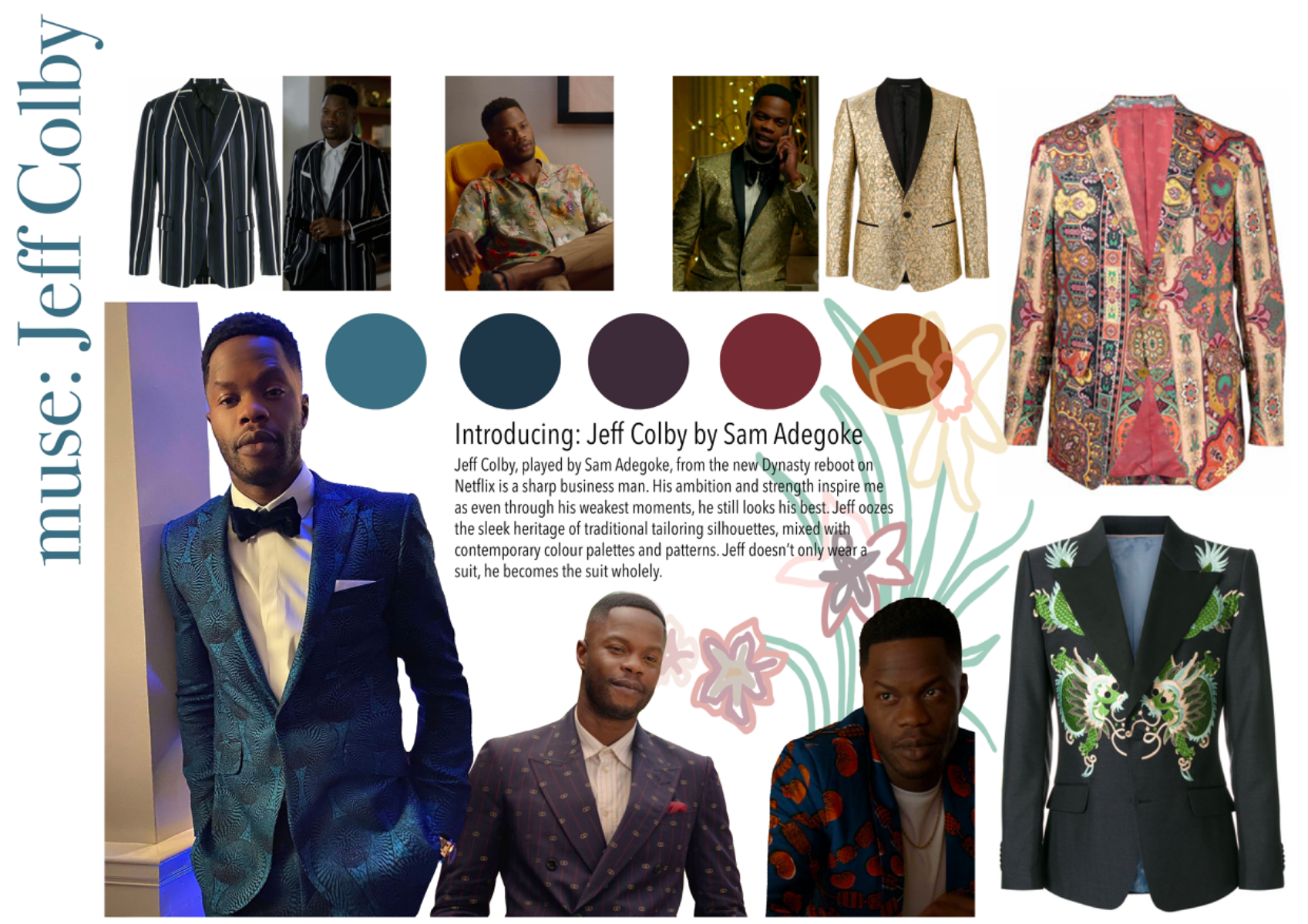
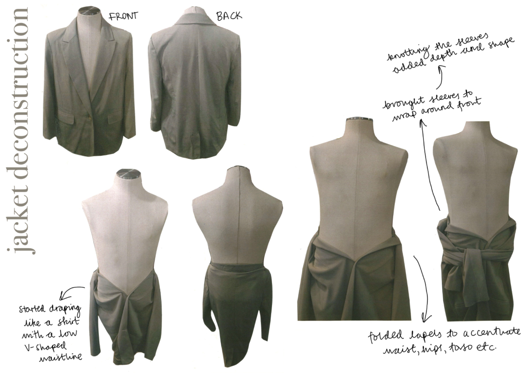
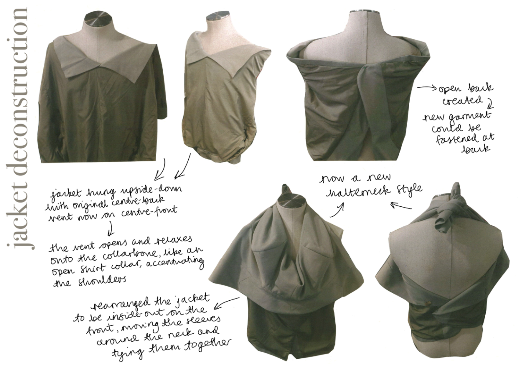
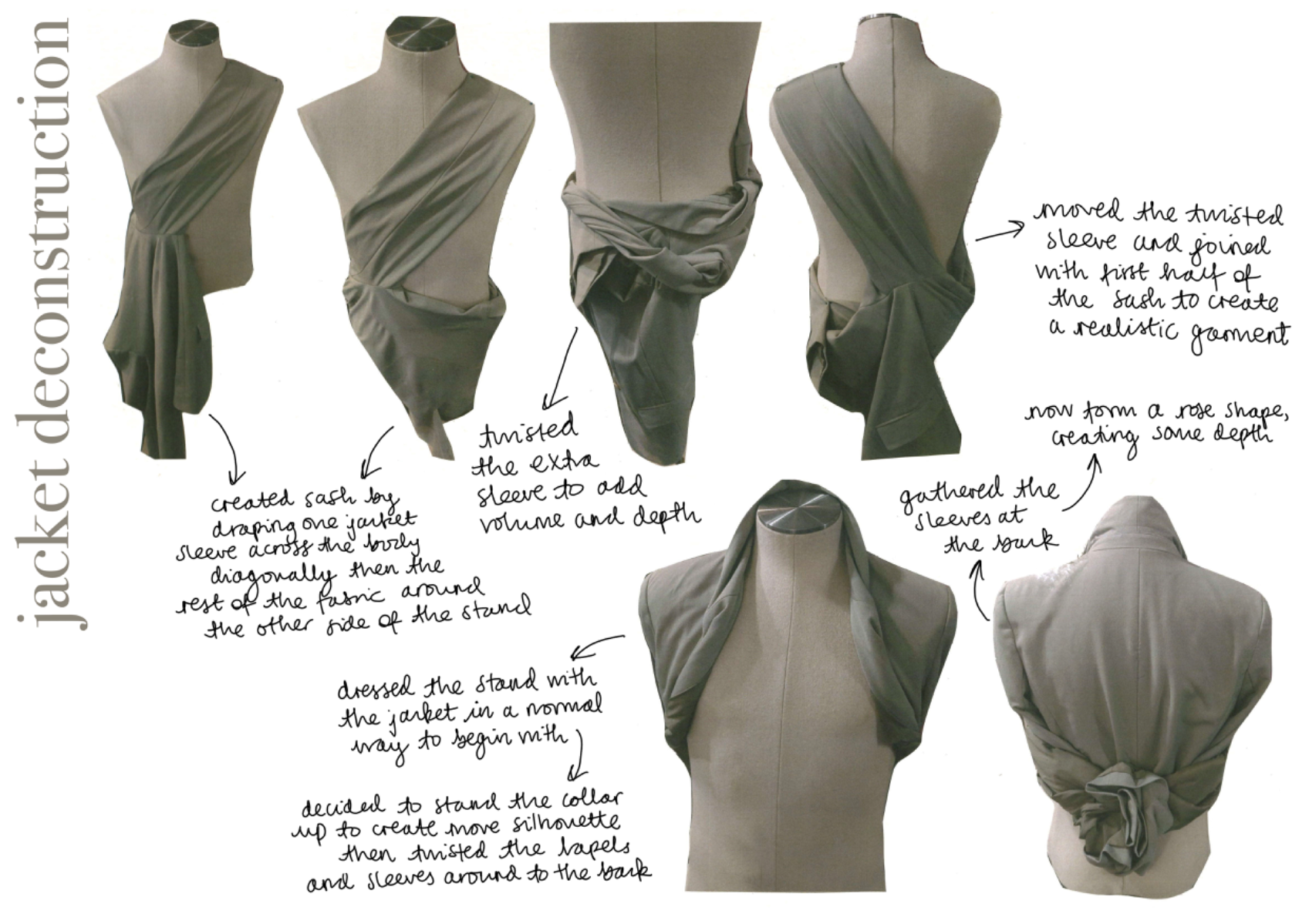
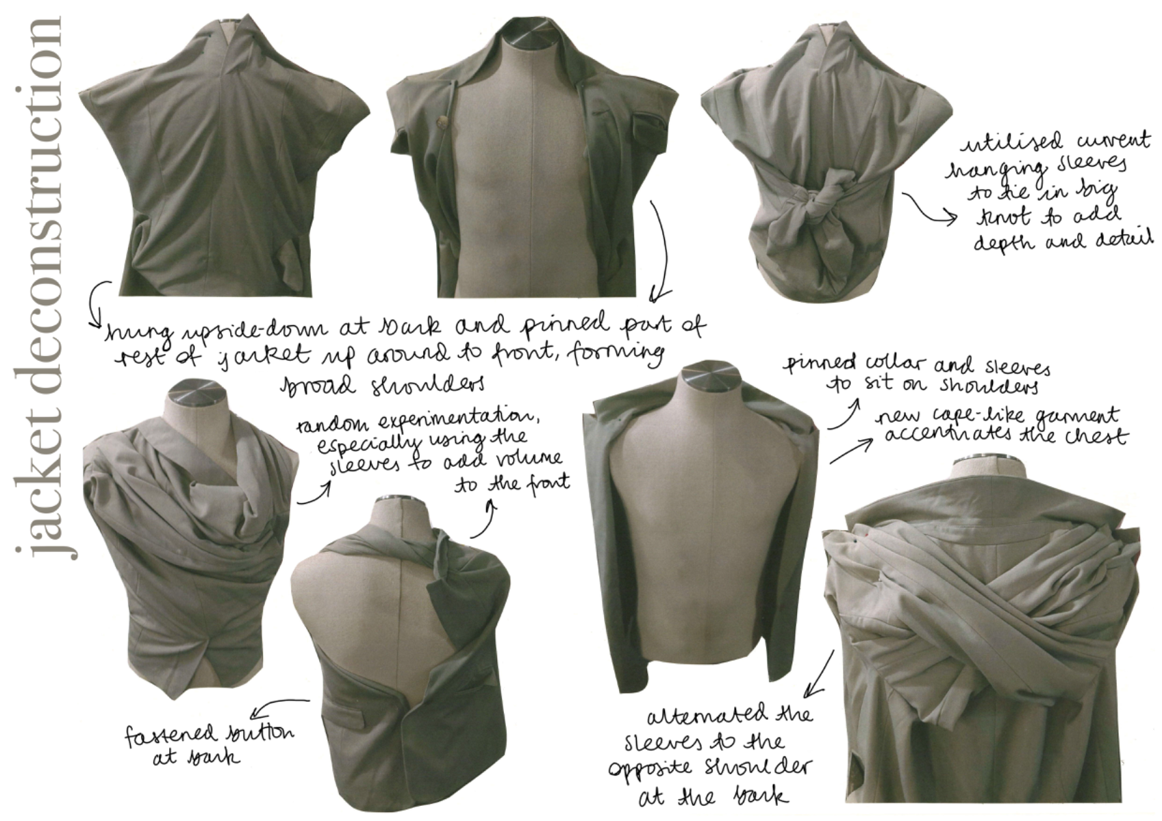
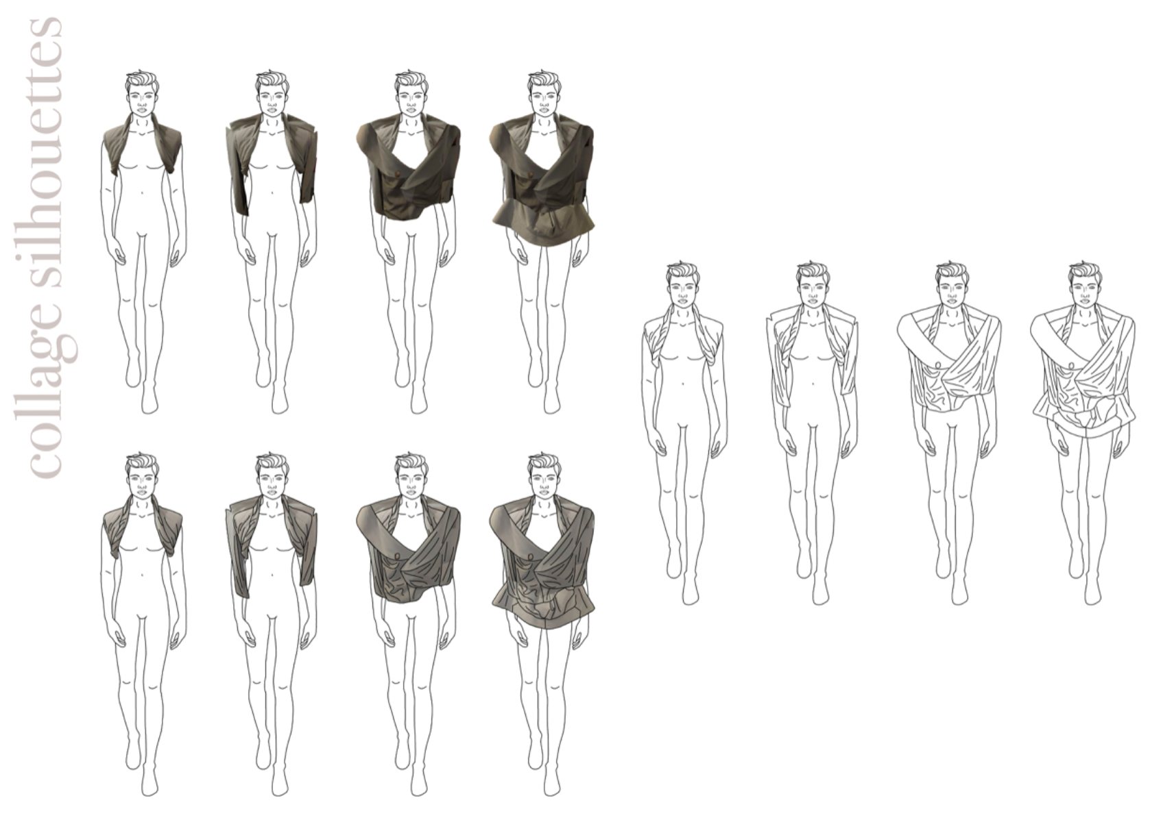
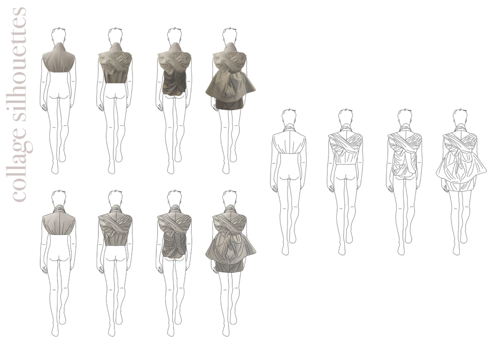
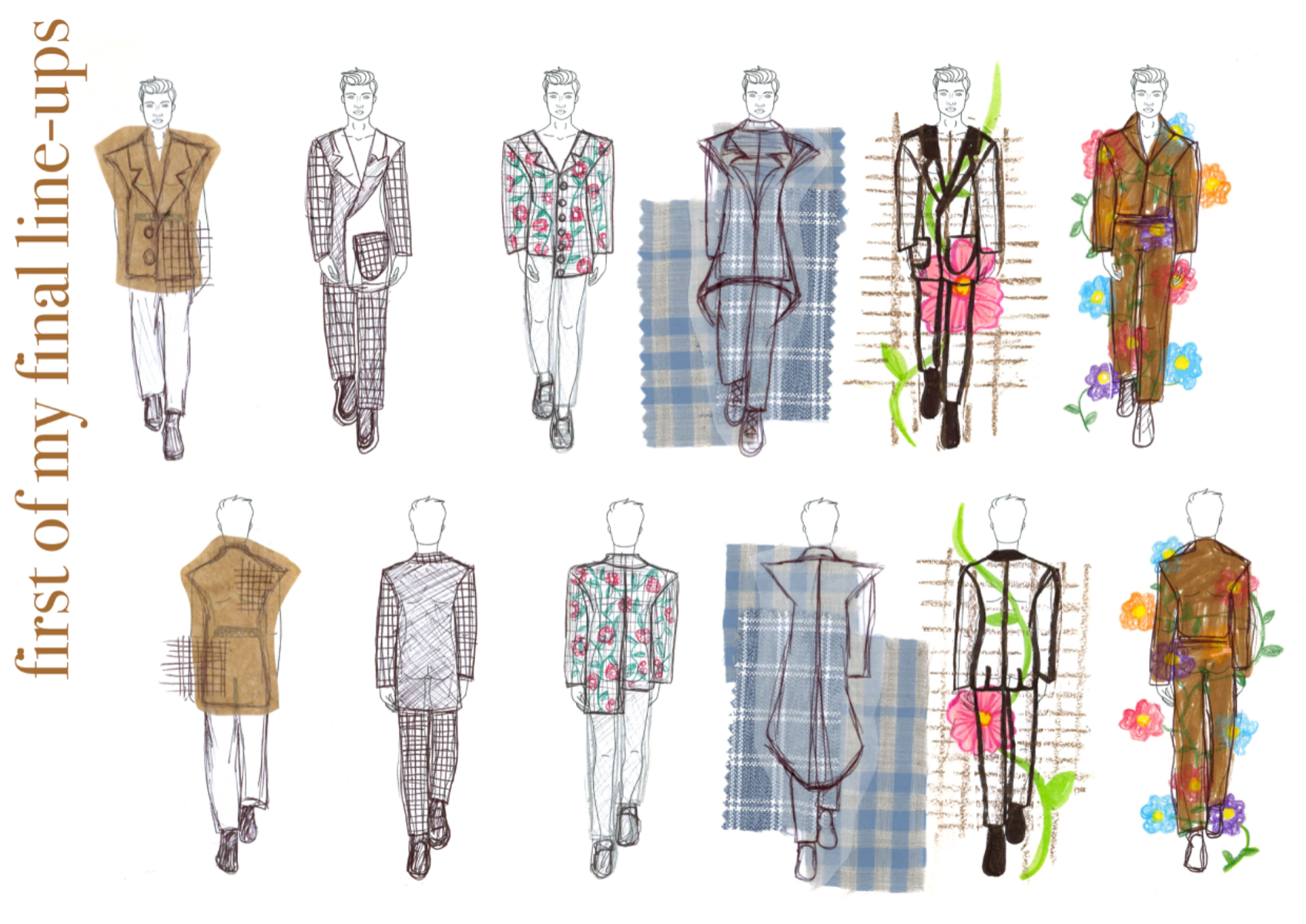
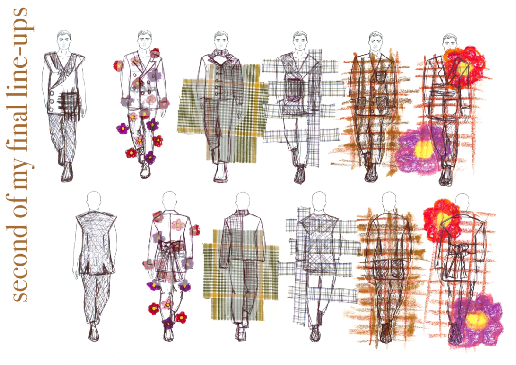
This mini project based on deconstructed fashion aided me to explore my true strengths with a very modern approach in mind. To commence a piece of deconstructed fashion, draping on the stand is incredibly effective for helping you see new design ideas (whether practical or not as the details come much later). I discovered many luxury fashion designers who employ a deconstructed approach for their runway looks and decided to mind map these with reference images, names/labels and illustrations on top to show that I understand where the deconstruction is occurring. Illustration and fine art being my forte with previous projects, I ensured I embedded it where possible to show my true strength. Following my basic name-dropping research, I decided to focus on a few designers that stood out to me: Rei Kawakubo's bulbous silhouettes and floral prints layered over each other; Issey Miyake's unusual silhouettes and intelligent use of line to create shape and tones to give his designs lots of character and realism even in a picture; Yohji Yamamoto's sometimes shredded garments to create a dramatic silhouette and communicate his meaning but also sharp and angular silhouettes to create a striking presence. To explore my own deconstructed garment, I took an old shirt from work that I would play around with to achieve a whole new look and different garment entirely. I got straight to draping and began using the sleeves and collar to create some new silhouettes, both on the front and back. I then partnered with one of my peers and we combined our garments (my shirt and her jacket). The silhouettes created are very contemporary and most definitely possible to see on the runway as a deconstructed piece. Following the imagery, I decided to sketch out my new silhouette using an observational approach. The left image on the 'observational sketches' slide is a 15 minute detailed pencil sketch of the back view of my final deconstructed garment, the middle a 5 minute blind contour drawing (I impressed myself with my accuracy) and the right a 5 minute non-dominant hand fashion illustration. The following slide commences my design development, creating a detailed sketch in colour, then an A3 fashion illustration, then line ups (the next slides) using a collaged silhouette approach. I was very satisfied with this project as I believe it creates variety and shows versatility in my portfolio. My application of my strength of illustration and digital collaging aids my communication of silhouette, colour and detail very effectively throughout the project.
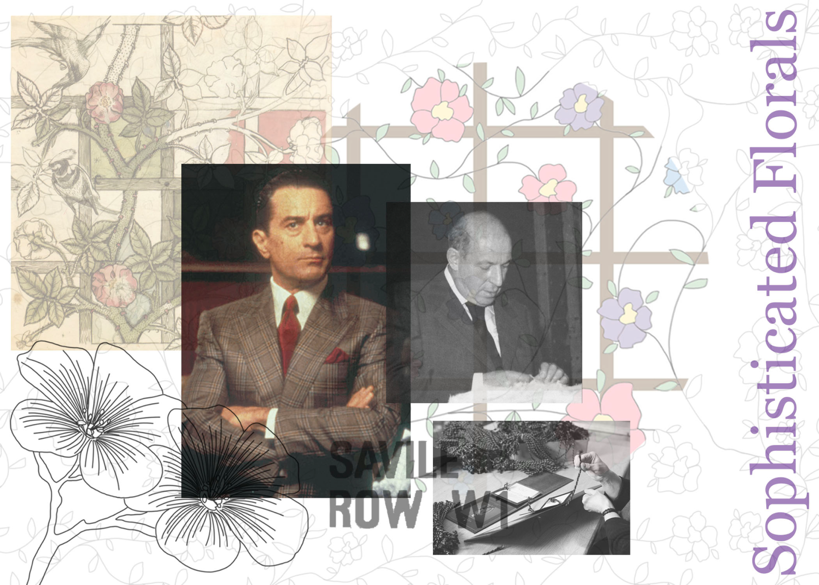
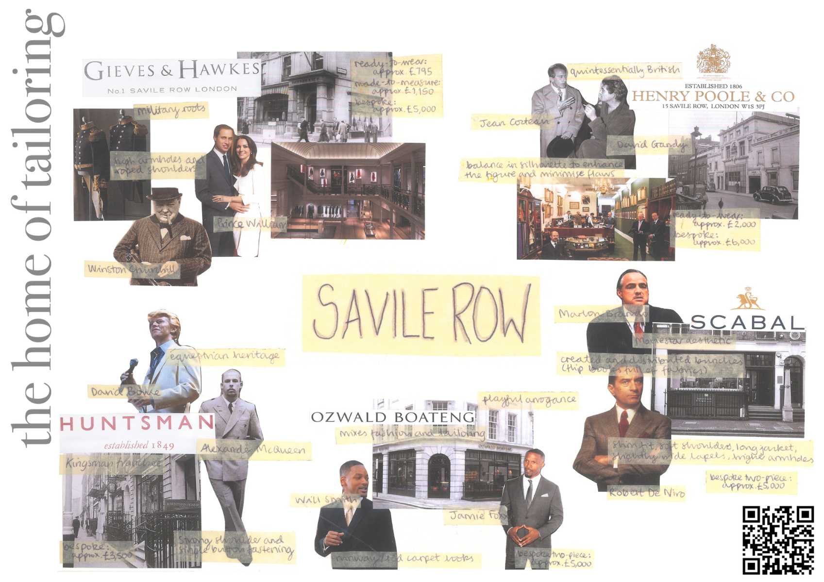
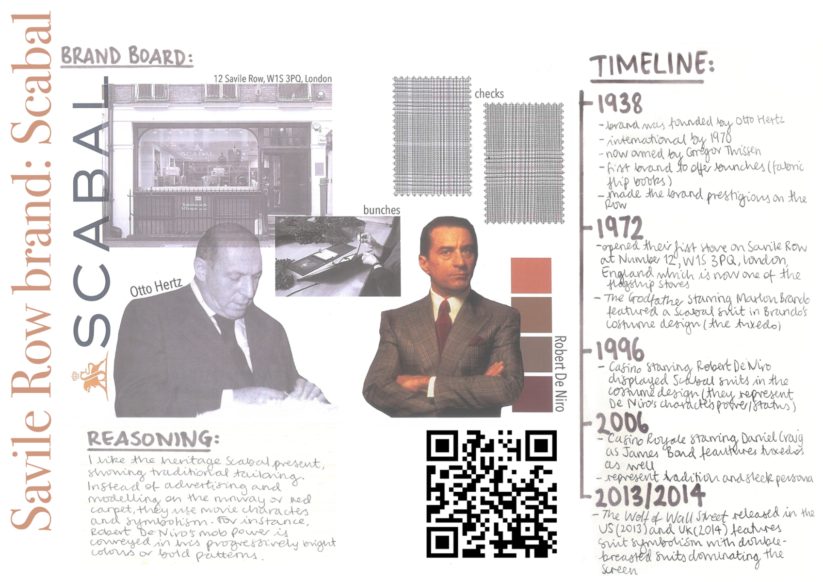
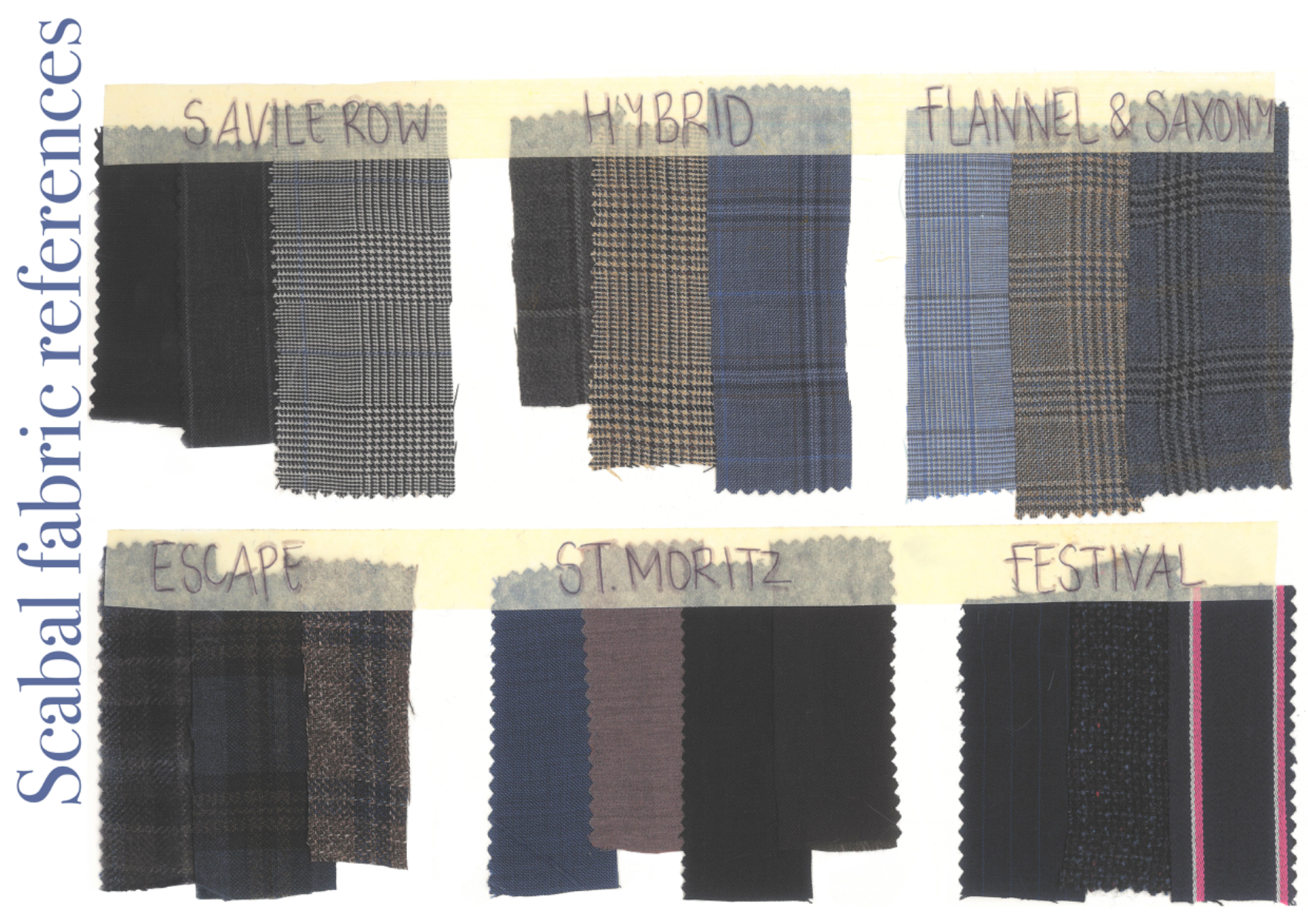
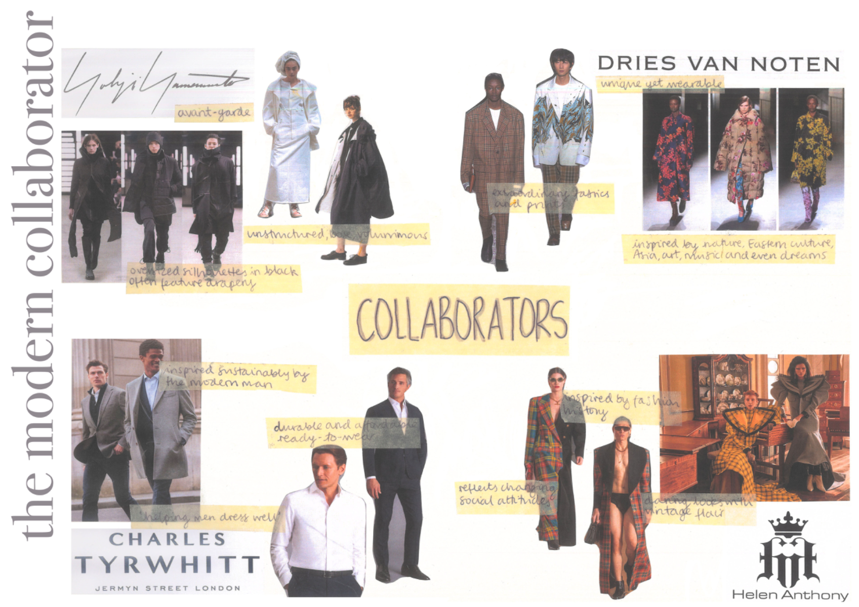
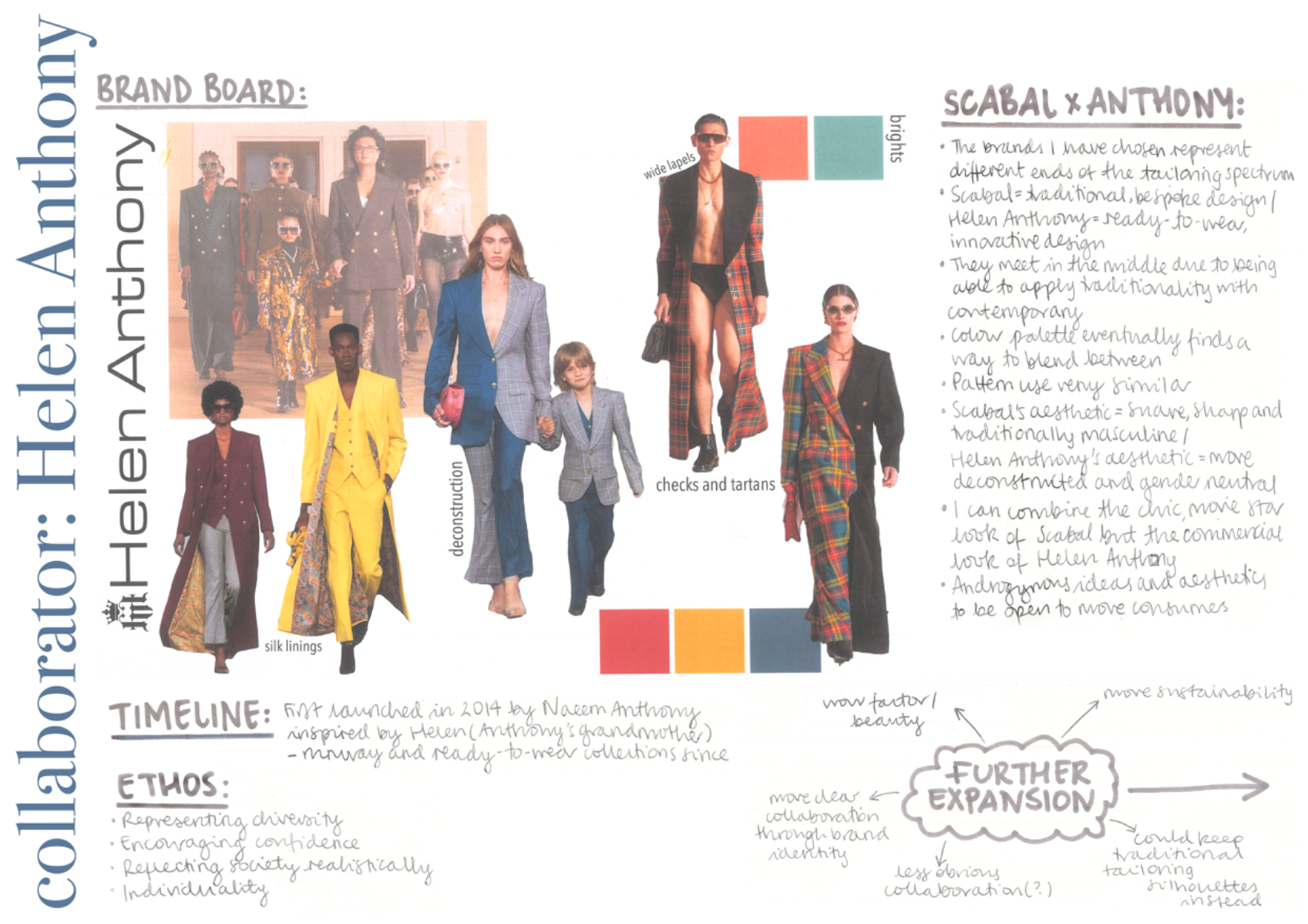
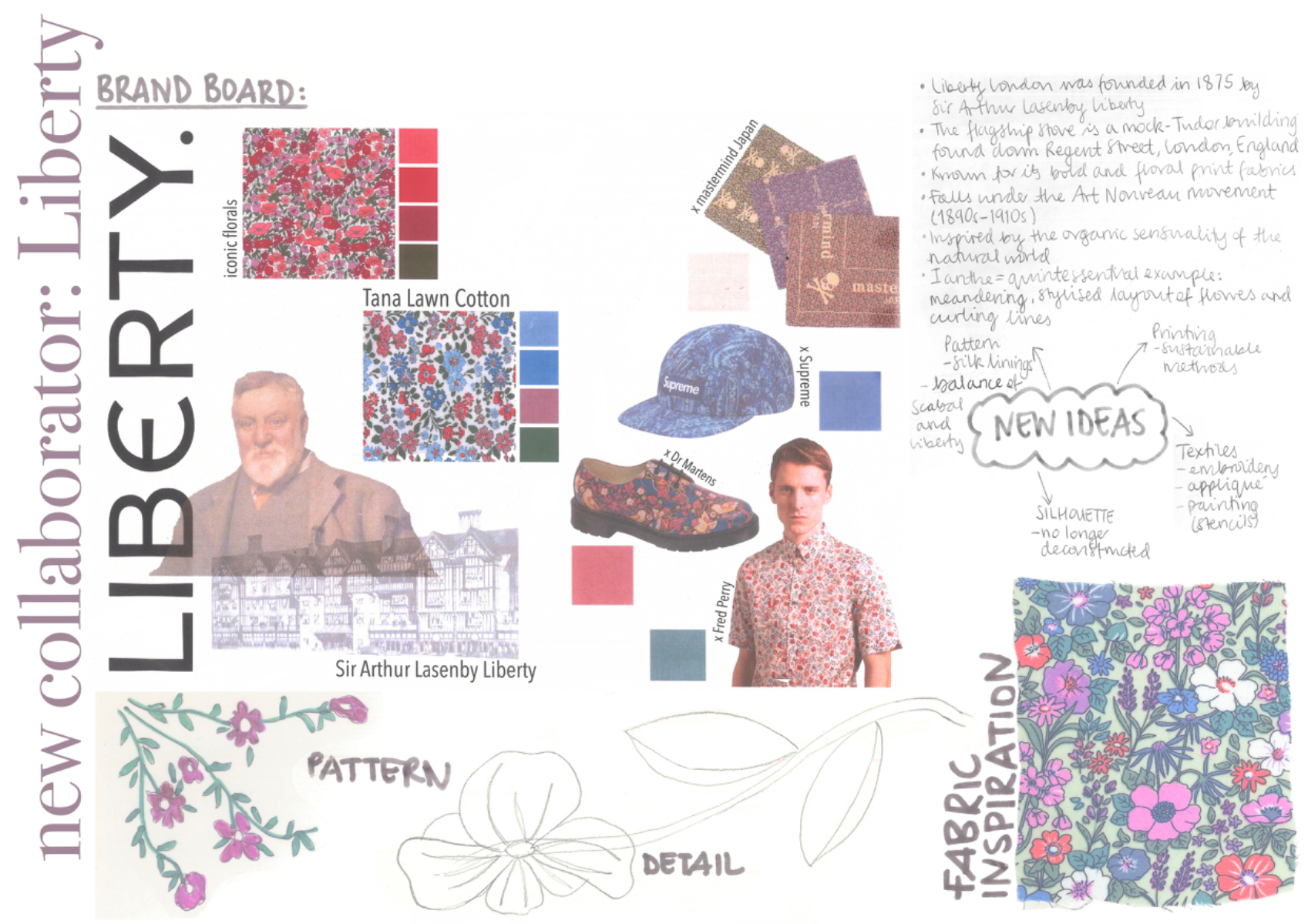
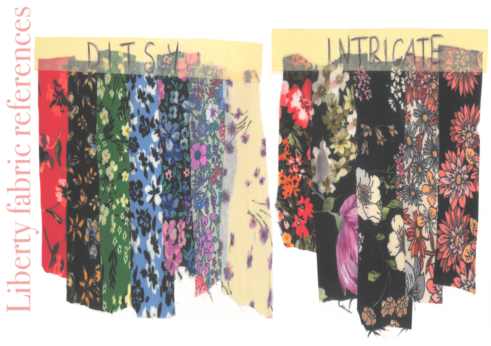
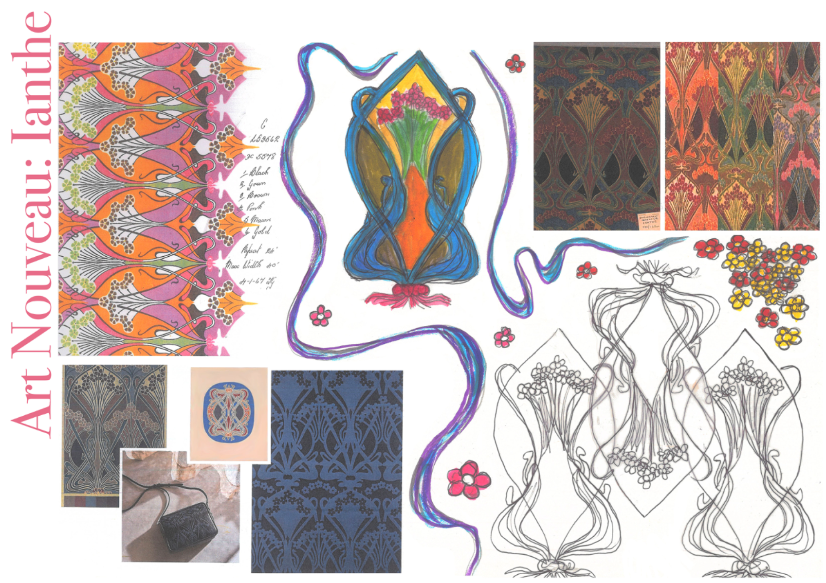
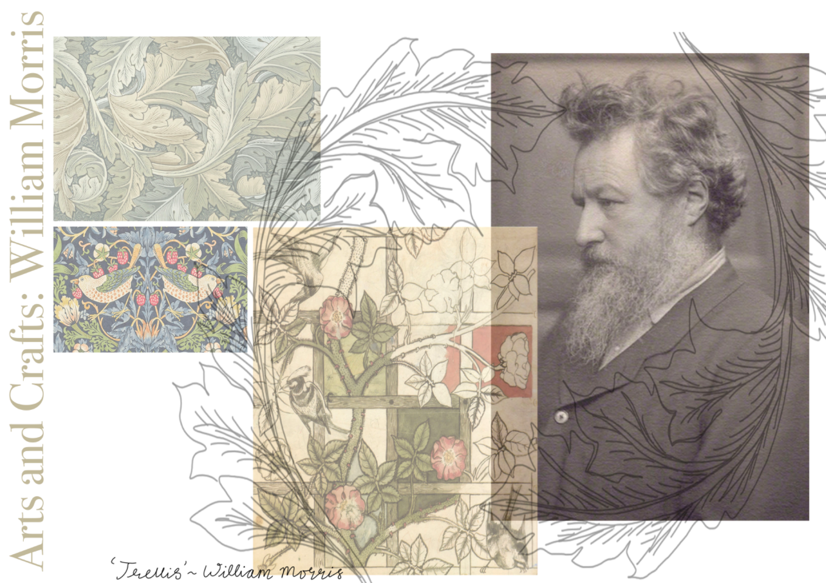
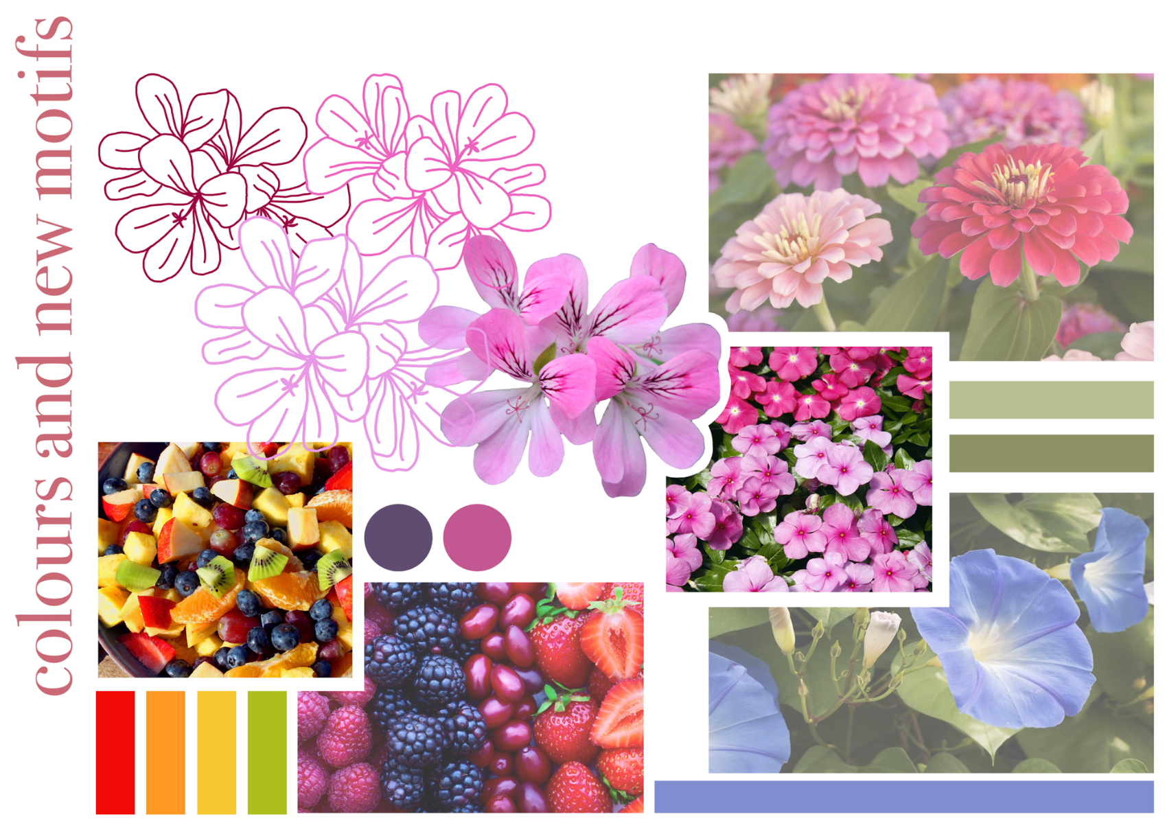
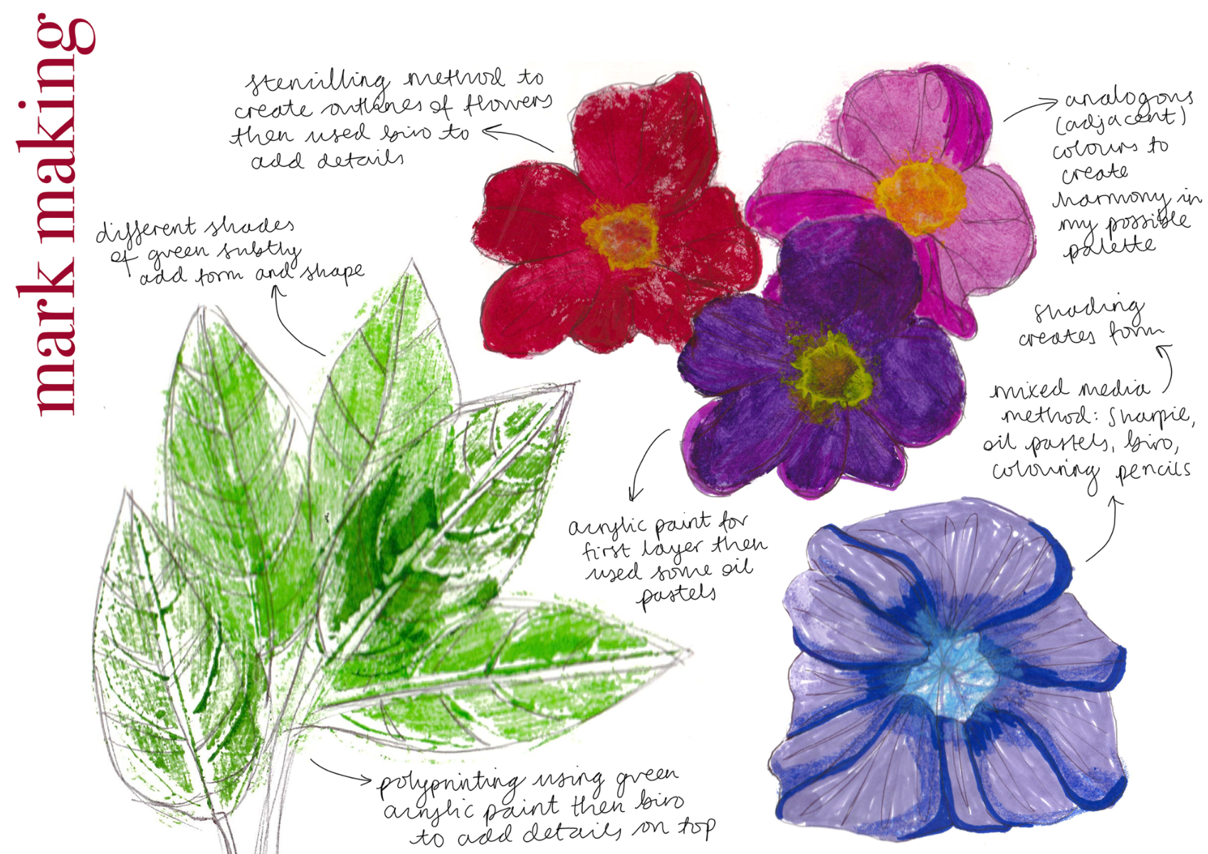
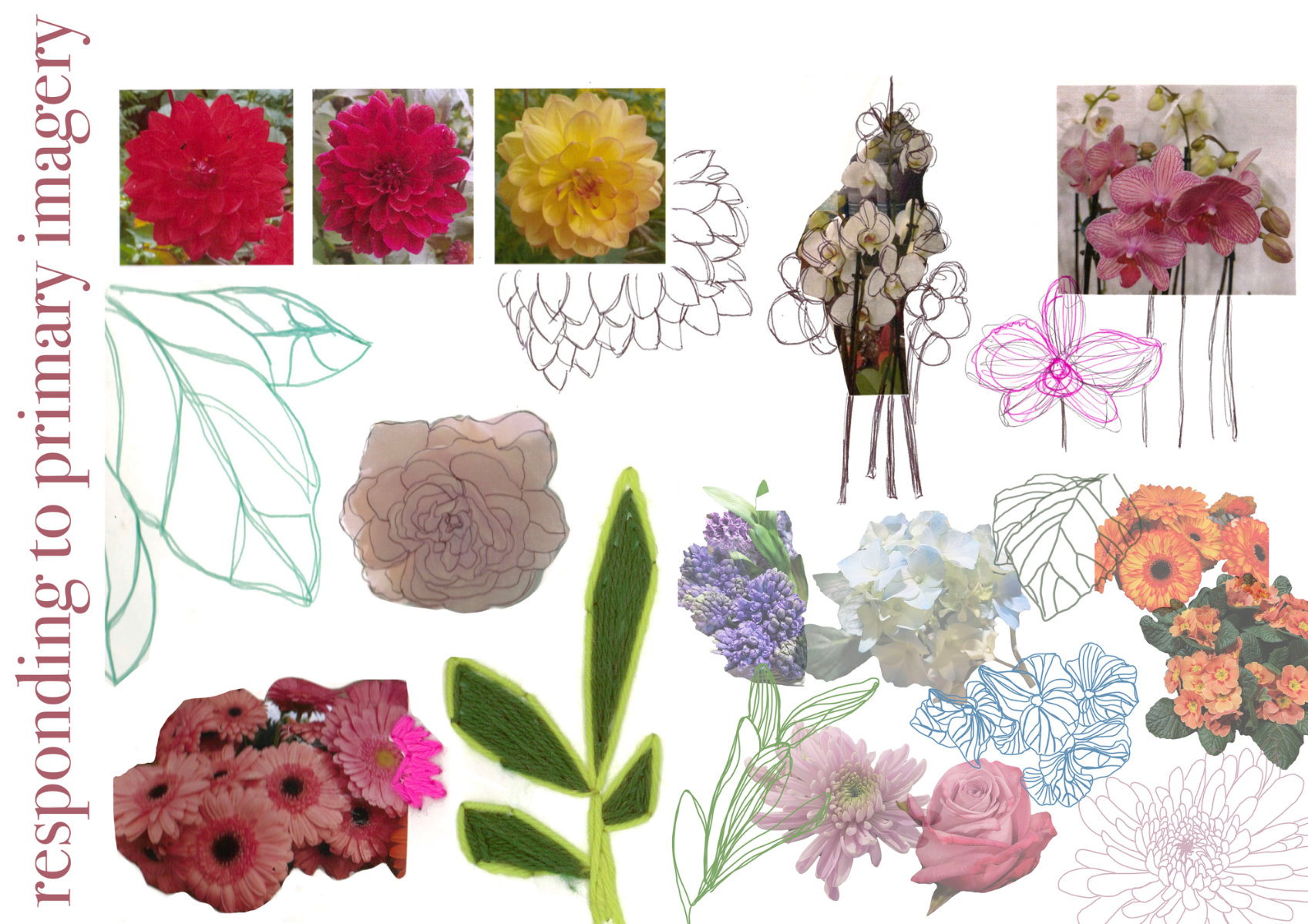
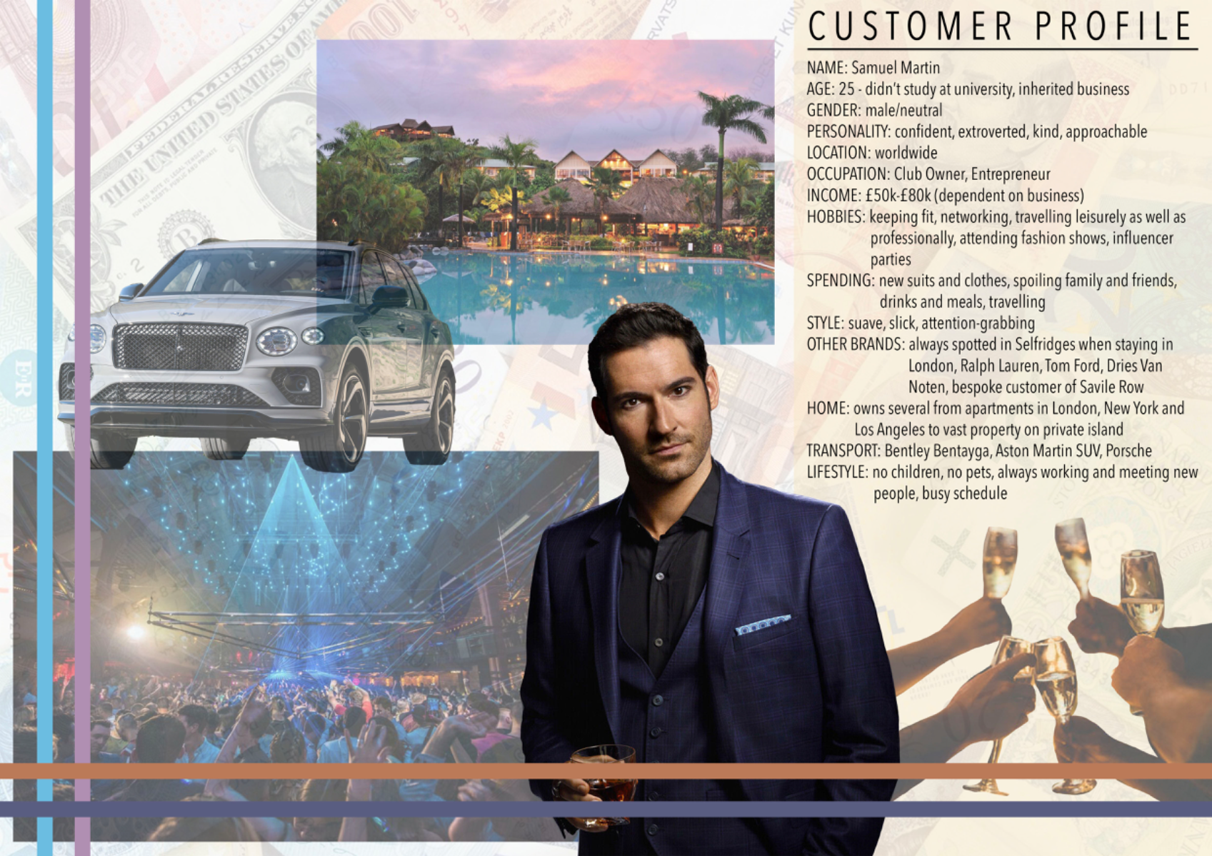
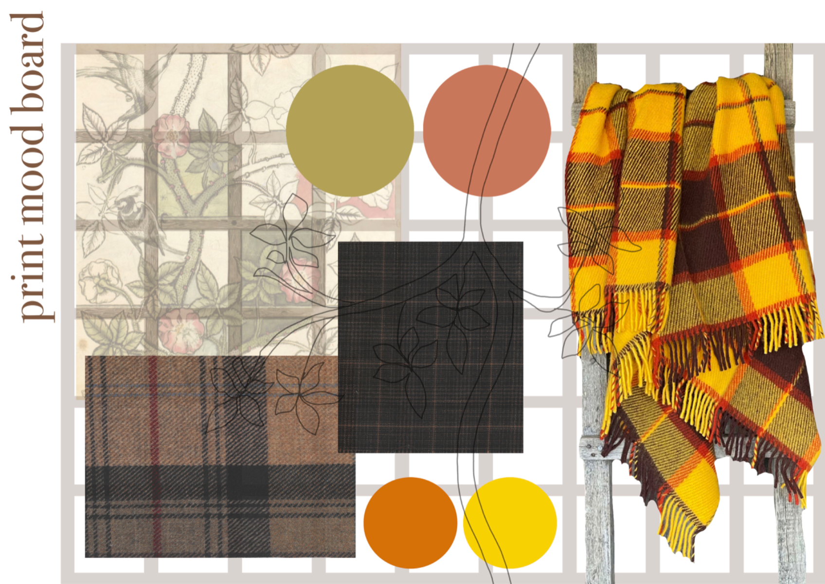
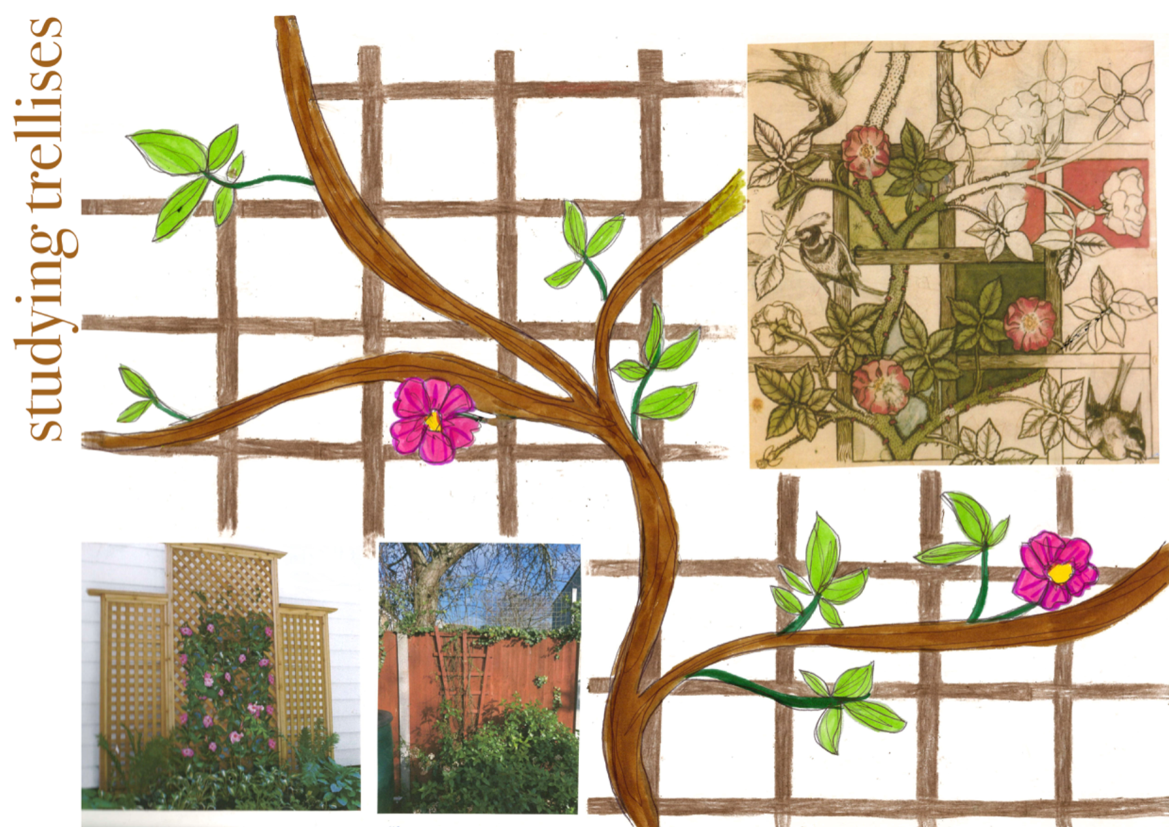
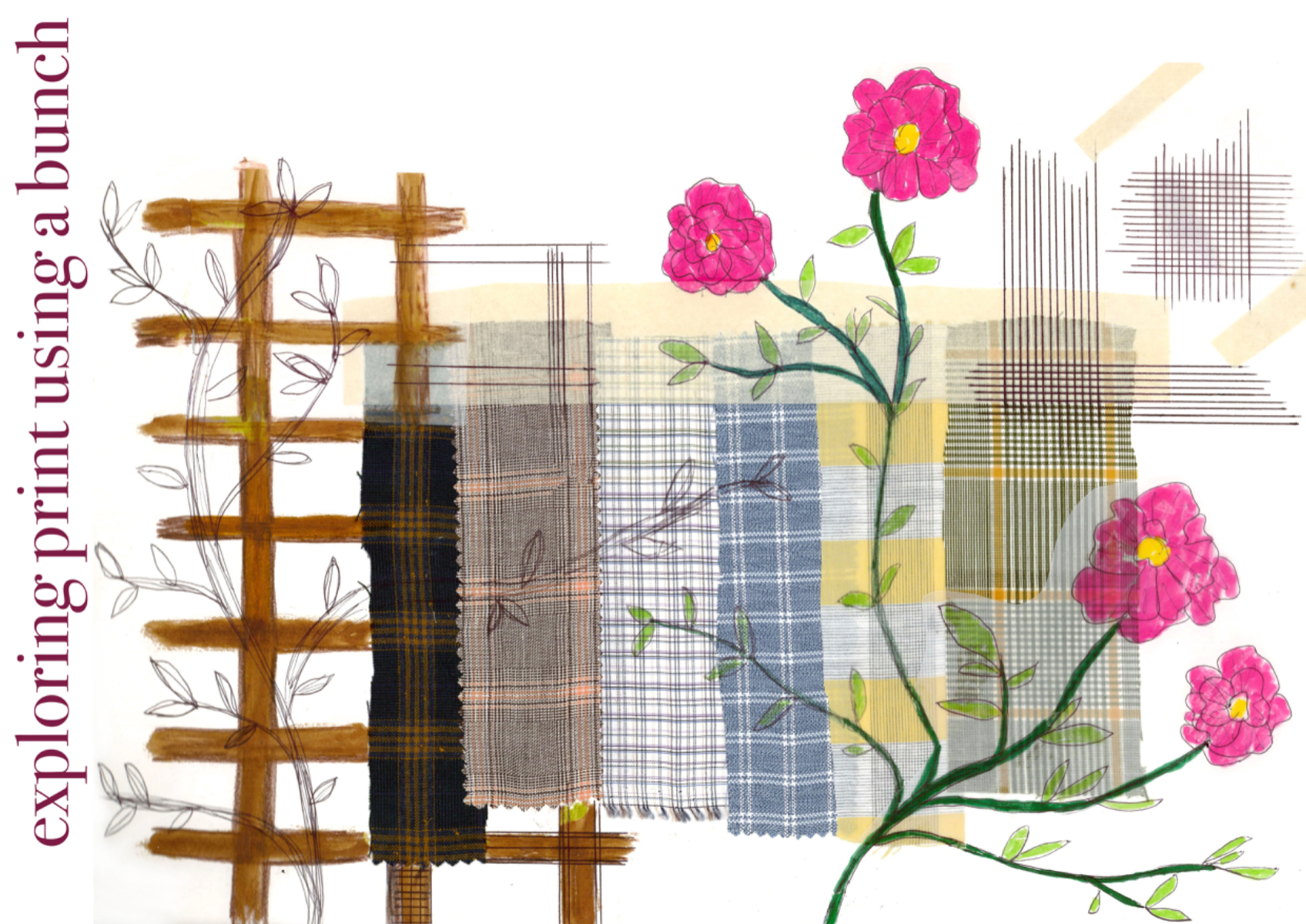
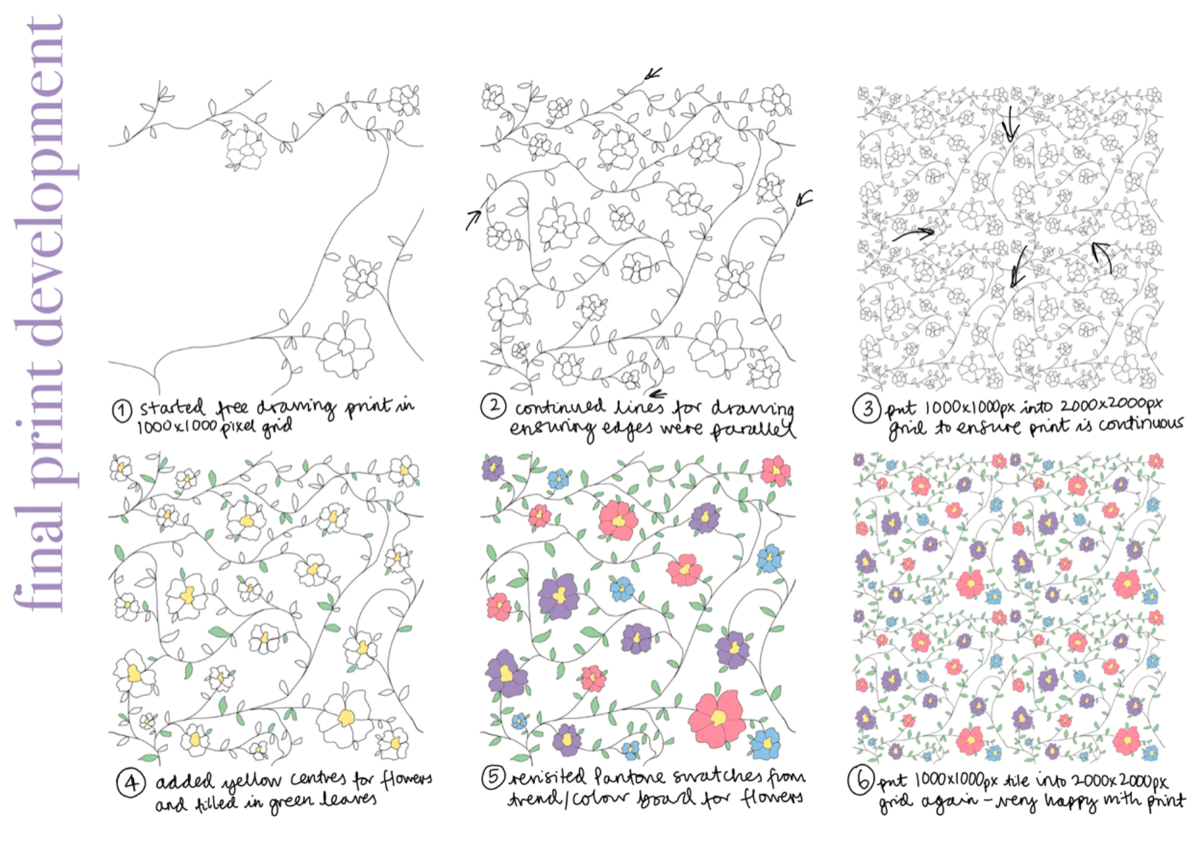
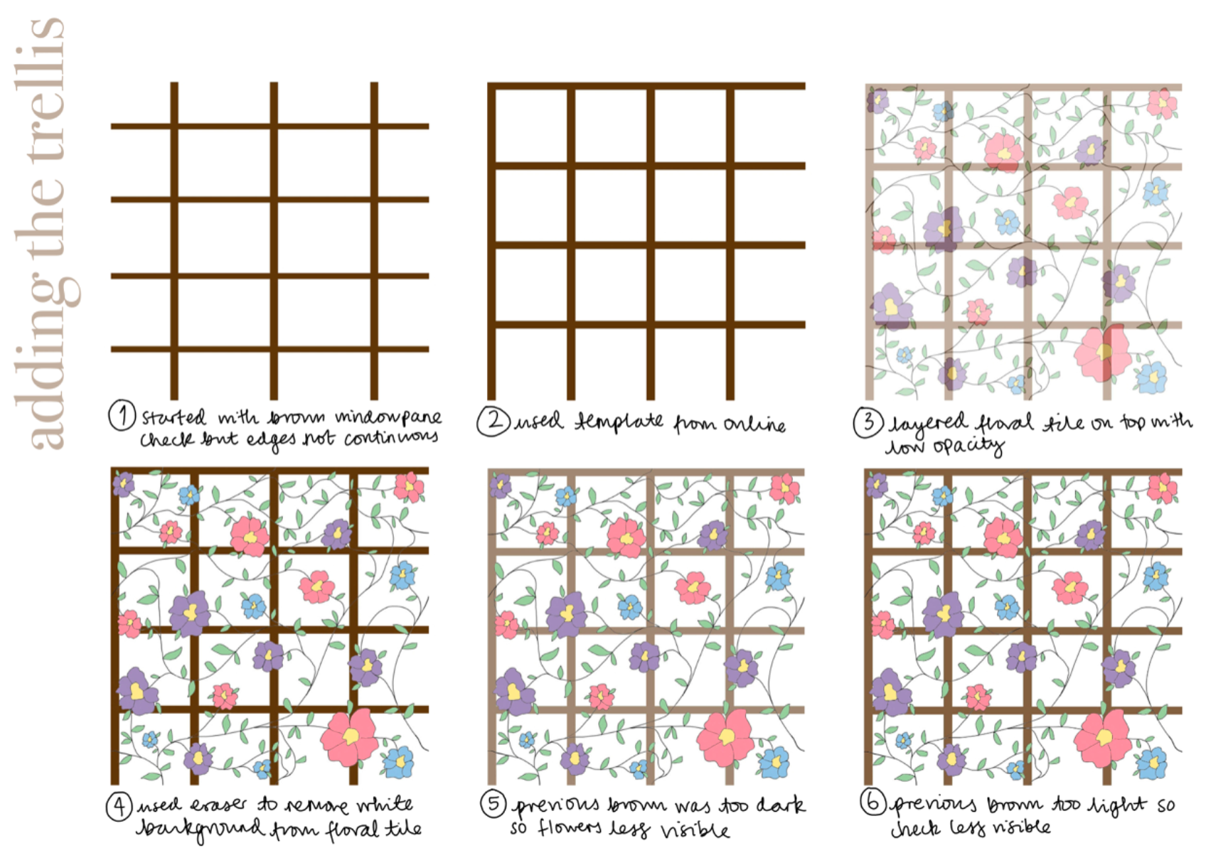
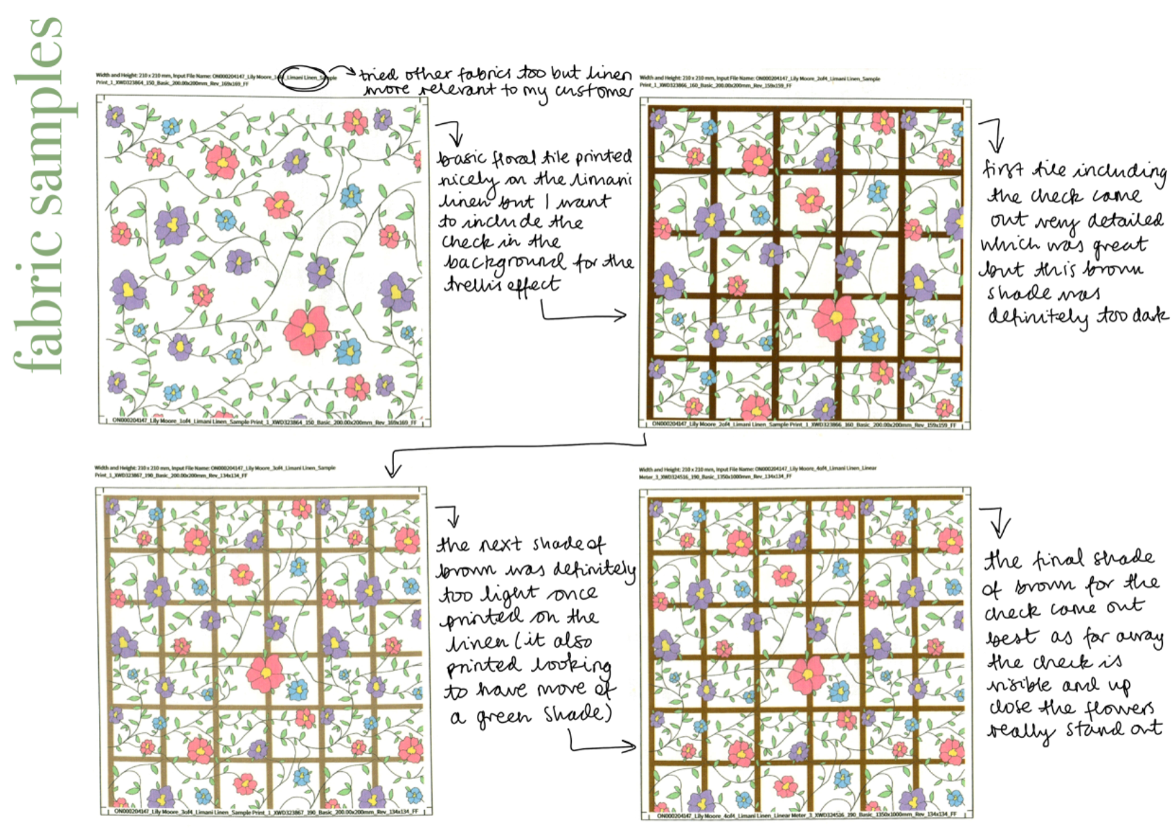
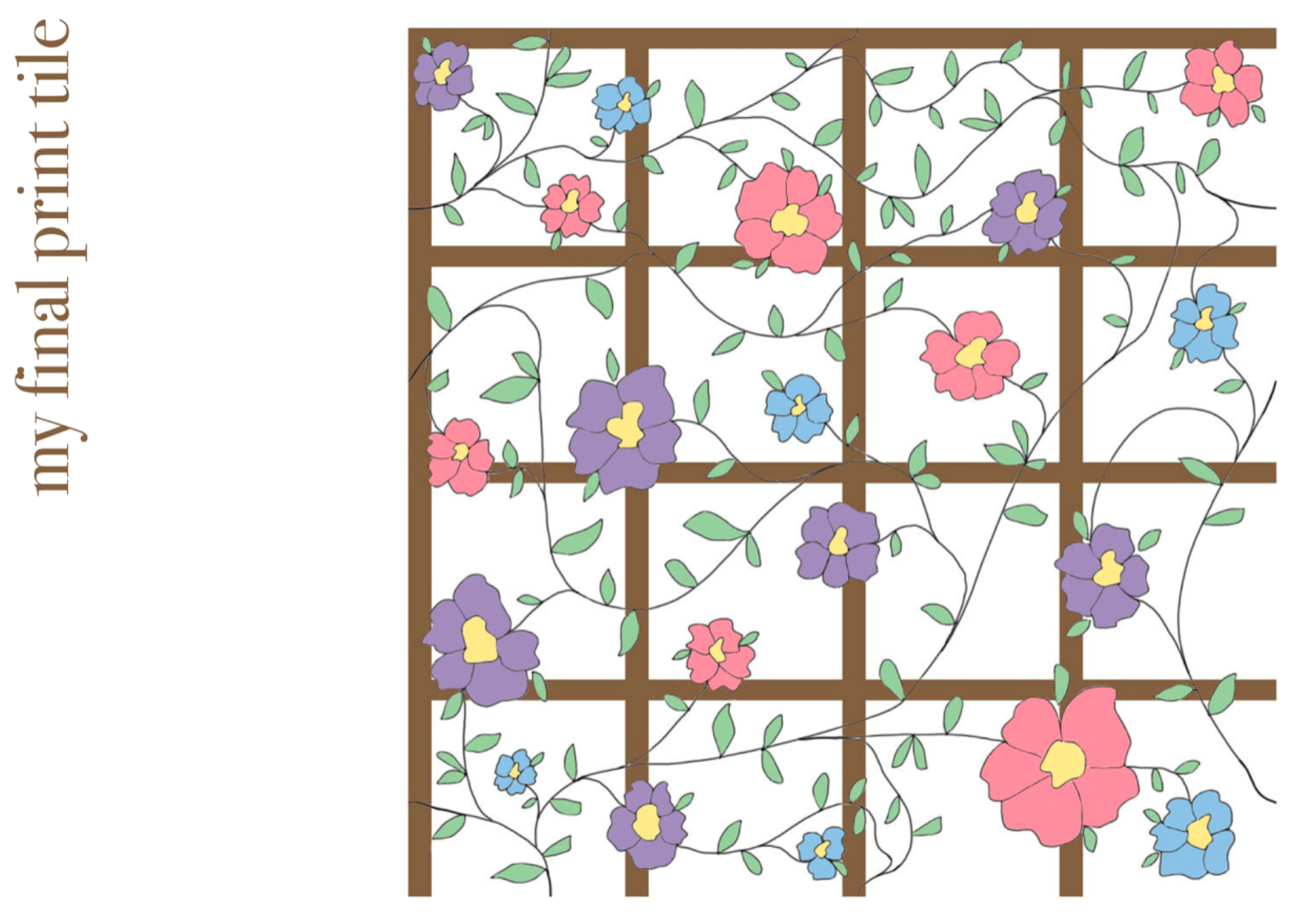
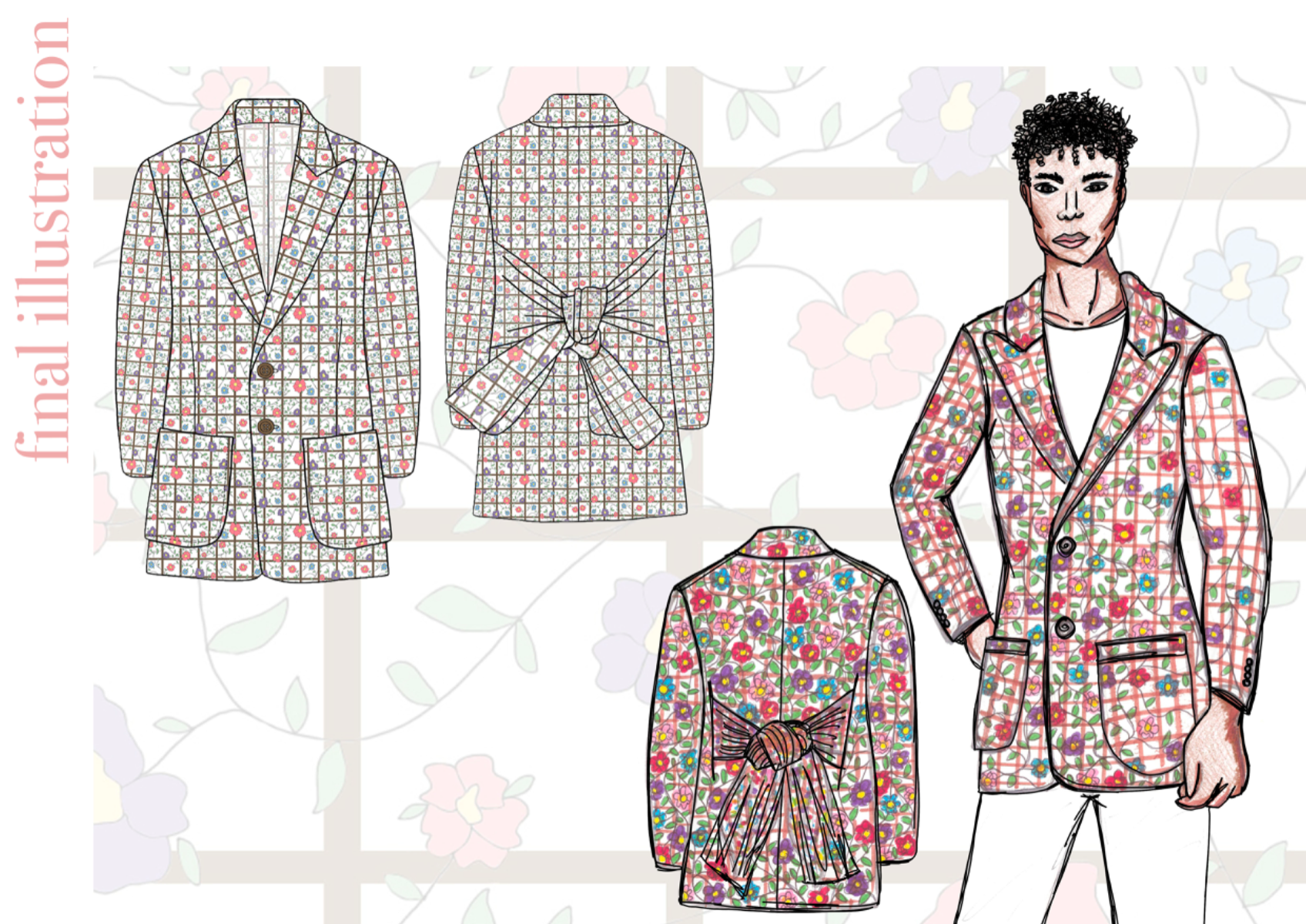
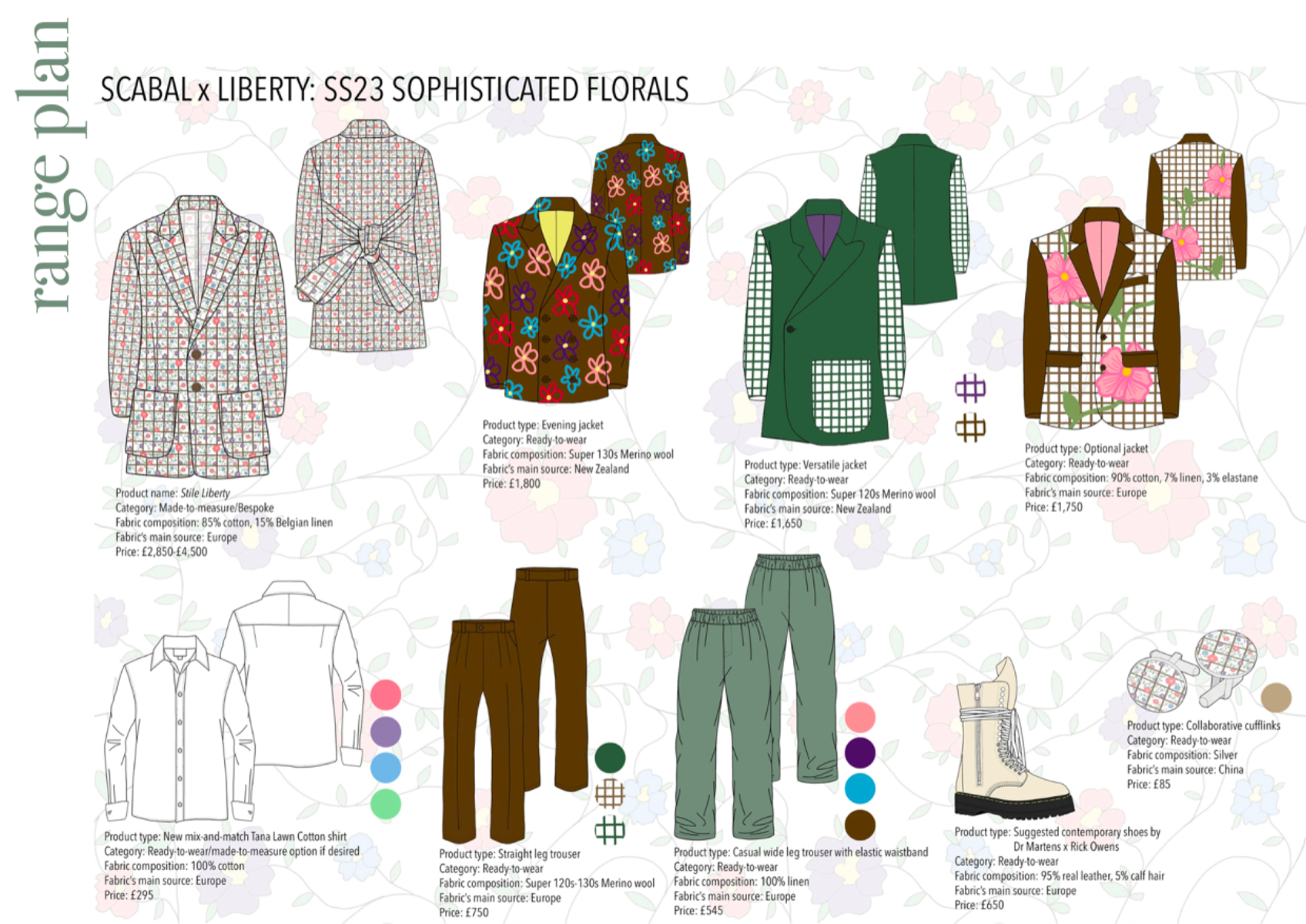
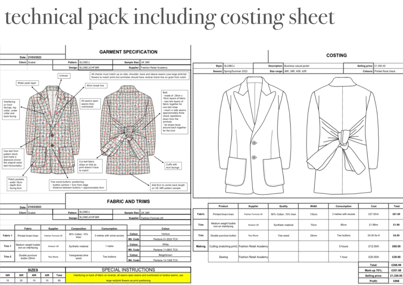
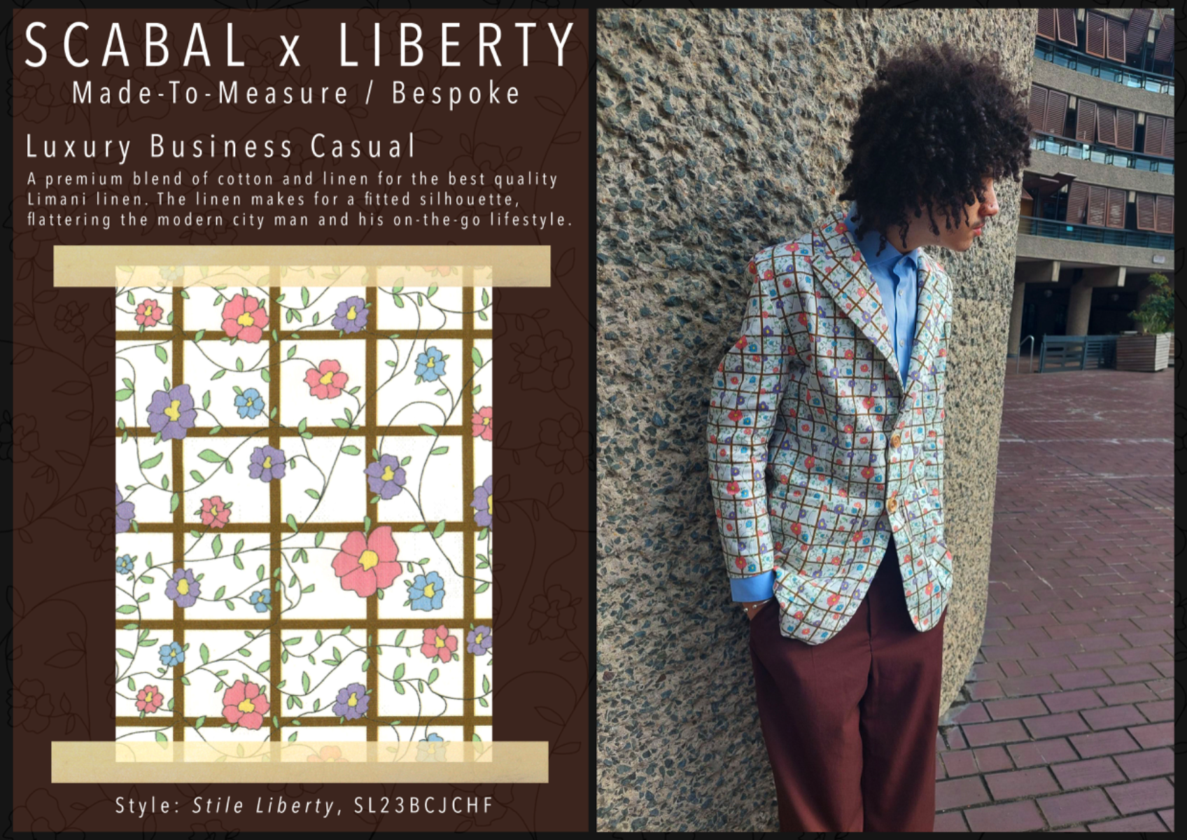
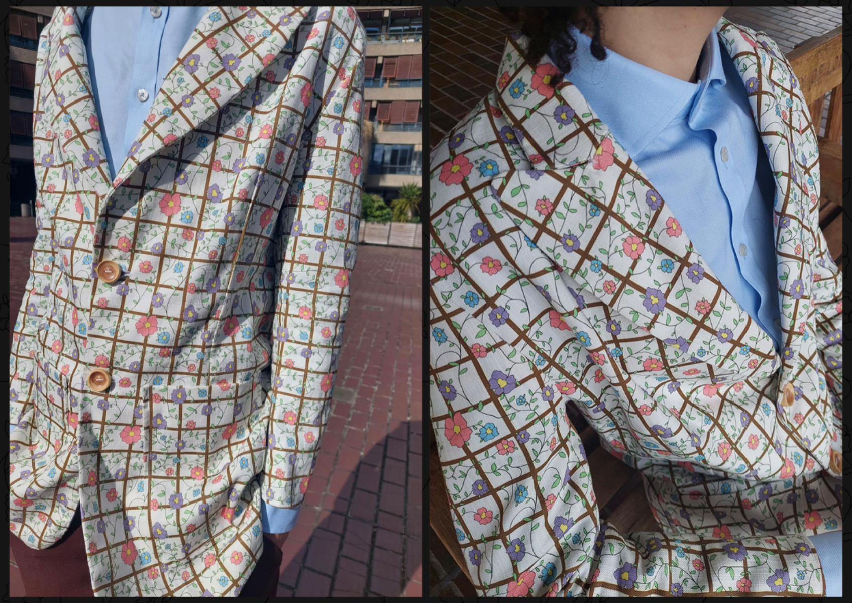
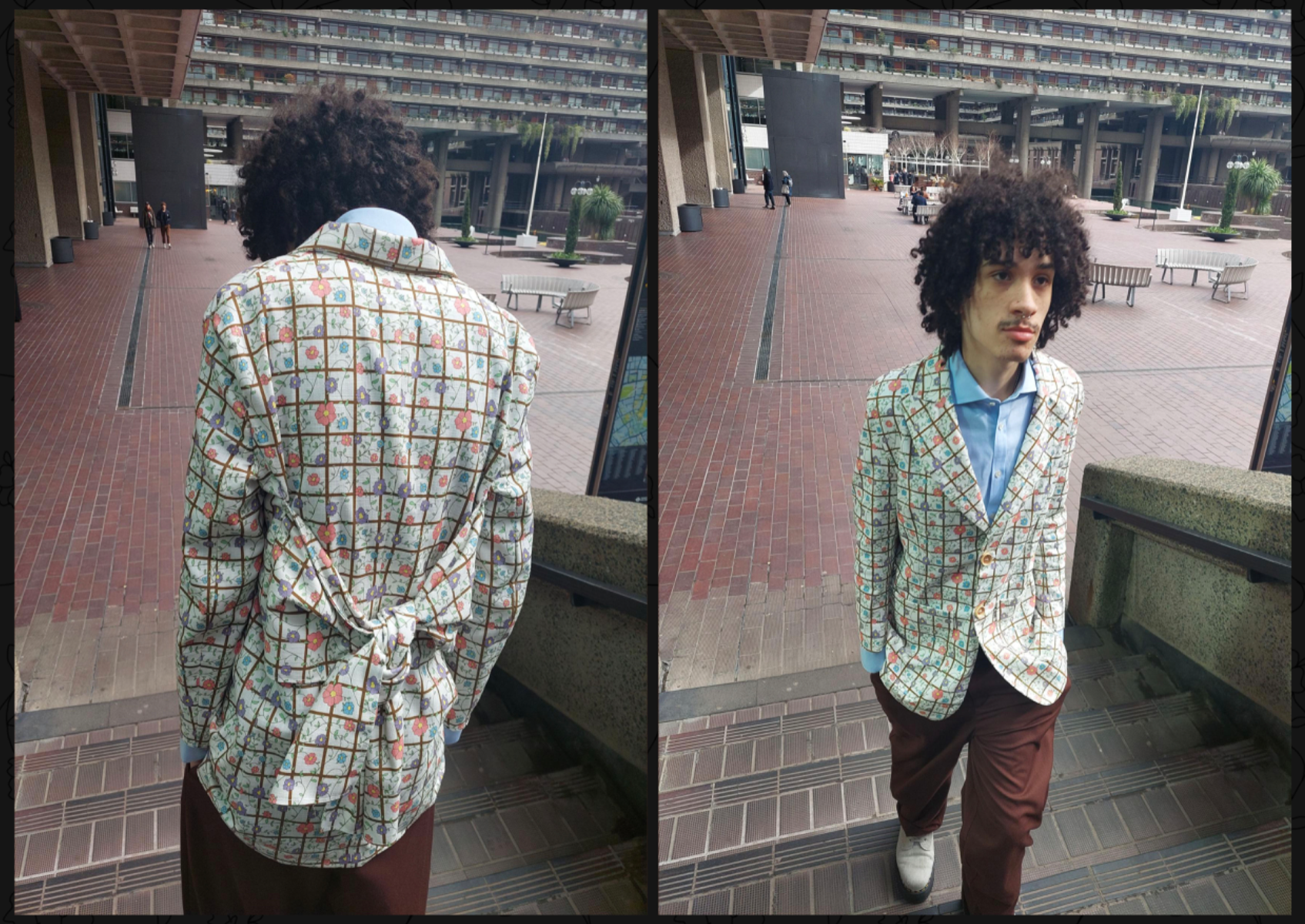
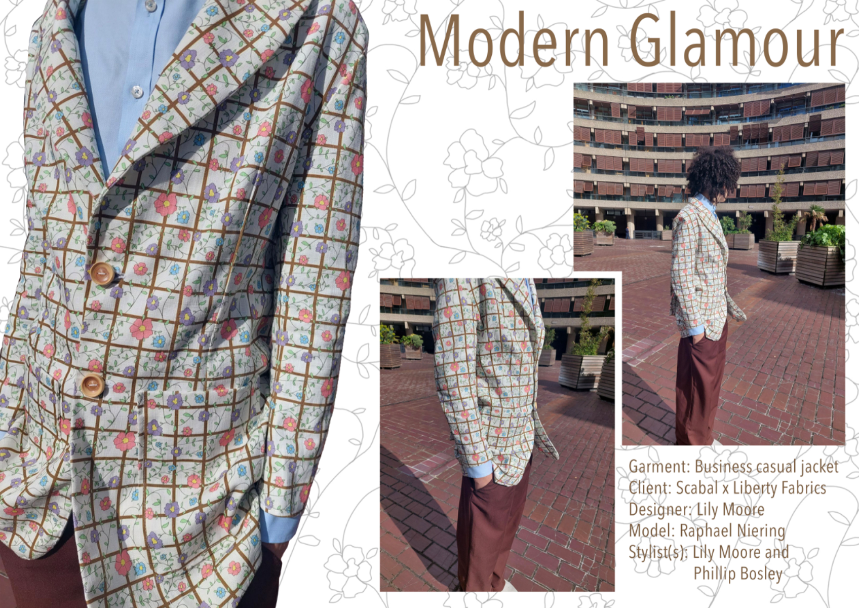
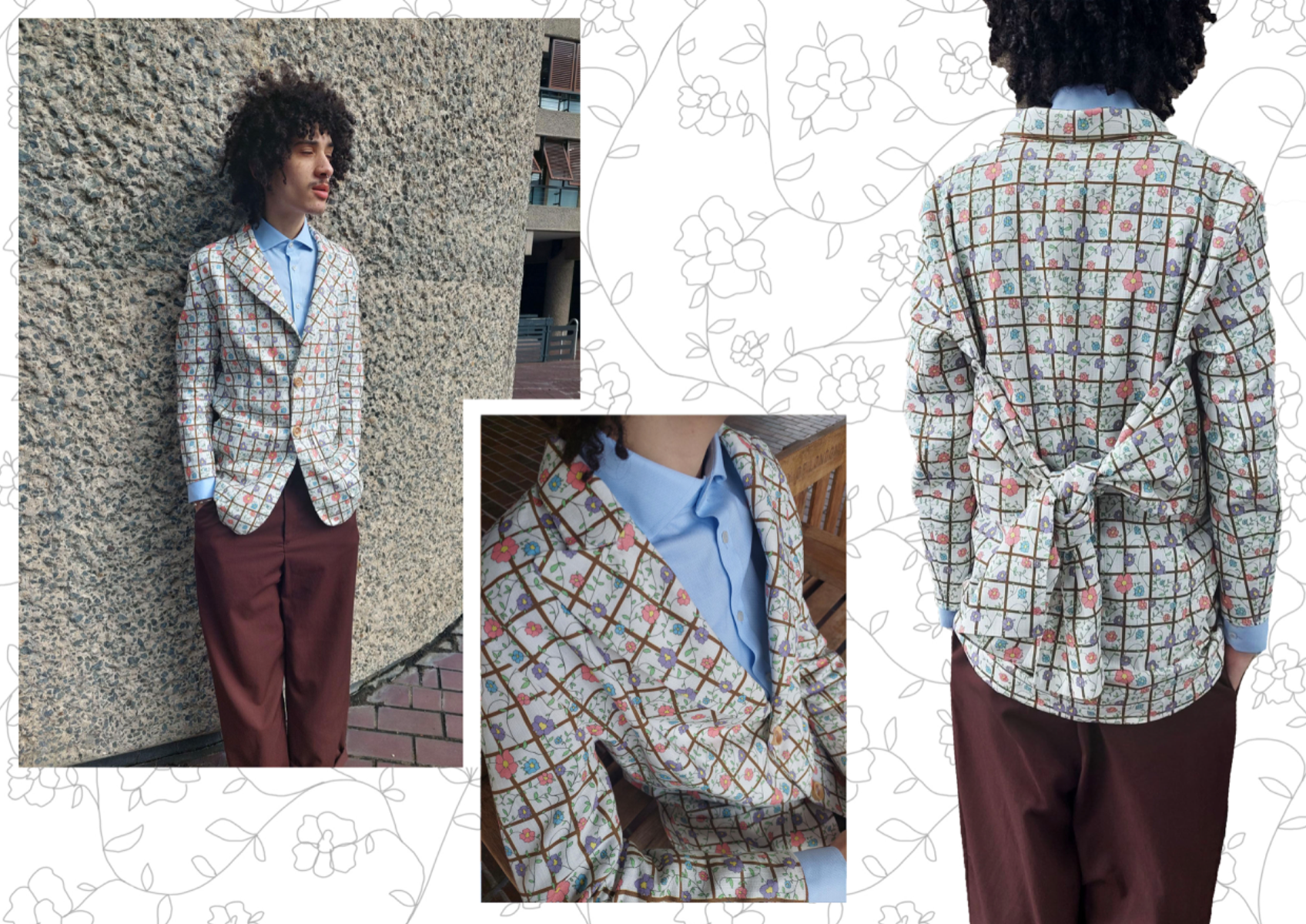
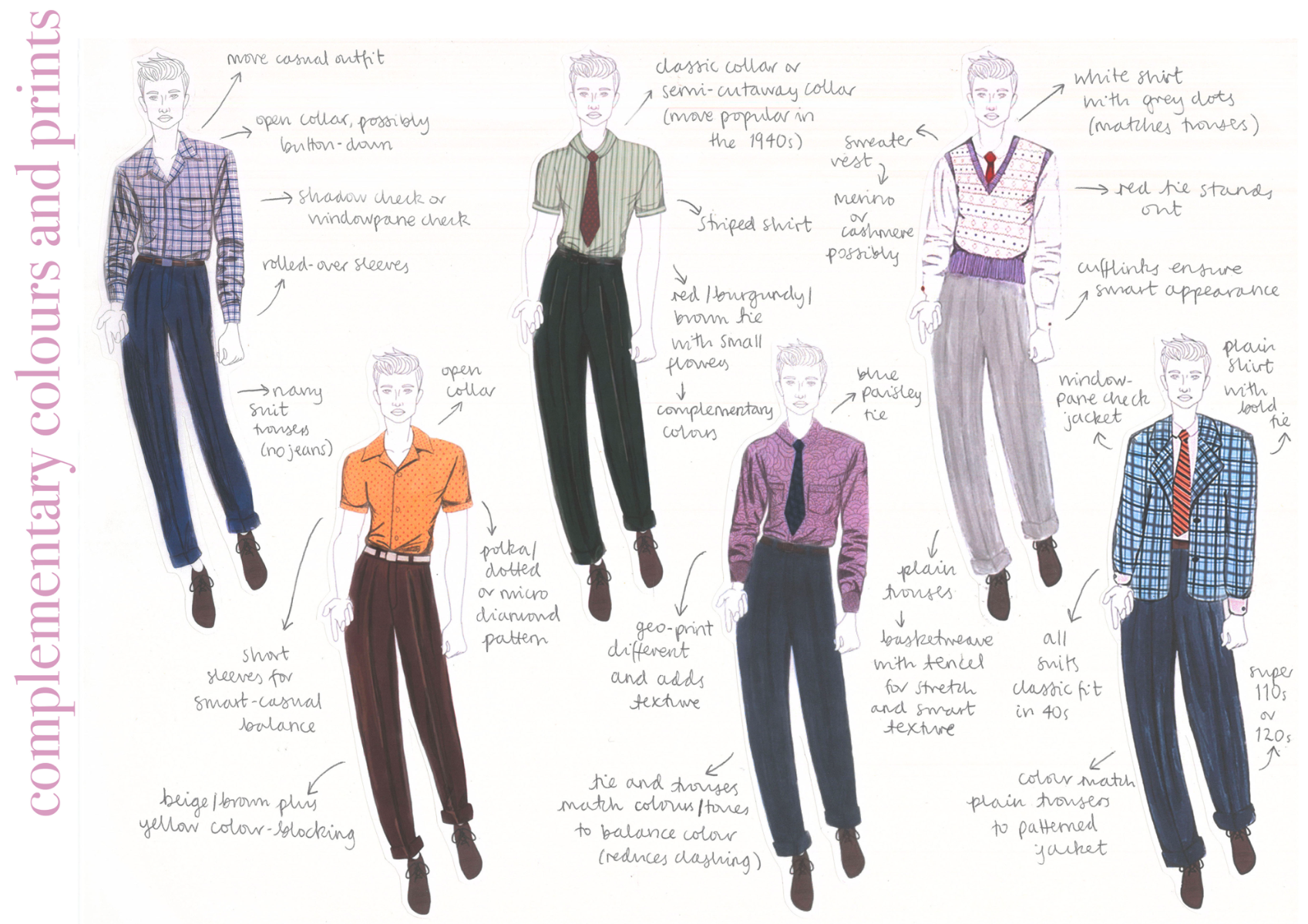
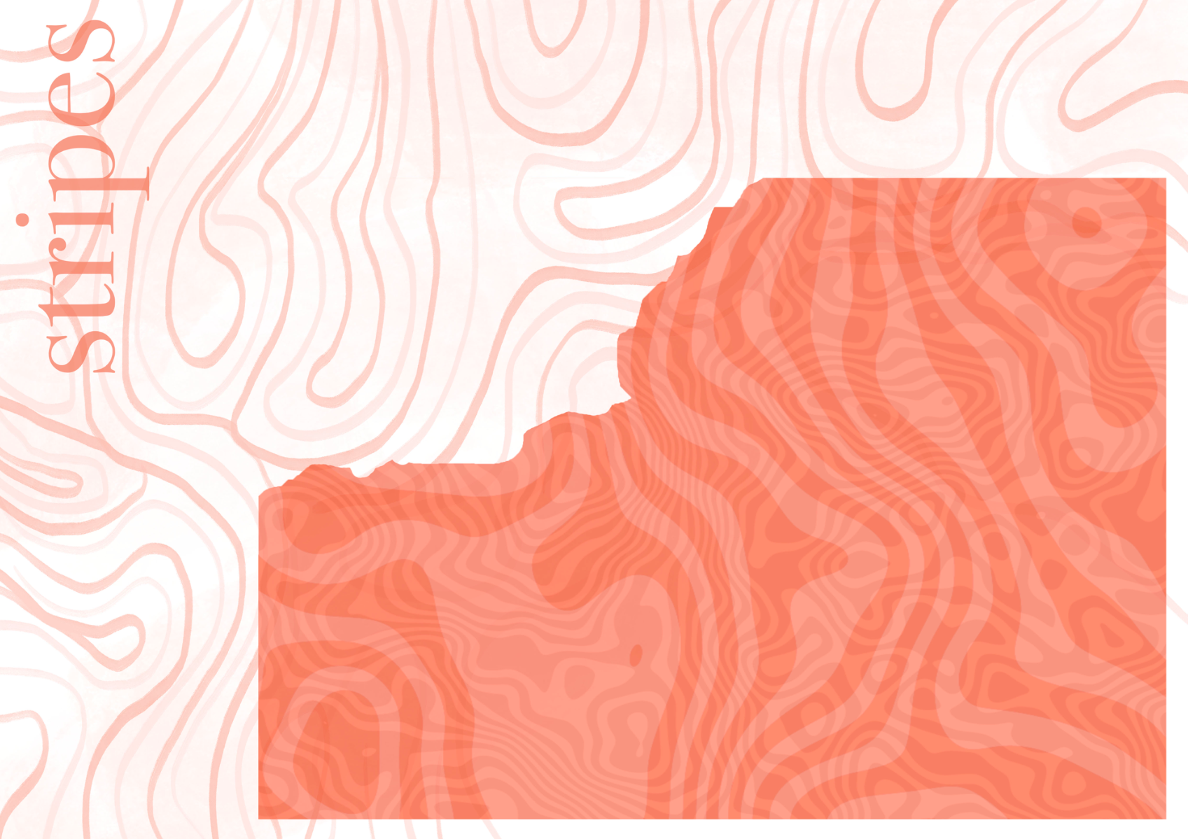
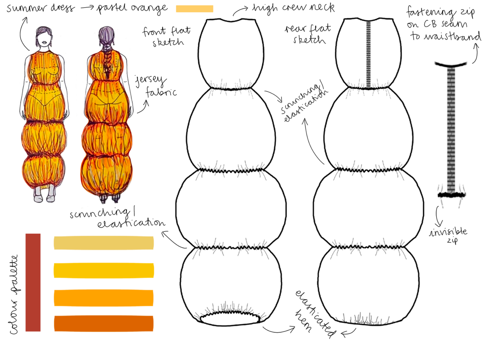
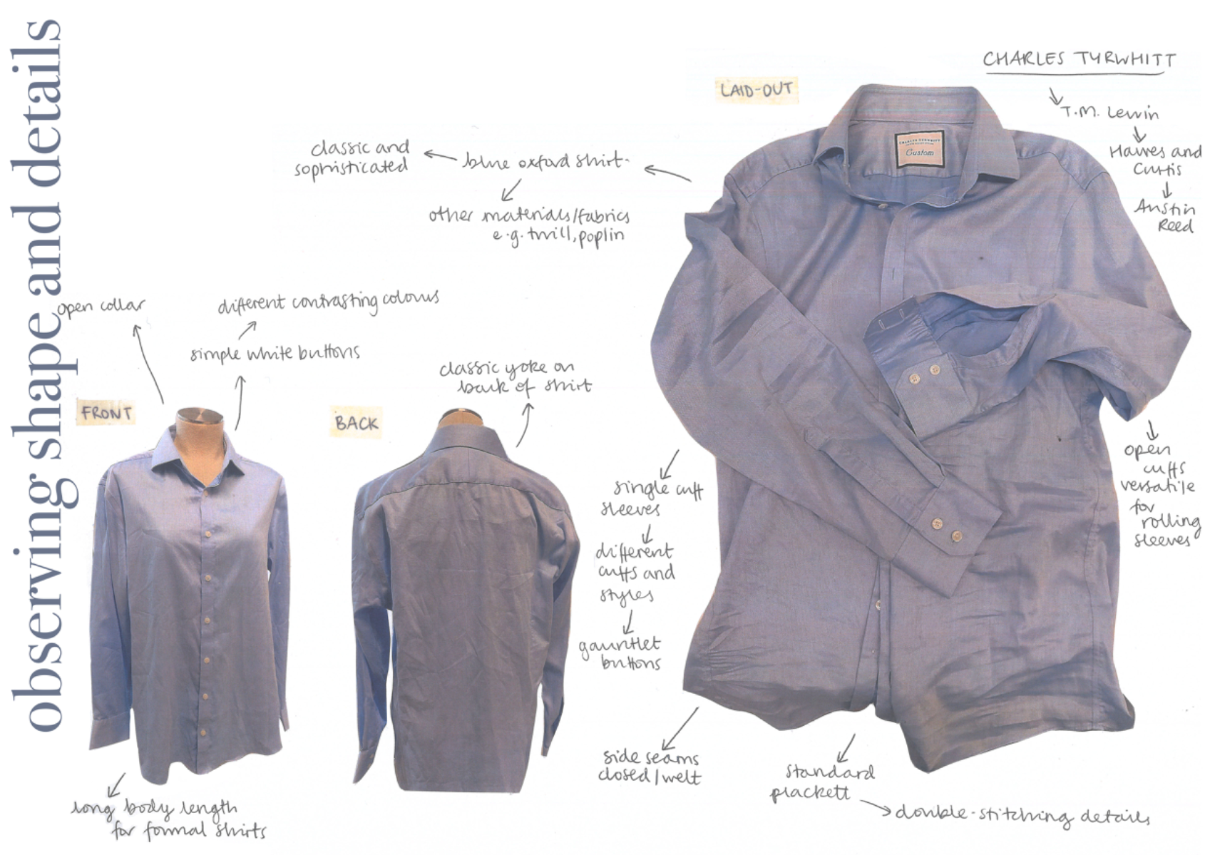
This project was completed in the penultimate term of my second and final year at the Fashion Retail Academy. Out of my peers, I was amongst the most engaged throughout this project as it was based on tailoring - possibly my biggest strength and passion - so I really wanted this project to flourish. The brief for this project was straightforward: select a Savile Row brand and another brand to collaborate with. Many of my peers selected high fashion brands with complex silhouettes but I wanted to find a way to utilise my design strengths. I found this by, after some research, choosing to collaborate with Liberty who are known for their beautiful floral fabrics. This worked very well for me because my Savile Row brand, Scabal, could retain their style (wide lapels, business casual cut, longer body length) but add a new flair with a floral print. Researching and developing my ideas was very fun as I looked at fabric references, breaking down patterns/prints to their line drawings, mark making, draping on the stand, collaging silhouette ideas and, of course, designing a print tile. This project taught me a lot about print design and showed me where I have some strengths that I hadn’t realised previously. To help with fabric printing, I used a company in London called Fashion Formula (now trading as maake.com) who specialise in sustainable digital printing techniques. They have copious types of fabrics to choose from, with myself settling on Limani Linen which is made of cotton and Belgian linen and is summery and lightweight (appropriate for my customer). The cutting of this fabric was what interested me the most as I wanted to have a print that flowed continuously, meaning every single seam would match. This took up more time than I thought but it opened my eyes to the fact that usually this process is, unfortunately, not very ethical. Since this project first introduced us to ethical and sustainability statements that all brands should be proudly advertising, I began to realise how much of a gap in ethics there is between making something abroad in, for example, Asia, to in London. The gap is ridiculously huge where younger children are usually used for free labour in Asia, whereas in London there is higher pay (which still isn’t feasible for most) and more appropriately aged workers. Making this one jacket was very time consuming due to the specifications I set for myself, meaning the final garment still wasn’t complete. I would have added a lining inside and made proper buttoned cuffs on the sleeves, as well as padded shoulders. However, these particular steps were not achieved. My final jacket still looks amazing, but it lacks the polished level that Savile Row is known for. Despite this, the final print tile I used printed beautifully, receiving many compliments from peers, strangers and anyone I show in the present day. It taught me a lot about how print can truly elevate a garment, but also how important it is for the printing to be sustainable. From a generation who is striving for climate change to be addressed, making decisions like these early on will help make the fashion world a safe, ethical and environmentally friendly place. I therefore am excited to see what my future projects, and the future of our planet, hold for sustainably printed garments.
Coming soon